If you open the major consumer social apps side by side (Instagram, TikTok, Twitter-now-X, Snapchat, Threads) the visual register is strikingly uniform. Bright saturated accent colors. Rounded geometric iconography. Gradient backgrounds. Bold display typography. The icon-grid era of mobile operating systems produced a near-monoculture in social-app branding.
Bluesky's identity is the first serious consumer social brand since Twitter's 2006 launch that deliberately refuses that register. The refusal is the point.
The Visual Rejection
Bluesky's logo is a flat blue butterfly: not a gradient, not a complex geometric wordmark, not an abstracted letterform. The shade of blue is a singular, slightly-muted, almost-ink blue, not the saturated electric blues that dominate tech branding. The butterfly is drawn at a low level of abstraction: simple wings, a center spine, no rendering flourishes.
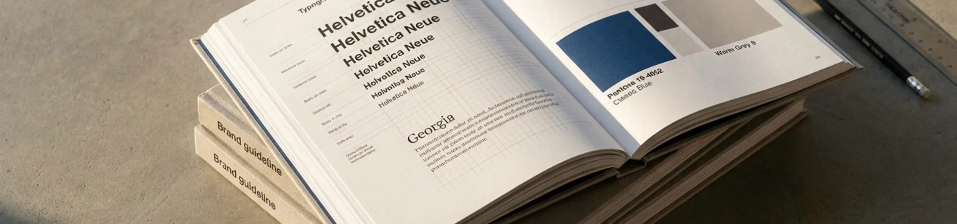
The typography across the app is a clean workhorse sans-serif: notably, not a custom type family designed to carry personality. Headers, body text, buttons all use the same treatment. The color palette is minimal: the ink blue, white, a neutral gray, and a single bright accent for action states.
This is all stylistic choice that reads as restraint by comparison to every other consumer social platform. It's also a calculated design argument: Bluesky is betting that in a saturated social-app field, the platform that looks the least like a platform wins.