project
Work, articles, studios and categories across the archive.
project
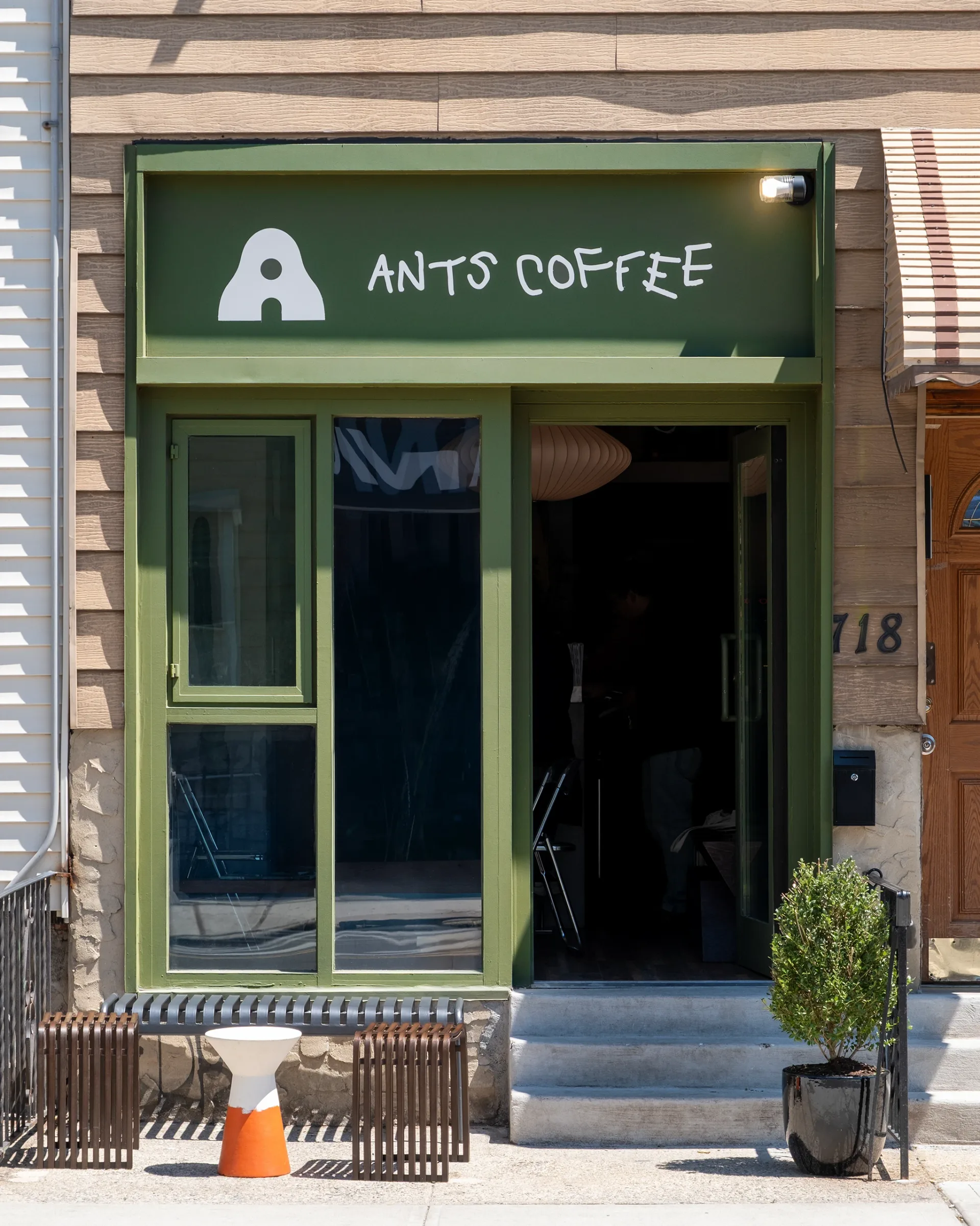
…borrowed from Greenpoint. Tuman Studio ® Tuman Team Creative Director → Ira Kosheleva Art Director → Artem Strizhkov General Producer → Konstantin Tolstikov Art Director → Artem…
project
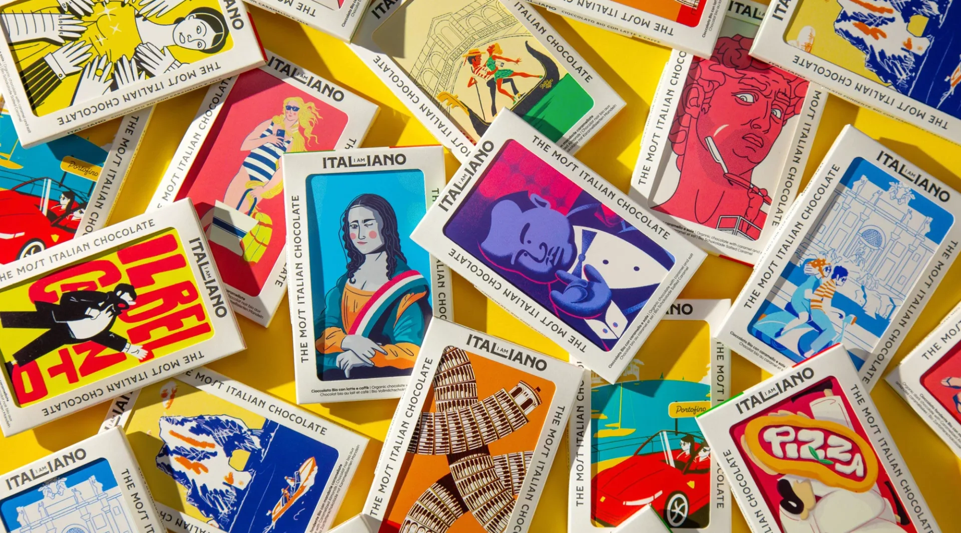
…bar's wrapper doubles as a collectible postcard, organized around Italian cultural themes. Art, destinations, and iconic symbols of Italian identity each get their own series. The wrapper…

project
…balanced personality with clarity, creating a system that could perform equally well across digital storefronts, retail imagery, and physical packaging. PERFECTLY FORMED, DISTINCTLY COLE…

article
…Jonathan Anderson, every store is a gallery of material culture. Ceramic walls by a Japanese artisan. Woven leather panels that reference the brand's craft heritage. Furniture by designers…
article
…invisible economics of visual familiarity, and a reminder that what consumers cannot articulate about why they buy something is often the most powerful force keeping them buying it…

project
…and how it's framed. Hard contrast, deep negative space, the form defined by the light. Art Direction A lot of time went into testing scenes, angles and lighting setups before locking…
project
…communicates the reliability and mastery that define Premium Automotivo. YEAR / 2026 Brand, Art Direction & Design: Kalleb Garcia Strategy: Kalleb Garcia. Contact: kallebgarcia@gmail…
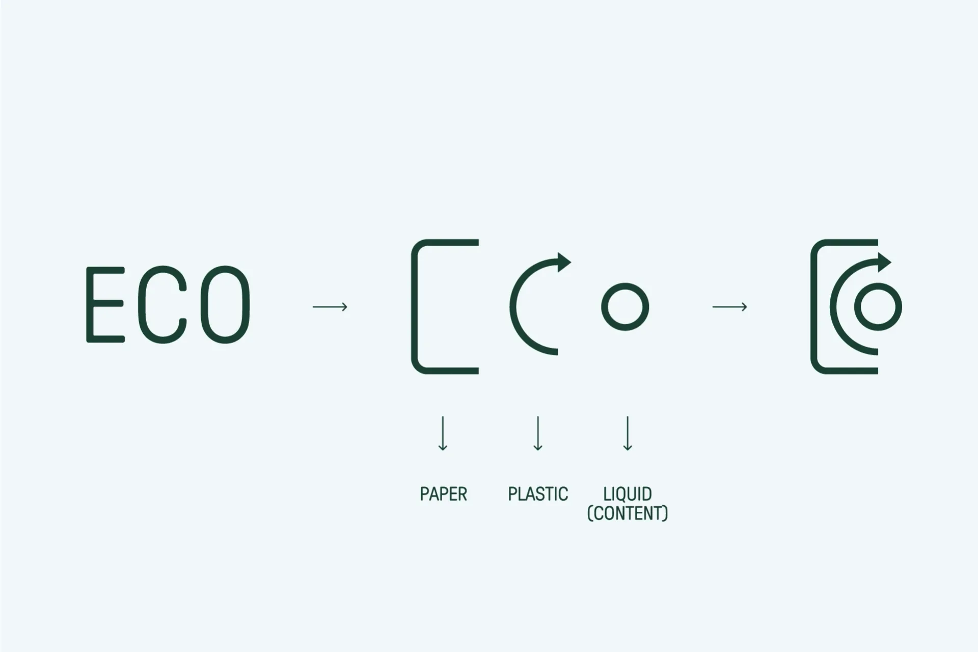
project
…Innovation is not only formal, it is structural and systemic. The brand development articulates a color palette, typographic system and visual elements that reinforce the business model…
article
…entering a story that started in 1883 on a railway platform. Every physical detail, from the Art Deco interiors to the hand-finished materials, serves that mythology. Cheval Blanc operates…
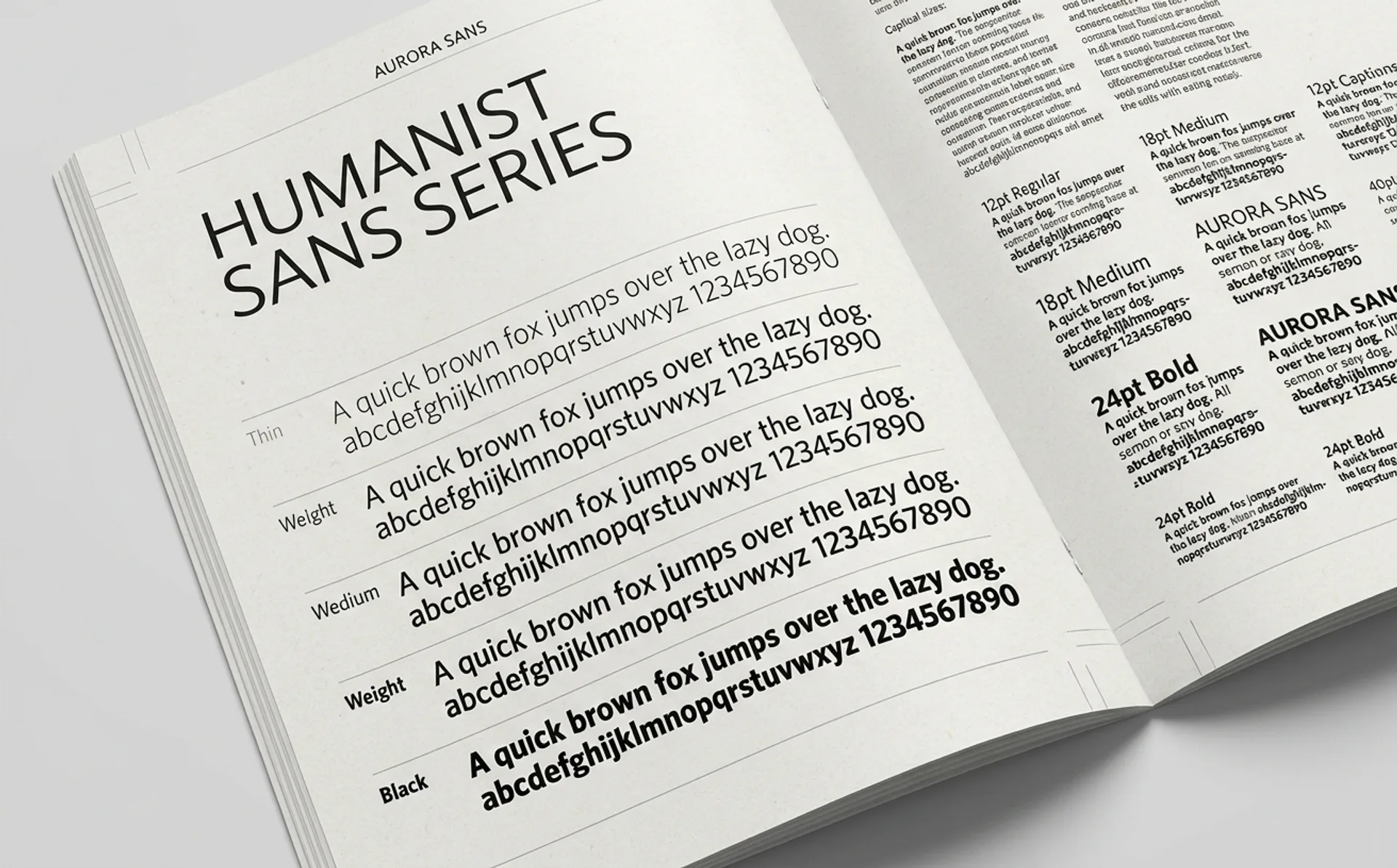
article
…visually different fonts, both under the same name. This was unusual at the time. Most digital typefaces were drawn once and scaled mathematically. Optical-size families existed in print…
ranking
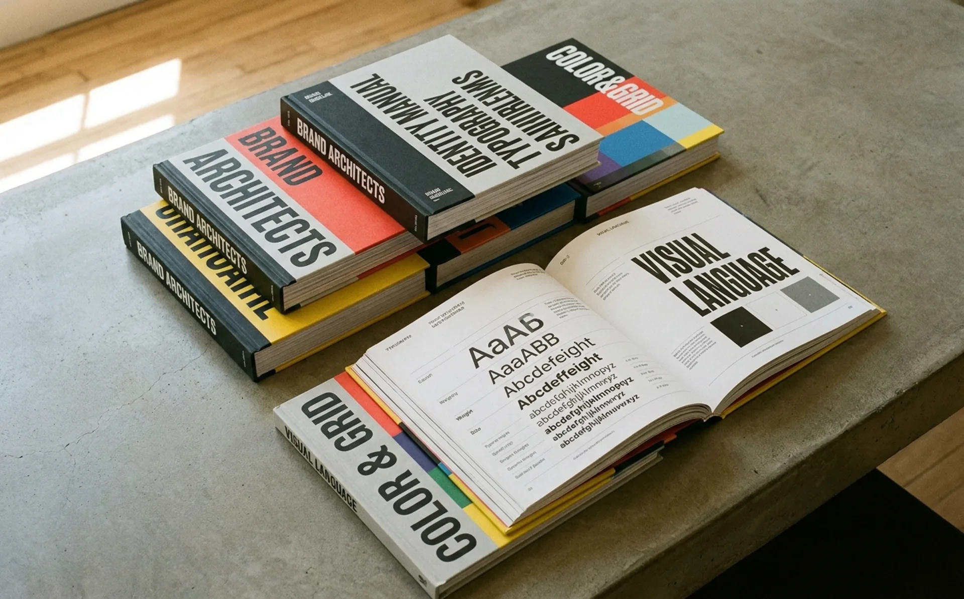
…handoff meeting, and never returns. The document lives in a shared drive, accumulating digital dust, while the marketing team guesses at hex codes and the junior designer scales the…
article
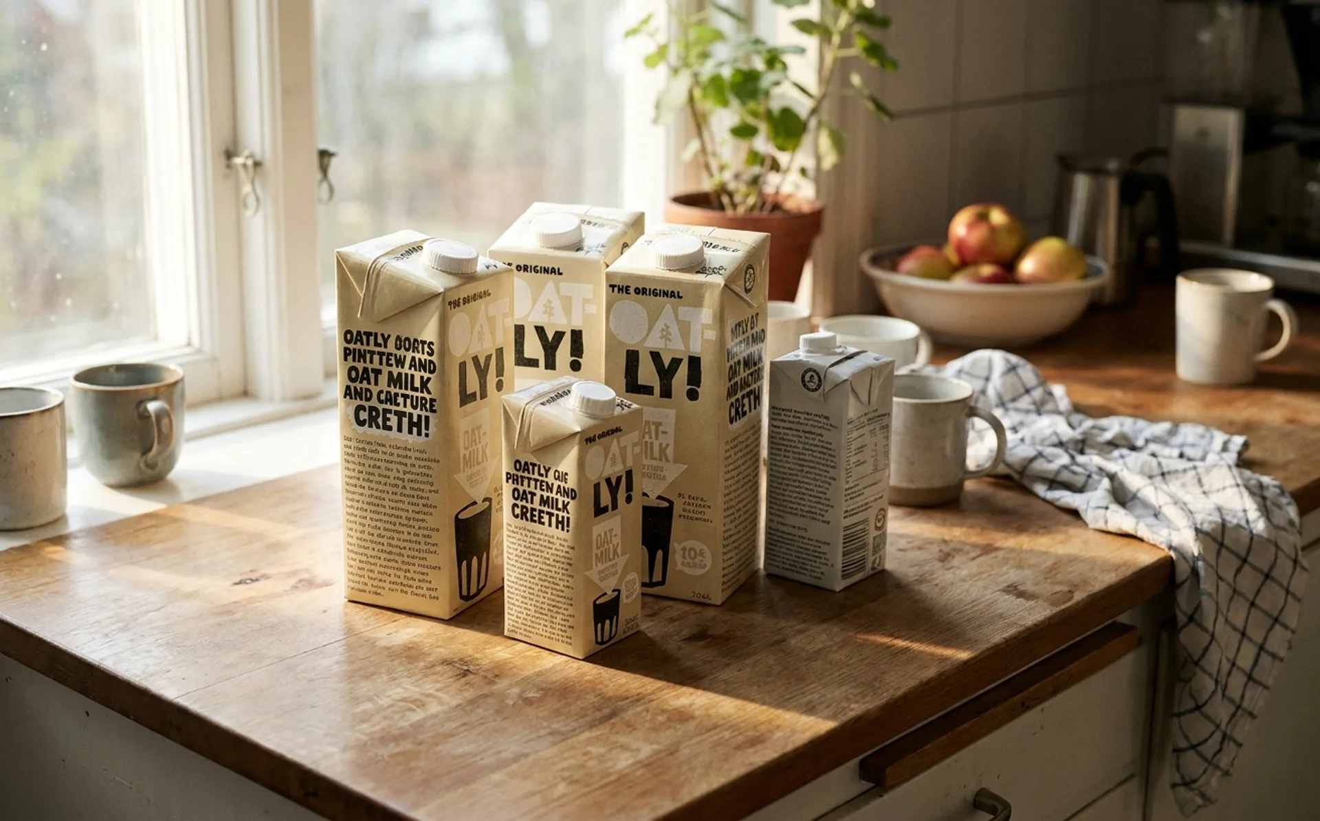
…during a meeting. Again, this impression is constructed. The illustrations are carefully art-directed to sit at precisely the right point on the spectrum between amateur and professional…
guide
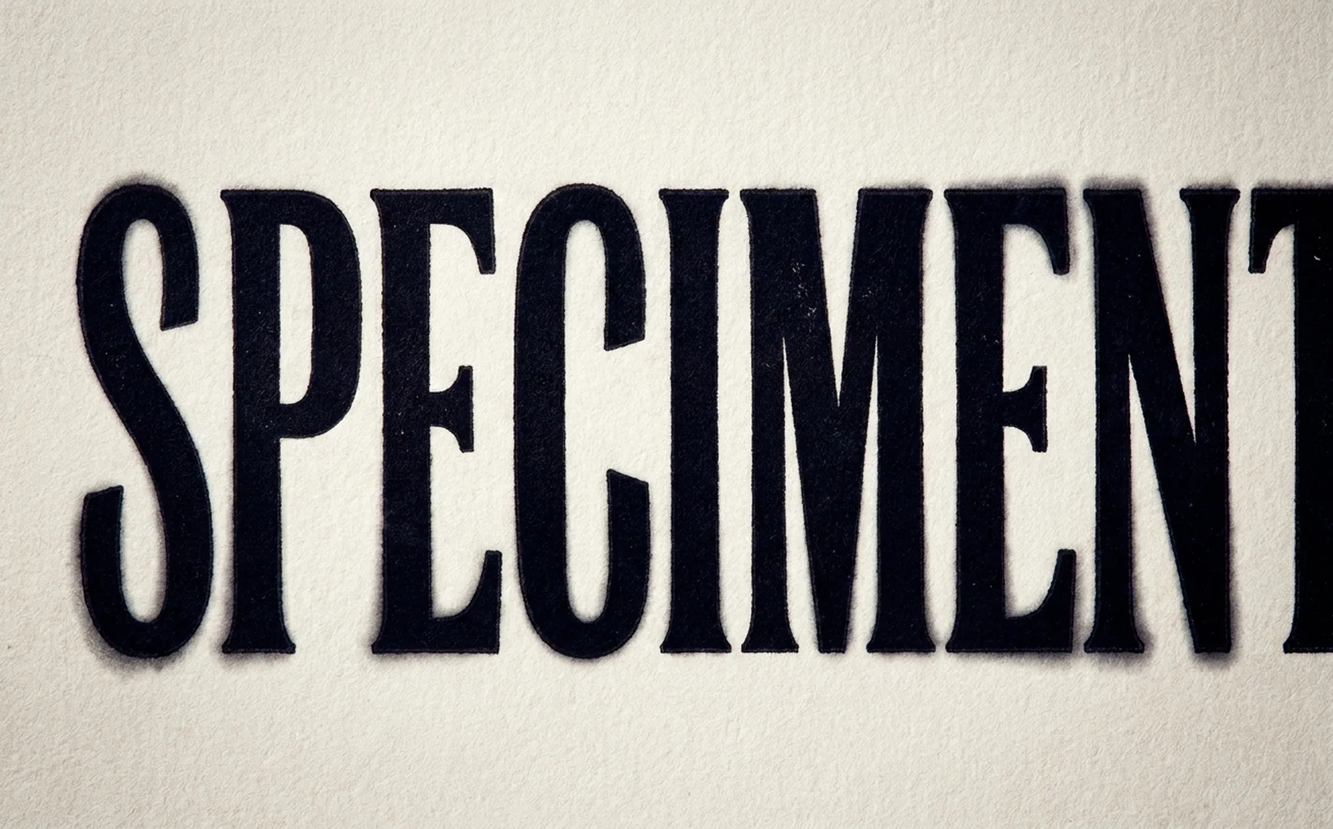
…optically kerning display type by hand. Why Auto-Kerning Fails at Large Sizes Every digital typeface ships with a kern table: a set of predefined spacing adjustments for specific…
ranking
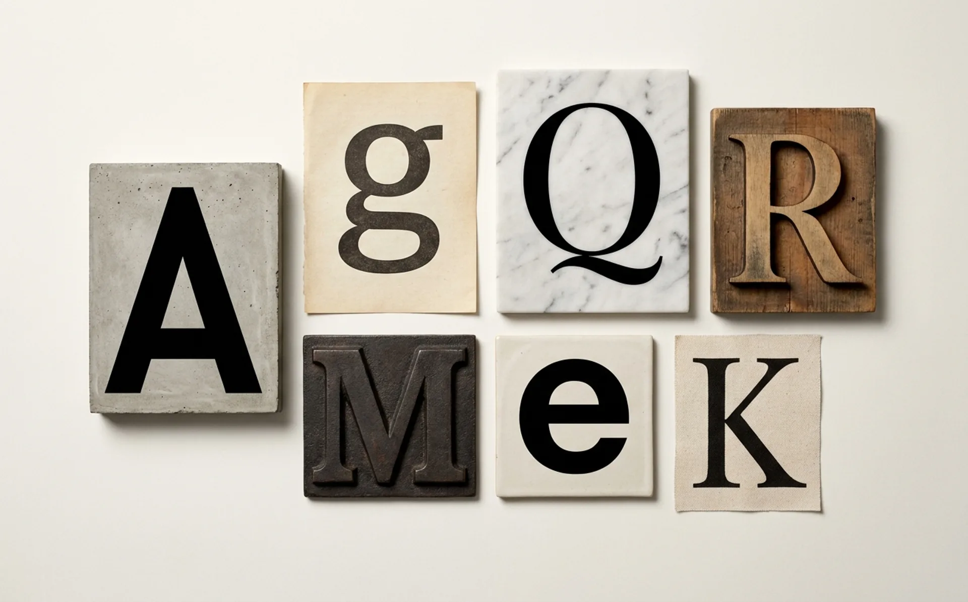
…drew from the tradition of American gothic typefaces while refining them for contemporary digital use. Coinbase made GT America central to its identity overhaul, pairing it with bold colour…
article
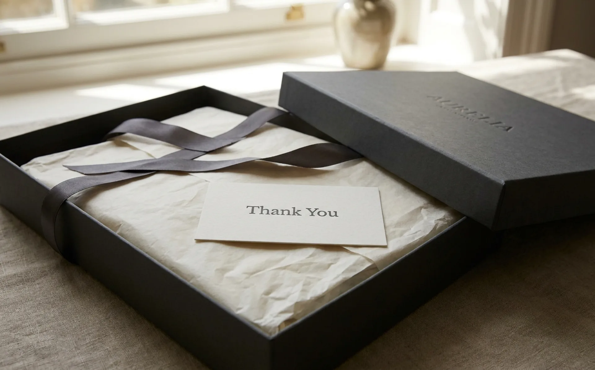
…a design specialty but as a branch of brand identity. Every decision described in this article (material, weight, sequence, sound, color) is an identity decision. Packaging is where…
article
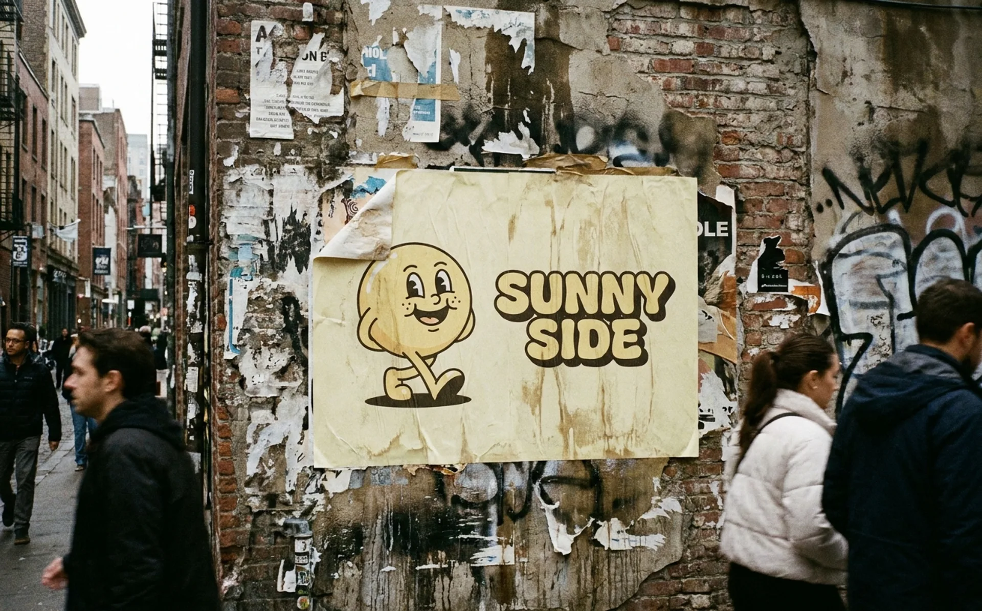
…replaced by a custom sans-serif that was cleaner, more versatile, and more scalable across digital contexts. Cooper survived as a display typeface for headlines and campaign material, but…
project
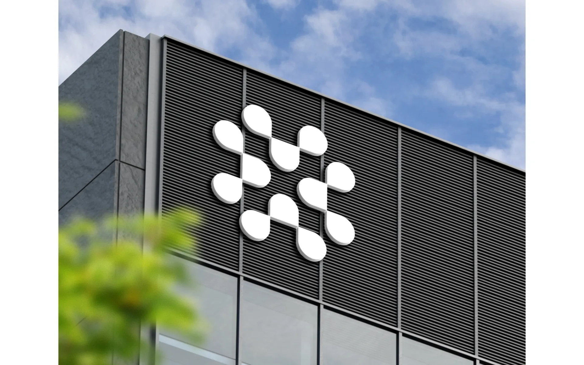
…the identity system must function across product lines, regions, retail environments, digital interfaces, and corporate communications. The strategic framework (what the brand means…

article
…and raw plaster, the materials left deliberately unfinished in a way that reads as both artisanal and industrial. In the Marais district of Paris, the store is set within a former electrical…
article
…most brands now happens on a screen, and screens move. Social video, app loading states, digital out-of-home, streaming intros, even the micro-animations inside a checkout flow: these…