project
Work, articles, studios and categories across the archive.

article
…are changing a single property on a container, and an entire interface re-themes itself. Real-World Application: A Two-Brand Product Suite Consider a practical scenario. You are the…

project
…professional event for experienced entrepreneurs doing business with China, focused on practical, real-world solutions in logistics, finance, and manufacturing. design concept /…
ranking
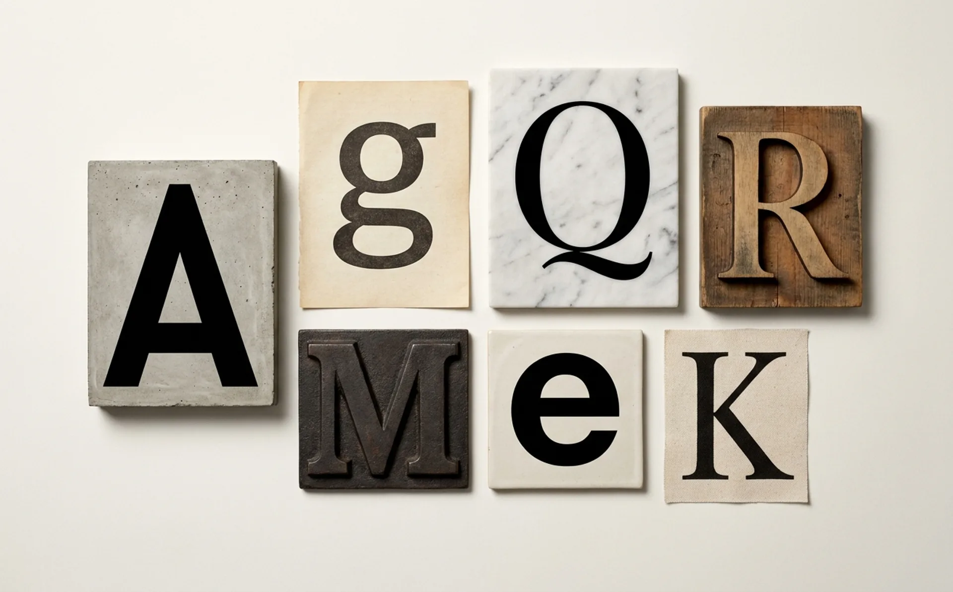
If you want to understand what a decade valued, skip the mission statements and look at the typefaces. The fonts a company licenses tell you more about its ambitions…
article
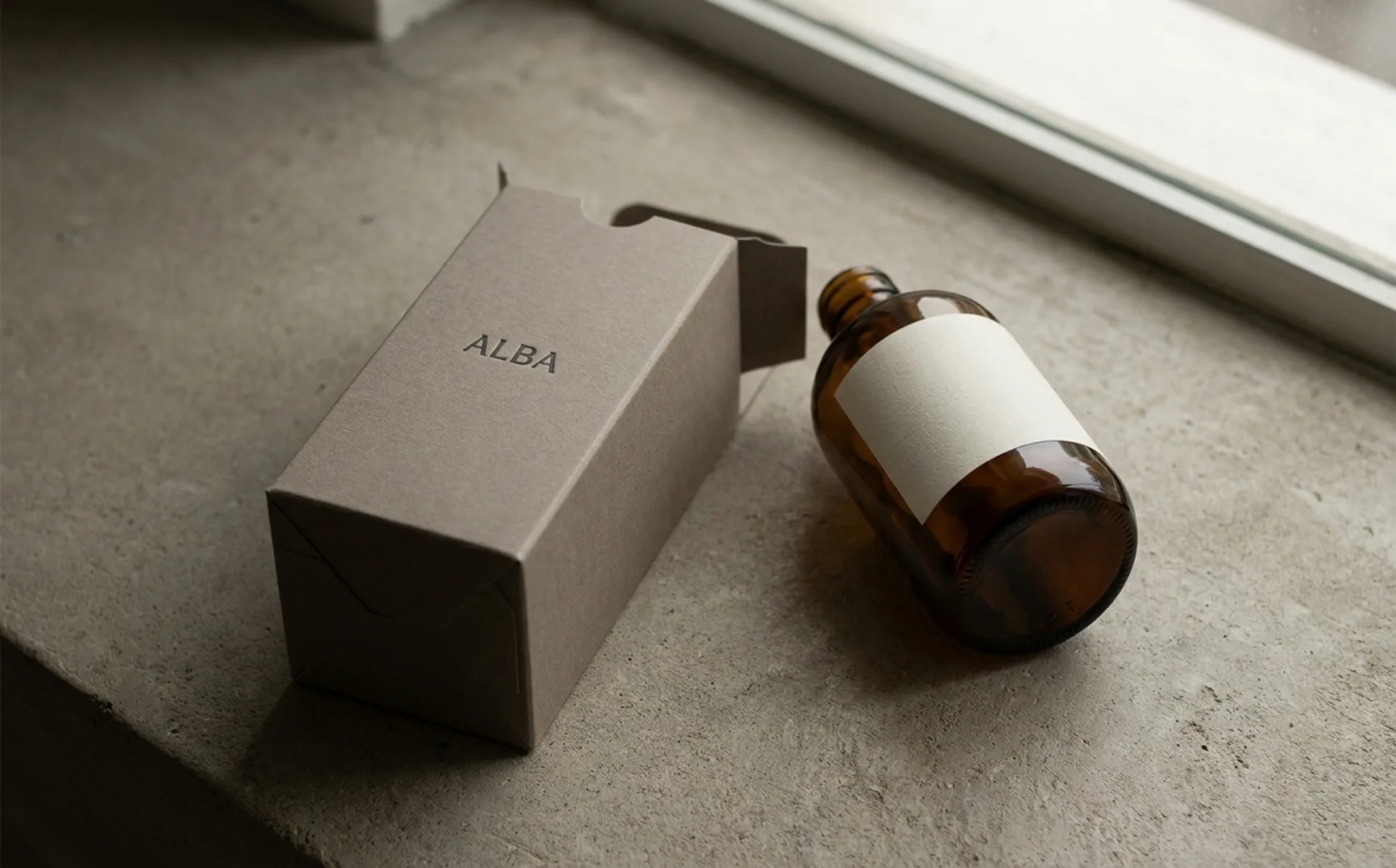
…tubes of skincare) became the standard in the 1990s and 2000s because they solved three real problems at once: barrier performance (oxygen, moisture), printability, and shelf visibility…
article
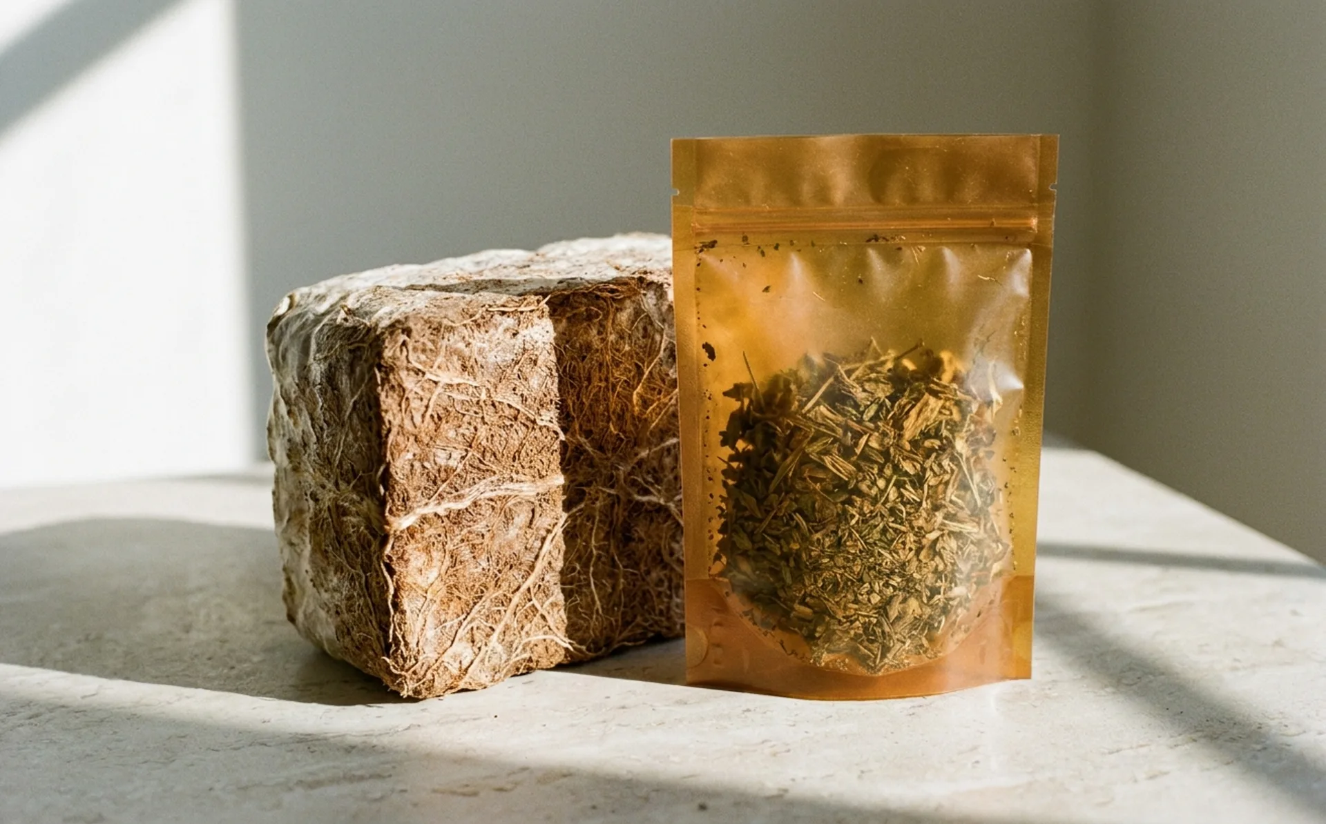
…the category; designers learned to work around it. The last two years have changed the reality underneath the claim. A new generation of bio-materials: actually organic in origin, actually…
article
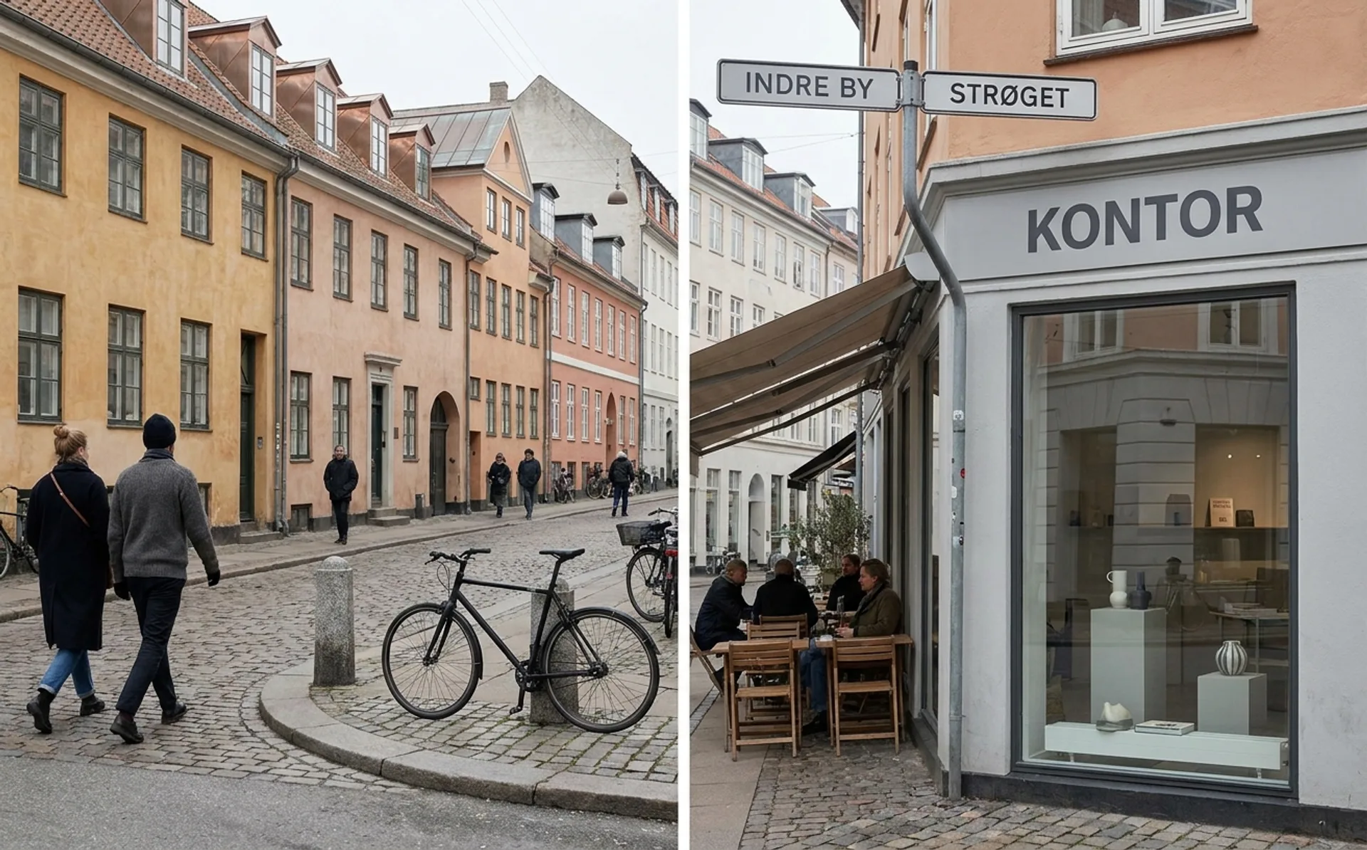
…public service. The school's physical campus in the Holmen naval base area is itself a statement: repurposed industrial architecture that embodies the Danish principle that good design…
article
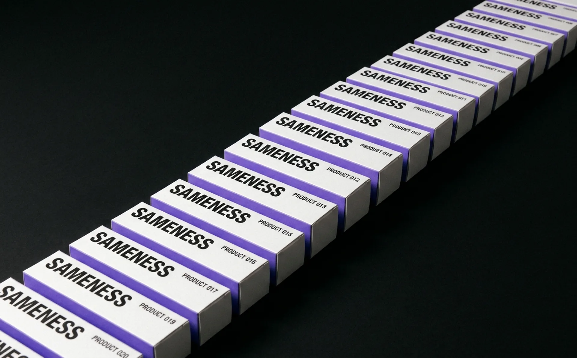
…the cheapest identity that won't actively hurt, use it to test the product, and invest in real brand work only after product-market fit. This logic produced a generation of SaaS startups…
project
…2008. The studio's name (just "Collins," no ampersand, no partner suffix) was itself a statement of intent. This wasn't going to be a collective of equal voices or a holding-company subsidiary…

project
…is minimal: the ink blue, white, a neutral gray, and a single bright accent for action states. This is all stylistic choice that reads as restraint by comparison to every other consumer…

article
…quality, has matured to the point that studios no longer outsource production to the United States for premium work. Editorial and criticism: Publications like Gato Negro Ediciones, Nexos…
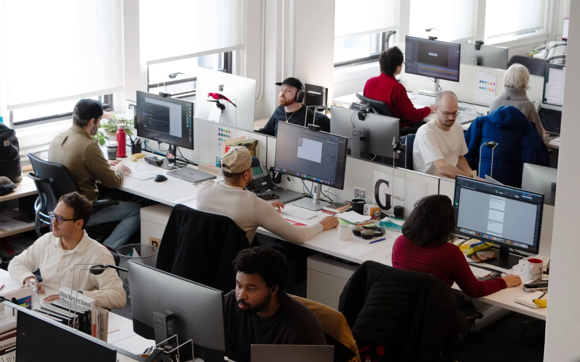
project
…strategic decisions about what Pentagram wants to be. Every new name on the letterhead is a statement of direction. And the recent appointments tell a clear story. Partners like Yuri Suzuki…
article
…typeface to contain an entire spectrum of weights, widths, and optical sizes, transformable in real time through code. A wordmark built on a variable font is not a single artifact but a system…
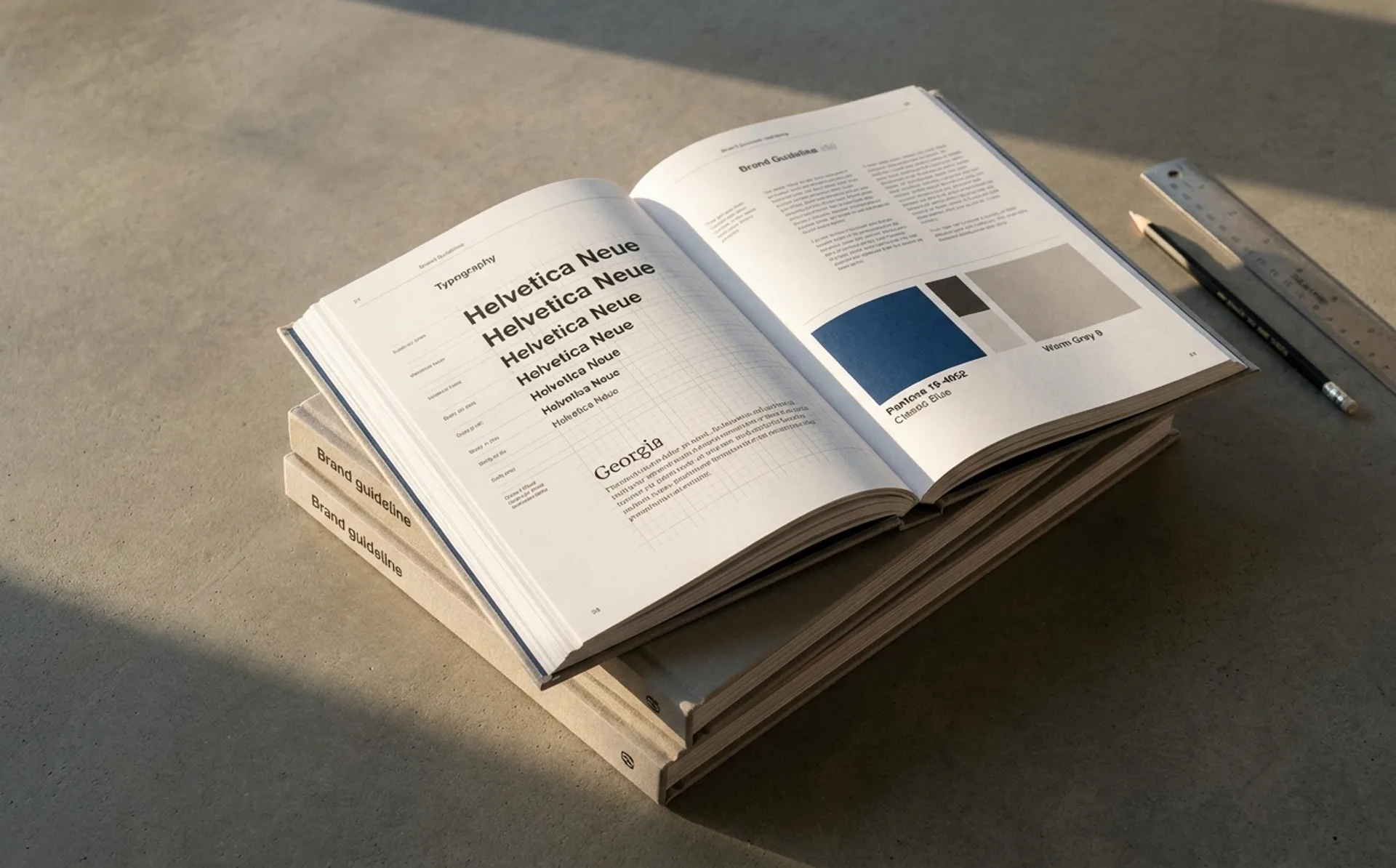
ranking
…move: Values-led identity system. The visual language is consistent with the company's stated environmental positioning to a degree that costs them sales (anti-consumption campaigns…
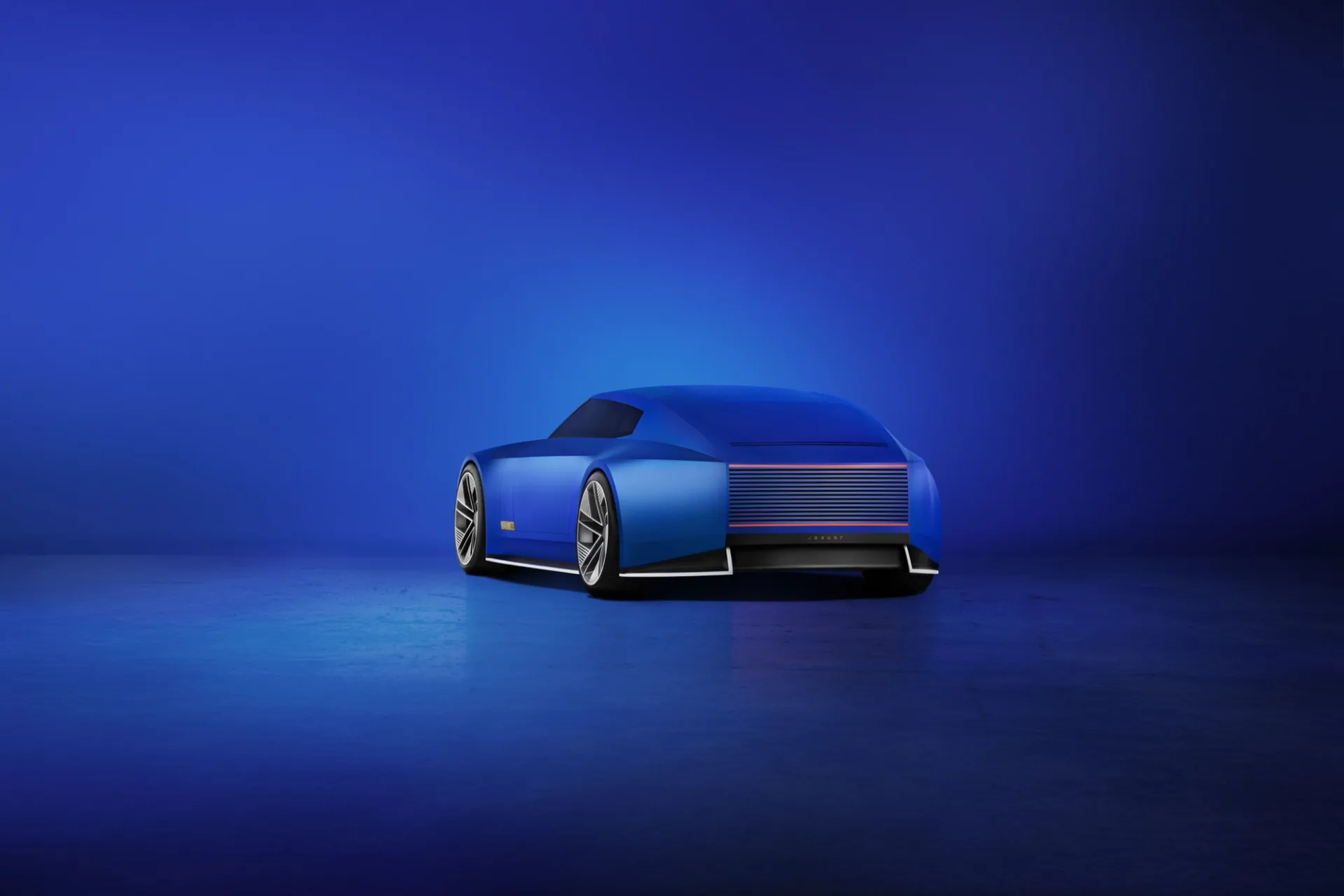
article
…happened. By 2024, Jaguar was a luxury brand in name and heritage, but not in commercial reality. Sales had been declining for years. The XE and XF saloons had been discontinued. The F…
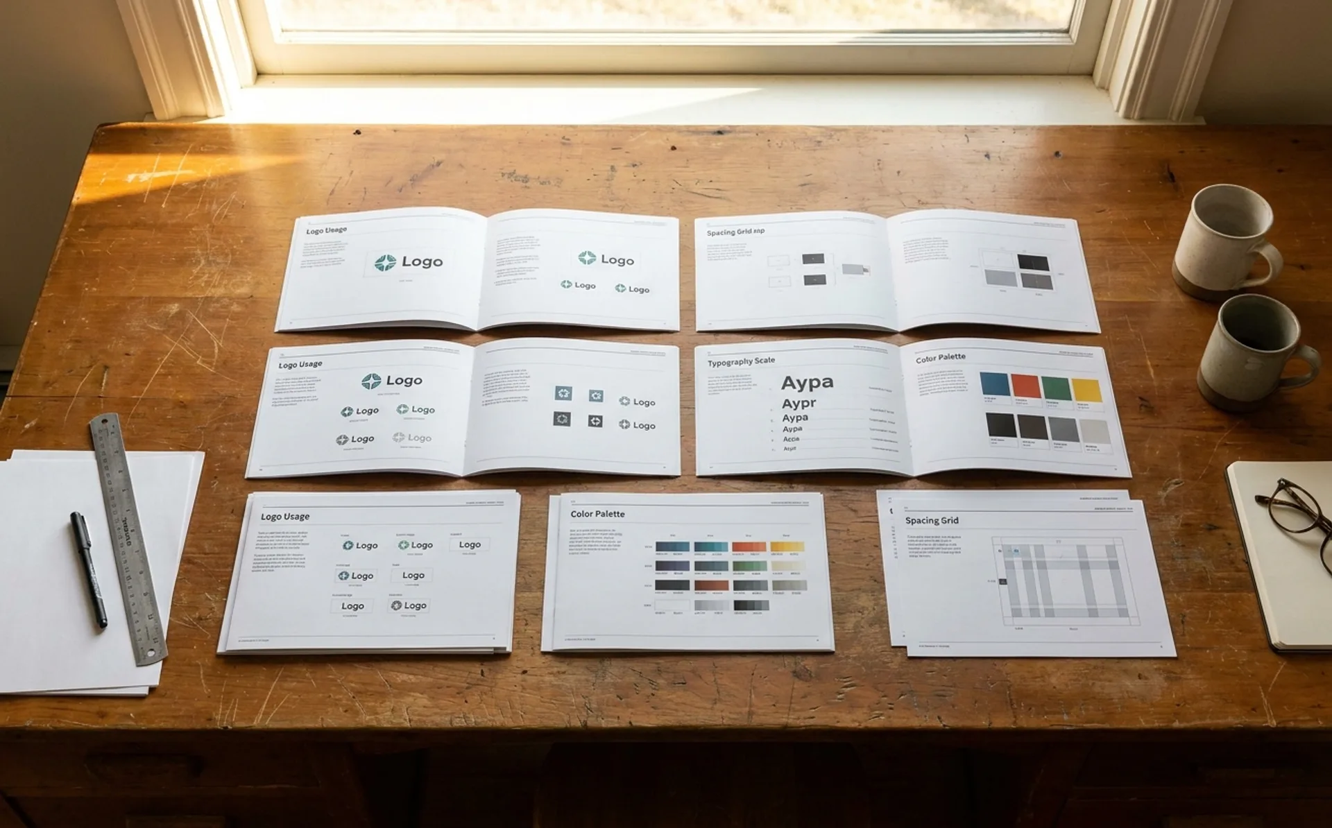
guide
…a client's machine, email clients with limited font support). Type in context: Show 2-3 real examples (social post, email header, presentation slide) with type specifications annotated…
ranking
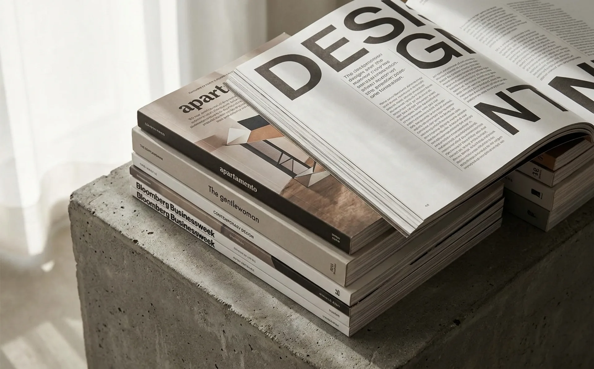
…reads closer to a zine than a consumer publication despite the premium production. 13. Real Review London architecture and design magazine with unusually aggressive typographic decisions…
article
…gravitational pull of trends. When a fashion house selects a serif in 2026, it is making a statement not just about aesthetics but about time, authority, and the deliberate refusal to be…
article
…between the two without losing the nuance of either. The tension between these roles is real and sometimes productive. A CMO may resist a CBO's authority over brand messaging that the…
project
…approachable, slightly geometric quality that has become synonymous with the brand. But the real typographic ambition lives in the broader system. Stripe's web properties have cycled through…