project
We use cookies to measure site traffic and improve WeLoveDaily. Nothing loads until you choose. Cookie Policy.
Work, articles, studios and categories across the archive.
project
…more corporate and serious, we dropped the faces entirely and worked with the yellow gradients and same shapes on their own – a more minimalistic, restrained solution for those moments…
project
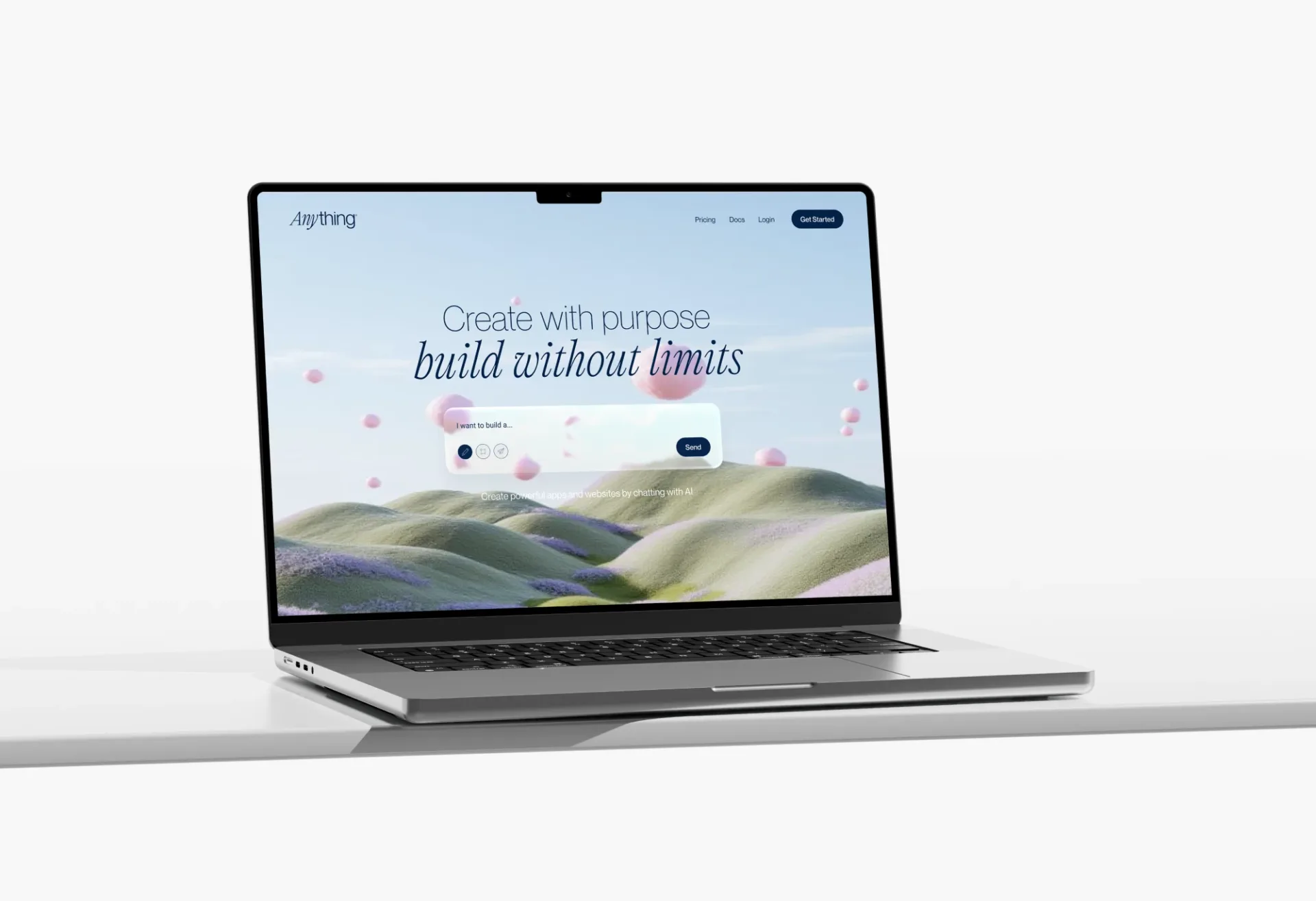
…draws inspiration from the sky, reinforcing the idea that the sky is the limit, while gradients and fluid compositions communicate adaptability and continuous growth. An abstract symbol…

project
…smiling business people standing in glass-walled conference rooms. Instead, there are gradients so precise they appear to have been mixed by a colourist, typography set with the care…

article
…communicates competence, taste, and ambition through every visual touchpoint, from the gradient system on its homepage to the typography in its API documentation. This is a preview…
article
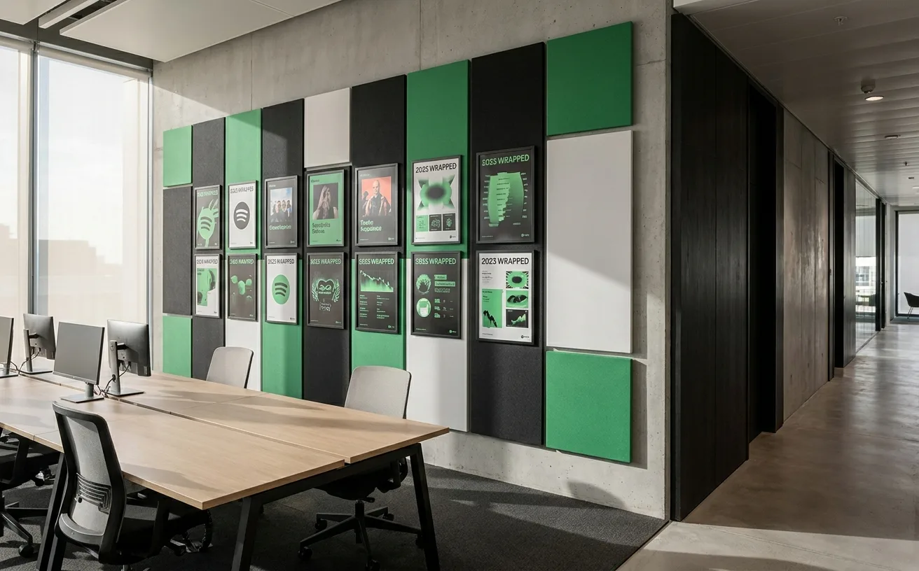
…broader than a color tweak. The agency redesigned Spotify's entire visual system: a new gradient language, a photography direction, a typographic framework, and the duotone image treatment…
project
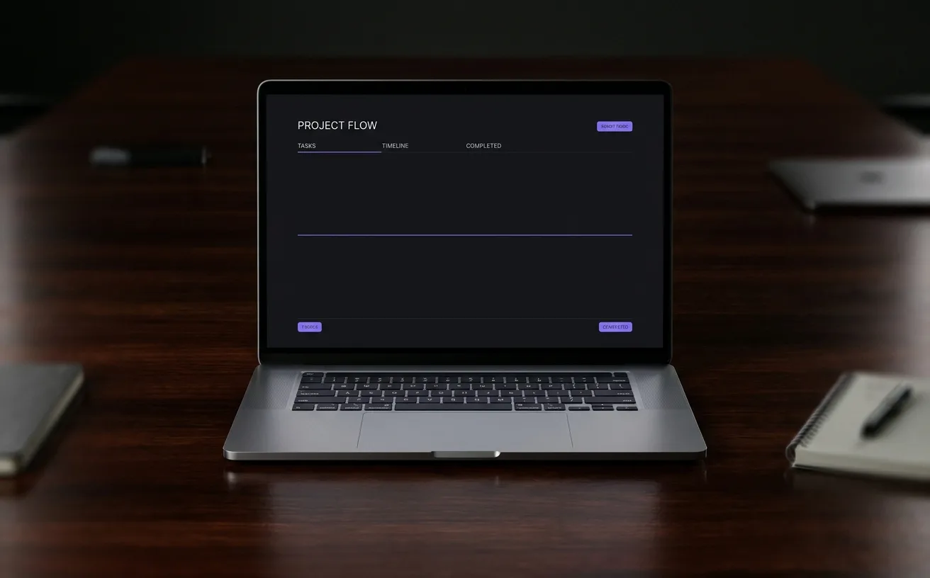
…The Identity of Less Linear's visual system is defined by what it refuses. There is no gradient. There is no illustration. There is no hero video. Every component (the logo, the documentation…

project
…symbol that operates independently of typography. Apple's apple. Nike's swoosh. Instagram's gradient. Airbnb's Bélo. These are the durable assets of consumer brand. Wordmarks, however well…

project
…is strikingly uniform. Bright saturated accent colors. Rounded geometric iconography. Gradient backgrounds. Bold display typography. The icon-grid era of mobile operating systems produced…

article
…confident navy), white, and the iron mark's silver. That's it. In an industry addicted to gradient meshes and electric accent colors, Volvo's restraint is radical. Every competitor is trying…
article
…consumption has flattened static differentiation, at the scale of a thumb-sized app icon, a gradient and a clean wordmark can distinguish a brand more reliably than any static illustration…
ranking
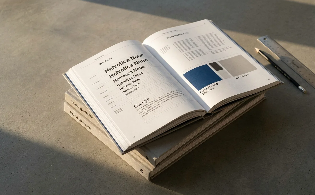
…Distinguishing move: Research-first restraint. Cream background, custom serif wordmark, no gradient. Steal: the refusal of category-default visual cliché as a brand argument. 6. Vercel…

project
…different from pre-recorded content platforms. The visual language they developed uses bold gradients, dynamic typography, and a graphic system that feels perpetually in motion, echoing the…
ranking
…up on no balance sheet but disappears the moment you kill it. 3. Instagram: The 2016 Gradient, Re-proven in 2024 Verdict: Vindicated bet. The 2016 flat-icon + gradient move was mocked…

article
…community rather than a social media platform. By 2016, the icon had been flattened into a gradient glyph. By 2022, under Meta's unified brand architecture, Instagram's in-app experience…

article
…cardboard boxes in a single shade of kraft. There is no colour-coding by product category, no gradient systems, no seasonal limited editions in collector packaging. Every product looks like…