article
The Variable Font Revolution: How One Technology Is Reshaping Brand Systems
by WeLoveDaily Editorial
We use cookies to measure site traffic and improve WeLoveDaily. Nothing loads until you choose. Cookie Policy.
Work, articles, studios, brands and categories across the archive.
19 results
article
by Jose Pablo Dominguez
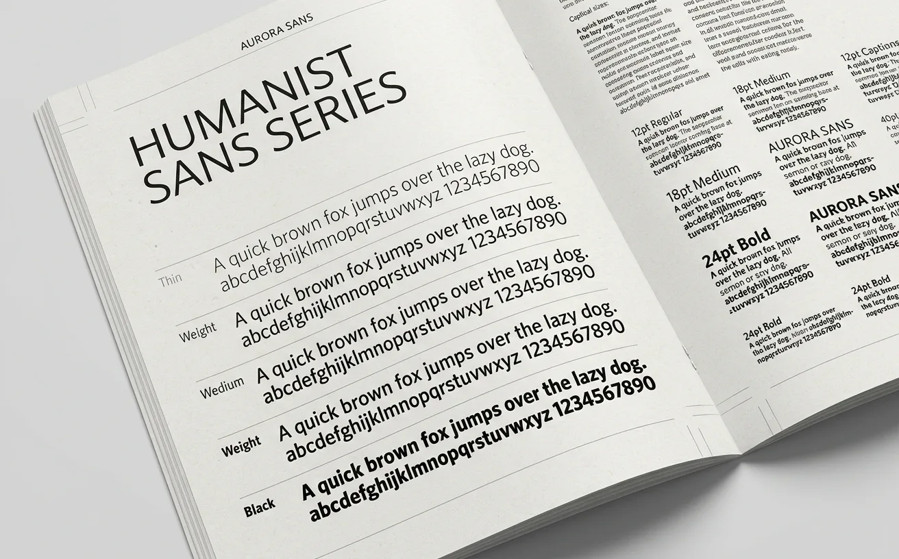
…size of the text. A 10-point button and a 48-point headline are set in visually different fonts, both under the same name. This was unusual at the time. Most digital typefaces were drawn…

article
by WeLoveDaily Editorial
…brand recognition and concluded that the mark is a luxury they do not yet need. Variable Fonts as Identity Systems The second force is technological, and it is changing what a wordmark…
project
by Dinamo
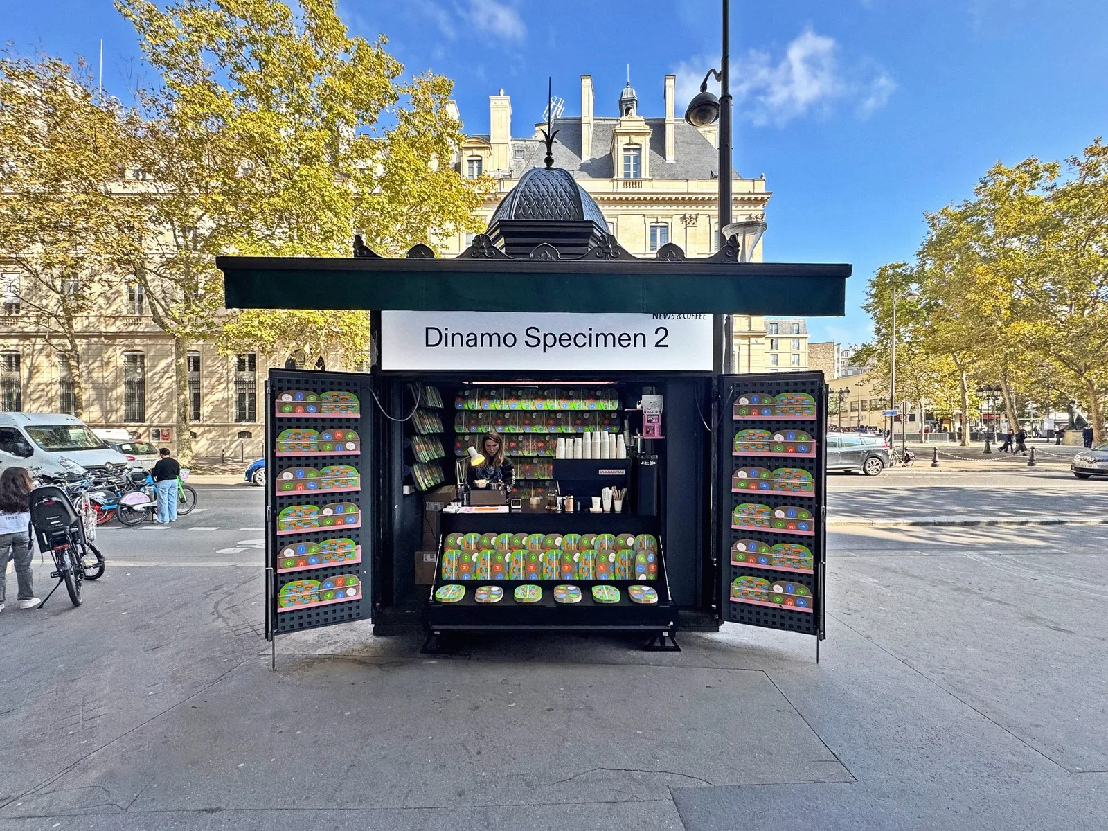
…Diatype). It's the trajectory of a studio growing up without growing conventional. Variable Fonts as Creative Canvas Dinamo was among the earliest independent foundries to treat variable…
ranking
by WeLoveDaily Editorial
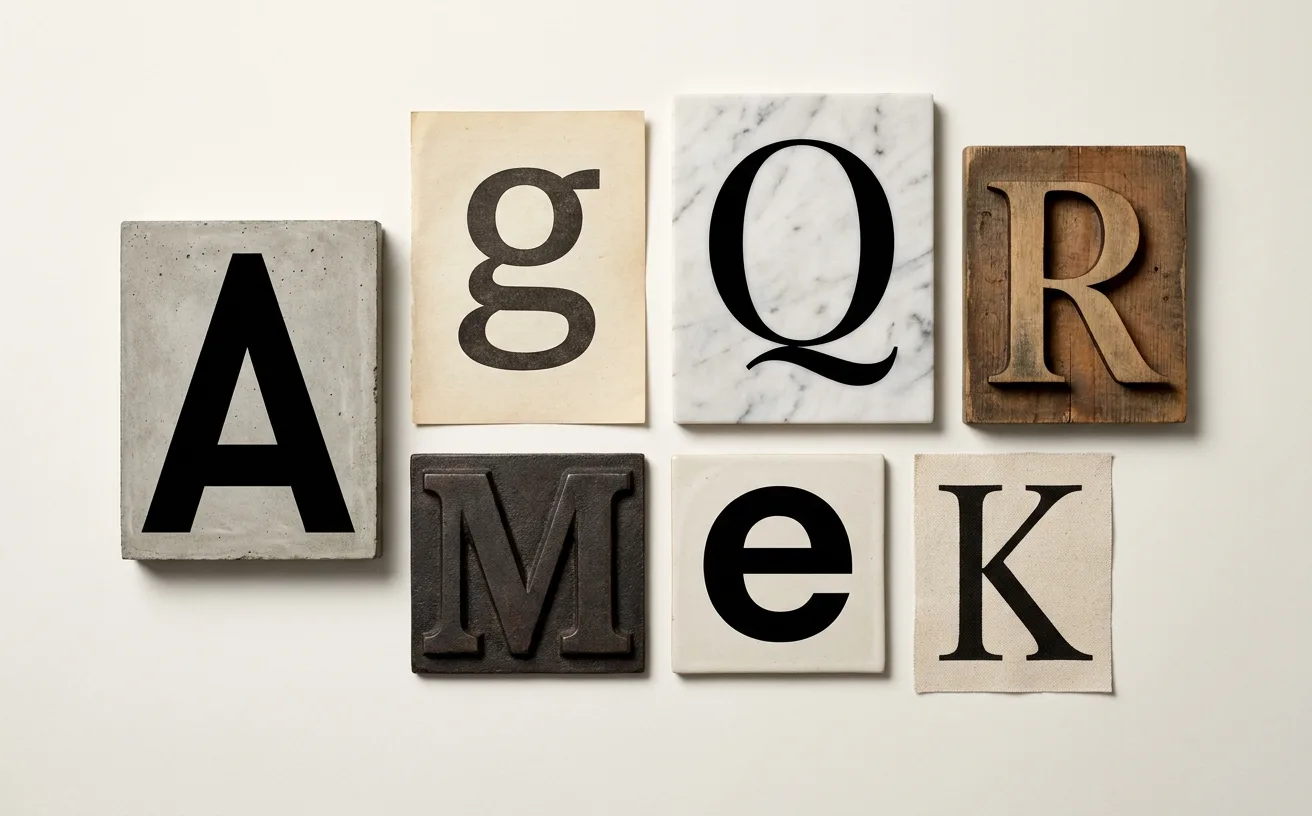
…understand what a decade valued, skip the mission statements and look at the typefaces. The fonts a company licenses tell you more about its ambitions, its audience, and its sense of self…

project
by Sara Bautista Studio
…gestures. Over and over again in every prompt. Design & AI Art Direction by Sara Bautista. Fonts: Serrif by @xyz_displaay (slightly modified to resemble the texture of Parmesan cheese)…
guide
by WeLoveDaily Editorial
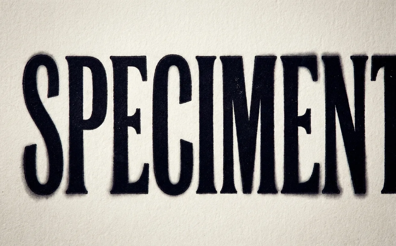
…typographers, lettering artists, and senior designers kern display type by hand. Not because the font is poorly made. Because the font was made for a different context. Optical vs. Metrics…
project
by Alex Dang
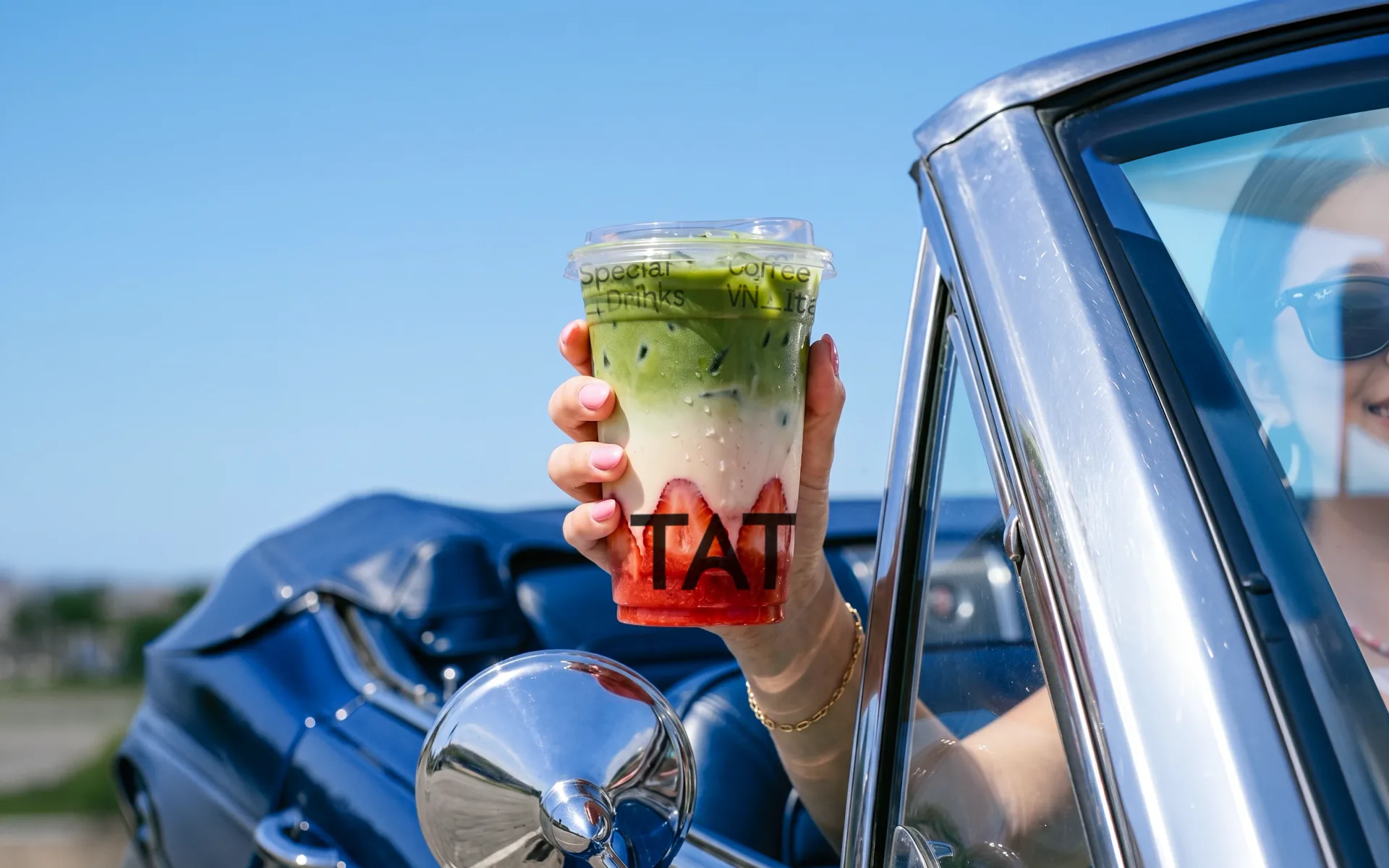
…everyday life in Vietnam. (WHAT WE DID): Brand Direction • Core Identity (Logo, Color, Fonts) • Key Visual System • Applications (APPROACH) The concept “The Nordic Breeze” brings…
project
by Denormalized ™
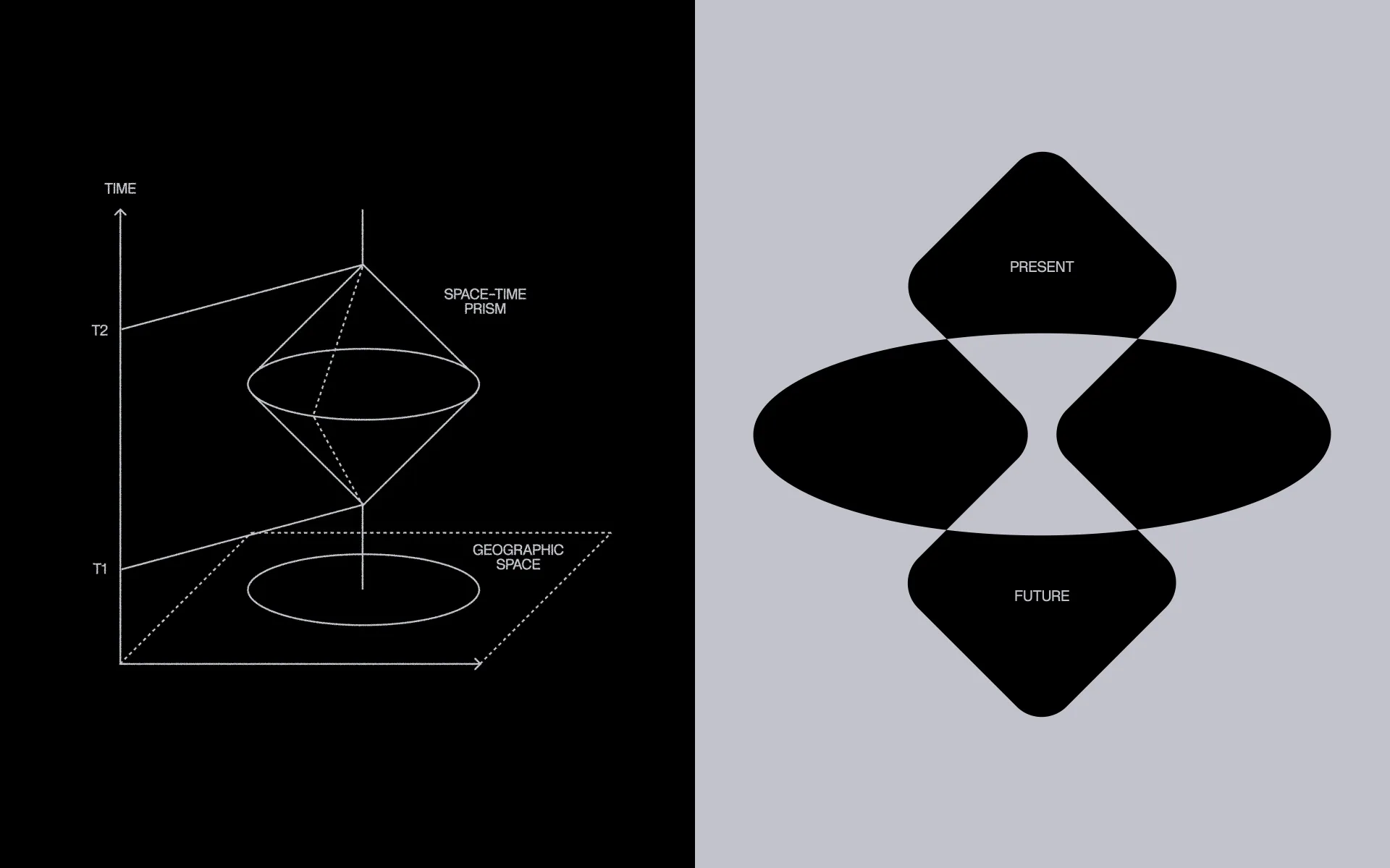
…life – sometimes even fun. We picked Cardinal Fruit, an elegant serif, to balance out logo font choice and overall visual language, bringing in the serious, credible side of the foundation…

article
by WeLoveDaily Editorial
…rebrands are often the ones nobody notices happened. Type is your voice. Volvo Novum isn't a font choice: it's an architectural decision that determines how the brand sounds at every scale…
article
by Jose Pablo Dominguez
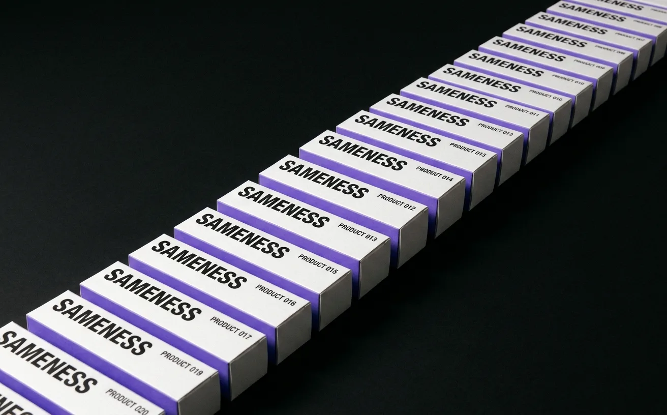
…cost money but create an immediate sonic signature that no competitor using the free-tier font can match. In 2016 this looked like overspending. In 2026 it's the baseline for a brand…

article
by Jose Pablo Dominguez
…and allergic to amateur design. Developers notice when a marketing site uses a free Google Font. They notice when illustrations look like 2018 tech-Twitter stock characters. The safe move…
article
by WeLoveDaily Editorial
…original designers could not have anticipated, a principle that intersects with variable fonts in brand identity systems, where a single typeface file can flex weight, width, and optical…
article
by WeLoveDaily Editorial
…layout frames - Corner radius, if brand-differentiated - Typography, via string variables for font family (with limitations, Figma's type variable support is still evolving) Step 4: Apply…
ranking
by WeLoveDaily Editorial
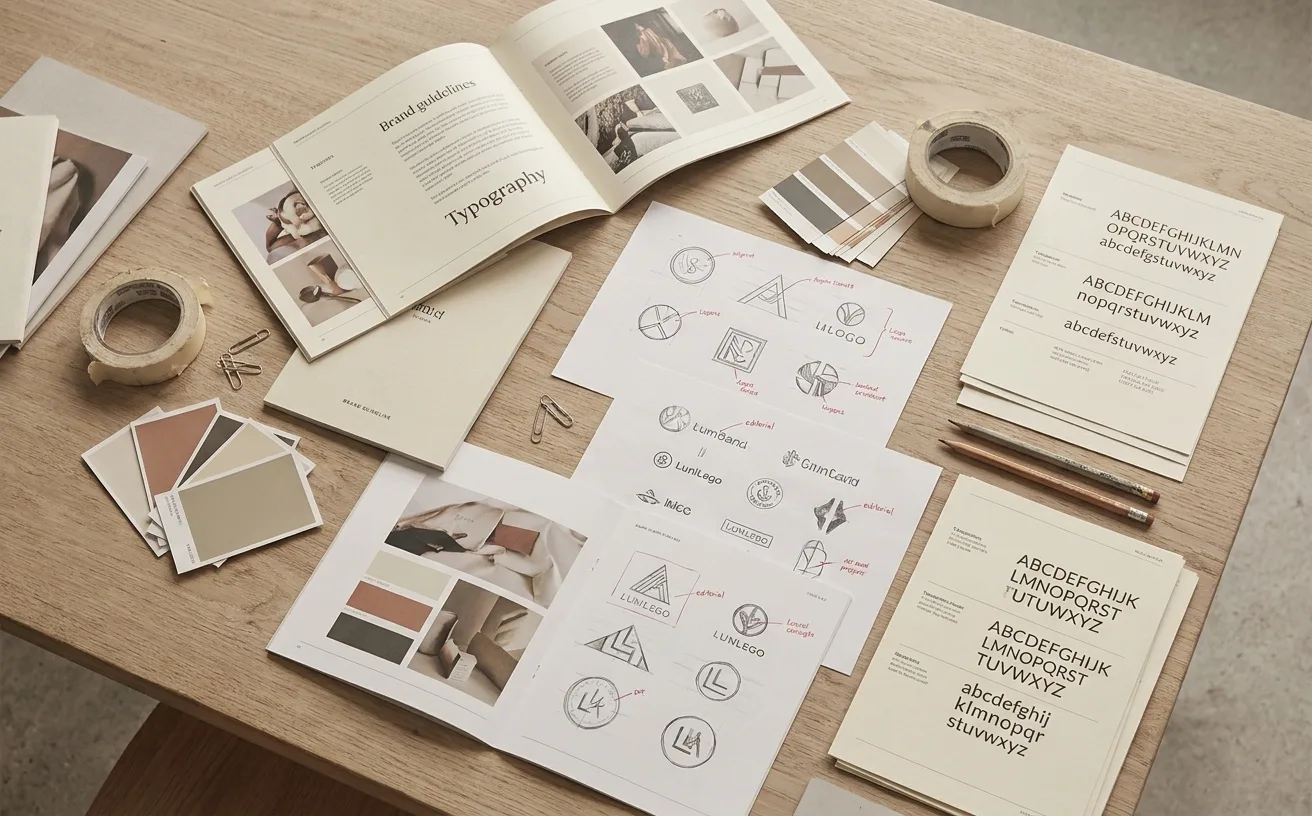
…generation of digital-native brands, but the studio's identity work goes far beyond licensing fonts. Dinamo's approach treats typography as a system of cultural signalling, and their collaborations…
guide
by WeLoveDaily Editorial
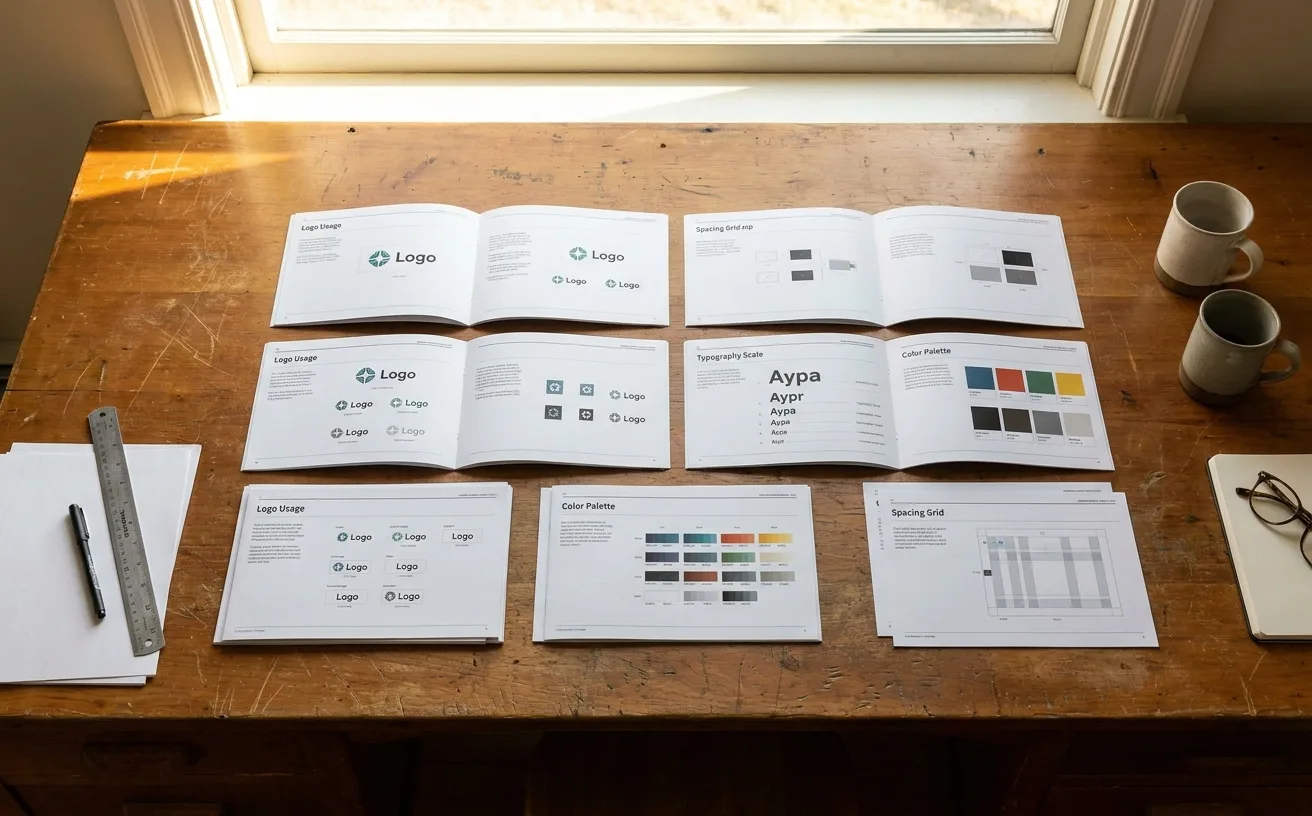
…opens brand guidelines to learn about the logo. They open them to answer a question: "What font do I use for a presentation?" "Can I put the logo on a dark background?" "What's the hex…

article
by WeLoveDaily Editorial
…with no design background could install a theme, upload product photos, choose a Google Font from the sans-serif category, and have a website that looked indistinguishable from a venture…
project
…reputation rests on typographic decisions: monospace code samples set in carefully chosen fonts, proportional text that maintains readability at extended reading lengths, a visual hierarchy…