ranking
Editorial Design in 2026: 30 Magazine Layouts Rewriting the Grid
by Jose Pablo Dominguez
We use cookies to measure site traffic and improve WeLoveDaily. Nothing loads until you choose. Cookie Policy.
Work, articles, studios, brands and categories across the archive.
22 results

project
by Saxon Campbellcurated by WeLoveDaily
Website UI design and 3D product visualization for a science-led oral care brand. Clear layouts and carefully crafted product imagery create an approachable digital experience, connecting…

project
by Maja Regulacurated by WeLoveDaily
…and straightforward iconography that communicates real benefits without the noise. The layout is clinical but soft, modern but restrained — designed to feel reliable on a shelf or in…
project
by S Lorencurated by WeLoveDaily
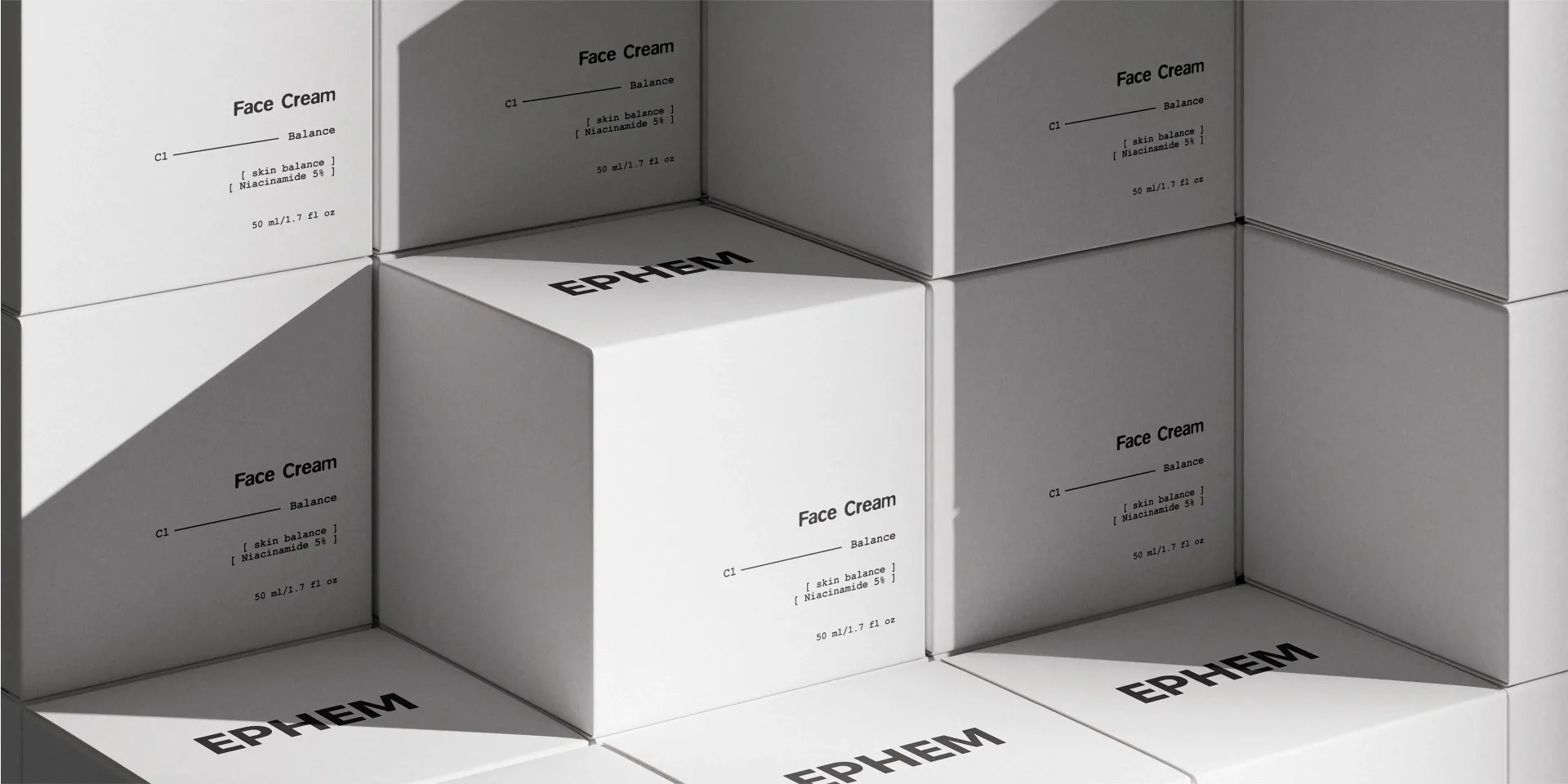
…control, while soft accent colors guide product differentiation within the line. Packaging, layout, and communication follow a system approach — consistent, scalable, and easy to navigate…
project
by Tiquismiquis Clubcurated by WeLoveDaily
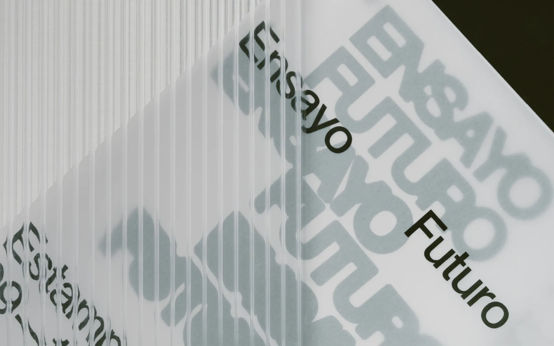
…open to experimentation. ENSAYO FUTURO ESTAMPA 2025. Contemporary art fair Design and Layout · Tiquismiquis Club + Sergio Paqué Organized by · Estampa Curated by · Jesús Alcaide…
project
by Sweety & Co.curated by WeLoveDaily
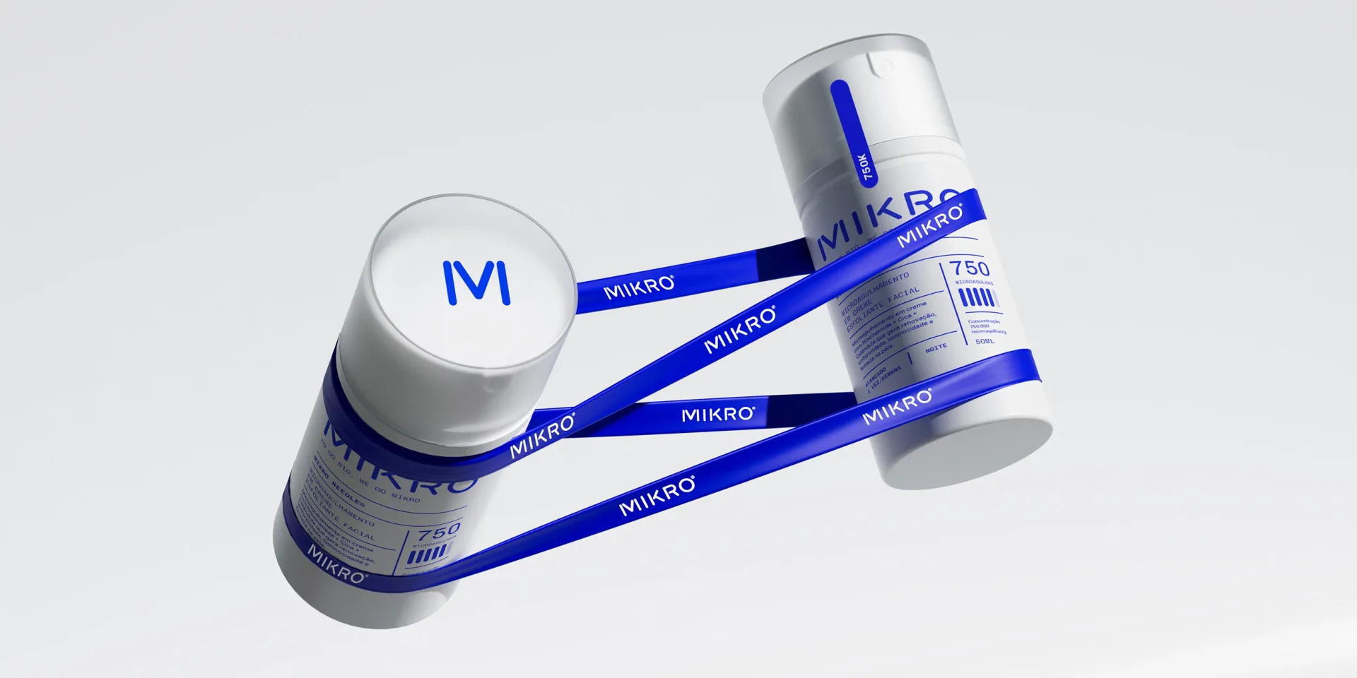
…credibility while maintaining a clean, structured, and engaging look. Bold blue hues and a sleek layout amplify the brand’s contemporary, high-tech appeal.
project
by Little makcurated by WeLoveDaily
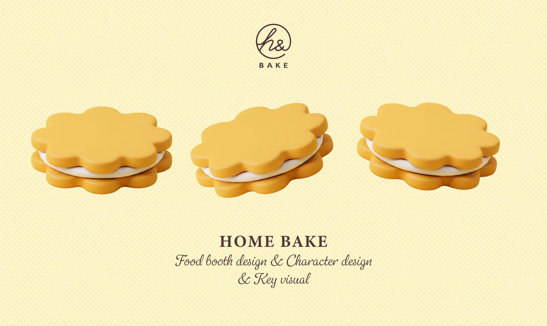
…steamed, fluffy bun. / Working hard to carry the pink flour bag. Exhibitio Elevations & Layout This three-view layout illustrates the booth's flow and structure. From the front facade…
project
by Arthur Galvãocurated by WeLoveDaily
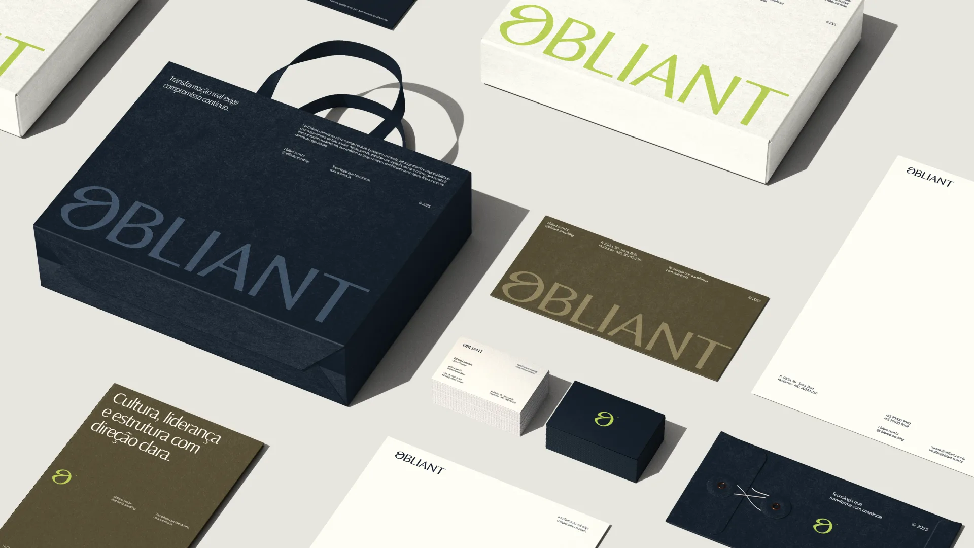
…express structural intelligence. Typographic hierarchy, a controlled color palette, modular layouts that reinforce clarity and institutional presence. The goal was precision, not decoration…
project
curated by WeLoveDaily
…Monocle or The New York Review of Books more than it does any AI or SaaS contemporary. Layouts privilege white space and line-height; headlines are never the dominant visual element…
project
by Dinamocurated by WeLoveDaily
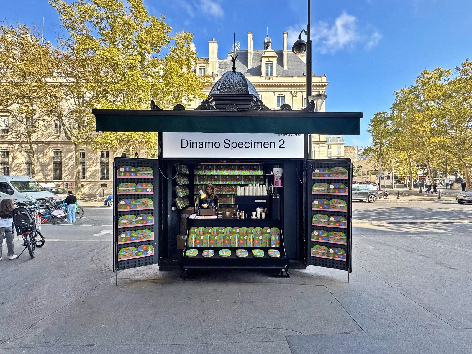
…but would never describe themselves as "typographic." ABC Whyte shows up in editorial layouts and app interfaces where the brief was clearly "modern but not cold, distinctive but not…

project
by Collinscurated by WeLoveDaily
…publishing house. A custom serif typeface, a richer colour palette, and editorial-grade layout systems gave the brand a materiality and warmth that its competitors lacked. The strategic…
guide
by WeLoveDaily Editorial
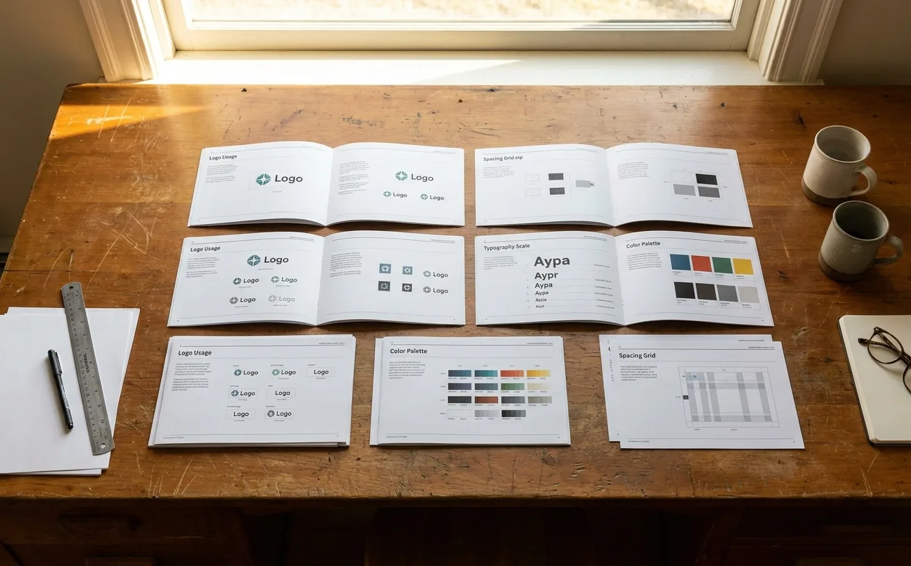
…brand elements. Traditional structure: Logo Color Typography Photography Iconography Layout Voice and tone Use-case structure: Quick-start guide (one-page cheat sheet) Making…

article
by WeLoveDaily Editorial
…Decathlon's L'Orbit identity in motion: the orbital gesture animating across type and layout. Source reference: Wolff Olins Decathlon case study. --> Decathlon's Orbit. When Wolff…

article
by WeLoveDaily Editorial
…their third-party descendants codified the DTC look into purchasable templates: pre-built layouts with clean grids, ample whitespace, and minimal decorative elements. A founder with no…
article
by WeLoveDaily Editorial
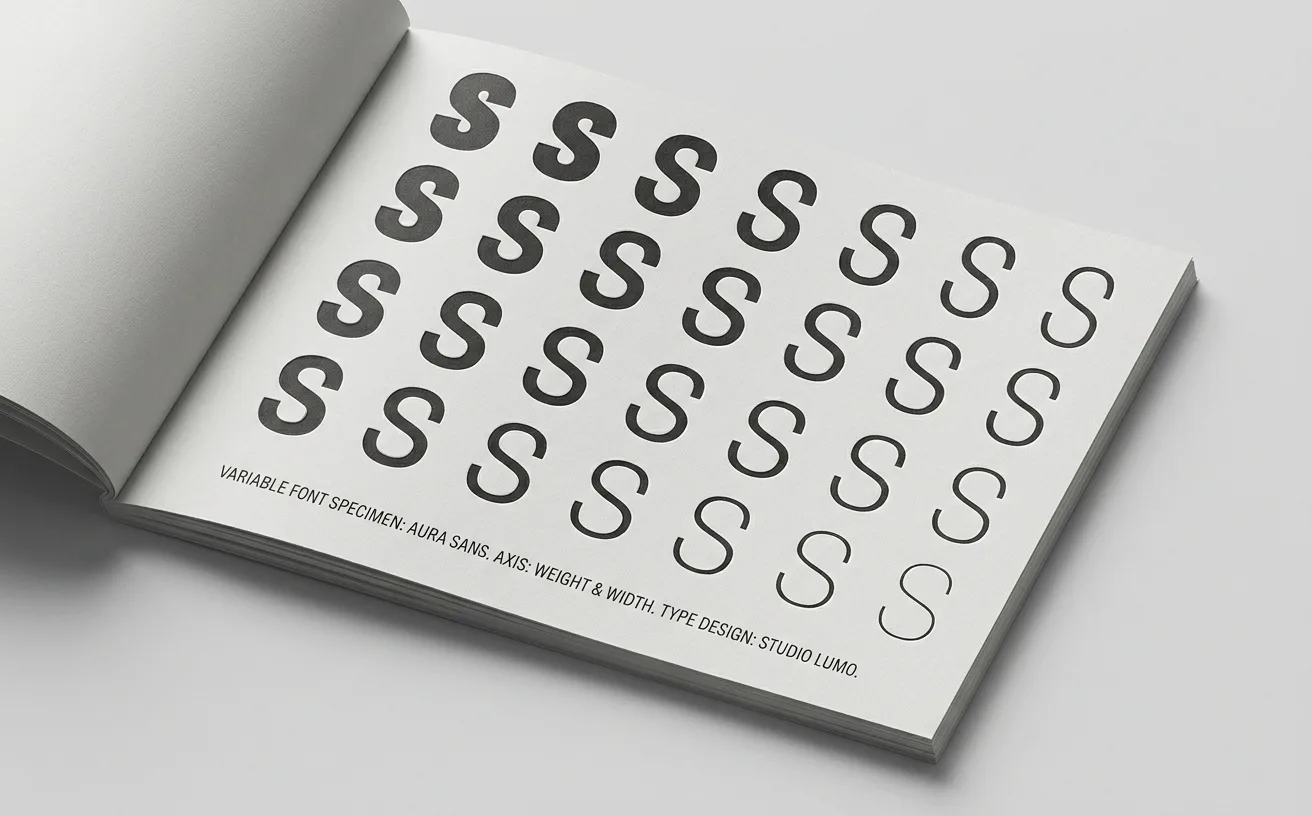
…The grade axis, which adjusts the apparent weight of type without changing its width or layout, is particularly significant in interface design, where you may want to make text visually…
article
by WeLoveDaily Editorial
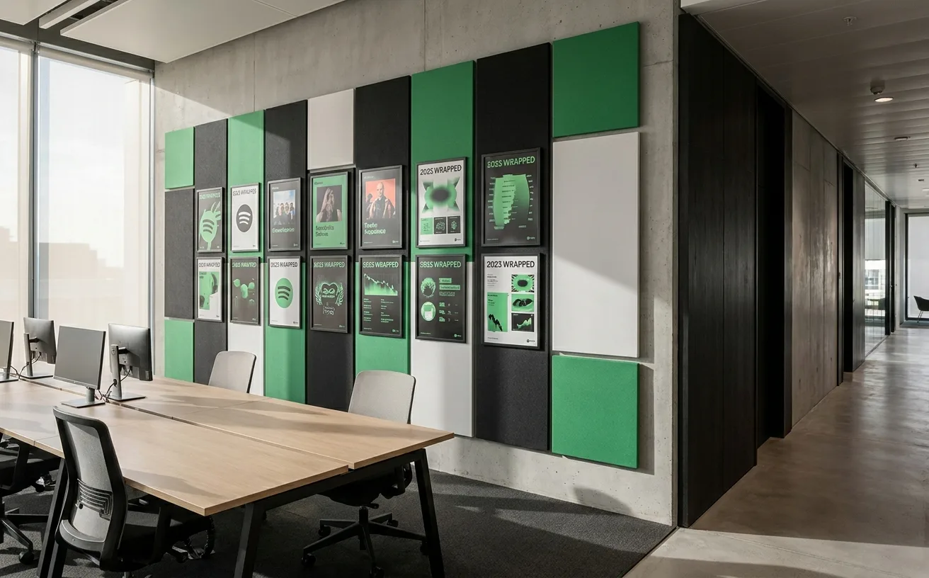
…isn't simply design localization, translating assets into local languages and adjusting layouts. It's cultural adaptation of the brand's visual personality, which requires both a system…
project
curated by WeLoveDaily
…design is a significant part of why. The API reference is structured with a split-pane layout (prose explanation on the left, working code examples on the right) that has become the…
project
by Lippincottcurated by WeLoveDaily
…enforce spacing and color rules, content management templates that constrain typography and layout, and design token systems that ensure consistency across web, mobile, and email without…
project
by Wolff Olinscurated by WeLoveDaily
…identity system (with its duotone photography treatments, bold colour palette, and flexible layout grids) gave Spotify a visual language elastic enough to encompass podcasts, video, and…
article
by WeLoveDaily Editorial
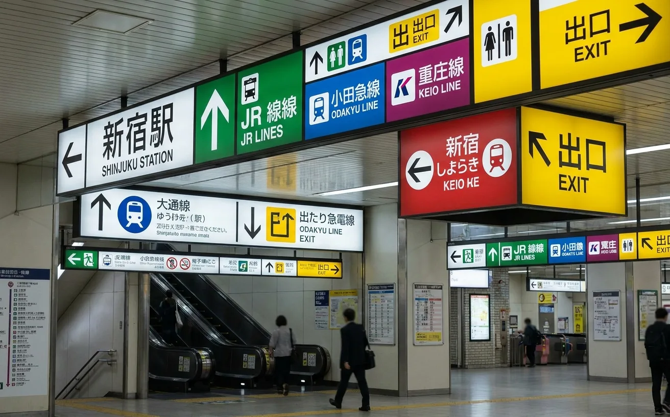
…ownership. Station signage was functional but rudimentary: hand-painted signs, inconsistent layouts, minimal consideration for anyone unfamiliar with the network. The system worked because…
article
by WeLoveDaily Editorial
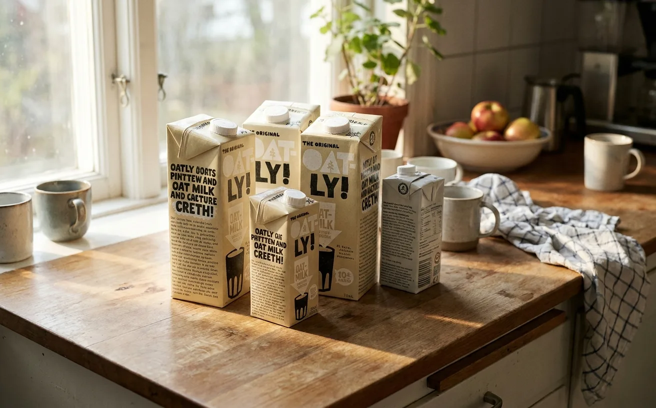
…could actually write. He gave designers the freedom to break the conventions of packaging layout. And he insisted on a principle that sounds simple but is, in practice, almost impossible…