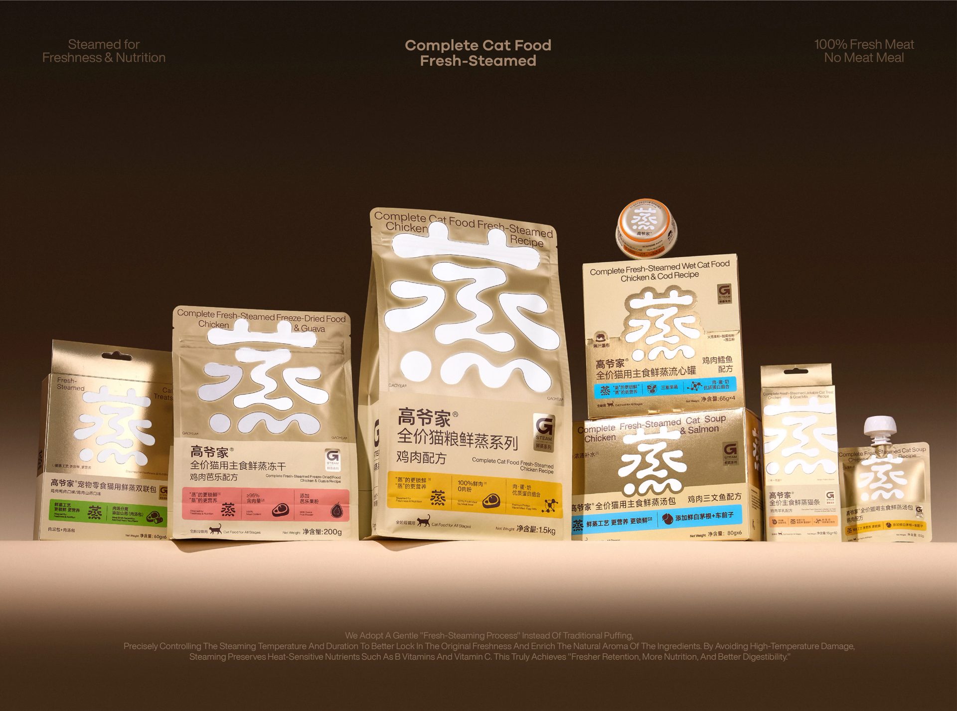
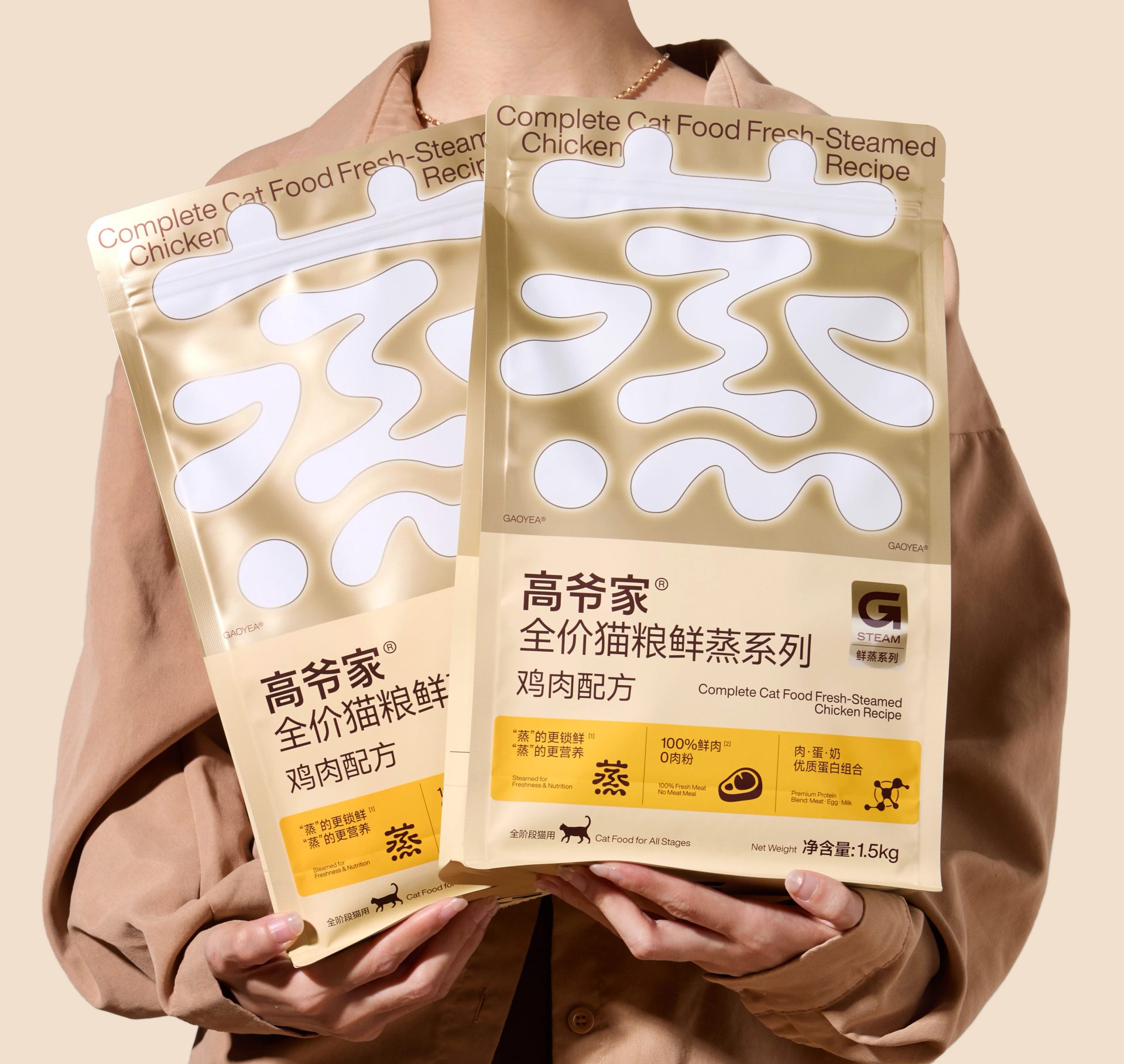
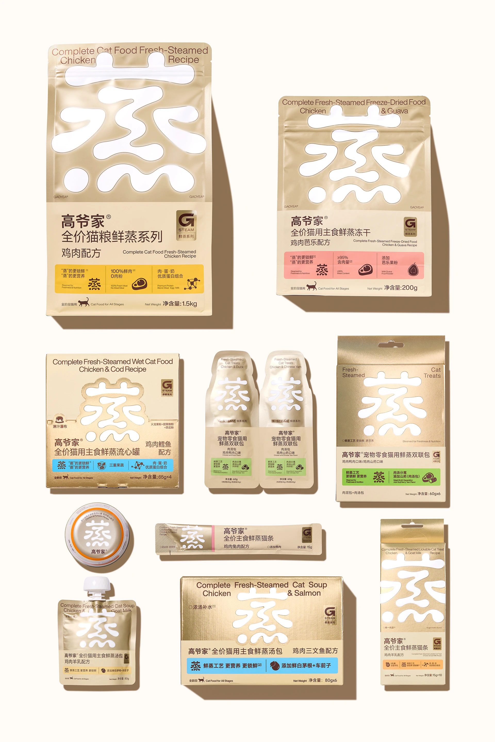
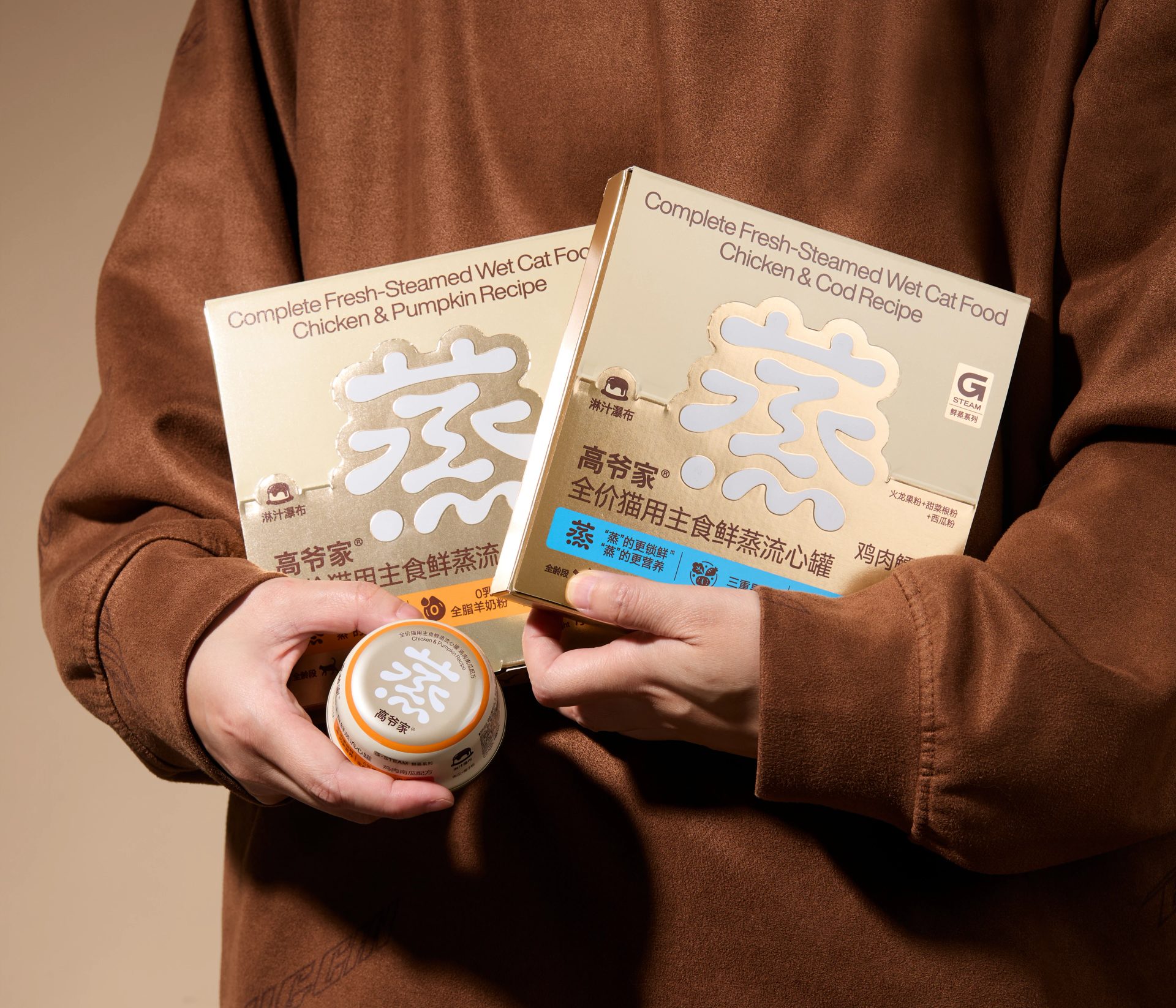
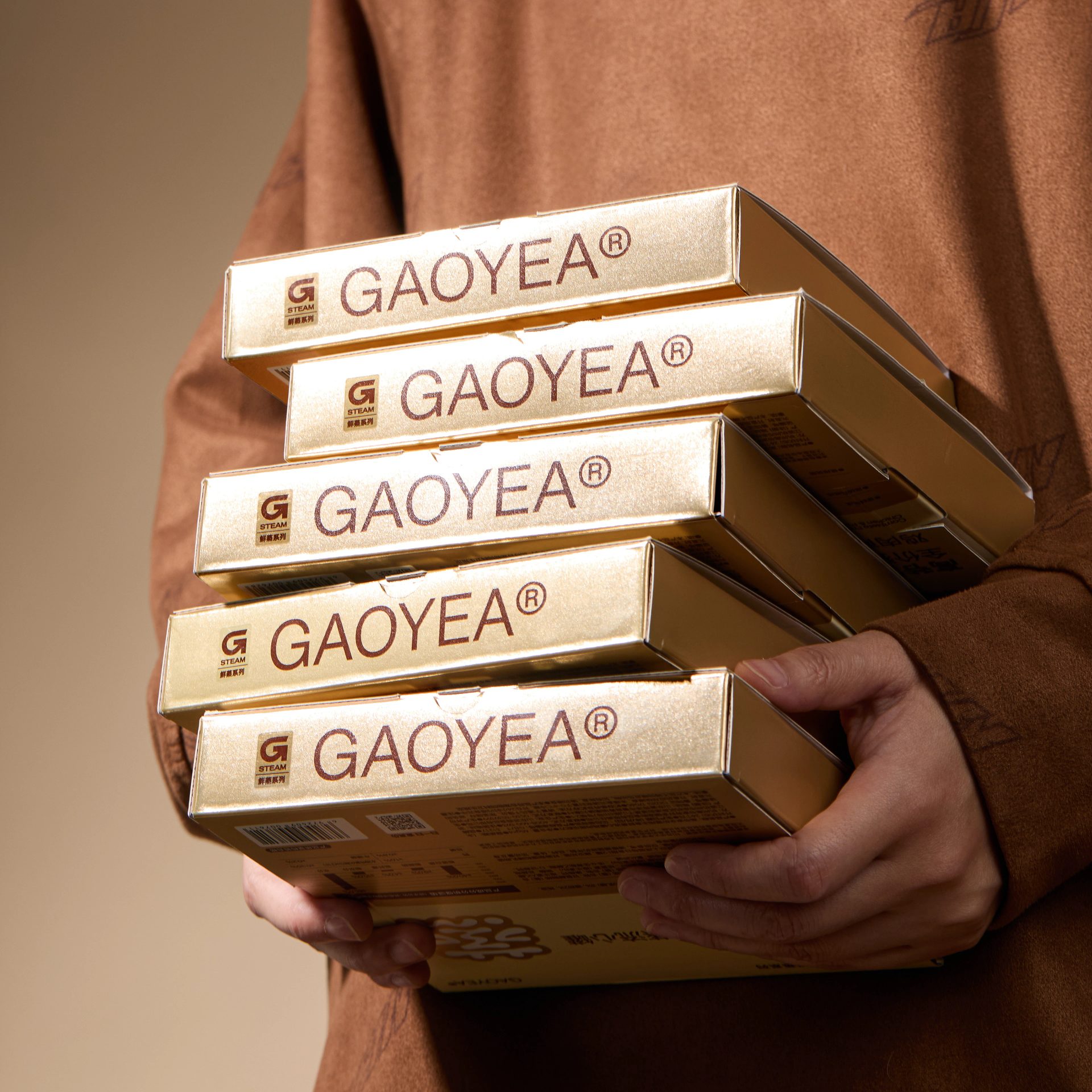
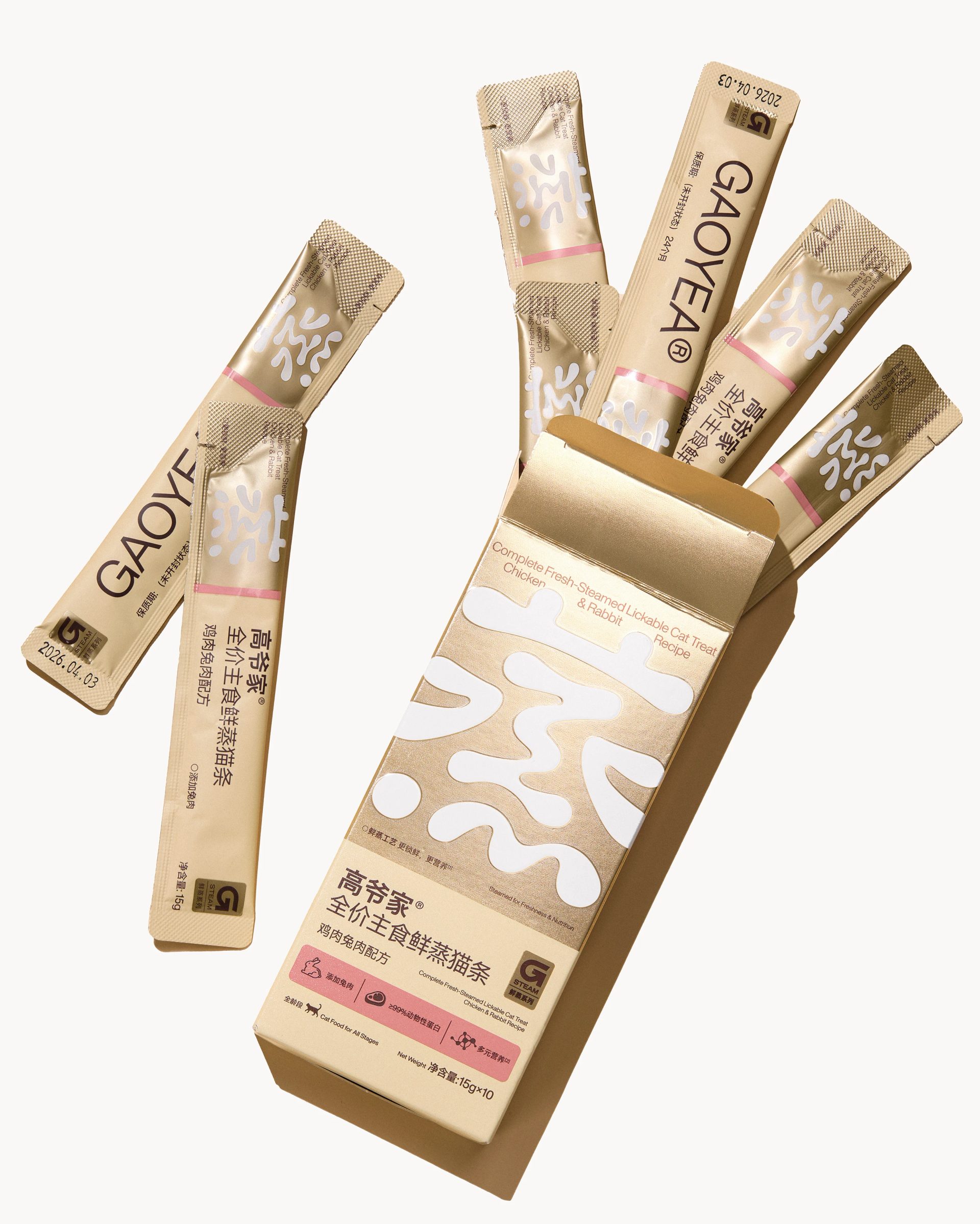
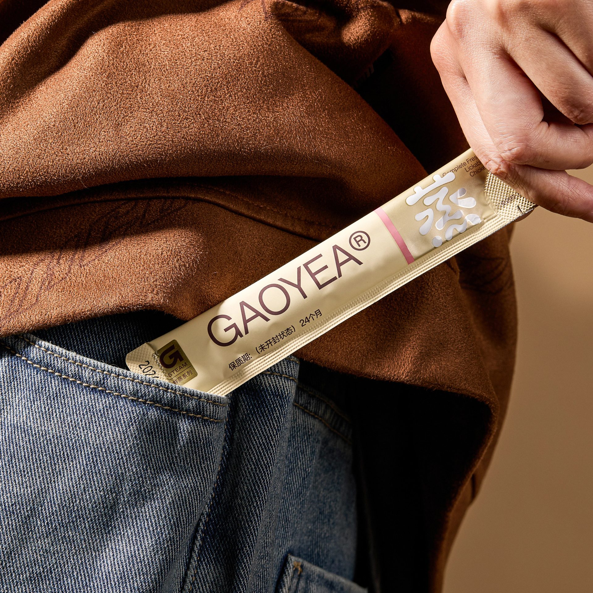
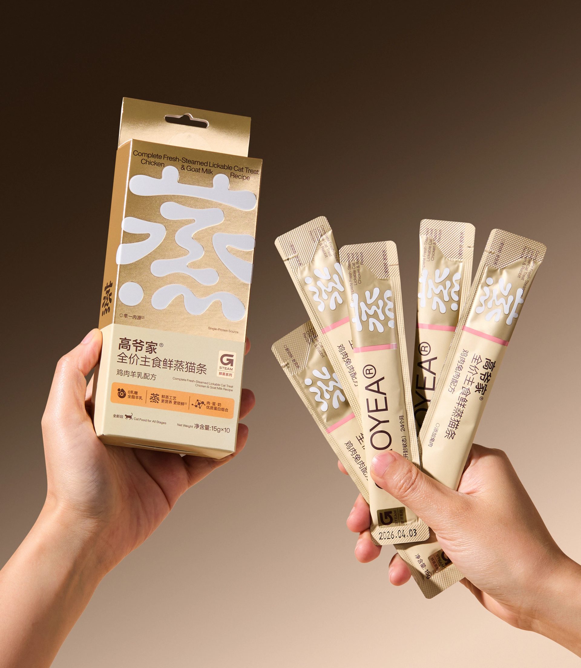
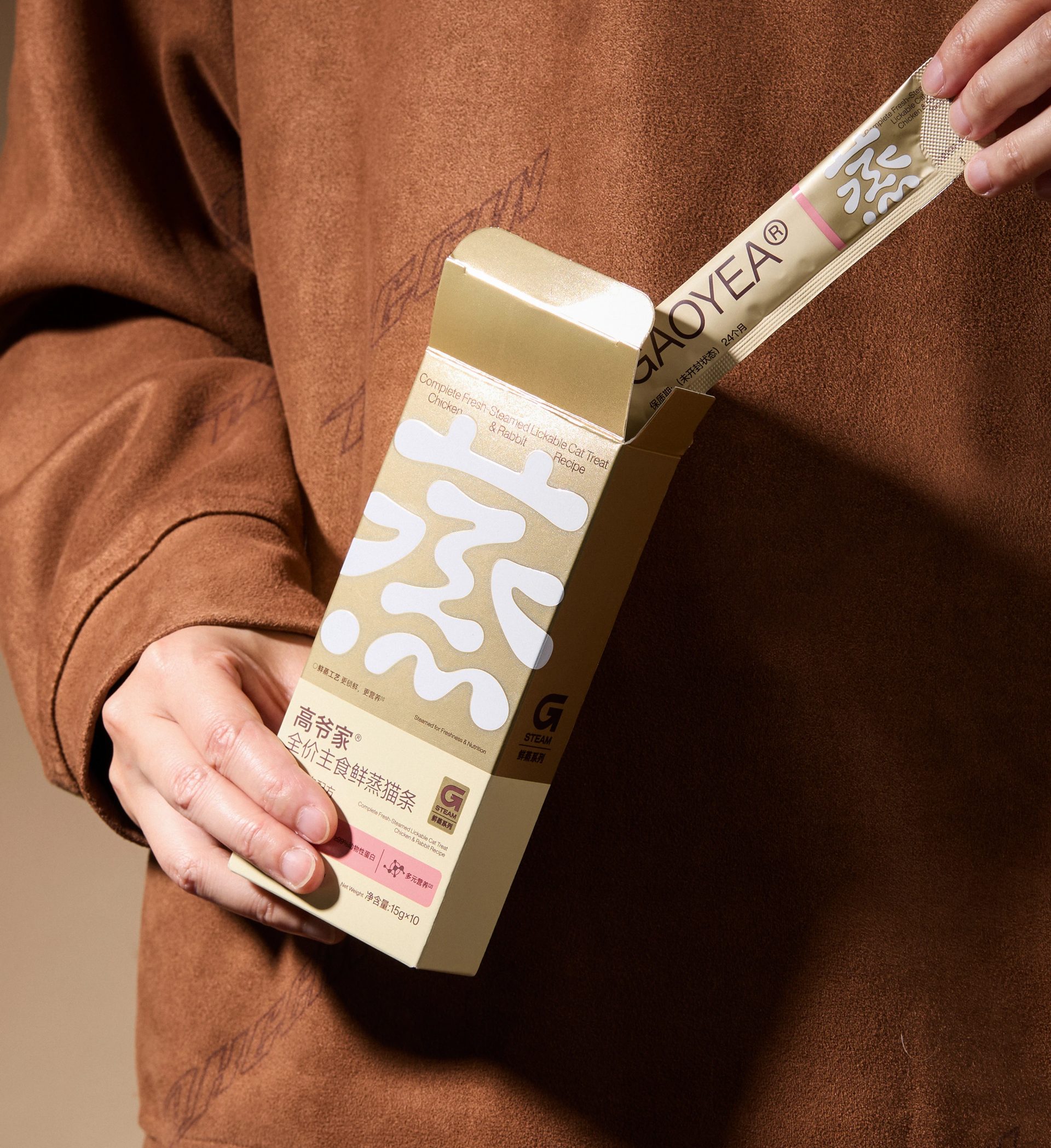
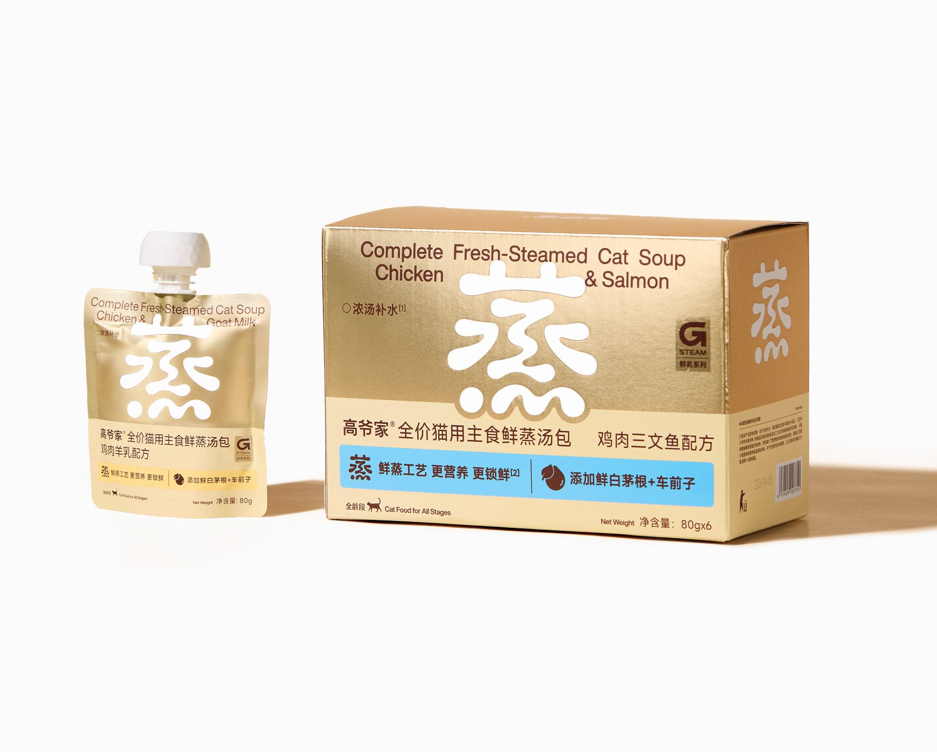
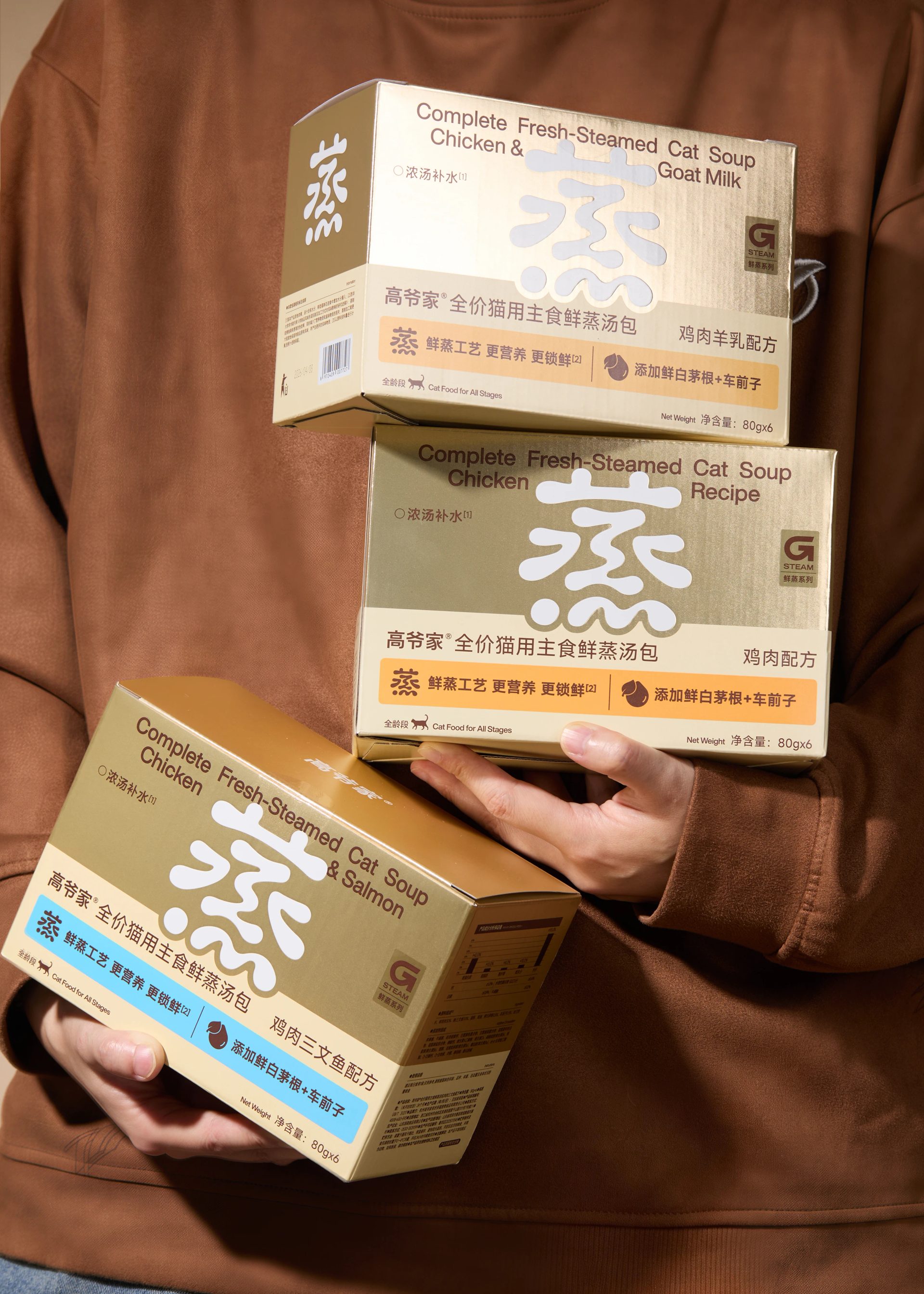
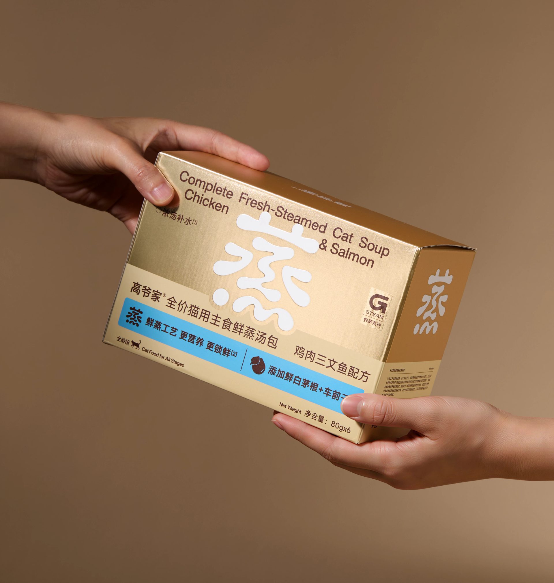
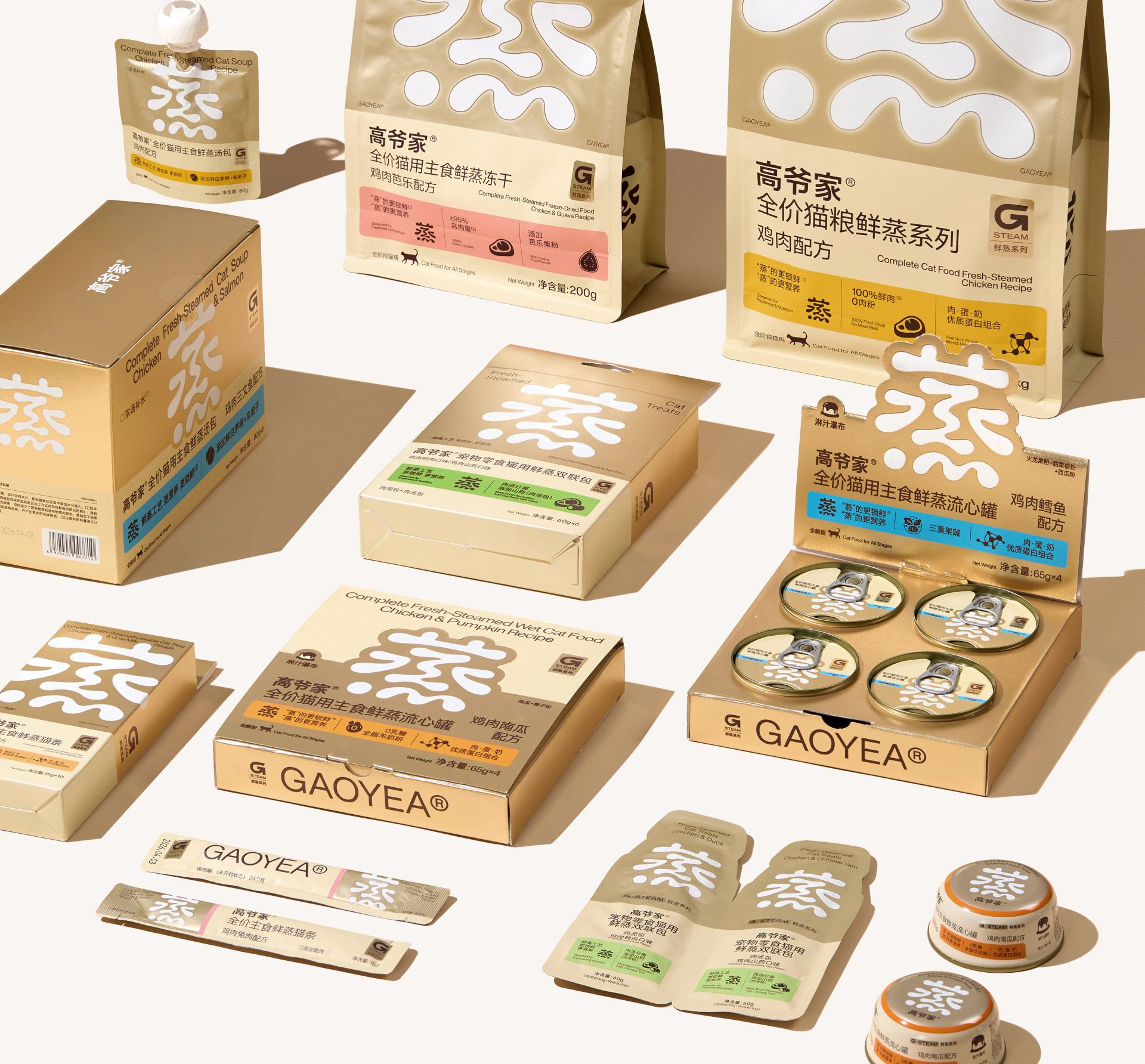
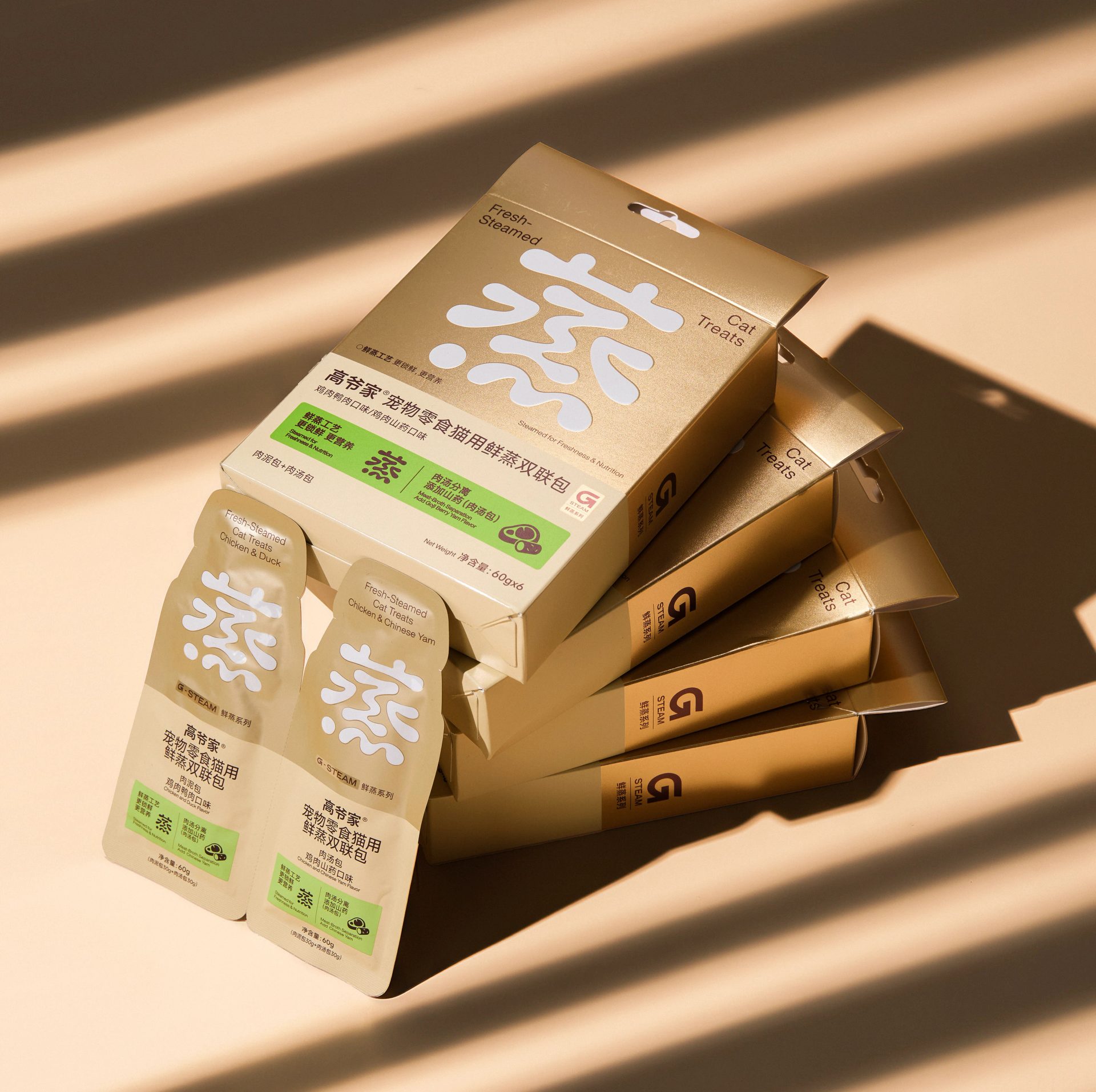
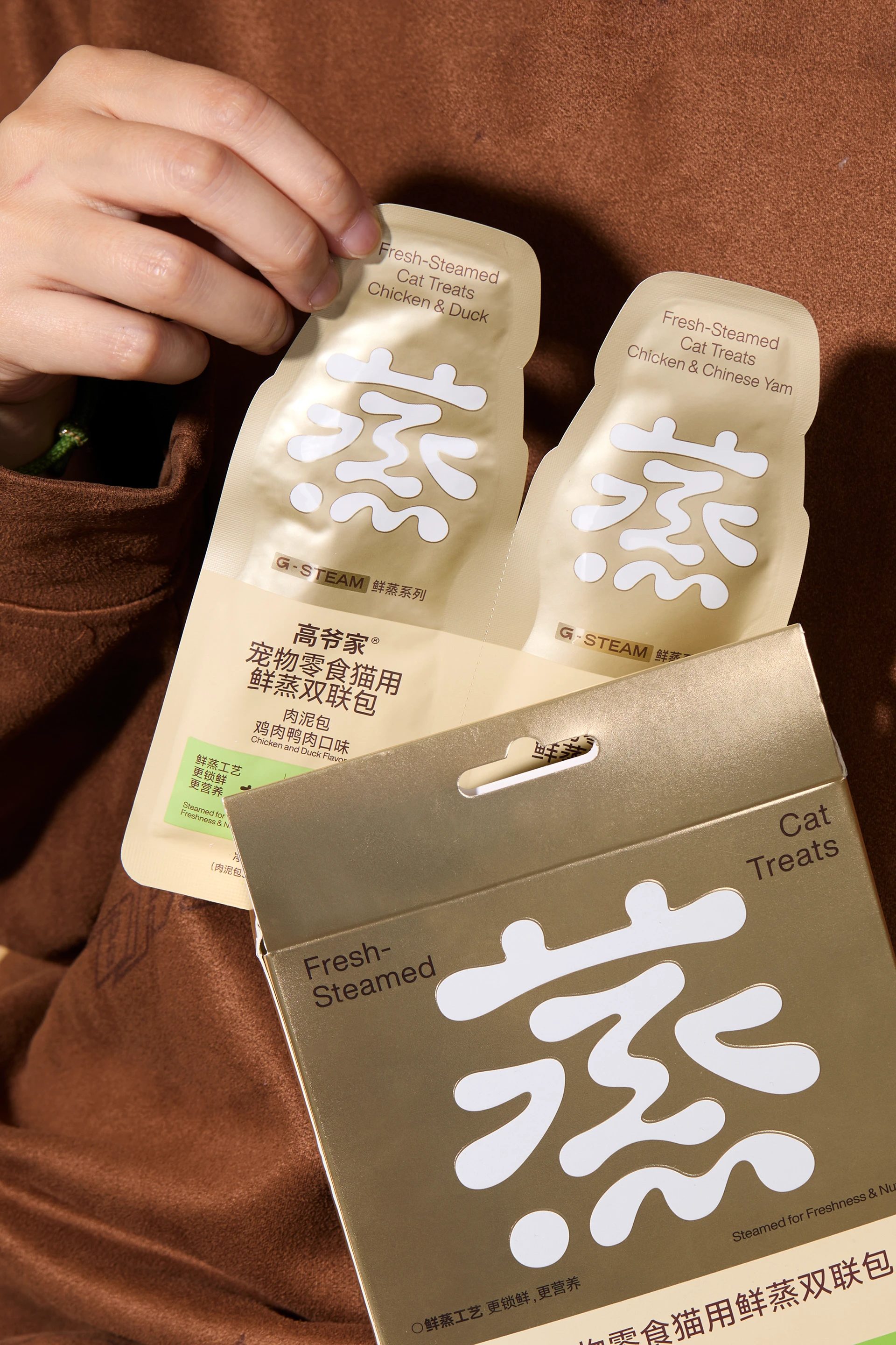
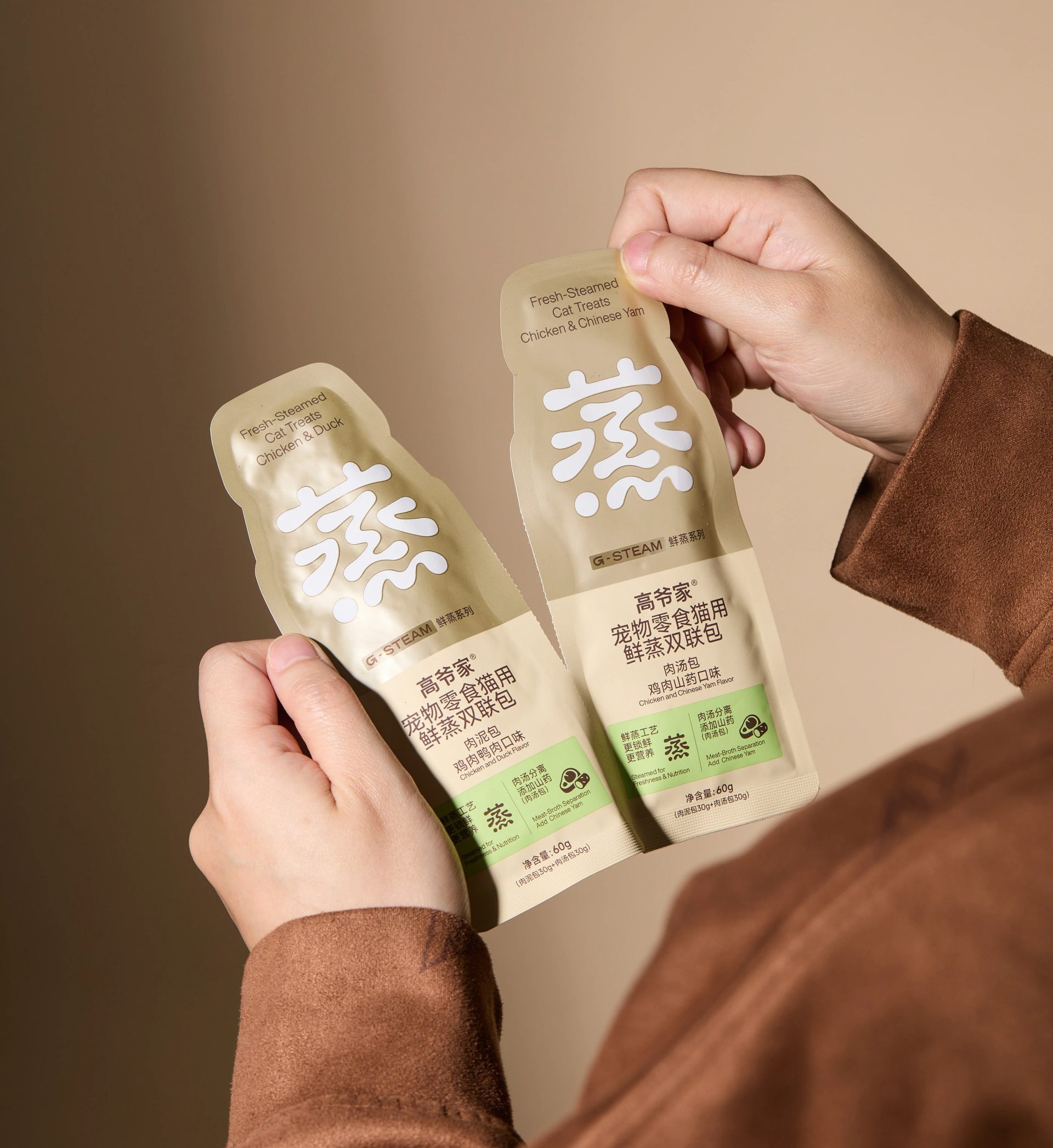
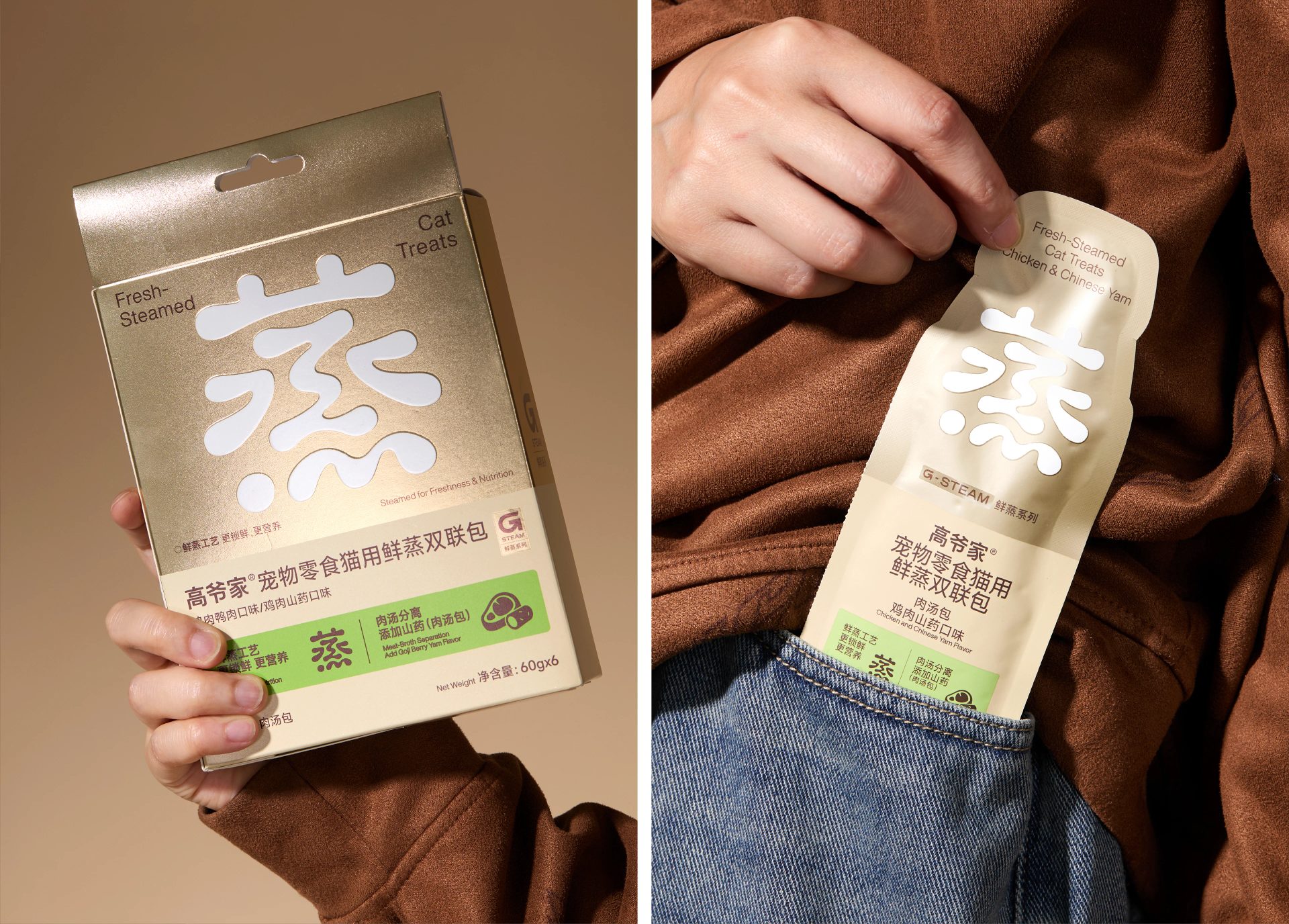
Our new packaging for Gaoyejia's Fresh-Steamed range. Beyond brand character and memorability, we wanted the packaging to show what the product does as clearly as possible, so that anyone can see at a glance what makes it special.
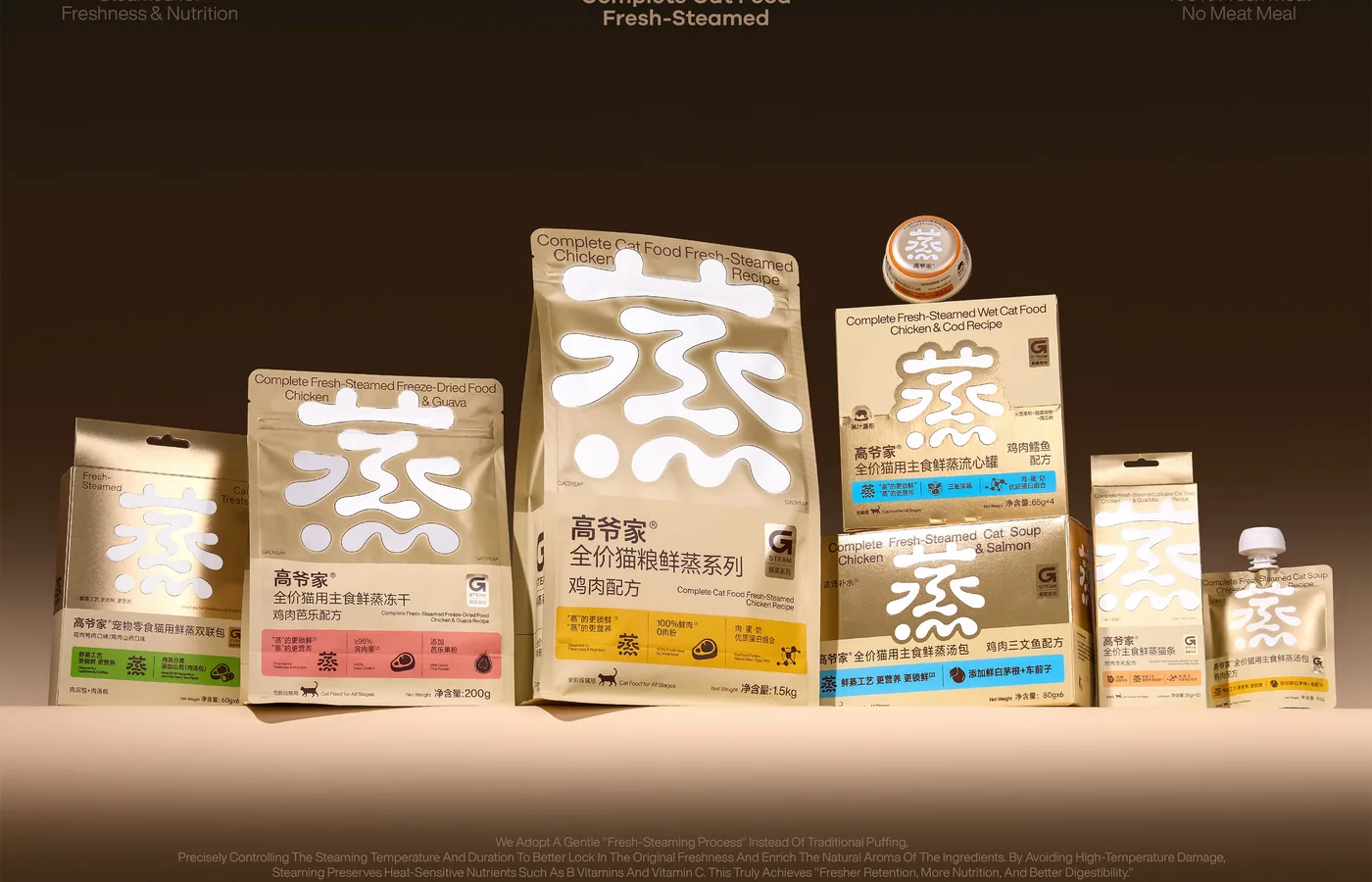
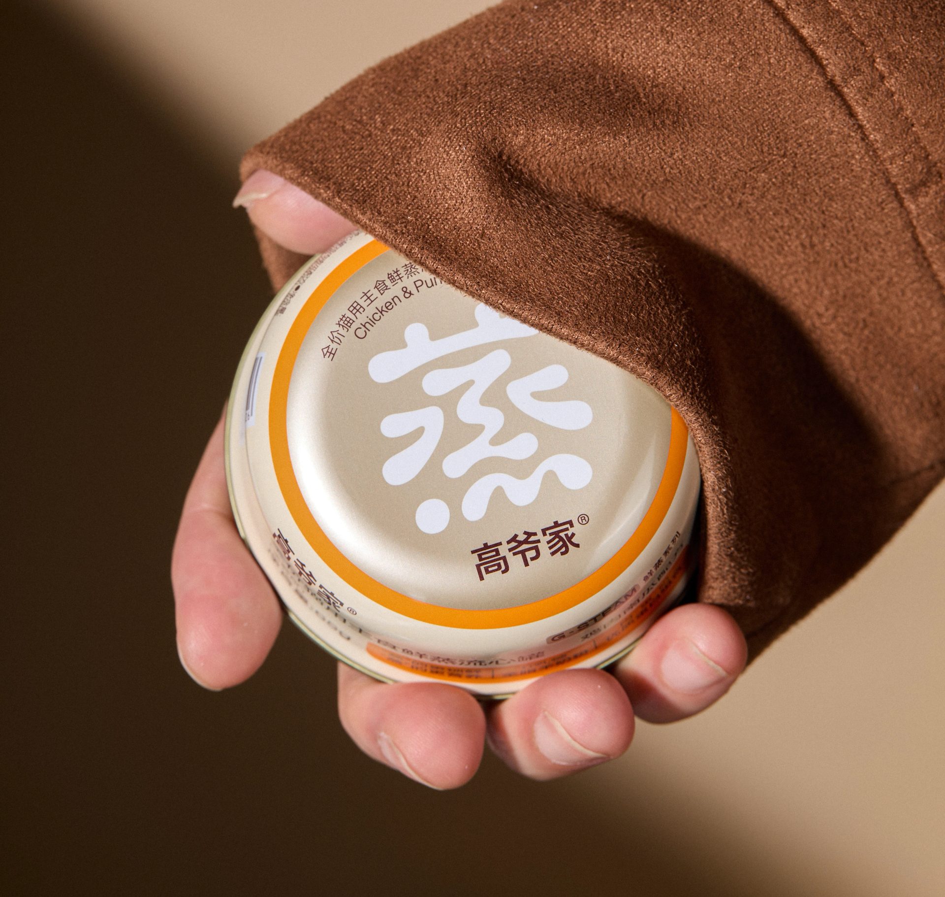
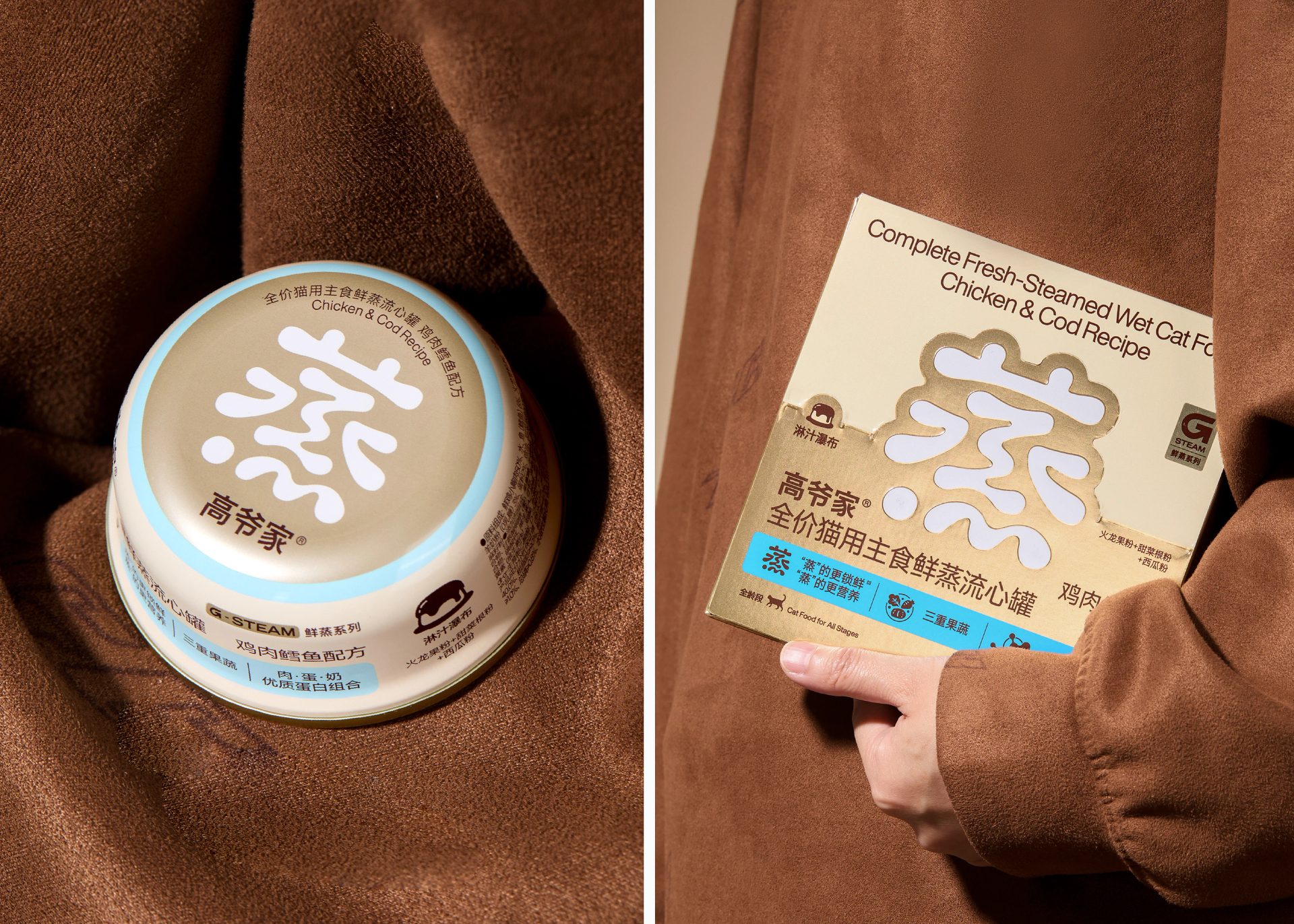
No bamboo steamers, no piles of meat: DXD blurs the edges of the character for "steam" so the type itself looks like rising vapor.
Our new packaging for Gaoyejia's Fresh-Steamed range. Beyond brand character and memorability, we wanted the packaging to show what the product does as clearly as possible, so that anyone can see at a glance what makes it special.
Browse more
Get The Edit — the week's best brand work
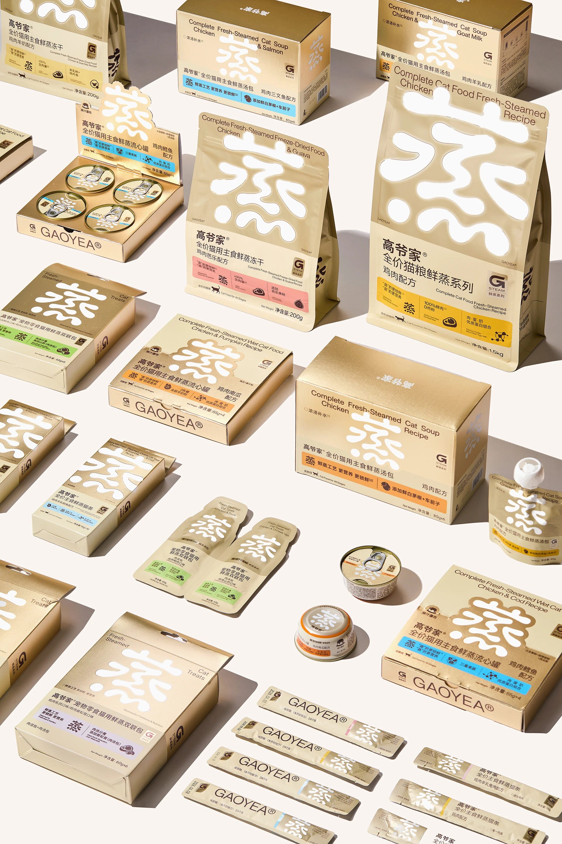
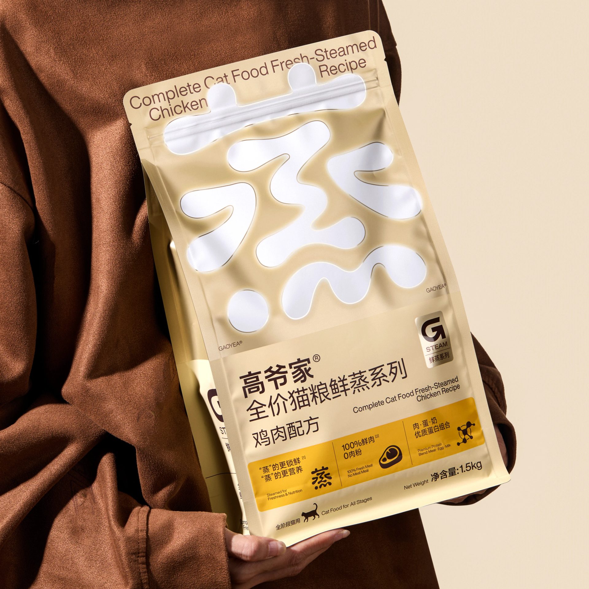
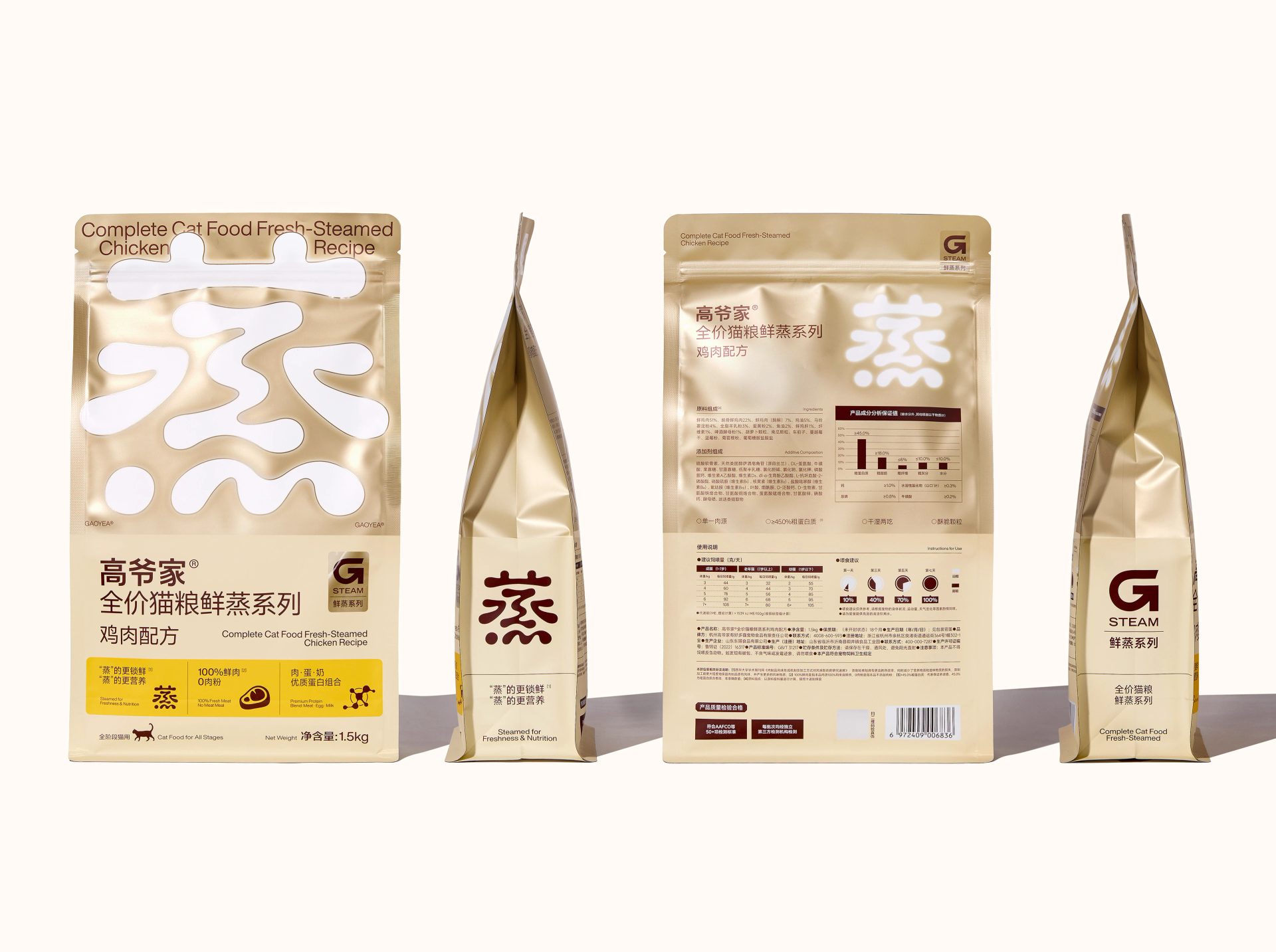
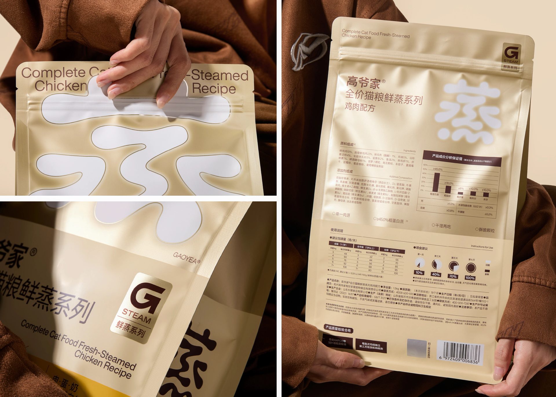
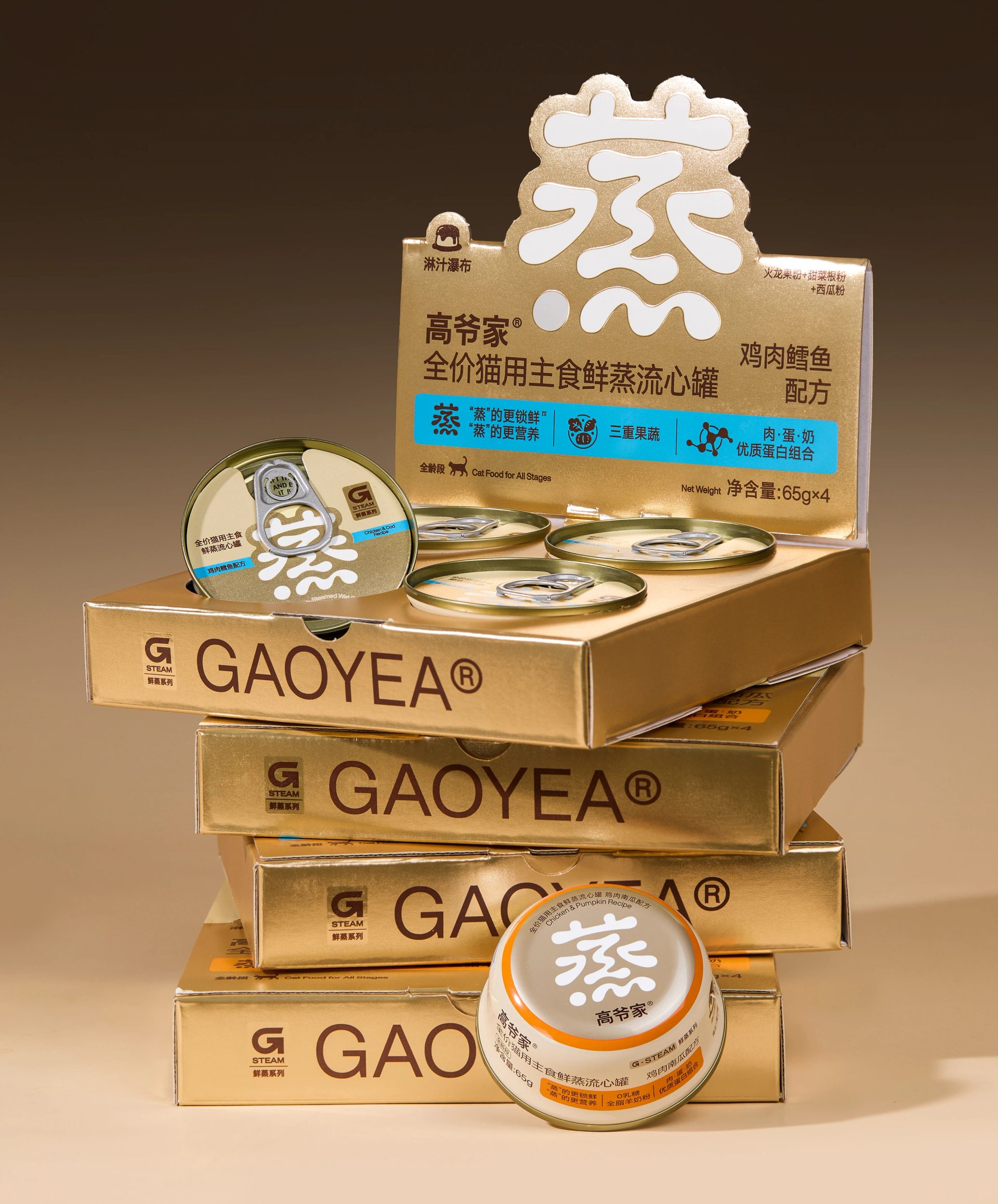
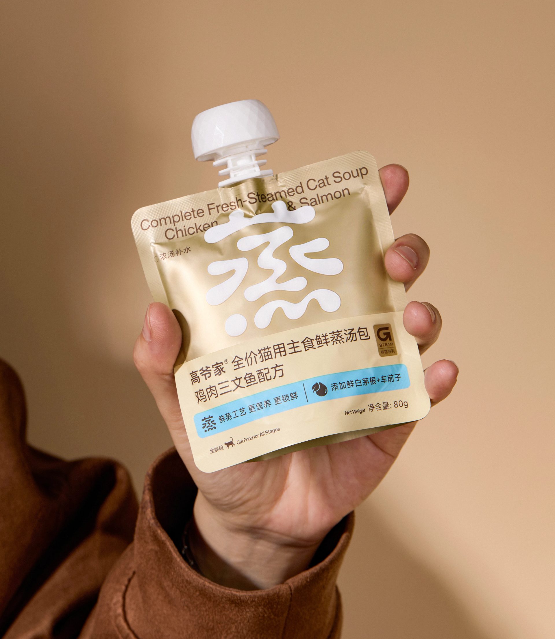
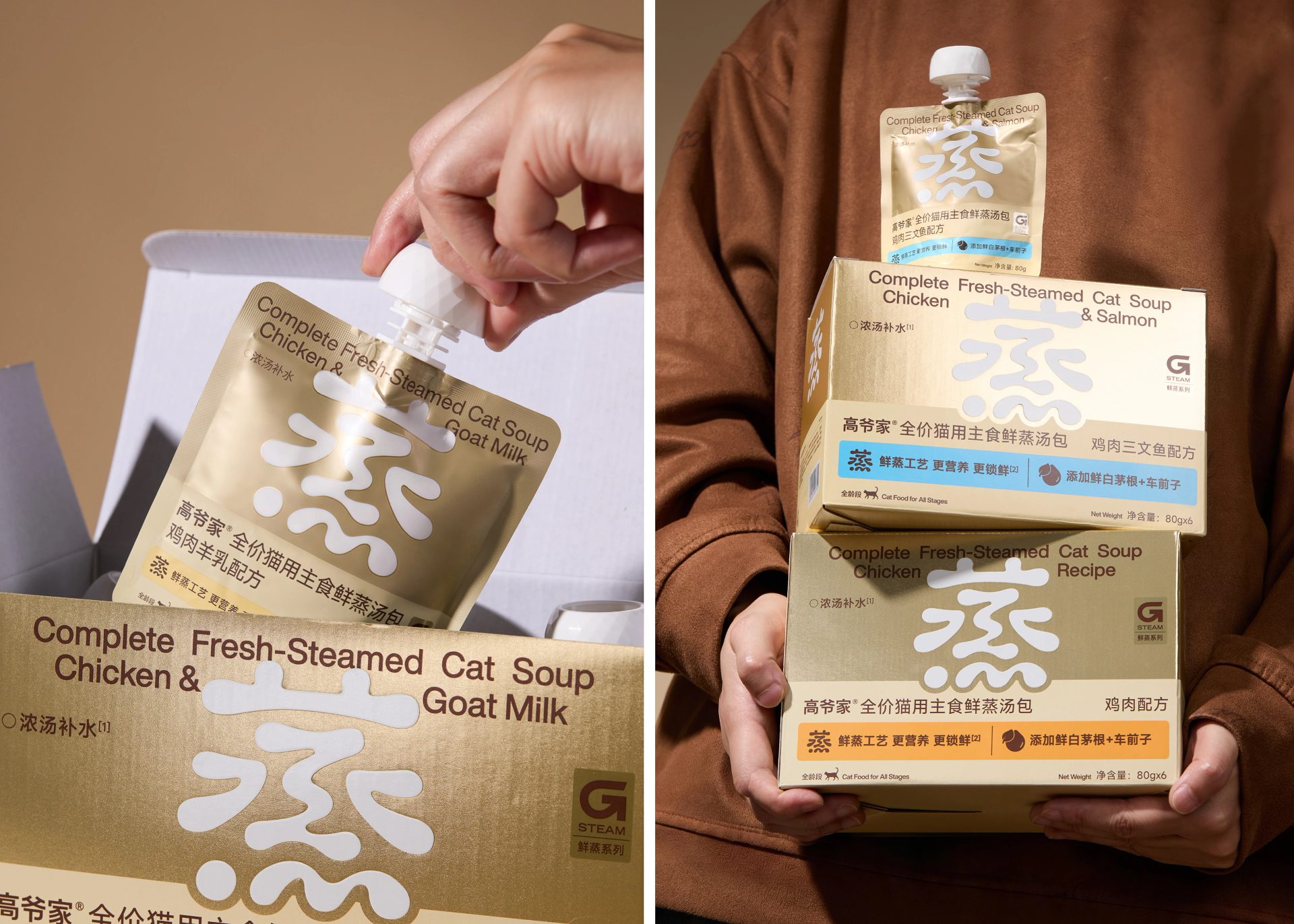
To express the "fresh-steamed" quality, we avoided both traditional steamers and piles of fresh ingredients, and instead focused on the Chinese character "蒸" (steam). Through custom typography, we lightened the structural skeleton of the character and applied progressive blurring to the edges of the strokes, mimicking the diffusion of rising steam. This creates a visual texture that feels soft, fluffy, and gently expanding outward — accurately conveying the physical nature of steam and delivering the core selling point in the most direct and precise way.
Paired with a clean, warm, and natural color palette and material choices, the design aligns the typography with the overall atmosphere of the "fresh-steamed" product concept. Our intention is that consumers will see the packaging and immediately remember: "This food is steamed."
Originally published on Behance by DXD studio. View the original project.
Curated work, sharp analysis, and one thing worth thinking about.
Free · Weekly · Unsubscribe anytime