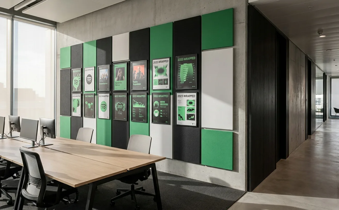
article
Spotify's Visual Identity Evolution: How Constraints Built One of Tech's Most Recognizable Brands
by WeLoveDaily Editorial
We use cookies to measure site traffic and improve WeLoveDaily. Nothing loads until you choose. Cookie Policy.
Work, articles, studios, brands and categories across the archive.
72 results
project
by Pentagramcurated by WeLoveDaily
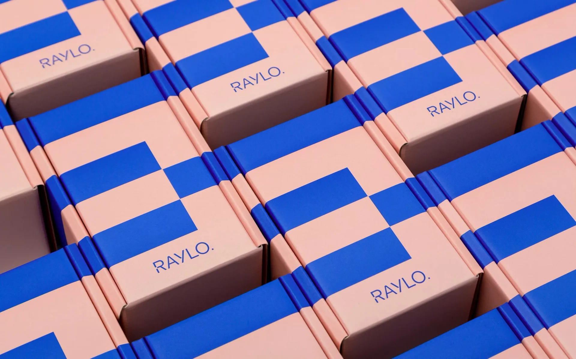
…does not. Soft pink and pop blue carry the system, set against a charcoal that does the technical work and keeps the other two from turning saccharine. The three run across packaging,…

project
curated by WeLoveDaily
…Duolingo brand identity itself. What began as a friendly owl perched atop a straightforward ed-tech product has become something rarer and more interesting: a character so vivid that it has…

article
by WeLoveDaily Editorial
…like Stripe." The Stripe brand identity is one of the most studied and imitated in the technology industry. A payments infrastructure company, a business that literally processes transactions…

article
by Jose Pablo Dominguez
…a marketing site uses a free Google Font. They notice when illustrations look like 2018 tech-Twitter stock characters. The safe move, category-wide, was to adopt a visual register that…
article
by Jose Pablo Dominguez
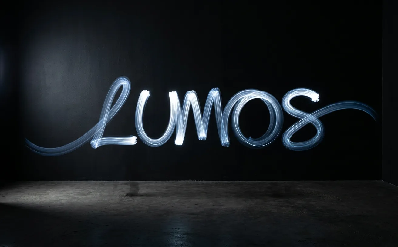
…best examples in 2026 pair motion with a structural business argument (evolution, scale, technology differentiation). Decorative motion dates within 18 months; argumentative motion compounds…

project
by Nea Studiocurated by WeLoveDaily
…solar energy projects and mini-farms, earning returns in real time, backed by blockchain technology. A bold, future-driven identity where sustainability meets financial intelligence. Solar…
project
by Dinamocurated by WeLoveDaily
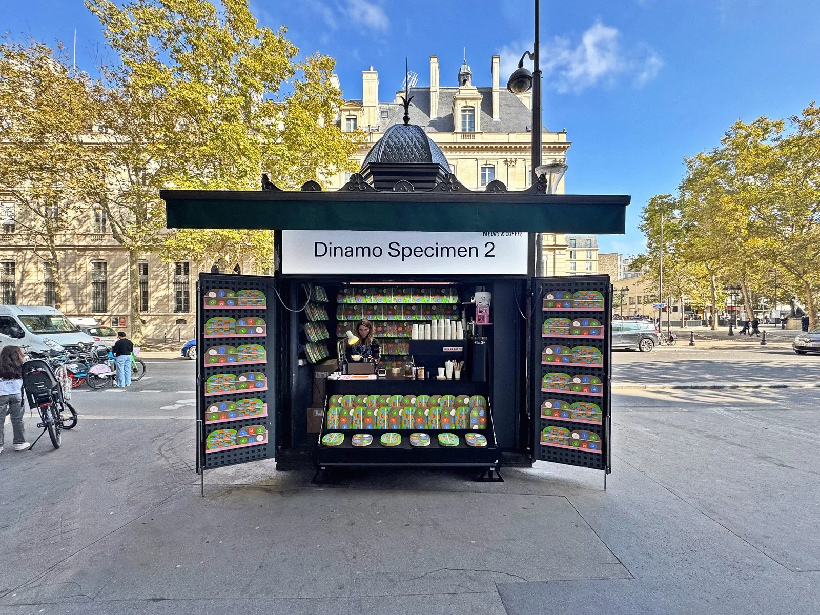
…appears on screens belonging to some of the most design-literate brands of the past decade: technology companies, cultural institutions, fashion labels that care deeply about visual language…
article
by WeLoveDaily Editorial
…curious happened in the mid-2010s. While Silicon Valley was busy stripping serifs from every tech logo it could find (Google, Spotify, Airbnb, Pinterest, all converging on the same clean…

project
curated by WeLoveDaily
…singular, slightly-muted, almost-ink blue, not the saturated electric blues that dominate tech branding. The butterfly is drawn at a low level of abstraction: simple wings, a center spine…
ranking
by WeLoveDaily Editorial
…was built on. The sheer range of their 2024–2026 output, from cultural institutions to technology platforms, makes Pentagram impossible to ignore, even for people who'd prefer to champion…
article
by WeLoveDaily Editorial
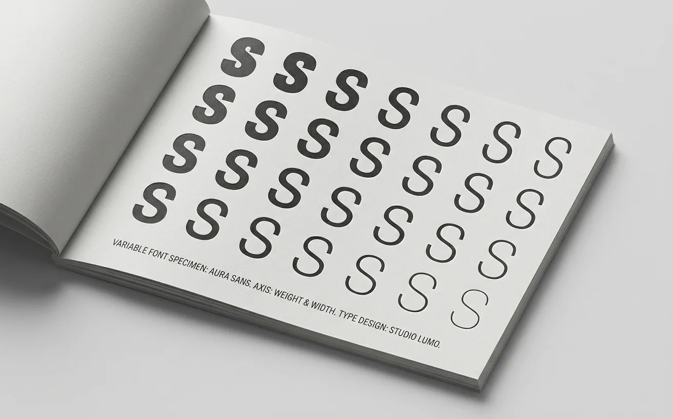
…luxury they do not yet need. Variable Fonts as Identity Systems The second force is technological, and it is changing what a wordmark can do. A decade ago, a wordmark-only identity…

project
curated by WeLoveDaily
…skeptical buyer remembers. The rest of AI will catch up to this move, the way consumer tech caught up to Apple's minimalism in the 2010s. For now, Anthropic owns the register: serious…
article
by Jose Pablo Dominguez
…provided the work launched in the qualifying year. It is not limited to any single industry. Tech, luxury, consumer goods, hospitality, cultural institutions, restaurants, civic identity…
project
curated by WeLoveDaily
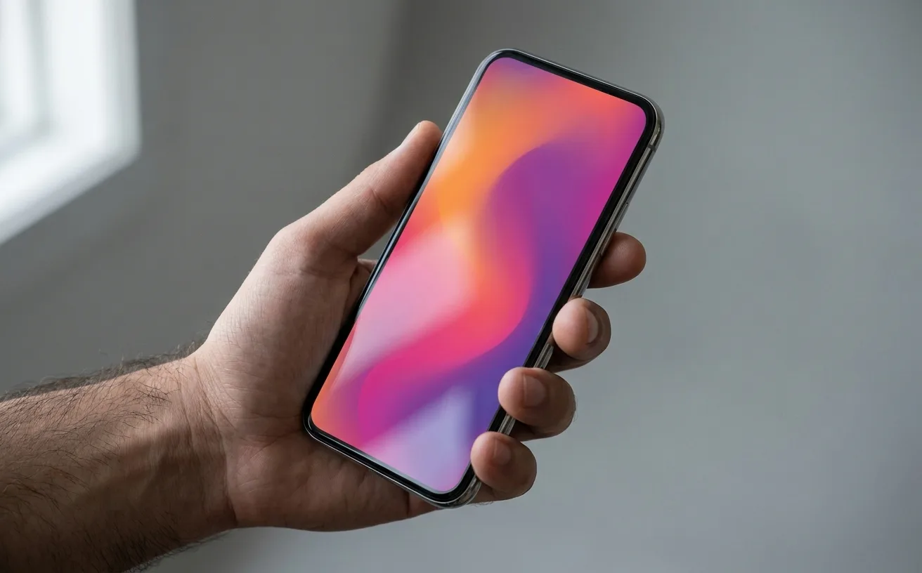
…That gradient is now arguably the most recognized single brand color system in consumer technology. The icon barely needs the camera silhouette anymore; the gradient alone tells you where…
ranking
by WeLoveDaily Editorial
…shaped by remote work, direct-to-consumer everything, and the relentless blurring of technology and lifestyle produced a typographic landscape that was both remarkably coherent and…

project
by Pentagramcurated by WeLoveDaily
…What they've done is extend it. Consider the firm's recent identity work for emerging technology platforms and cultural institutions. Where an earlier generation of Pentagram partners…
article
by WeLoveDaily Editorial
…users' output would be like a picture frame that draws more attention than the painting, technically present, functionally wrong. This tension, between self-expression and self-effacement…
Raylo
Refurbished-phone marketplace. Identity system by Koto.
Anthropic
AI safety company building Claude. Quiet, research-first visual identity.
Apple
Consumer electronics company. San Francisco typeface shaped the modern OS visual standard.
Arc Browser
Browser by The Browser Company. Treats browsing as furniture, not a tool.
Duolingo
Language-learning app. The green owl Duo is the brand.
Figma
Collaborative design tool. Color-plus-geometry brand language.
Linear
Project tracker for software teams. Speed-first brand language.
Stripe
Payments infrastructure. Design-led fintech. The Press brand system.
Vercel
Frontend cloud platform. Aesthetic template for modern dev tools.
Mailchimp
Email marketing platform with the Freddie mascot and a playful cream-yellow identity.
Notion
Productivity tool. Identity system built on a tight illustration + typography palette.