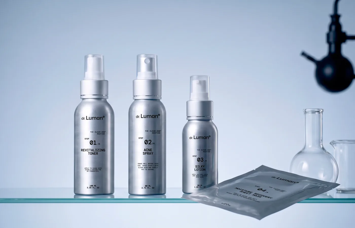
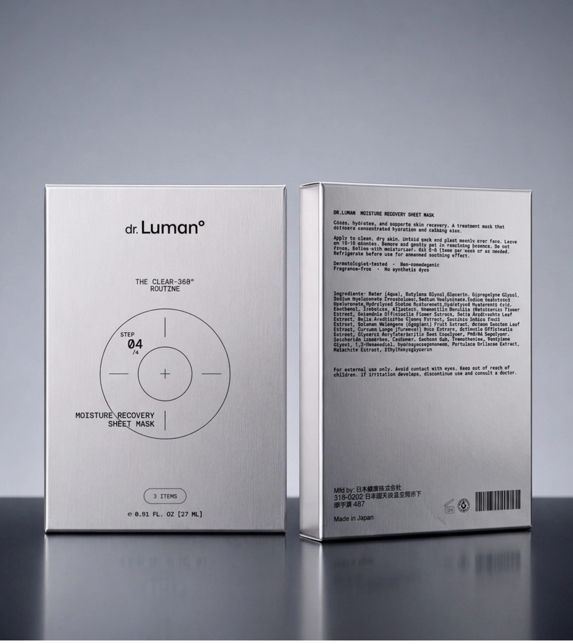
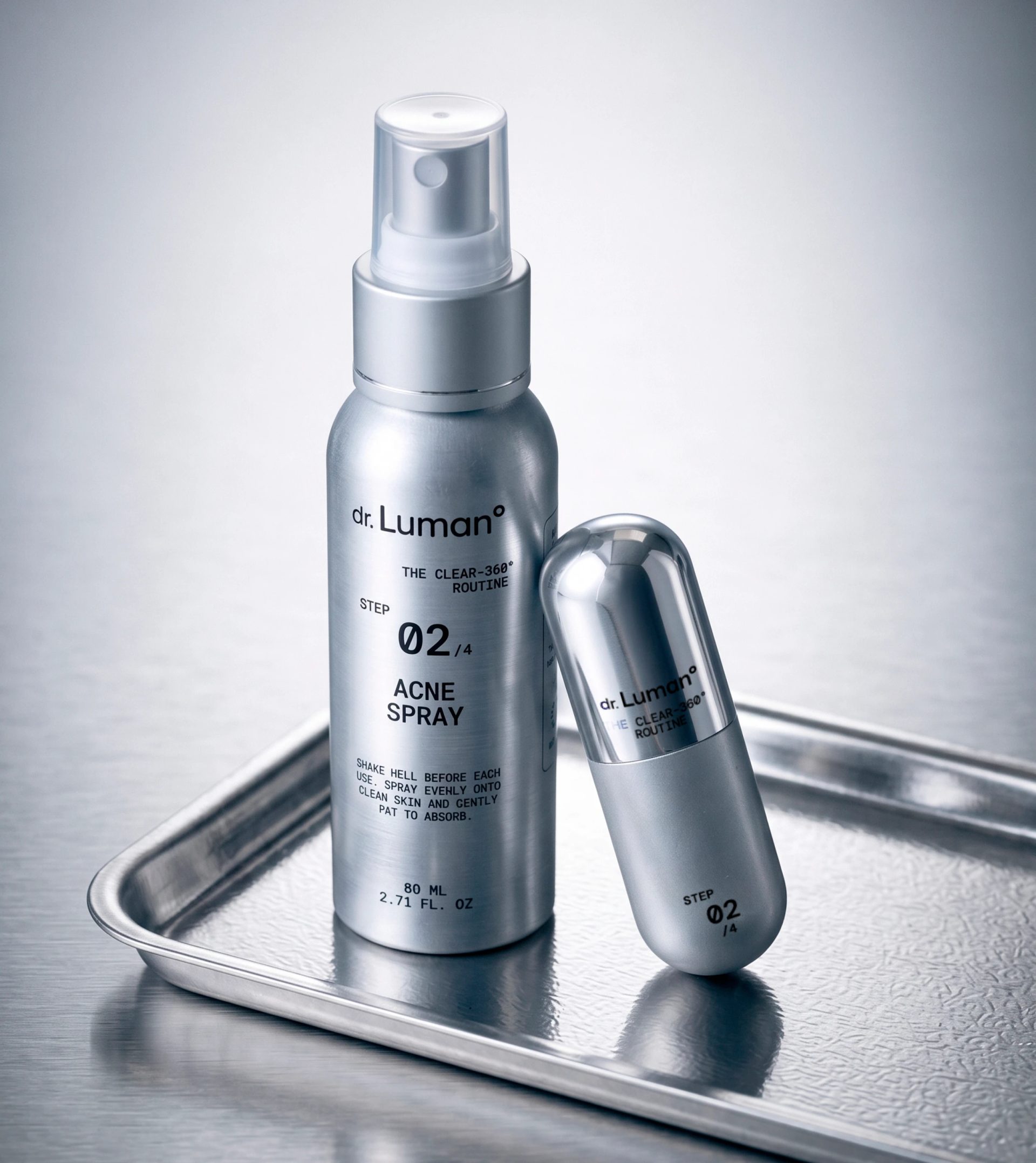
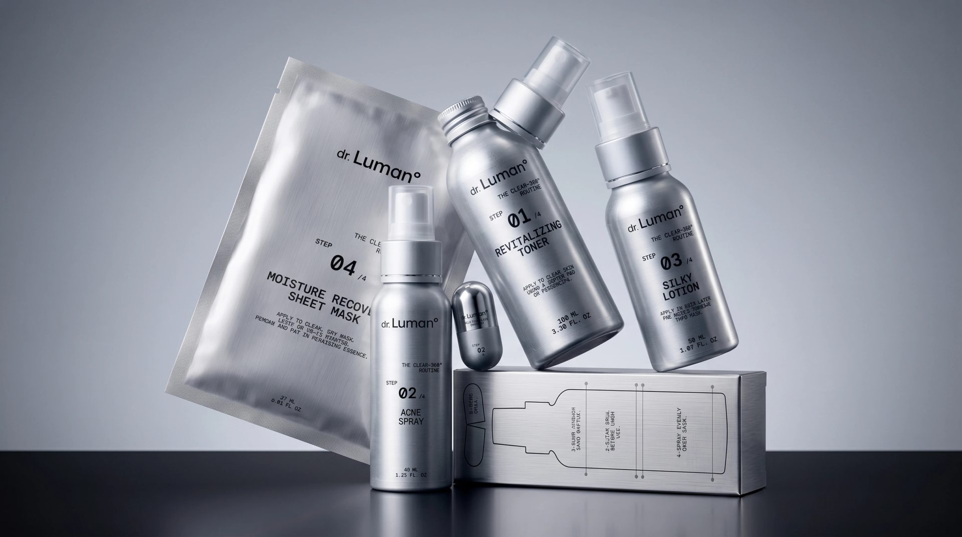
Luxury skincare packaging design and art direction for dr. Luman° — a four-step CLEAR-360° routine. A complete system built on brushed silver, monospaced typography and a clean clinical grid. Concept, packaging and product visualization by Karina Loboda / airo btq.
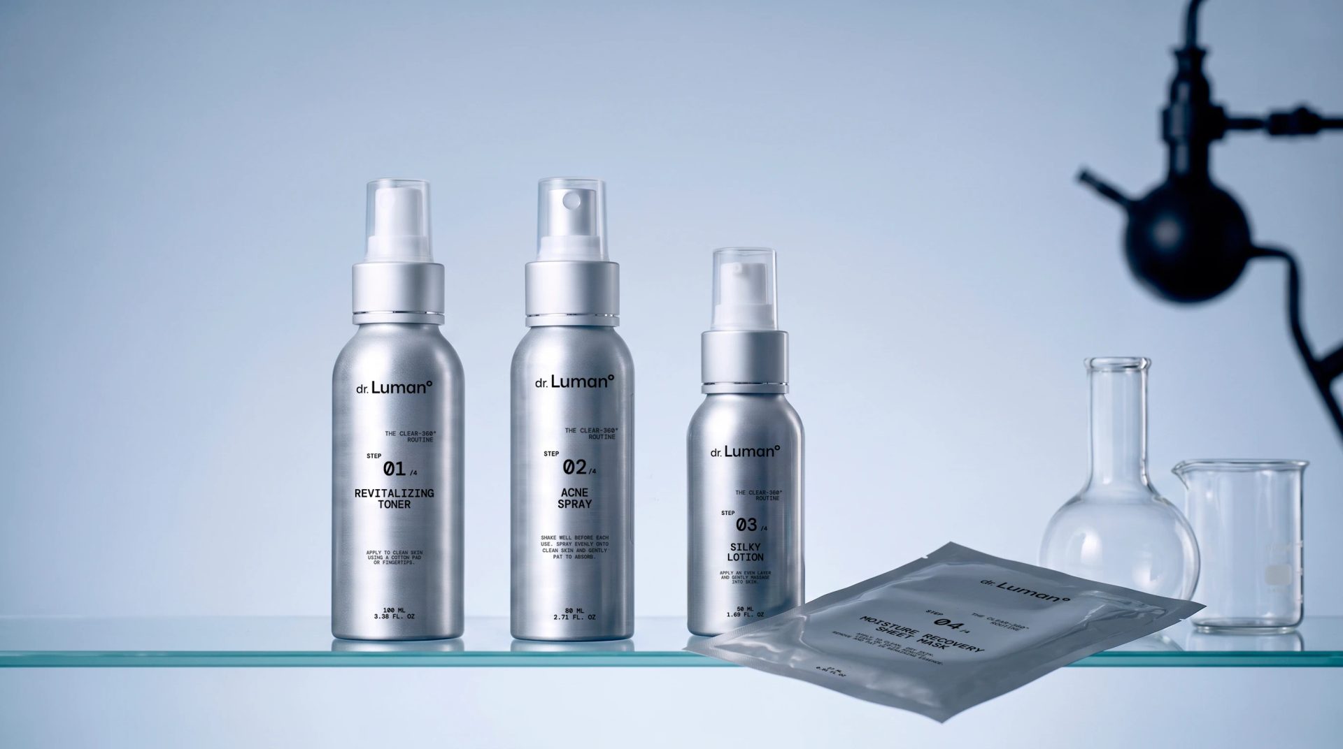
dr. Luman° (packaging redesign)
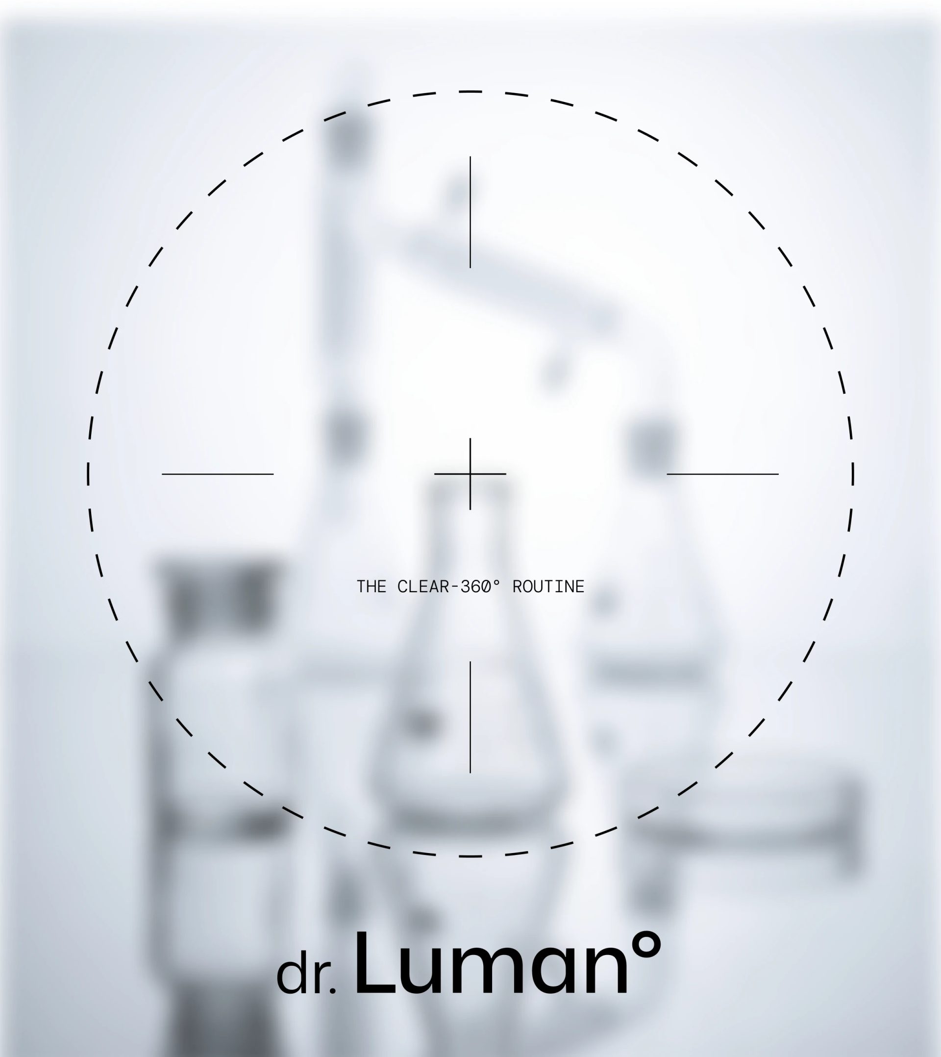
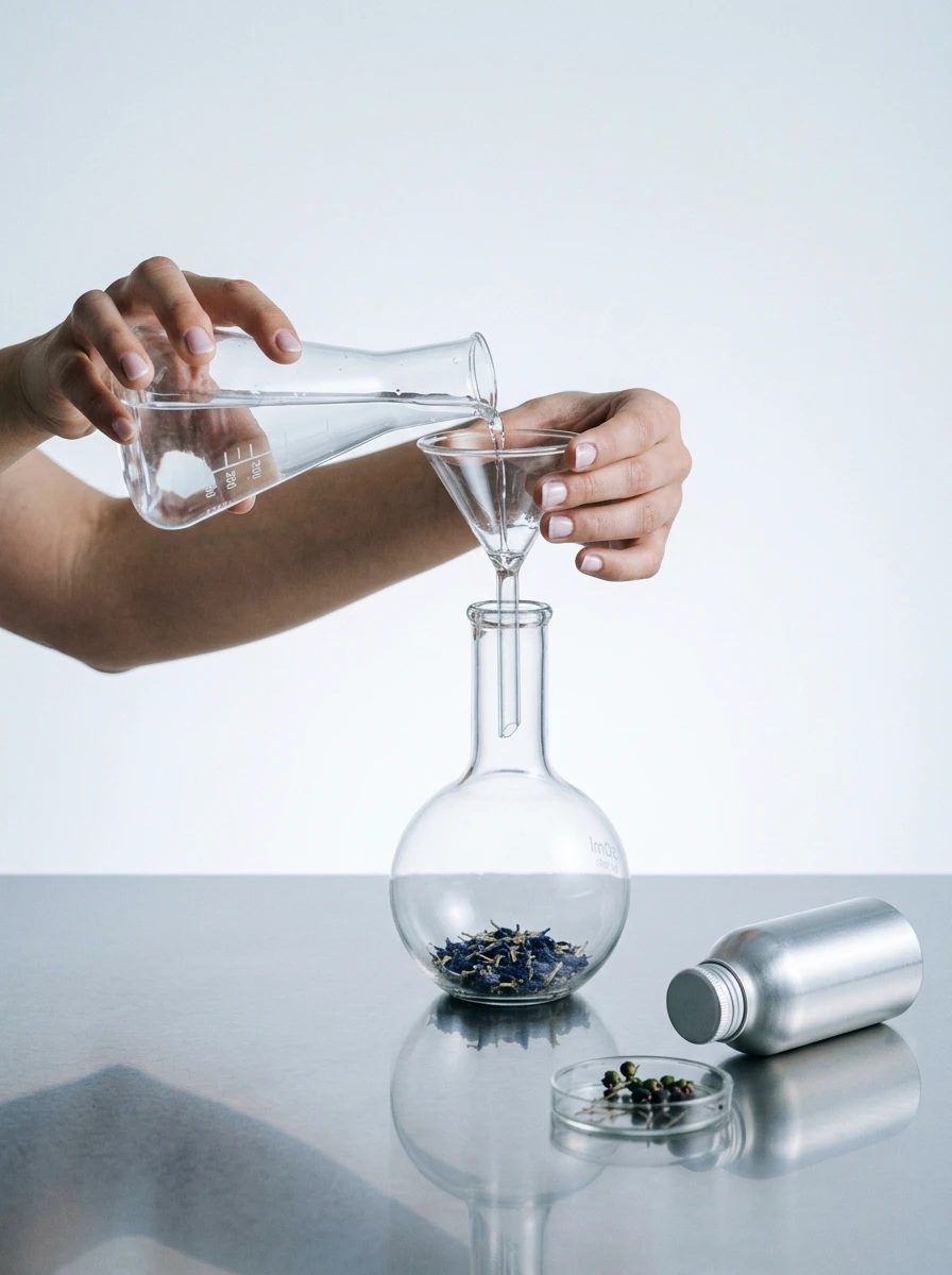
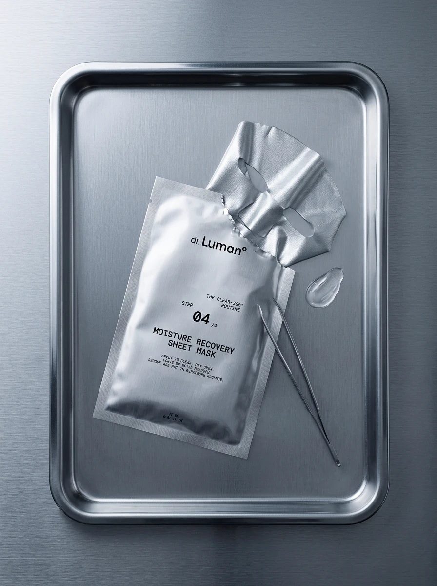
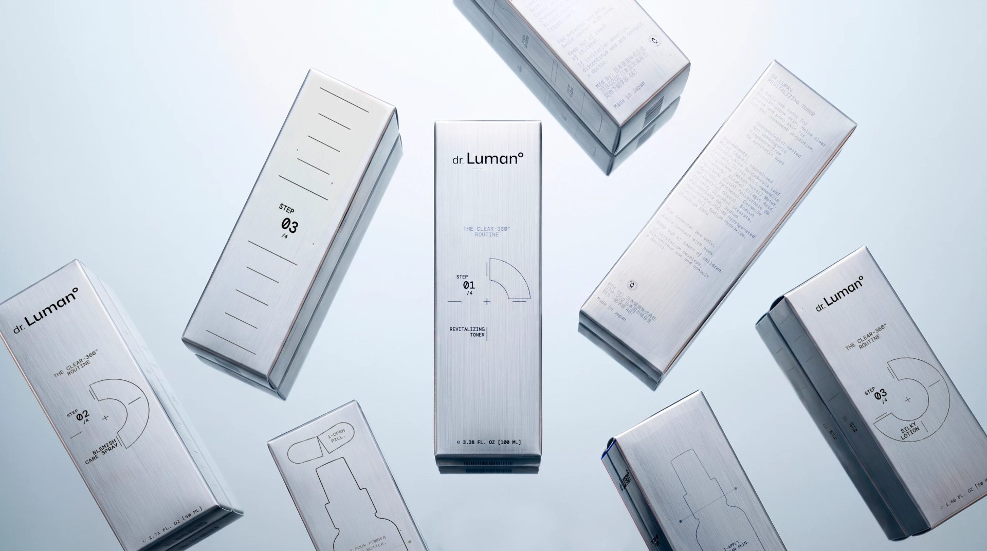
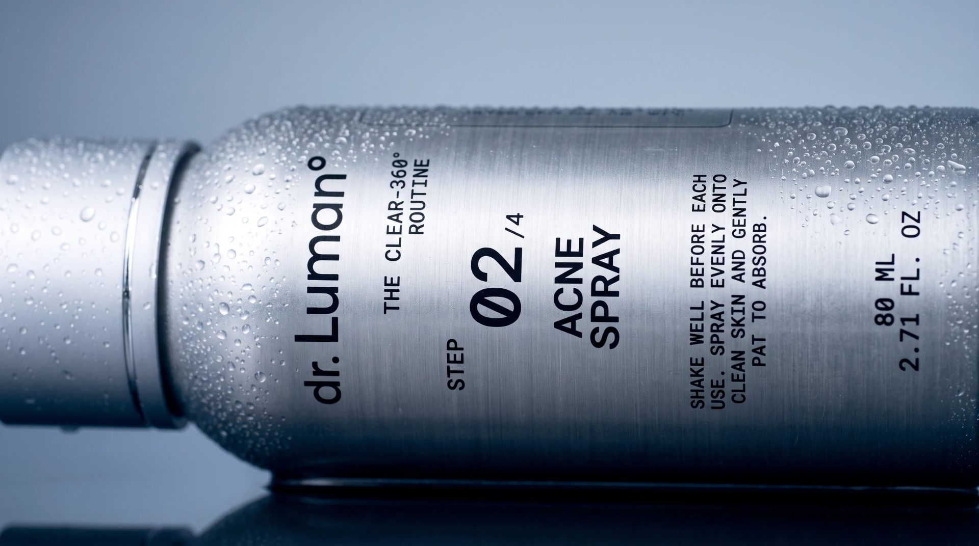
A complete packaging system for a four-step skincare routine — THE CLEAR-360°. Built on one material logic: brushed aluminium, monospaced typography and a precise clinical grid. Cold silver as the signature, the degree mark "°" as the thread that ties the range together — turning base formula into something precise and precious.
Packaging & Art Direction [2026]
Creative Direction & Design — Karina Loboda / airo btq
HAVE A PROJECT IN MIND?
Let’s bring it to life → studio@airobtq.com
Follow us on Instagram | Explore on Pinterest