project
We use cookies to measure site traffic and improve WeLoveDaily. Nothing loads until you choose. Cookie Policy.
Work, articles, studios and categories across the archive.
project
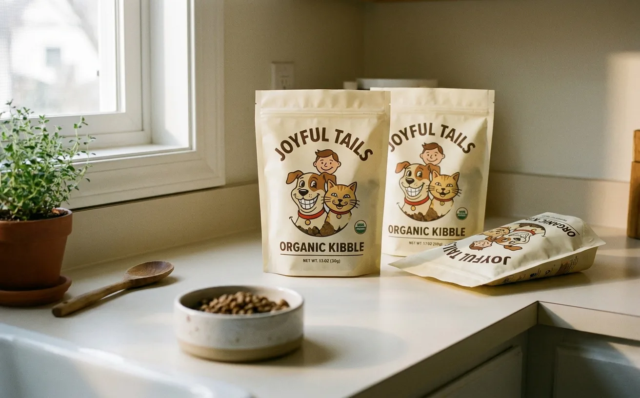
…Reggie's character-first system splits the difference: the illustration is the argument for care, but the typography and color restraint is the argument for seriousness. A brand a pet owner…
project
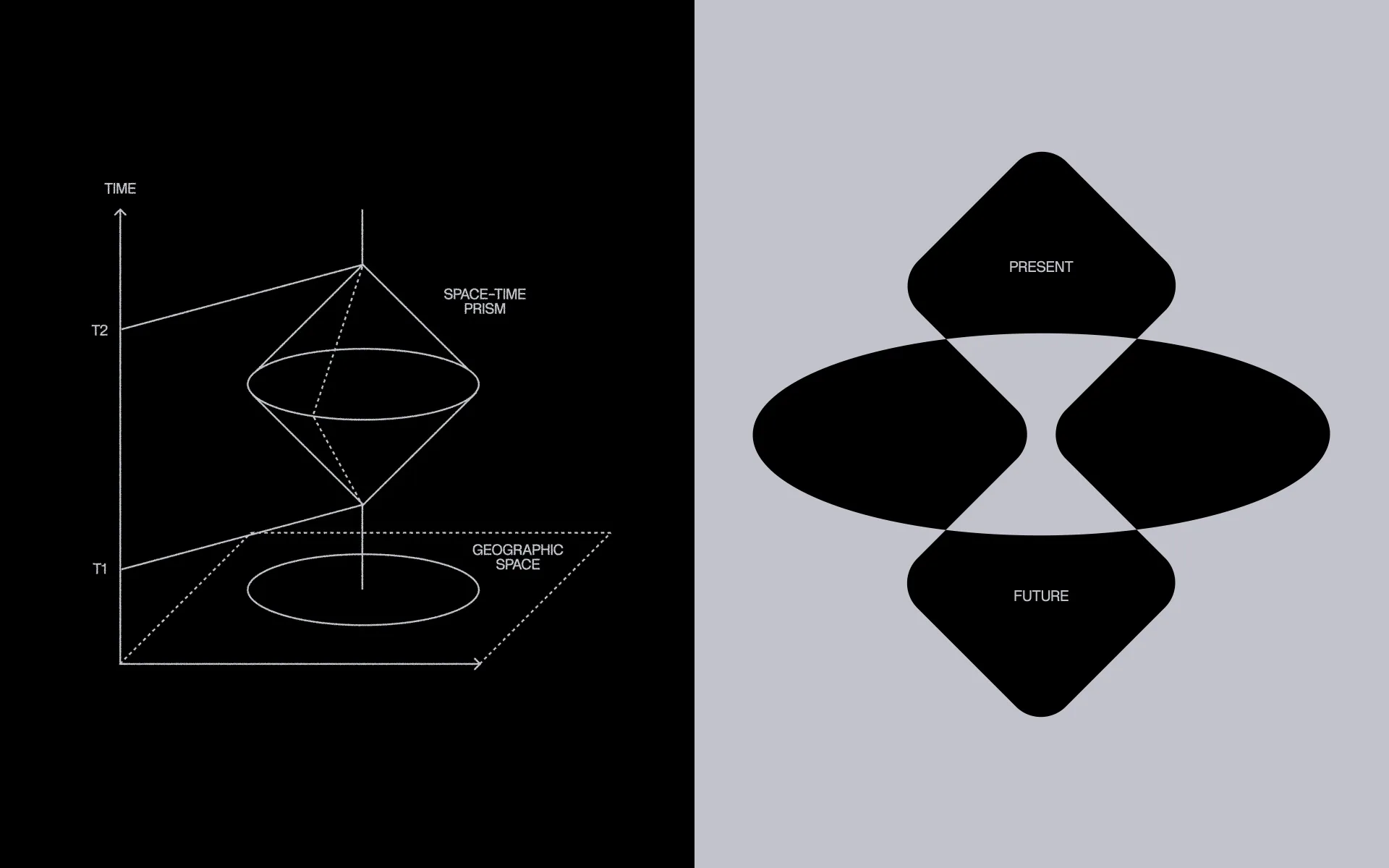
…came the central metaphor: the prism. A single beam of light – one donation, one act of care – passes through the foundation like light through a prism, and comes out the other side…
article
…rest of your post, your carousel, your reel, your caption, your call to action, your carefully researched insight does not exist. You can optimize headlines. You can A/B test hooks…
project
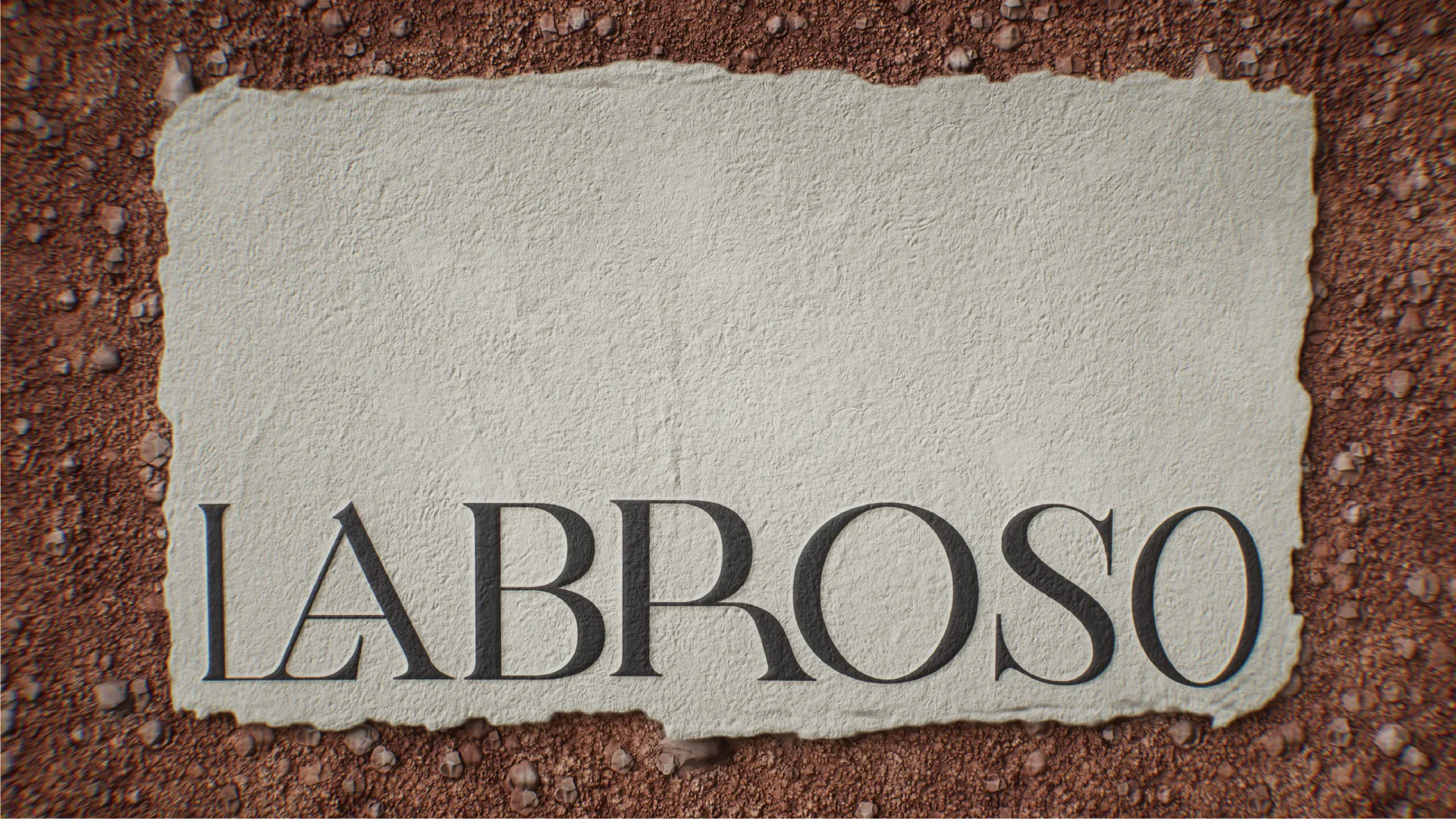
…cultivating, transforming, and elevating tradition. Labroso is a blanco tequila that takes care of every detail, from the origin of the agave to the production processes like baking, milling…
project
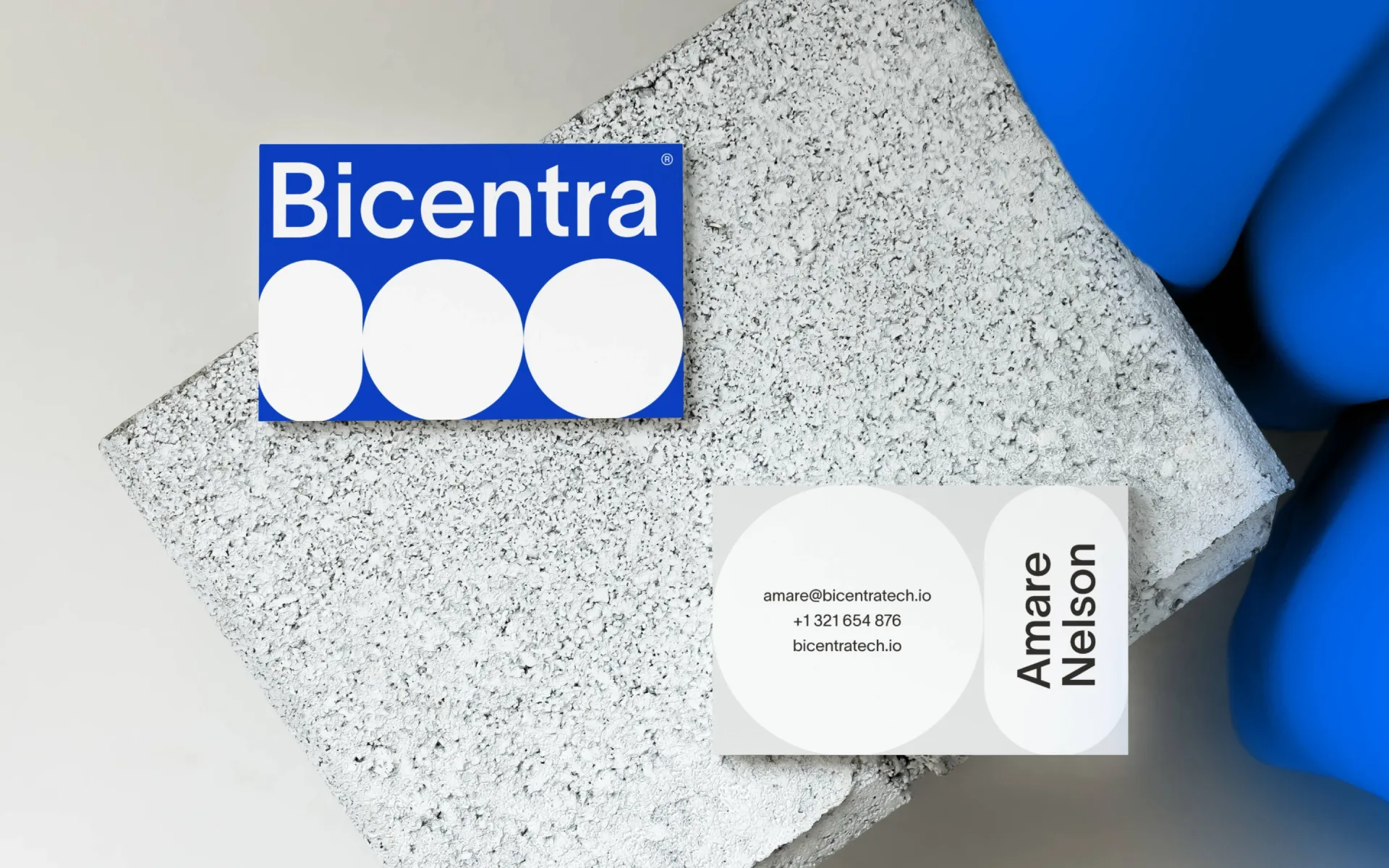
…identity for Bicentra Biotech that aligns with the company’s mission to re-center autoimmune care around targeted, durable immune reset. The identity should reflect the brand’s core values…
project
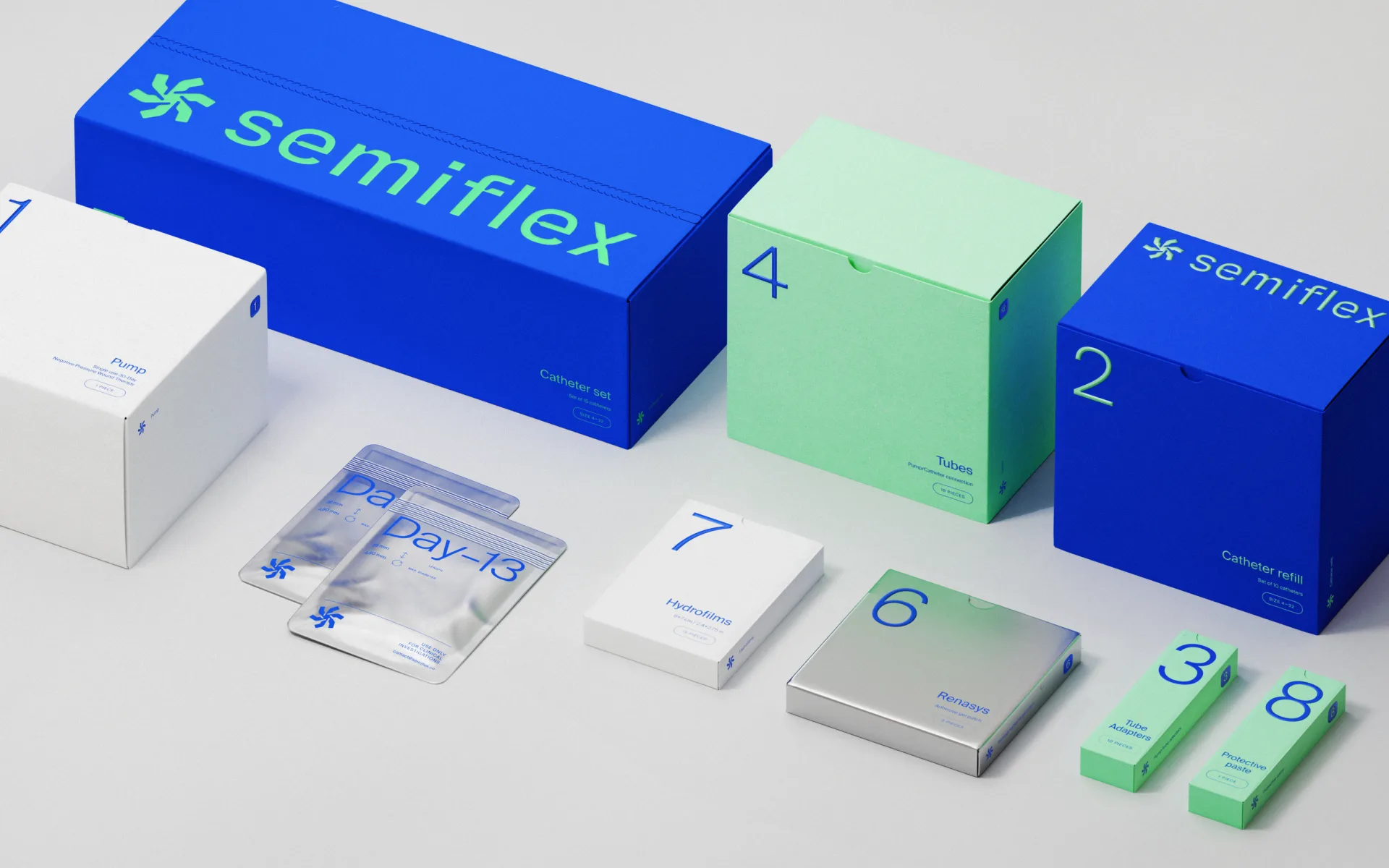
Medical device branding and packaging for innovative IBD care We developed a comprehensive brand identity and medical device packaging system for Semiflex…
project
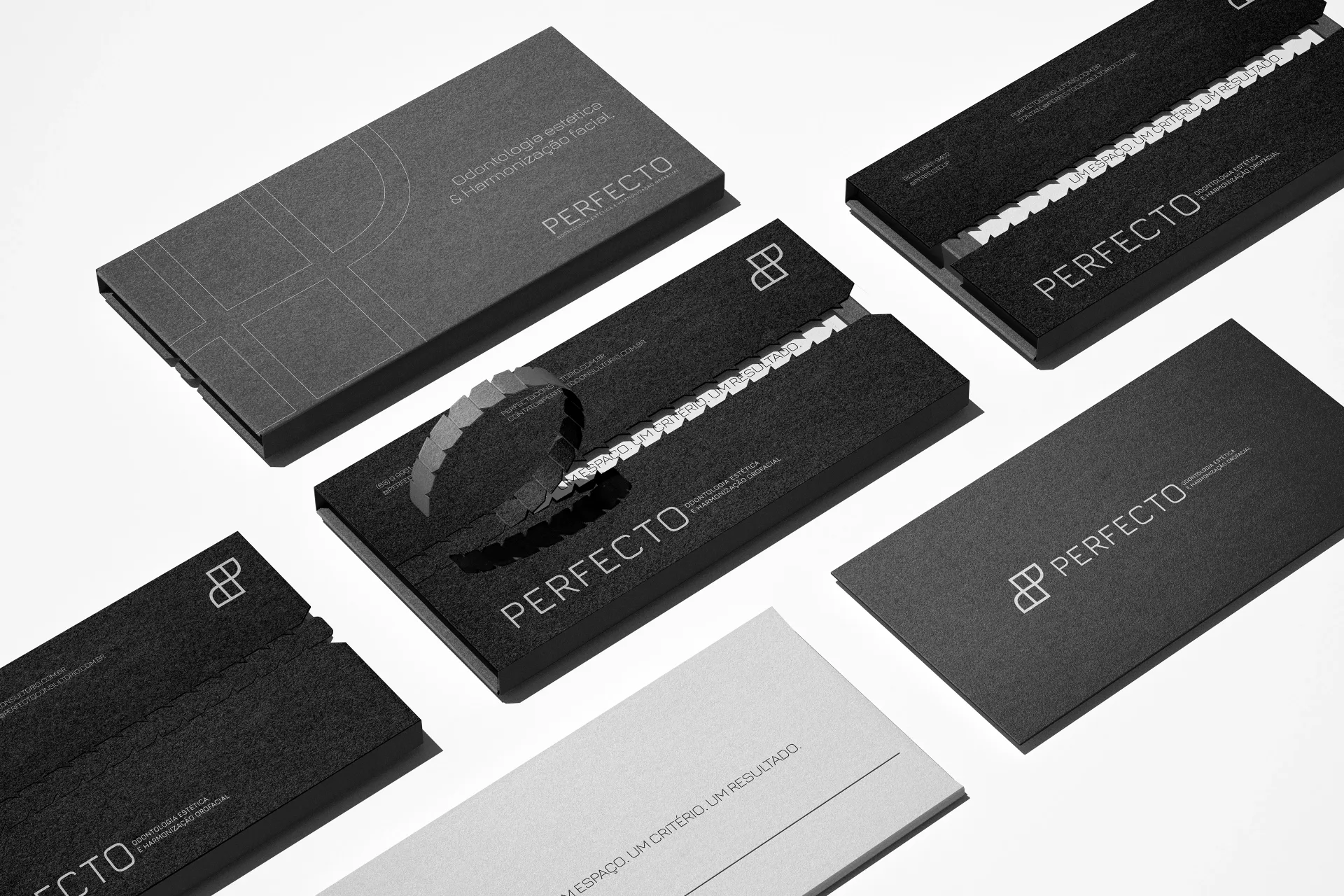
…and commitment in every interaction. More than a clinic, Perfecto represents a premium care experience, where science, aesthetics, and technology come together to enhance beauty in…
project
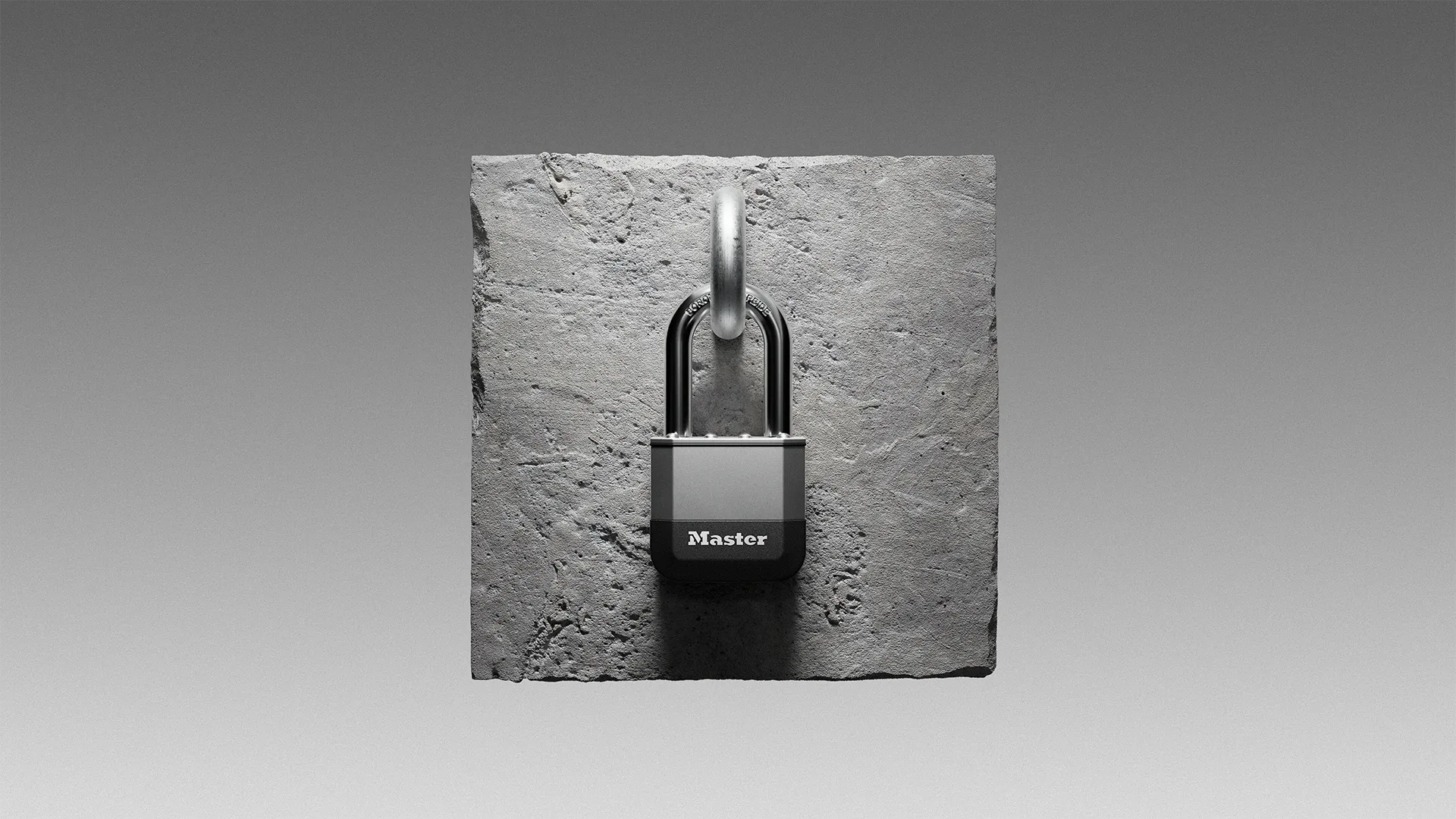
…s design approach of a seamless meant revising the engineering stack-up strategy and carefully considering how each required mechanical detail could become part of the story of solid…

project
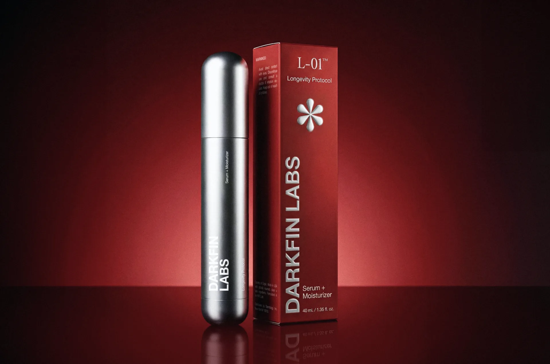
…help the skin restore and maintain its most stable state of equilibrium on its own. By carefully addressing key mechanisms of the skin—such as the balance of oil and moisture, the cycle…
project
…development: The identity combines industrial-inspired packaging, restrained typography and a carefully balanced color palette to create a distinctive visual language. Photography extends this…
article
…that the ecosystem became self-sustaining. Before that threshold, a Mexican designer's career path often still ran through New York or Madrid. You left to get serious. After the threshold…

article
…is both Figma's achievement and its challenge. Because Figma is, in fact, a brand. A carefully constructed one. And its visual identity offers a case study in how to build recognition…
project
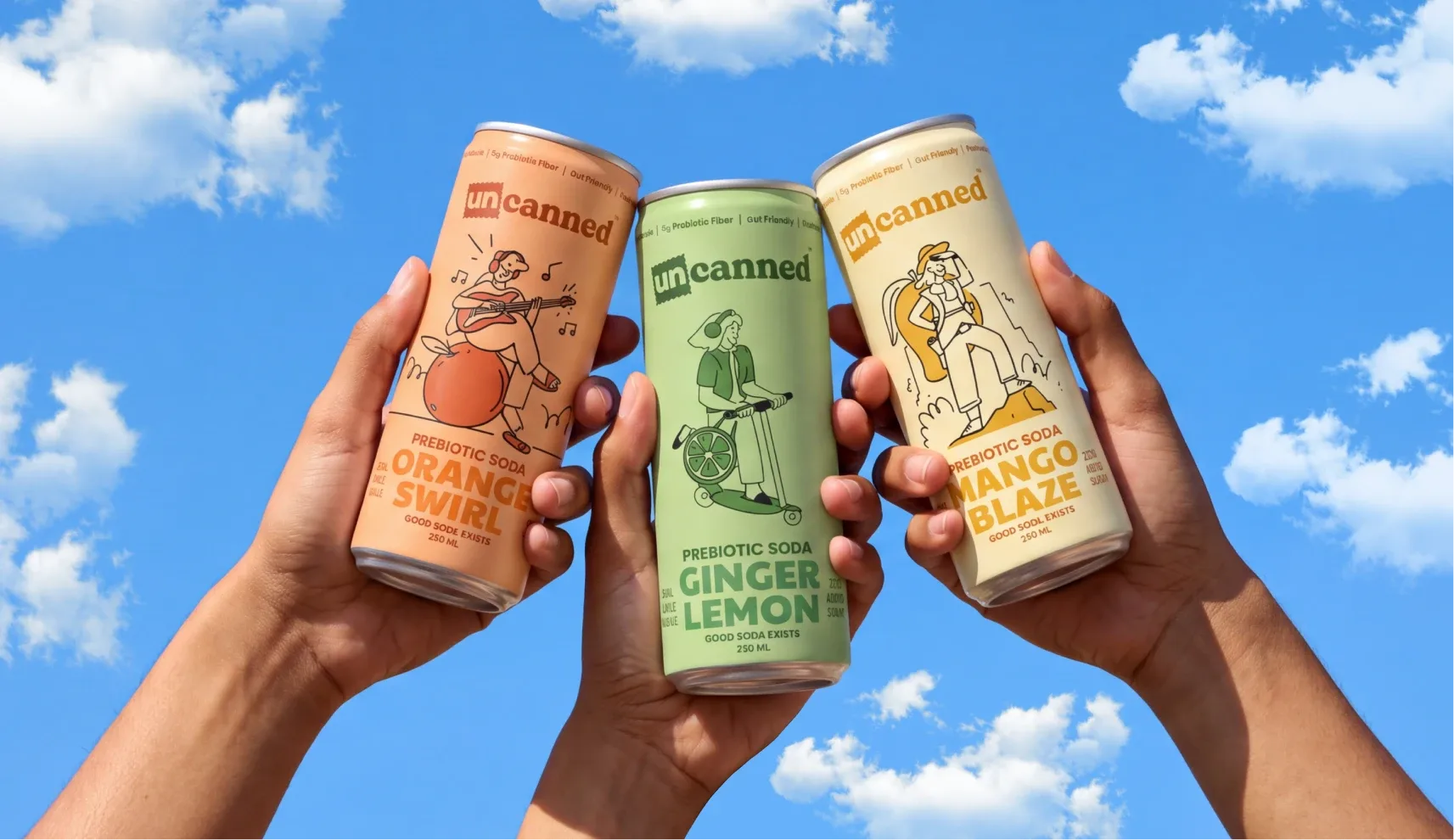
…Indian prebiotic soda brand built for a Gen Z audience with no interest in being sold too carefully. Confetti named the brand, built its complete identity, and designed packaging and merchandise…
project
…worse, a governance concern) for enterprise IT. Notion's recent design moves suggest careful recalibration. Enterprise marketing is noticeably more restrained. Illustrations persist…

article
…unheard of in grocery. The typography is irregular in ways that feel intentional rather than careless. The brand's visual system extends to its advertising, which favours lo-fi production…
project
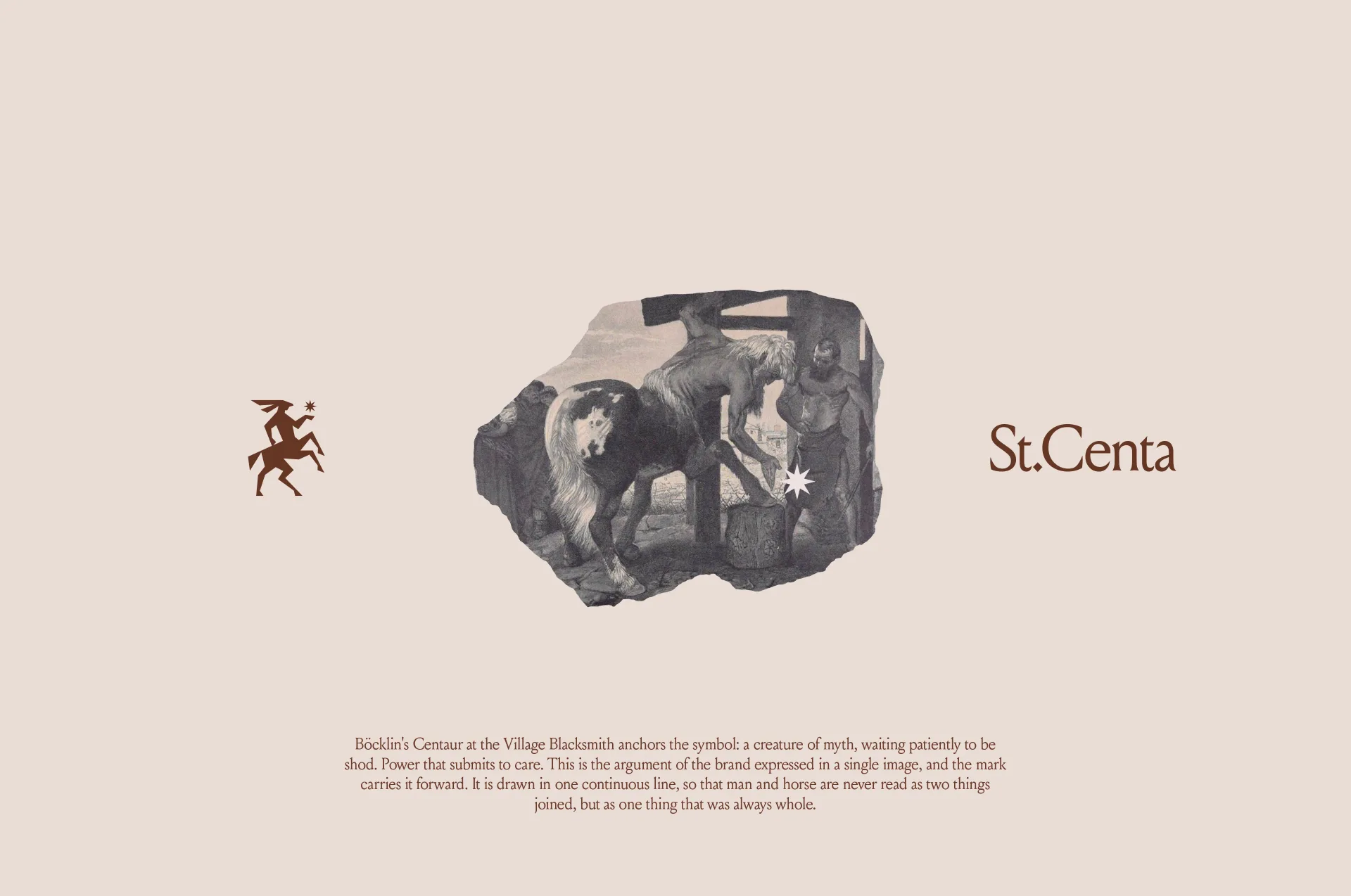
Saint Centa Saint Centa was founded for the side of horse care that most private stables never reach. It is a centre where thoroughbreds are looked after…
project
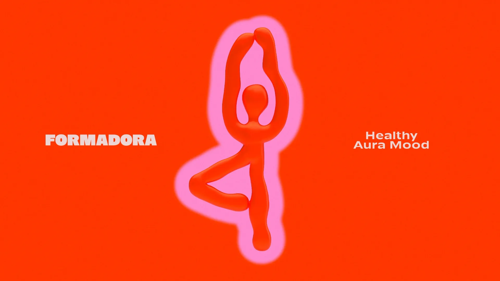
FORMADORA is a modern family-oriented wellness studio designed to transform self-care into a joyful, sustainable habit. The brand is built around a simple yet powerful formula…
project
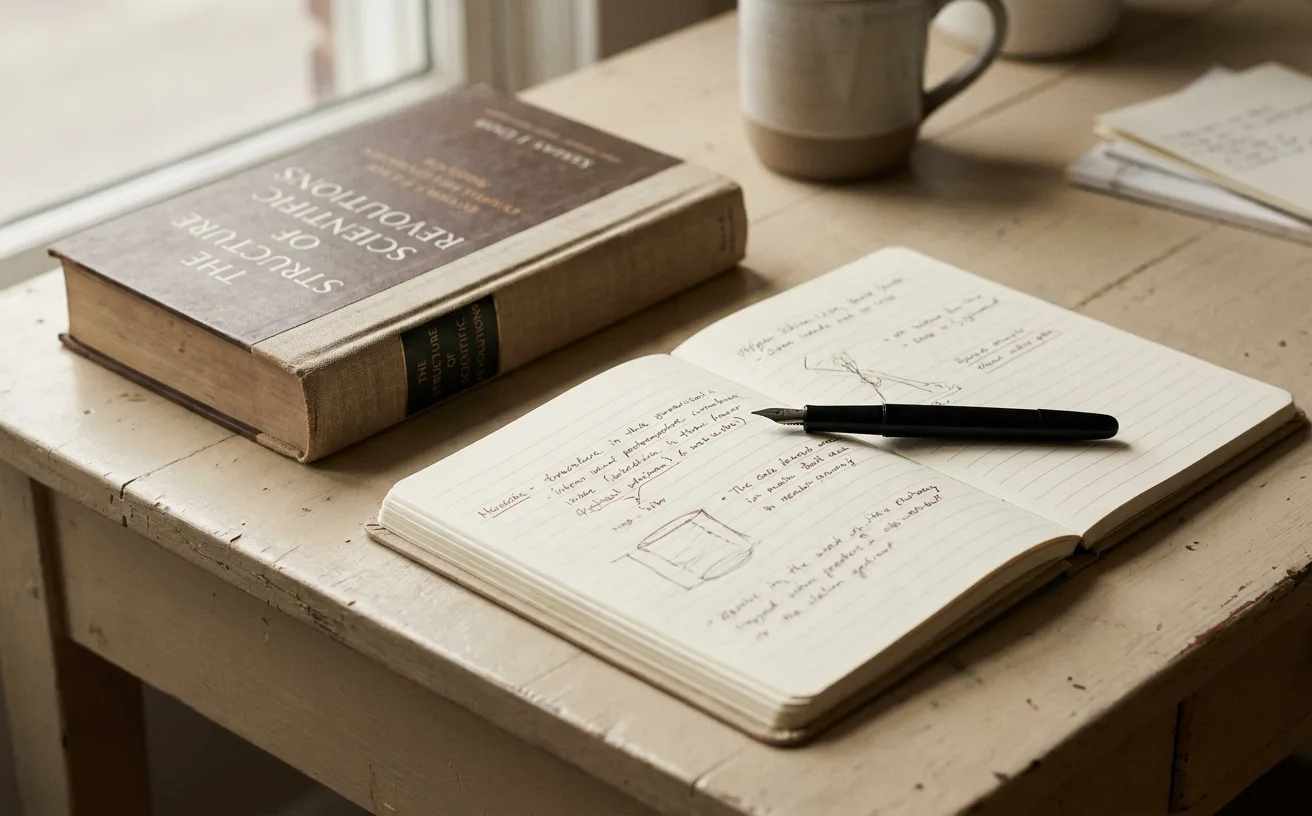
…you should come with us, Anthropic's identity quietly says we are reading the papers carefully and we would like you to read them too. Why It Works The bet works because the audience…
article
…difference in the first three seconds. WeLoveDaily is a design publication for people who care about how things look, work, and feel. Sources and data notes DIA's motion identity for…
project
…restraint. The deliberate pace. The feeling that every decision was made by someone who cared more about craft than quarterly earnings. That tension is now visible if you know where…
ranking
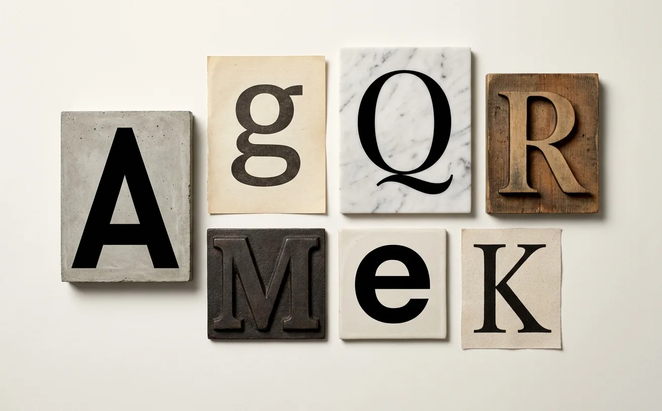
…designed for screens from the first stroke. Its tall x-height, generous spacing, and carefully tuned apertures made it legible at the small sizes where most UI text actually lives.…
article
…hospitality competed on frequency. Stay ten nights, get one free. That model assumes the customer cares about transactions. The most valuable customers in 2026 do not. They care about identity…
article
…the "D" is wider than standard, the "R" has an elongated leg, the overall rhythm is carefully calibrated to feel timeless without being historicist. The typeface doesn't reference…

project
…studio's provocative tradition. Others feel more conventional, more market-tested, more careful. Whether this represents a natural maturation or a gradual loss of nerve is a question…
project
…draws it with legibility. The monogram scarf is recognizable only to people who already care about fashion at a specific level. It does not broadcast. It whispers. This creates a two…
project
…gradients so precise they appear to have been mixed by a colourist, typography set with the care of a fine-press book, and illustrations that belong in a design annual rather than on a…

article
…and numbering systems. Typography ties it together. Station signage in Tokyo uses a carefully controlled typographic hierarchy. Japanese text, typically in a clean Gothic typeface…
article
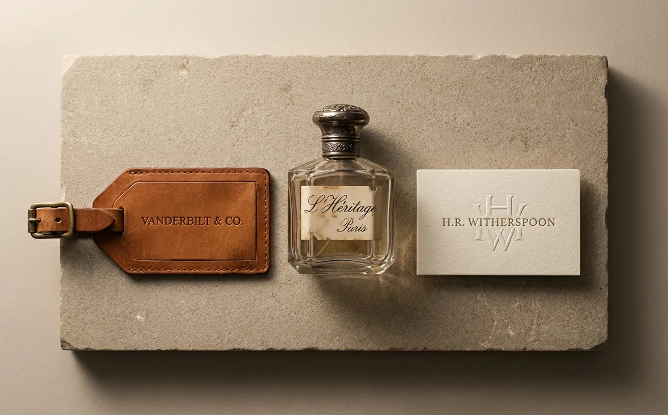
…work a non-person name has to do to survive. The default path, your surname or a place you care about, is doing that work for free. Sources and data notes The 1995 to 2015 window for…