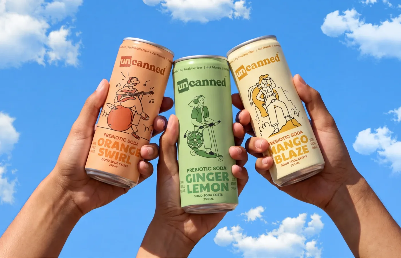
Uncanned is an Indian prebiotic soda brand built for a Gen Z audience with no interest in being sold too carefully. Confetti named the brand, built its complete identity, and designed packaging and merchandise across the range. The name plays on everything a can usually isn't allowed to be, unconventional, unbothered, unfiltered, anchored by a Creator archetype and a postcard-stamp logo mark. Packaging uses a character-led illustration system, with over fifty concepts explored before landing on flavour-specific figures, a girl on an orange playing music, a girl on a motorbike for ginger lemon, a girl hiking for mango glaze, all in a muted palette of warm beige, burnt orange, dusty teal, and olive grey. The identity extends into t-shirts, totes, caps, stickers, and more, building a brand world rather than just a drink.
Project
Uncanned
Disciplines
Branding & Packaging
Project Description
Prebiotic soda already made its case abroad, brands like OLIPOP and Poppi turned "good for your gut" into something people actually want to be seen holding. India hadn't seen its own version of that, something made for the audience that likes to be unapologetically bold. Confetti named Uncanned, built its complete identity, and designed packaging and merchandise across the brand.
Contributors
Creative Director & Brand Strategist – Himal Hazra
Packaging Design – Himal Hazra
Case Study and Presentation – Aniket Singh & Nimisha Modi
Motion Graphic Designer – Sumit Kumar
Project Manager - Sakshi Gandhi
The Challenges
Drinks built for Gen Z tend to either lecture about wellness or perform "fun" so hard it reads as trying too hard. Uncanned's audience can spot both instantly. The brief was to build a community before a product, unbothered, a little rebellious, and confident enough not to explain the joke. Unfazed, unfiltered, unwavering, whatever mood the day brought, the brand needed to move with it rather than around it. That's what made it unapologetically, consistently itself.
The Name and the Idea
Confetti named the brand Uncanned, built on everything a can usually isn't allowed to be. Unconventional. Unbothered. Unfiltered. Unfazed. The brand was built around the Creator archetype, someone who makes their own rules rather than borrowing everyone else's.
The Logo
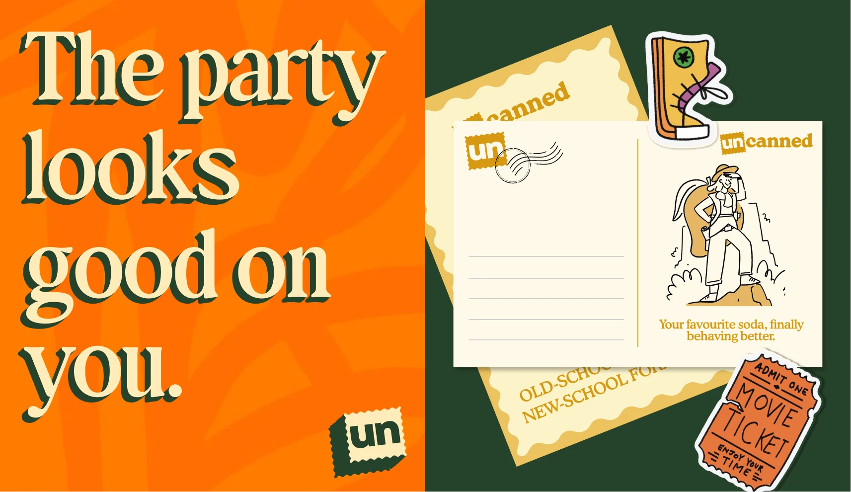
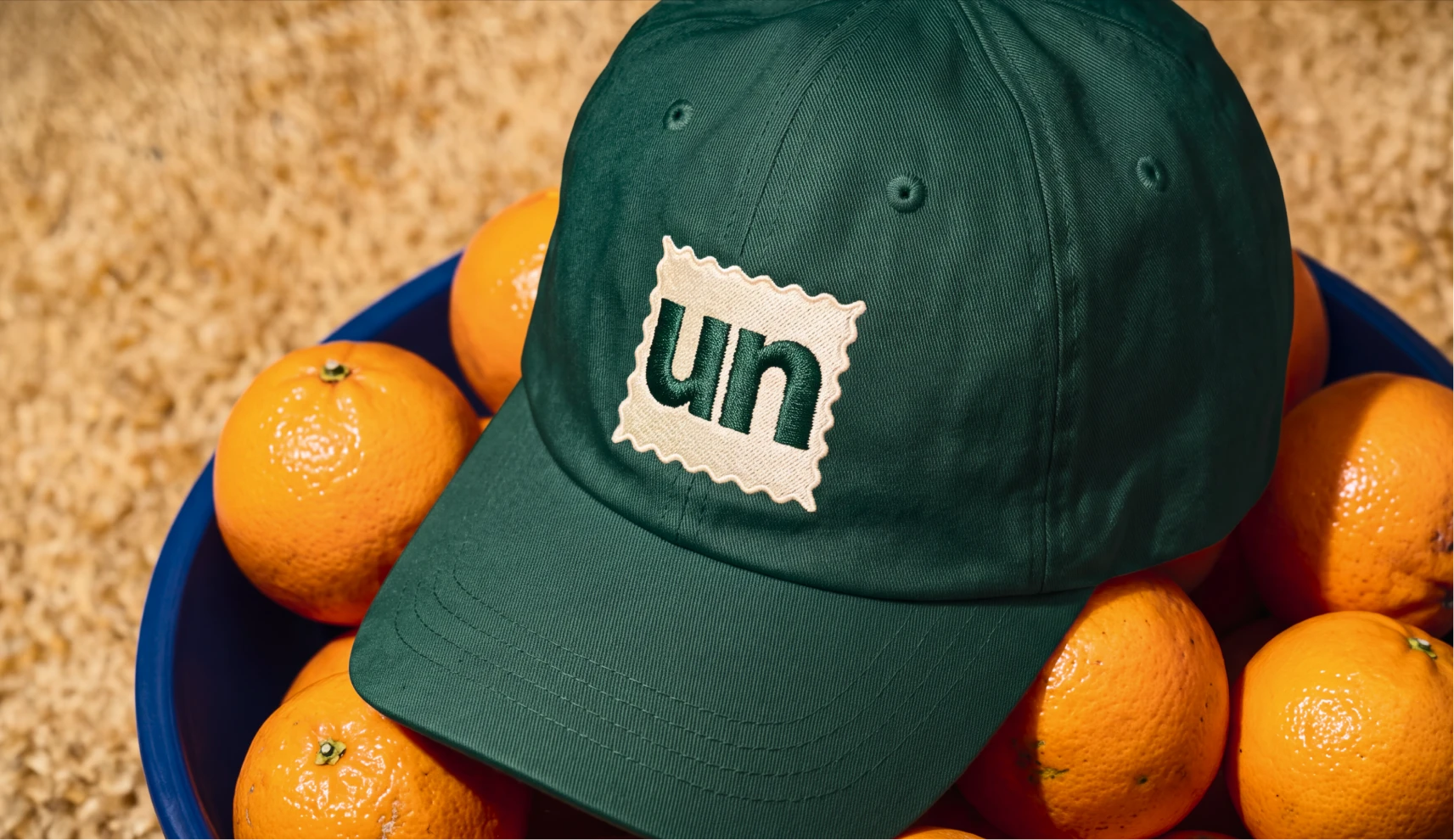
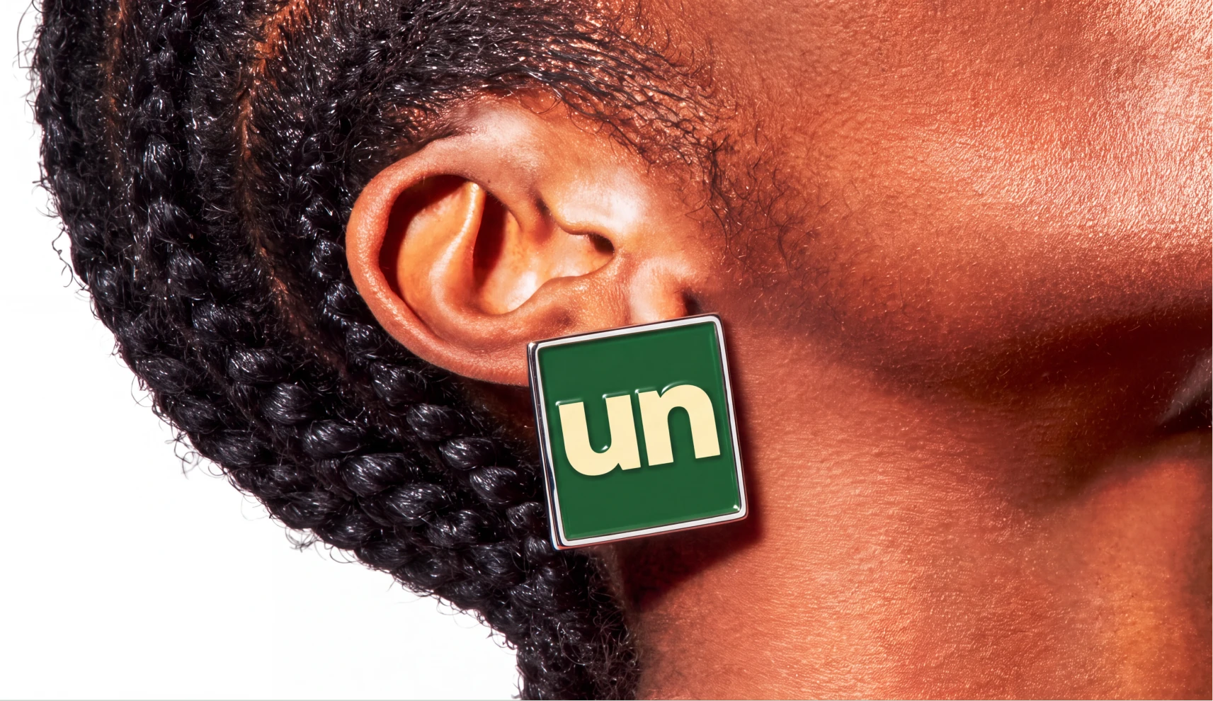
The wordmark went through dozens of concepts before landing on its final form, the word Uncanned with "UN" framed inside a postcard stamp mark, a small nod to something sent out into the world rather than sealed shut.
The Visual Identity
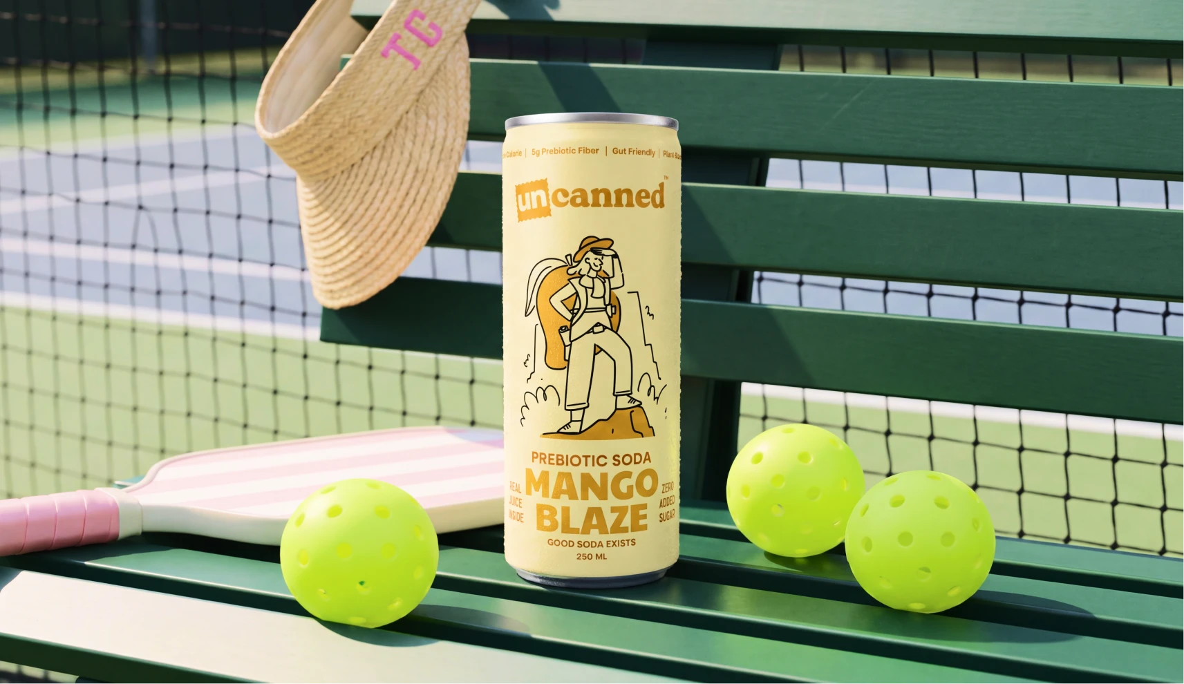
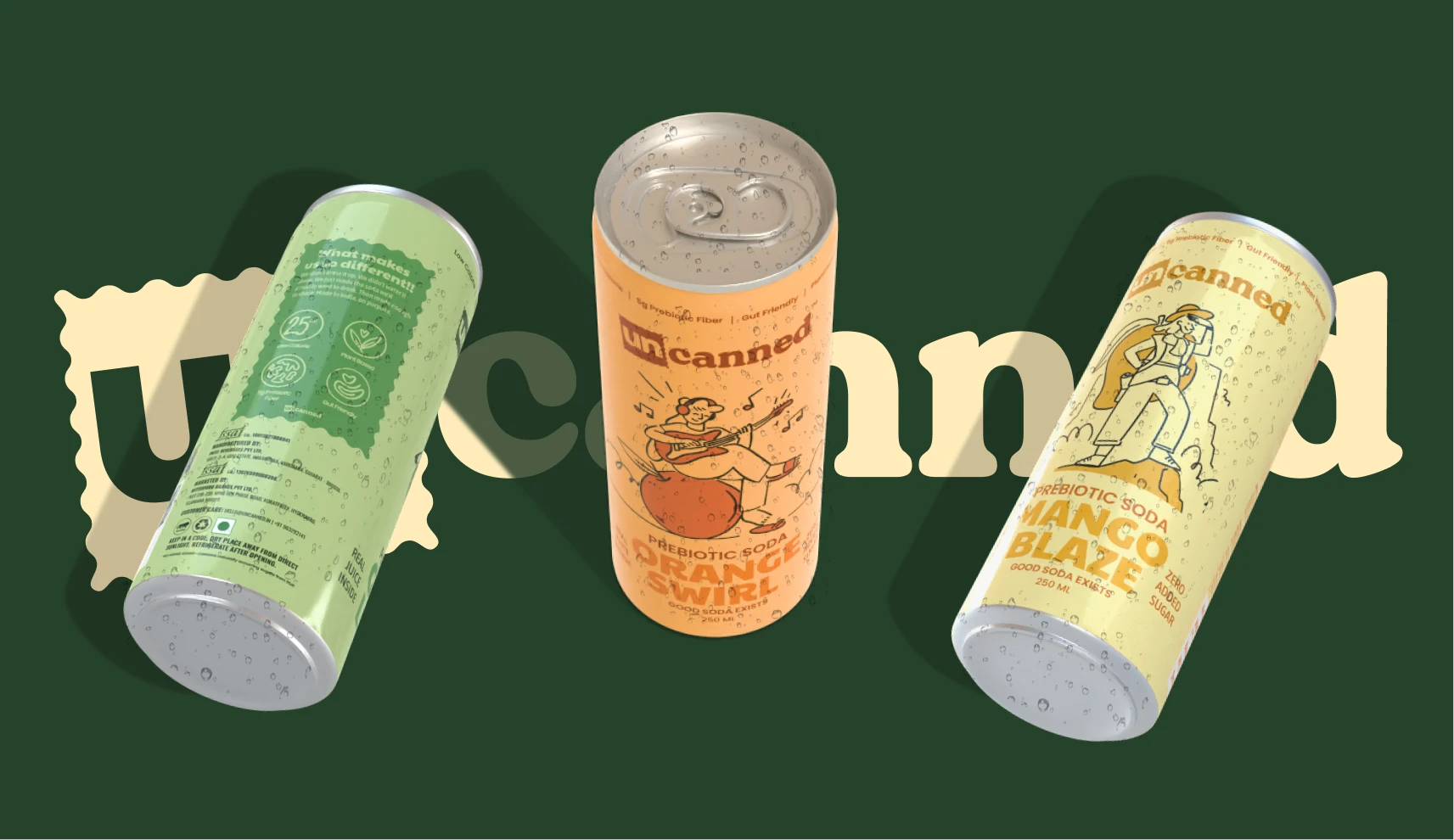
The palette skips the bright, saturated colours most Gen Z drink brands default to, choosing warm beige, burnt orange, dusty teal, and olive grey instead. Muted and confident rather than loud and desperate to be noticed.
The Packaging
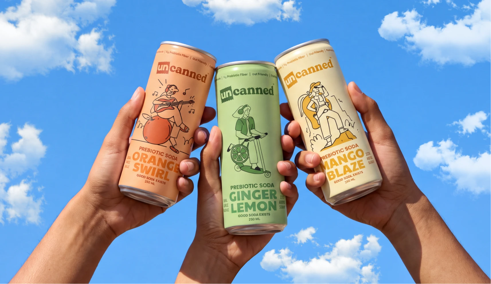
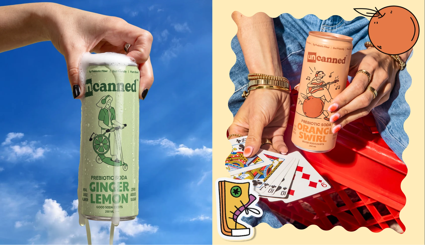
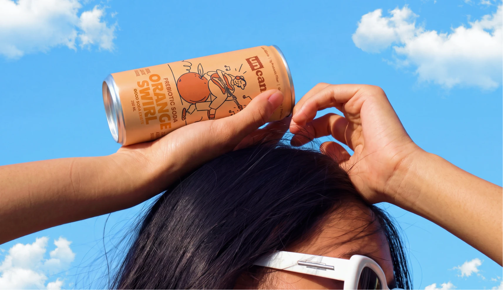
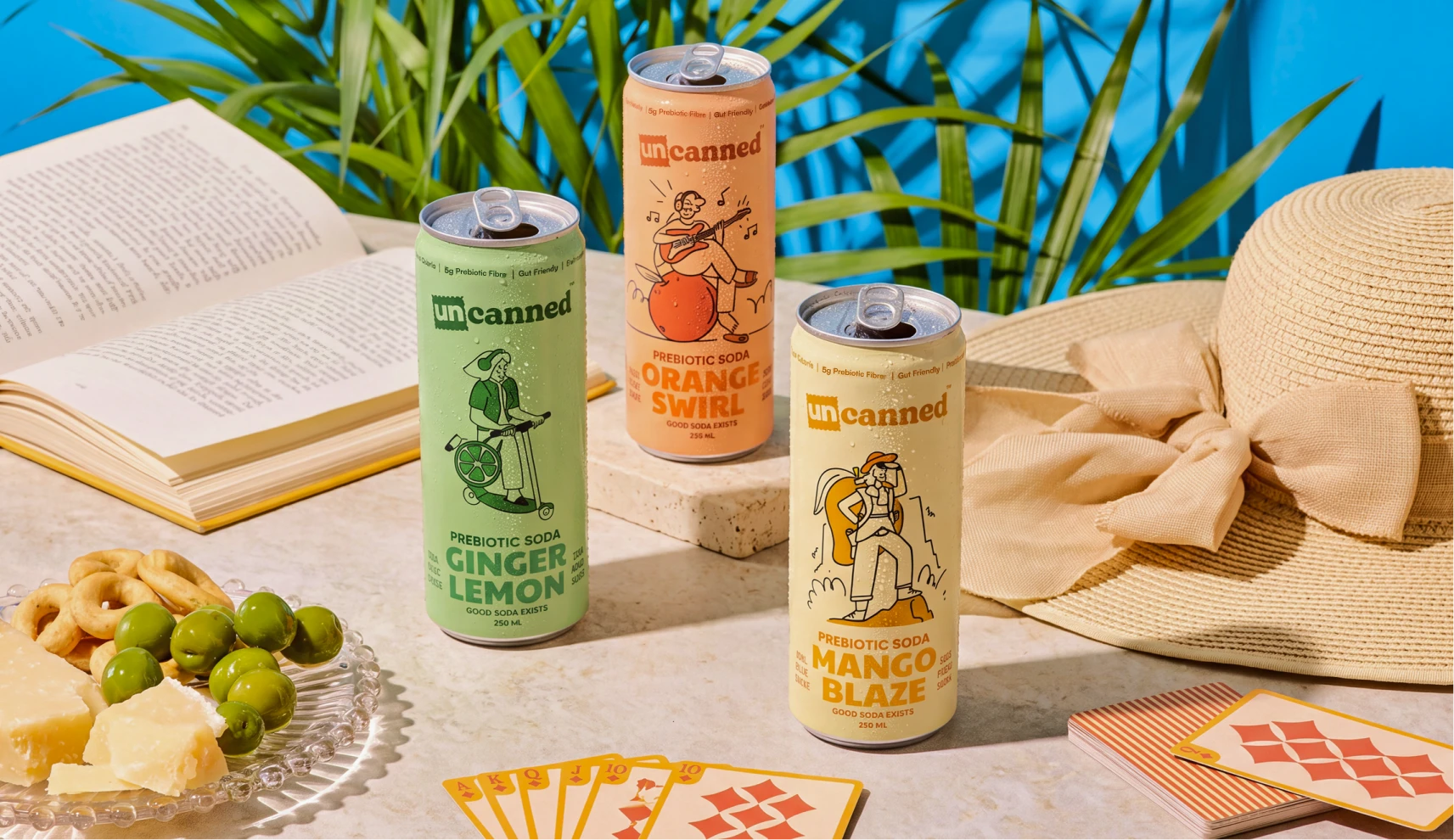
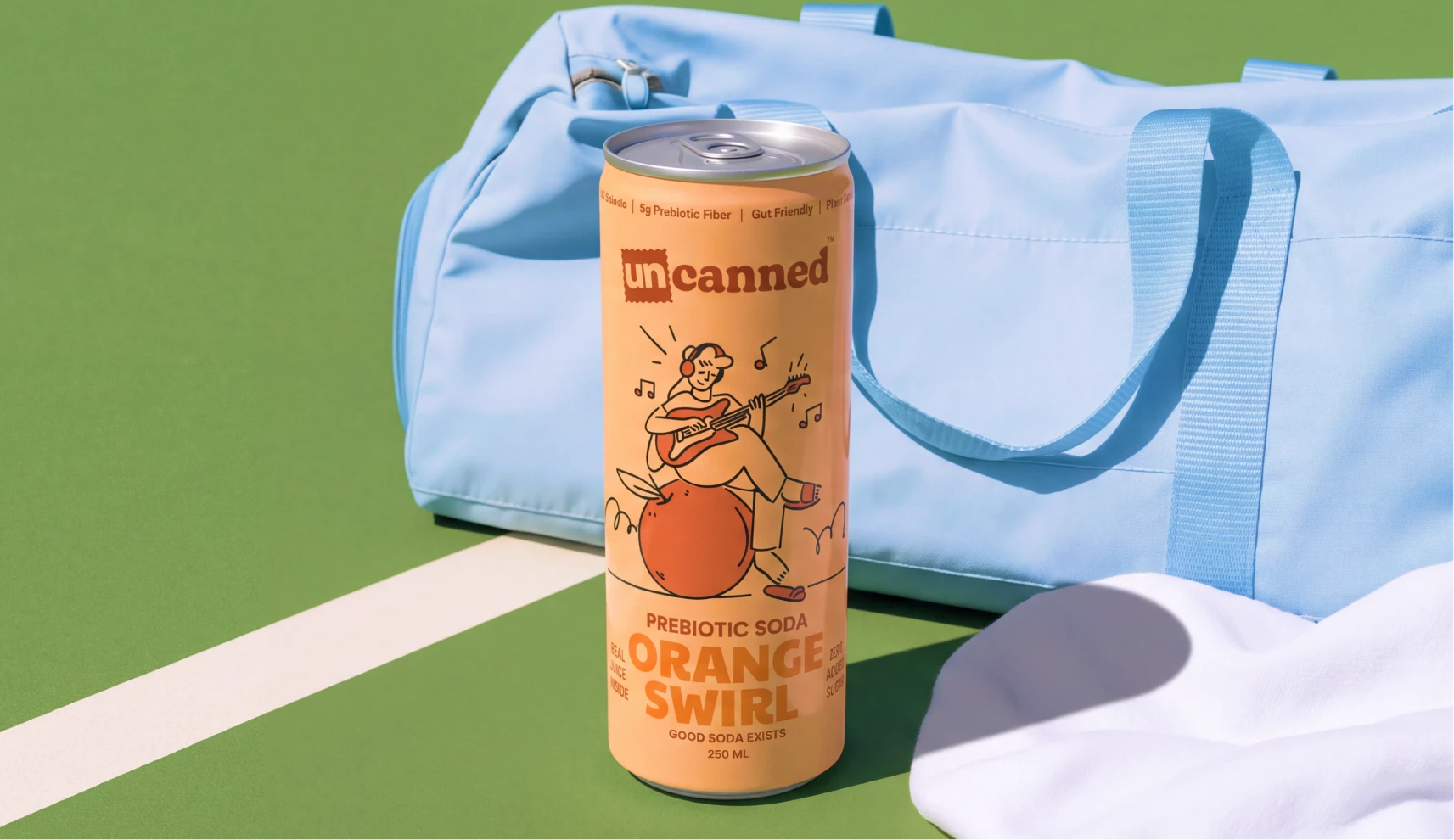
More than fifty concepts explored before landing on a character-led illustration system. A girl sitting on a giant orange, playing music, for the orange can. A girl riding a motorbike with a lemon-shaped bag, for the green ginger lemon can. A girl hiking a mountain with a mango-shaped backpack, for the pastel yellow mango glaze can. Every illustration carries the idea of people who move through the world exactly as they are.
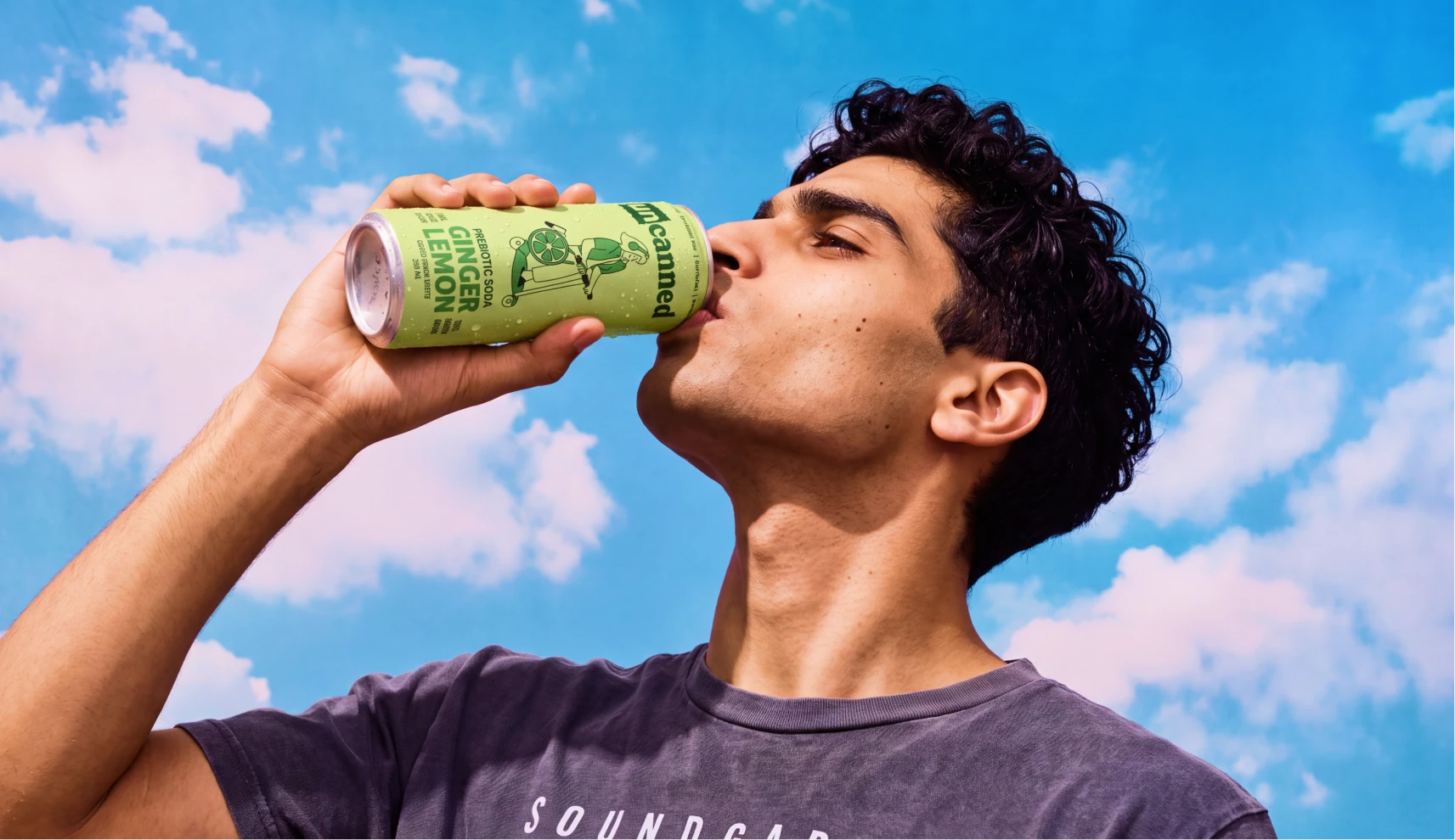
Building the Wider World
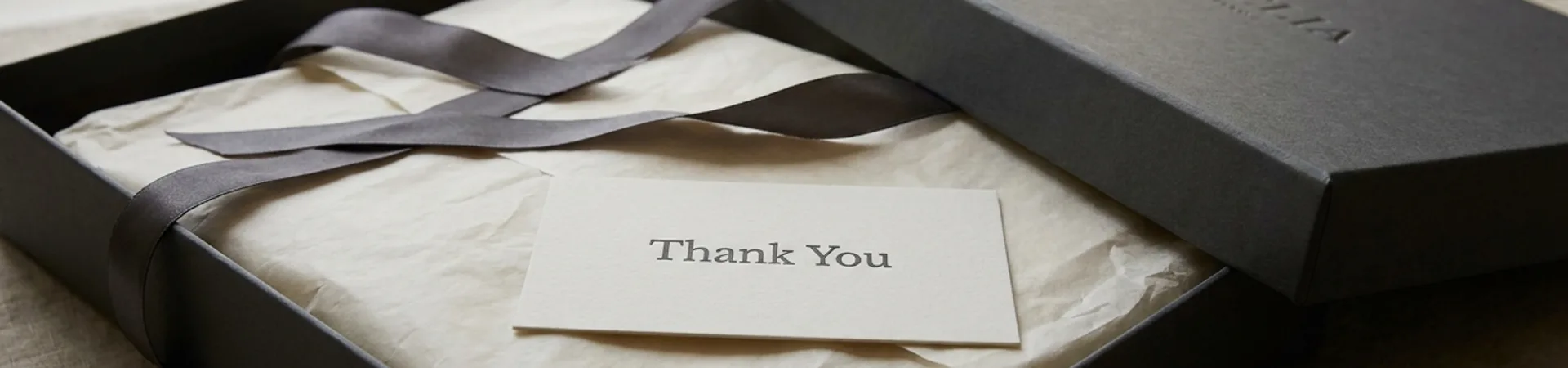
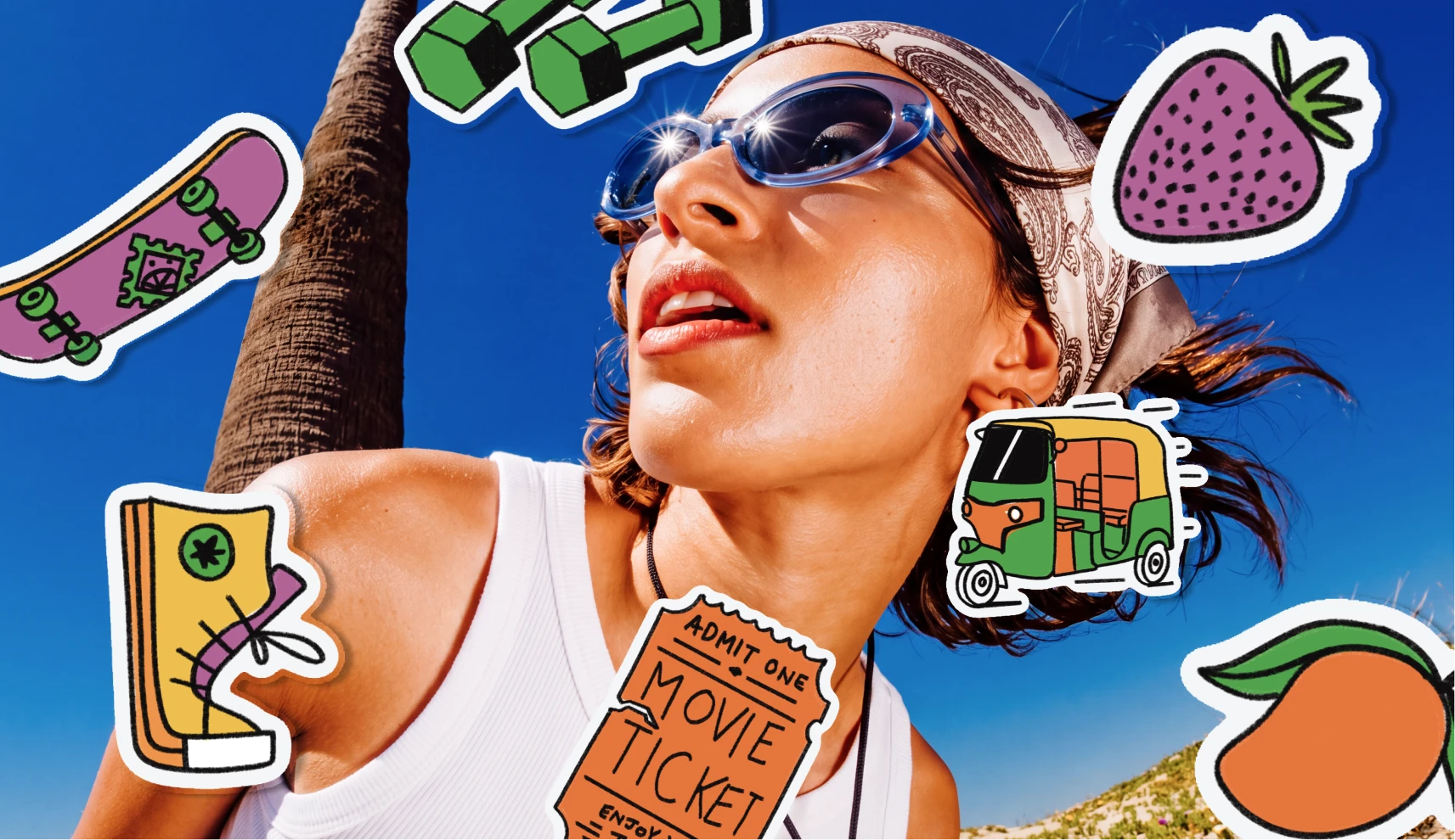
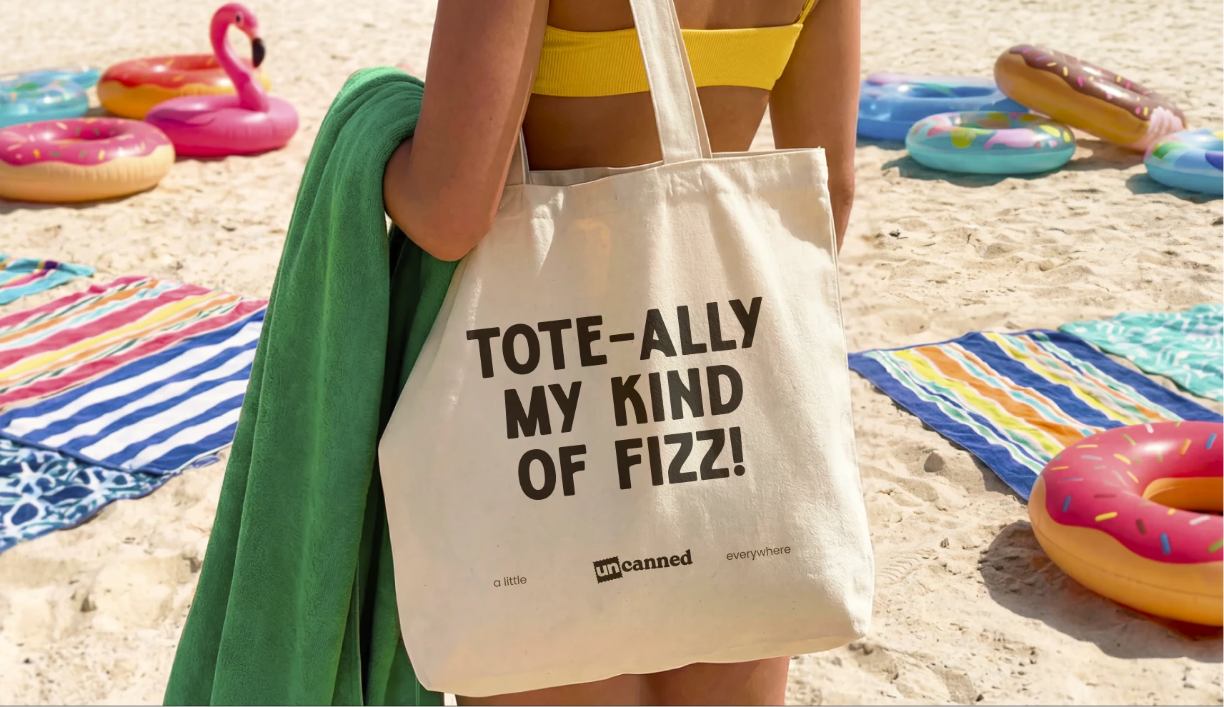
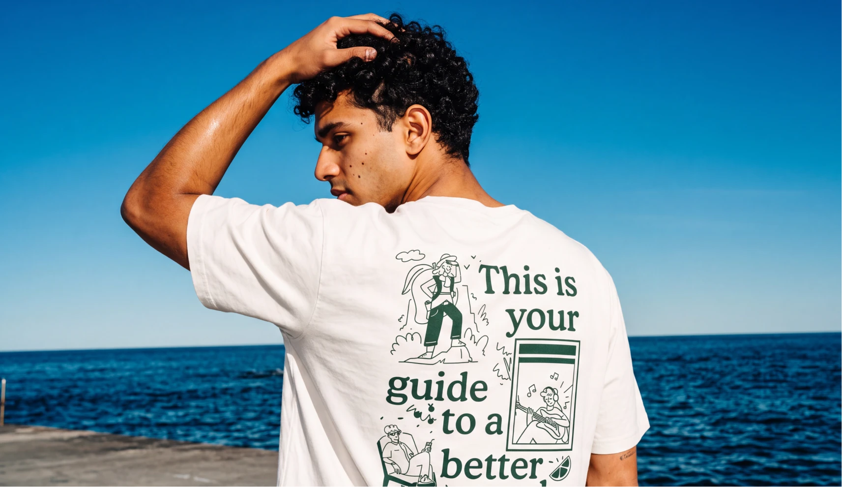
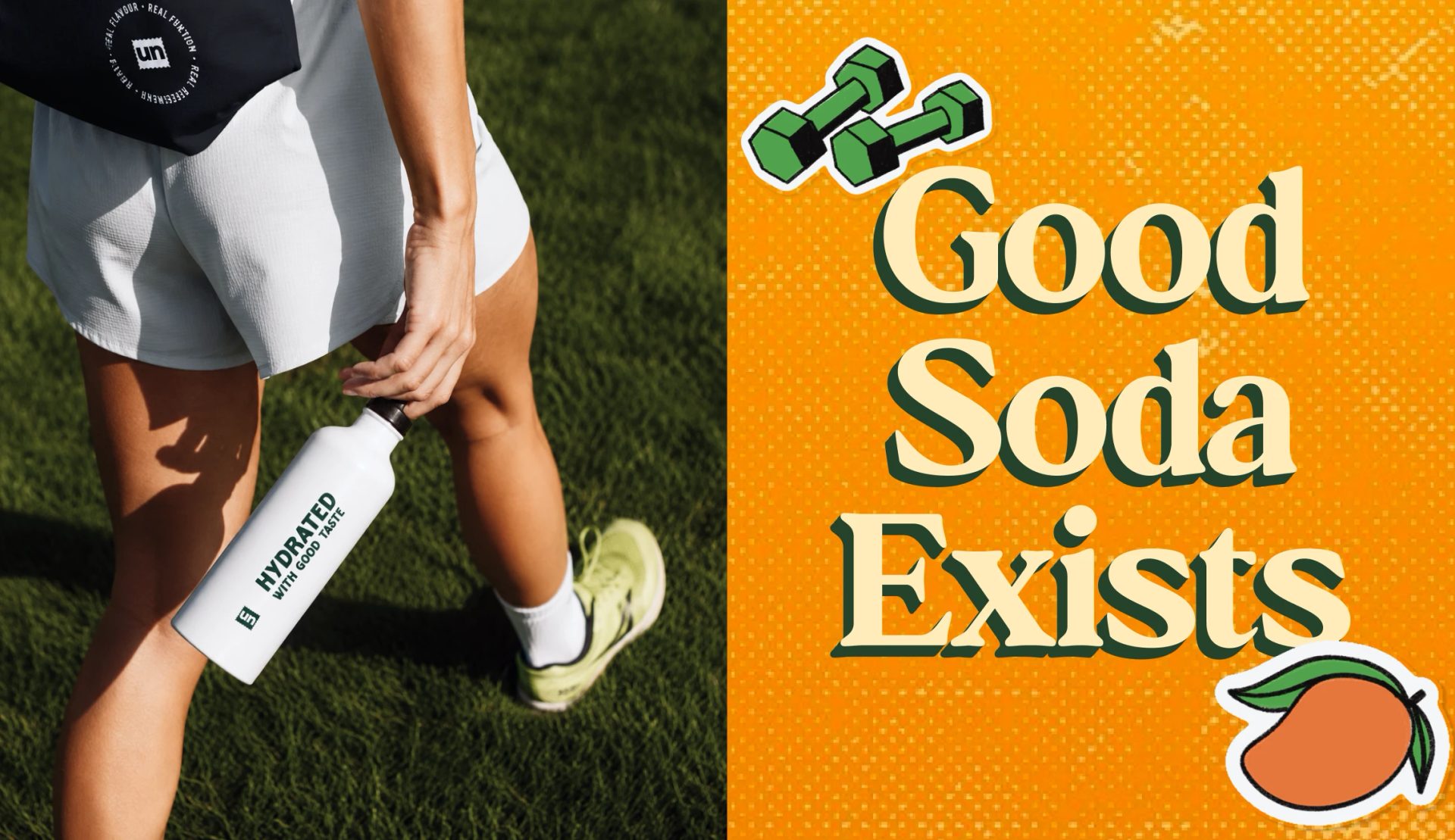
The identity extended into t-shirts, tote bags, caps, a wide range of quirky, colourful stickers, thank you notes, and bottles, giving Uncanned's audience things they'd actually want to wear and carry, not just drink.
The Outcome
Uncanned launched into India's soda category with an identity that never asks its audience to explain themselves, and it turned out to be exactly the brand the category needed. A name that carries the attitude, packaging that reads as characters rather than flavours, and a wider brand world that gives its community something to hold onto beyond the can itself.