project
We use cookies to measure site traffic and improve WeLoveDaily. Nothing loads until you choose. Cookie Policy.
Work, articles, studios and categories across the archive.
project
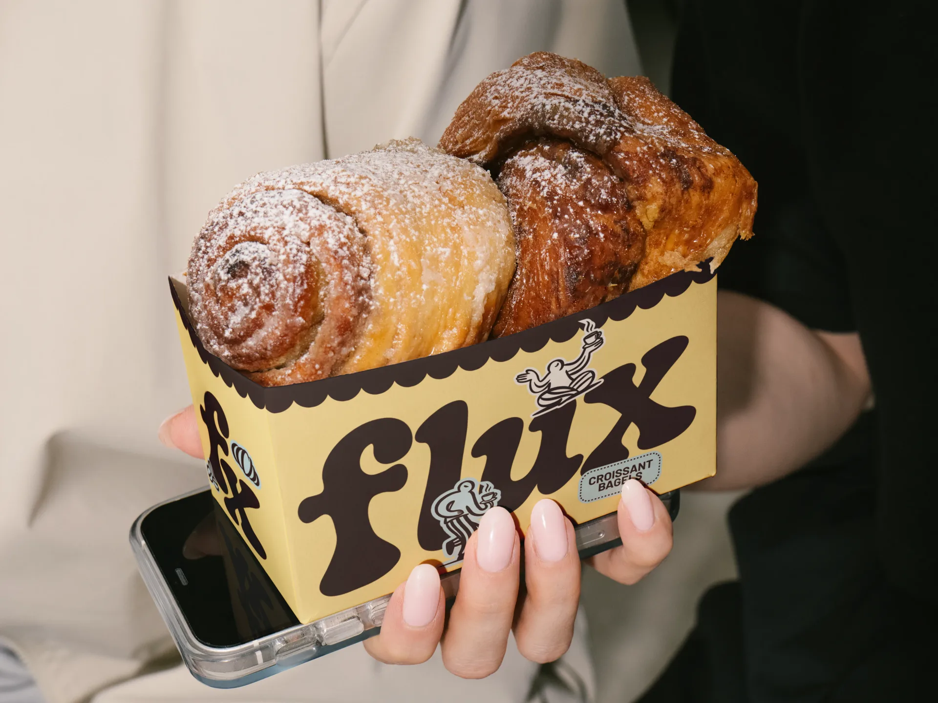
…touch with a homey, approachable atmosphere. The colors, typography, and illustrations are designed to feel nostalgic yet fresh, bringing the comfort of a familiar café in a playful, modern…

project
In July 2014, Airbnb unveiled a new brand identity developed with London studio DesignStudio. The centerpiece was the Bélo: a looped symbol meant to evoke people, places, love,…
project
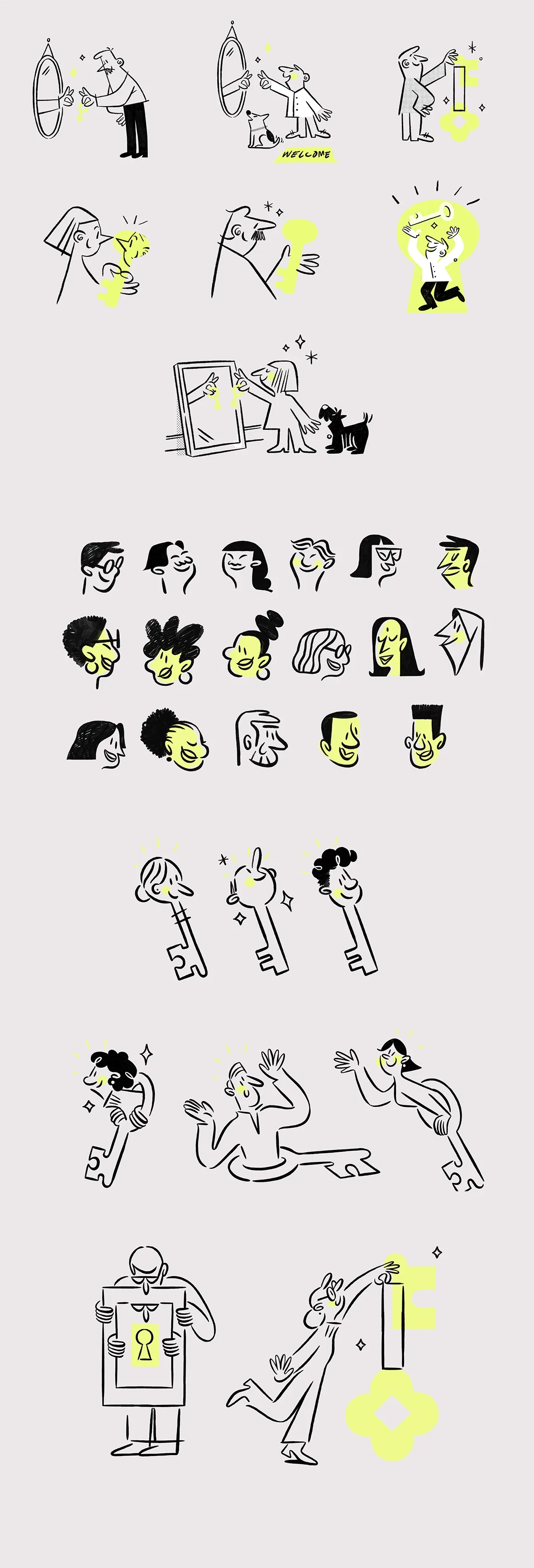
…the right place for what comes next. A collection of illustrations and animated moments designed to bring that sense of guidance, movement, and human connection to life. Initial explorations…
project
…broader visual language, and one derivative of that was a small cast of grandparent-like characters – a way to represent the foundation's actual work more explicitly, and to create emotional…

project
…a straightforward ed-tech product has become something rarer and more interesting: a character so vivid that it has effectively replaced traditional brand architecture. Duolingo doesn…

project
…another analytics platform or AI-first solution. Instead, it operates as a system architect, designin the conditions under which fragmented data evolves into decision-ready intelligence.…
article
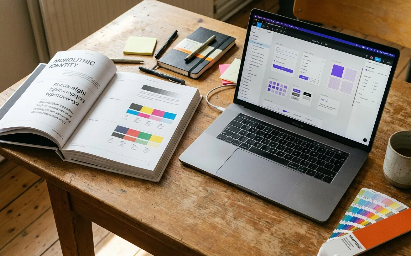
…be produced consistently in every future context by people who were not in the original design project. The deliverables of a brand system are different: A component library (usually…
project
…promise of futurity. OpenAI's visual system leans on the black-and-white minimalism of a design-forward consumer brand, with the orb-like mark doing the imaginative work. Google DeepMind…
article
…of the year, built to become the D&AD-of-brand-identity. The scoring rubric is public: design craft, strategic fit, cultural relevance, originality, system integrity (10 points each…
project
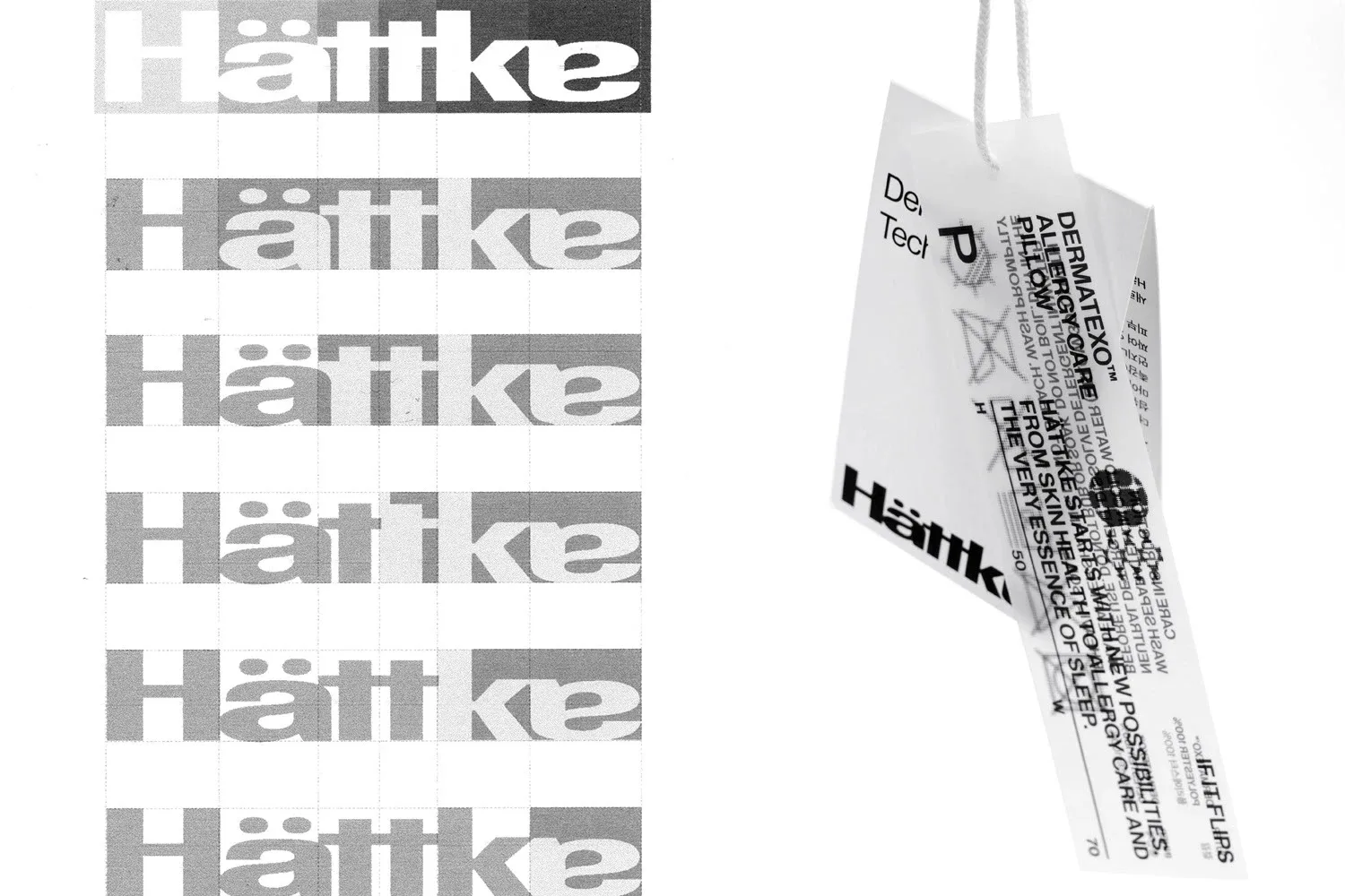
…wordmark is a delicate serif with umlauted "ä" preserved: typographically risky (special characters often get dropped in retail) but signals seriousness about the heritage claim. Packaging…

article
…Stripe Indigo, #635BFF) that has done more to define the visual language of fintech than any design manifesto, conference talk, or brand agency portfolio piece. It's the color of Stripe's…
project
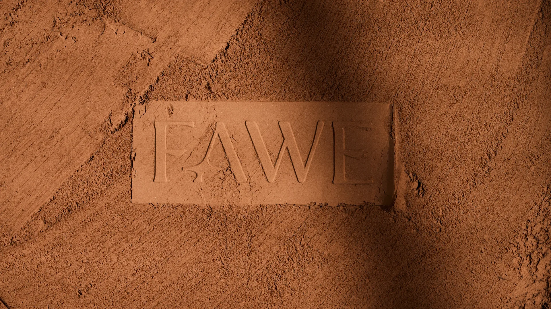
…authenticity over pretence. We developed a visual identity that balances delicacy and character: elegant typography, a versatile palette and a visual system able to adapt to every format…
guide
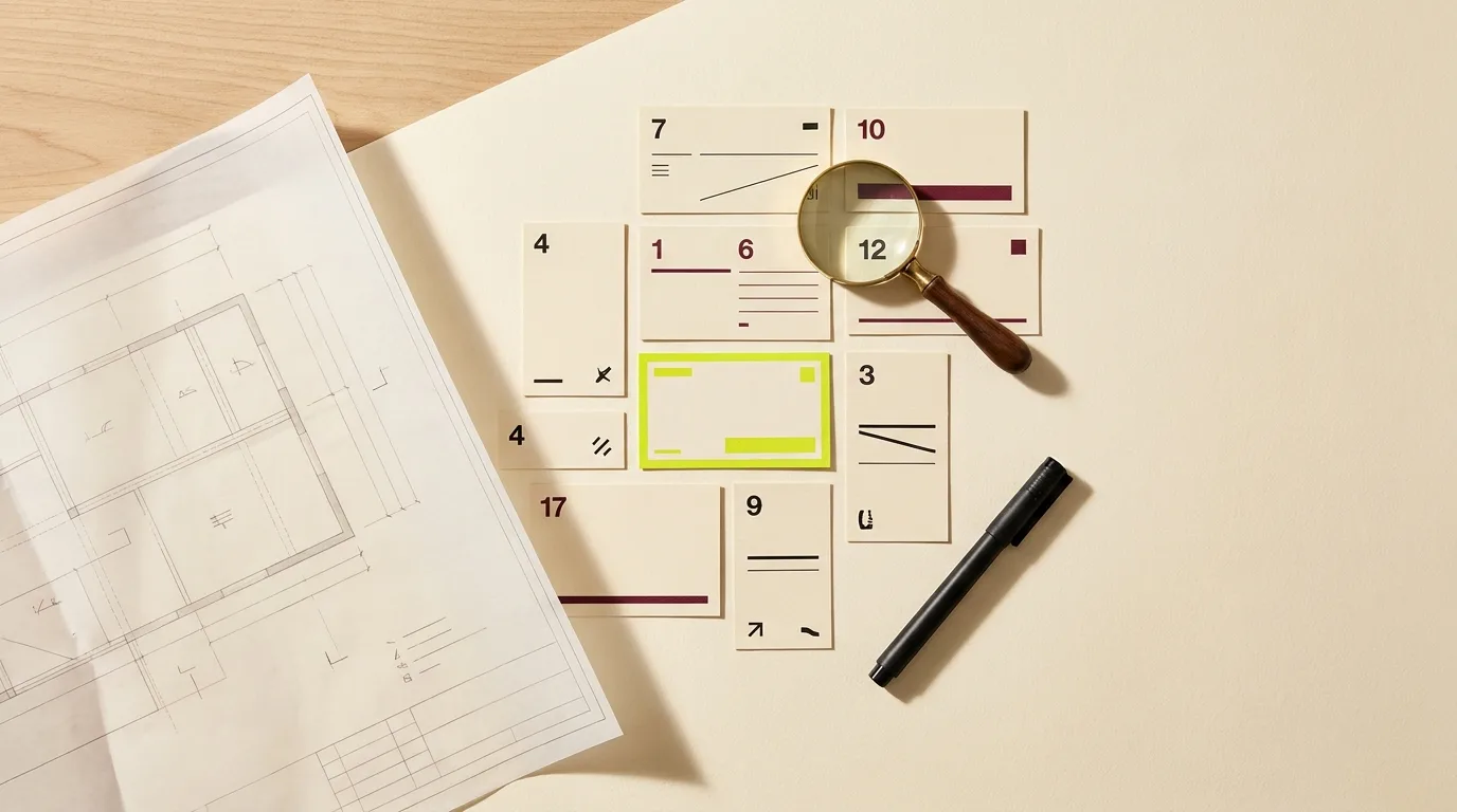
…is a PDF of guidelines. A brand system is an operating capability: component libraries, design tokens, governance rules, extension pathways. If you're buying a system but the agency…
article
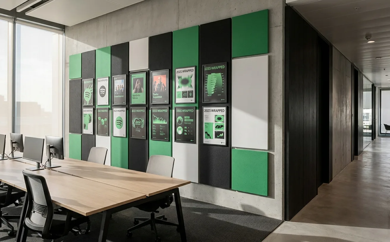
…visual identity: an artist's artwork, a playlist's mood photography, a podcast's cover design. The brand has to be present without competing, recognizable without overpowering, systematic…
article
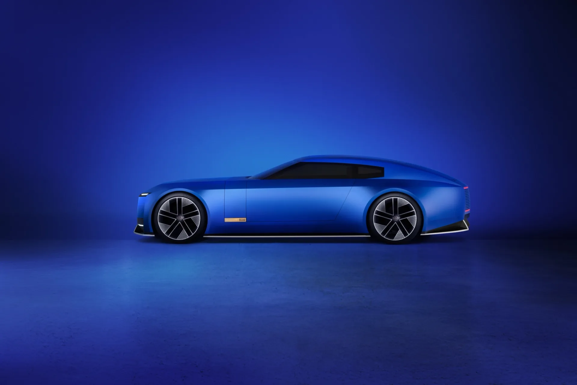
…discontinued. The brand risked a 12-month valley and has, so far, paid that price. The design system itself (the geometric monogram, the Jaguar Sans typeface, the pink-chrome accents…
article
…Study: Burberry's Typographic Return In 2018, Burberry unveiled a new visual identity designed by Peter Saville, replacing the brand's iconic Equestrian Knight crest and serif logotype…
project
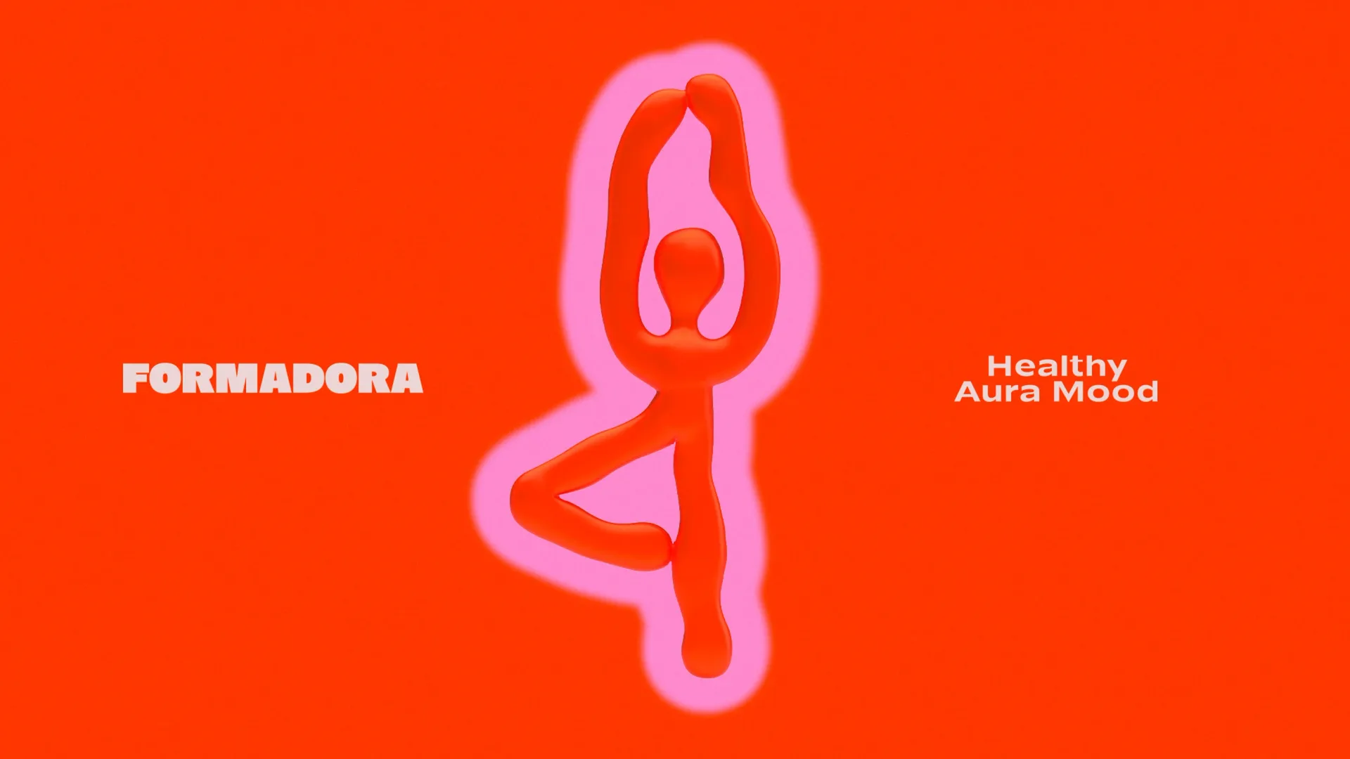
FORMADORA is a modern family-oriented wellness studio designed to transform self-care into a joyful, sustainable habit. The brand is built around a simple…
project
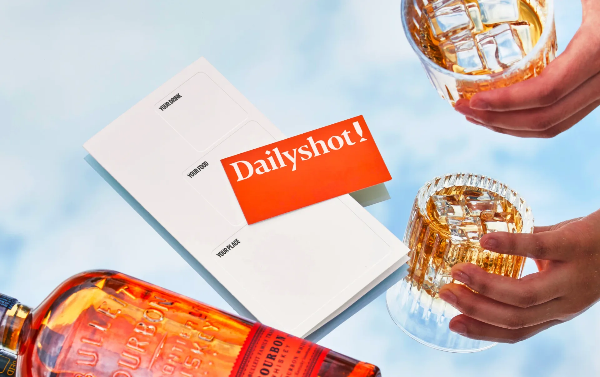
…Recognizing the need for a fresh approach, we focused on highlighting the individuality and characteristics of each product. Rather than just presenting static images, we created immersive experiences…