project
Work, articles, studios and categories across the archive.
project
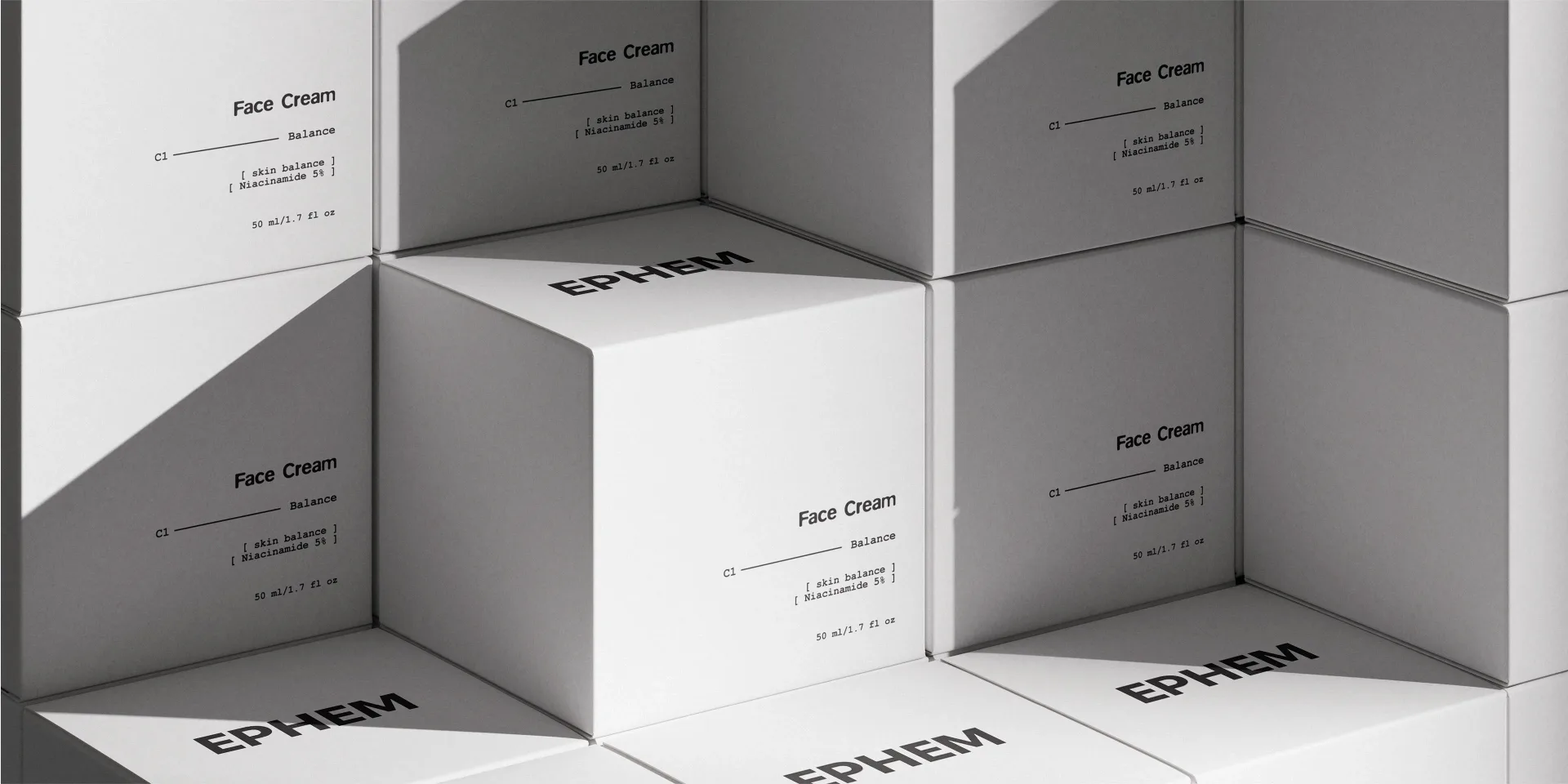
…to essential, effective steps. The visual system is based on strict typography, neutral color logic, and modular structure. Design decisions avoid decoration and focus on clarity, balance…

article
…sounds expansive and strategic. It implies depth. In practice, it usually means a set of colors, some textures, a photography direction, and maybe a custom typeface. That's not a world…

project
…secondary seal carries the brand's history as a graphic asset rather than a dated stamp. Color palette is utilitarian: workwear white, chef-coat black, and a single warm accent that surfaces…
project
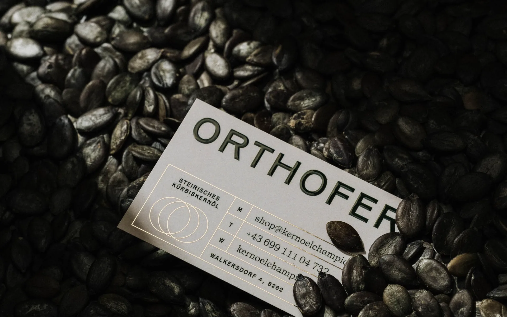
…the pumpkin's silhouette as a mark that can be scaled, cropped, and reoriented across packaging, labels, and secondary materials, a modular asset rather than a fixed lockup. The color…
ranking
…strip the ornament, keep the recognition anchor, invest the savings in a typographic or color asset that compounds. The failures in this sample share a single trait: a brand trying…

article
…studio accepts the project. Six months later, a beautiful final deliverable ships: logo, color palette, typography, photography guidelines, tone-of-voice document, the works. The client…
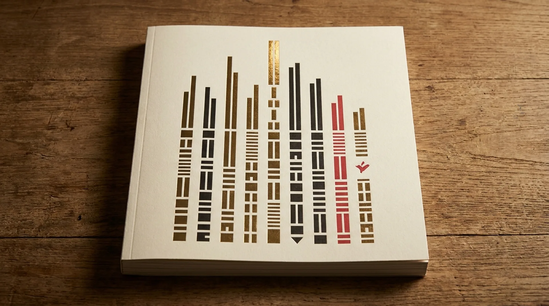
article
…methodology page; summary below: Design craft (10 pts): the quality of the typographic, color, structural, and visual-system decisions in the identity itself. Strategic fit (10 pts…
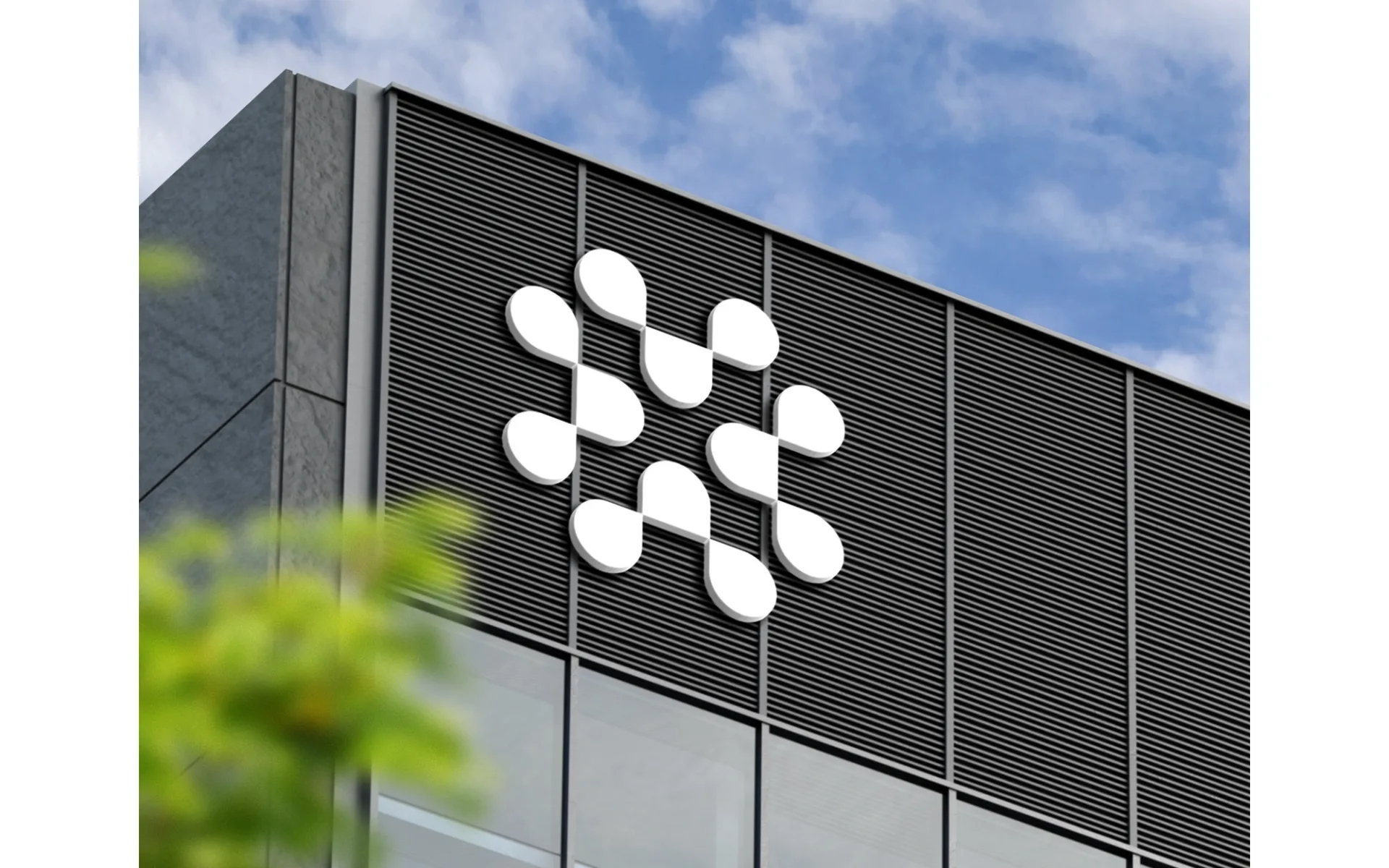
project
…unified corporate visual identity didn't exist. Companies had logos, certainly. They had packaging and signage. But the idea that every visual touchpoint of a corporation, from the letterhead…