project
We use cookies to measure site traffic and improve WeLoveDaily. Nothing loads until you choose. Cookie Policy.
Work, articles, studios and categories across the archive.
project
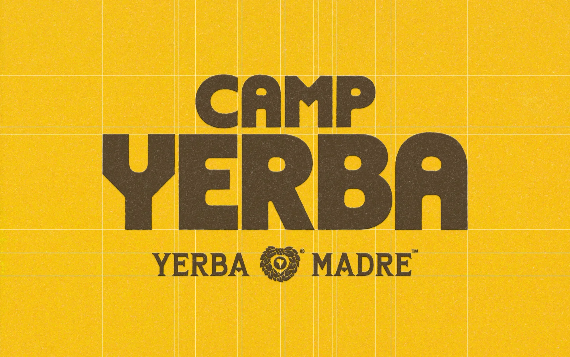
…Yerba Madre brand while standing as a world of its own. The system spans environmental graphics and banners, to House identities, merchandise, and wayfinding, bringing the spirit of…
project
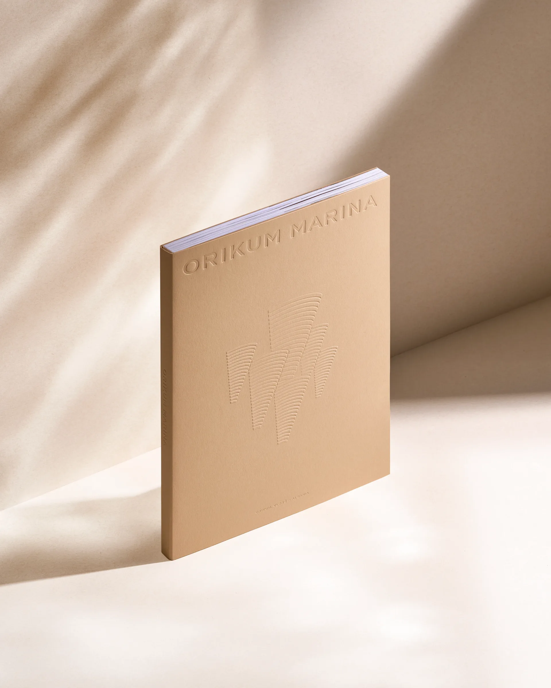
…continue the idea of the architectural concept like a coral reef. Minimal cone-shaped graphics of the book cover symbolizes the corals-like structure and linear texture of the buildings…
project
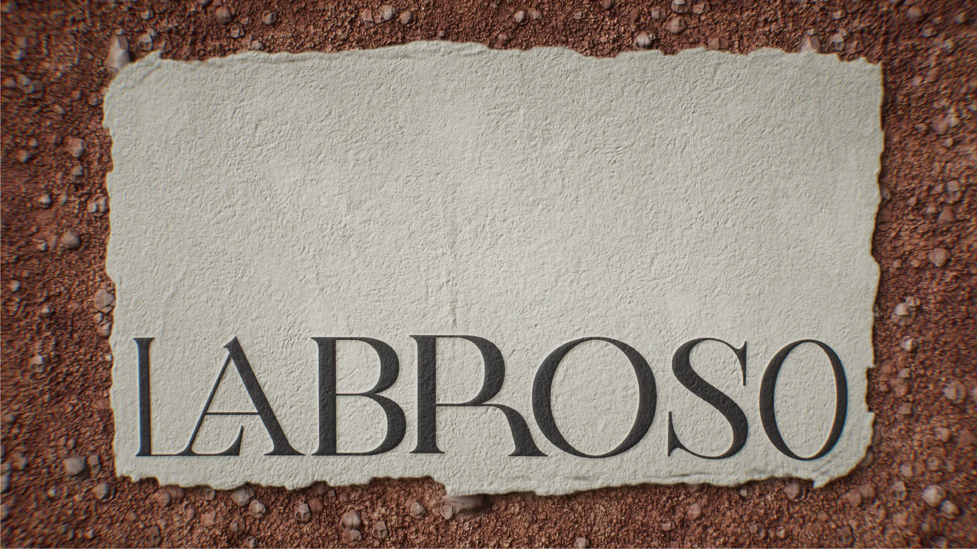
…caps, old manuscripts, battlefield flags, seals, paper textures and simple, almost raw graphic signs.
project
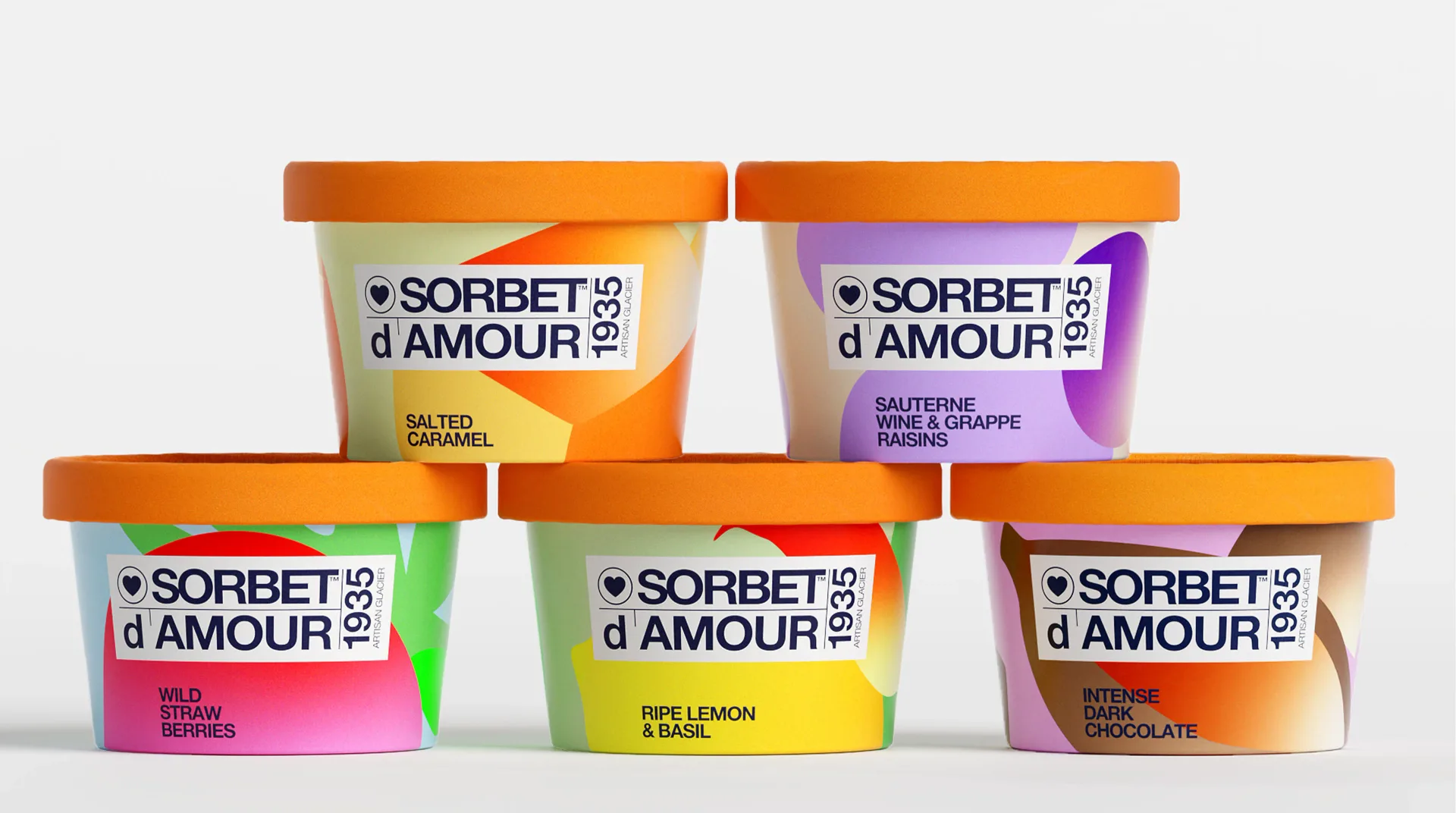
…confident, without losing the soul of what the brand has always been. We designed the graphic language for a new product line: flavor-specific color worlds built from abstract organic…

article
…your business changes. Rules adapt. The best brand systems today look more like code than graphic design - they define behaviour, not appearance. Examples Worth Studying The BBC Global…

article
…in constraint. The brand's entire visual vocabulary is derived from product - not from graphic design, not from logo work. That means every design decision in the product reinforces…
project
…rather than a logo. It is embedded in typography, in spatial design, in the way motion graphics move. The chevron stopped being a badge and became a grammar. That is a sophisticated…
project
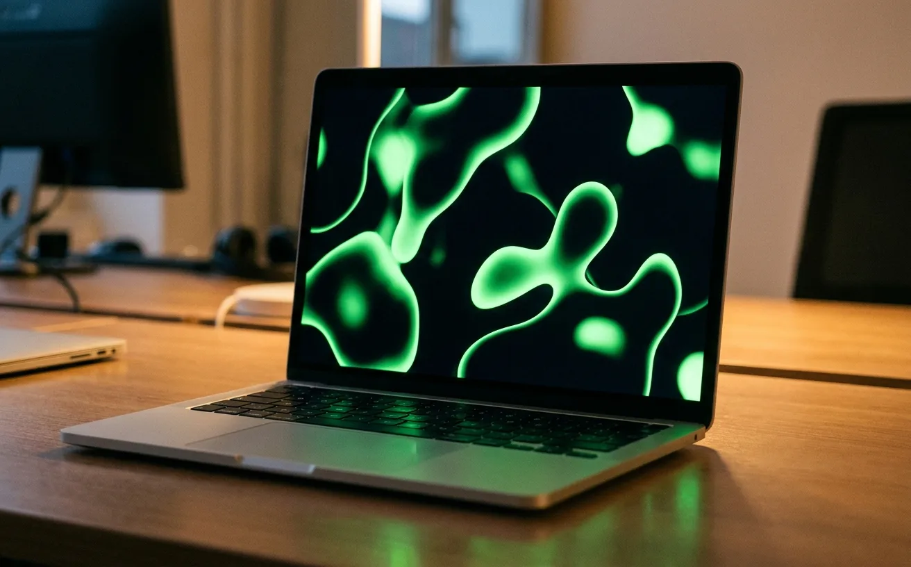
…moments are reserved for the liquid-form wordmark treatment. Photography is integrated with graphic elements rather than treated as a separate asset library: a practical consequence of the…
project
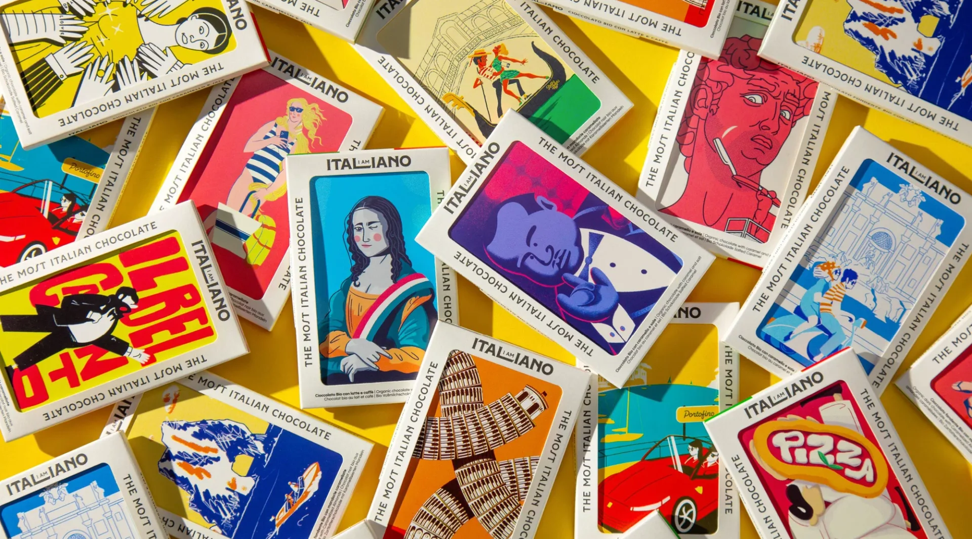
…Direction: Federico Galvani Illustration: Andrea Rubele, Mattia Cristini, Federico Galvani Graphic Design: Andrea Rubele Type Design: Mattia Cristini Photography: Federico Galvani Client…
project
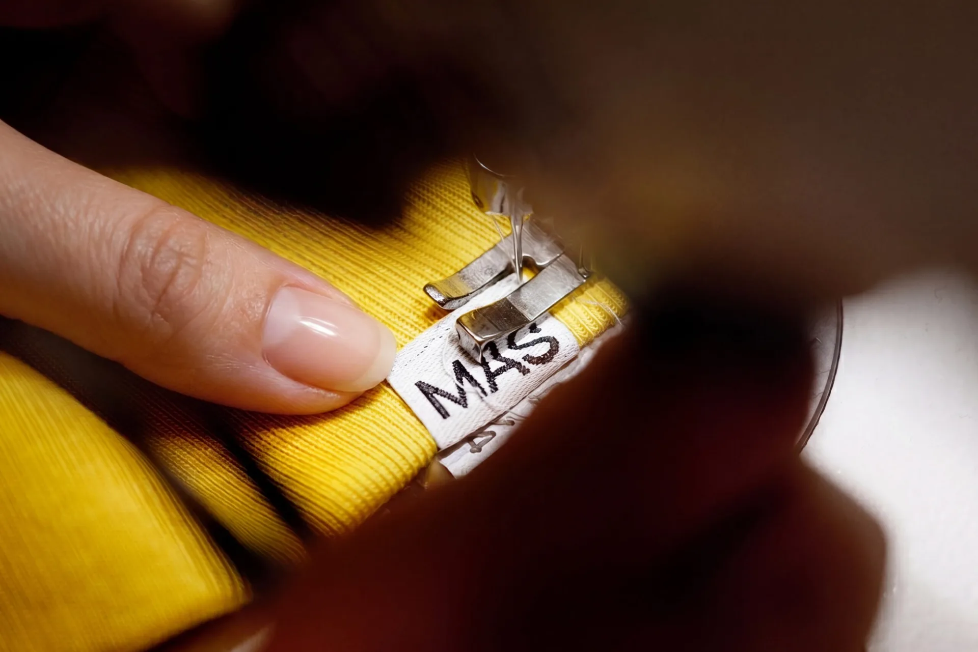
…by measuring tape marks the 75 years; a secondary seal carries the brand's history as a graphic asset rather than a dated stamp. Color palette is utilitarian: workwear white, chef-coat…
project
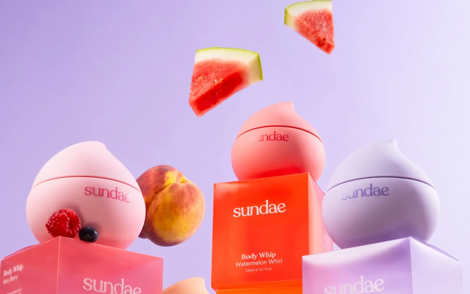
…each readable at distance as a color-field rather than a label-first identification. Graphic language is minimal on each bottle: the Sundae wordmark in a tight sans, the scent name…
project
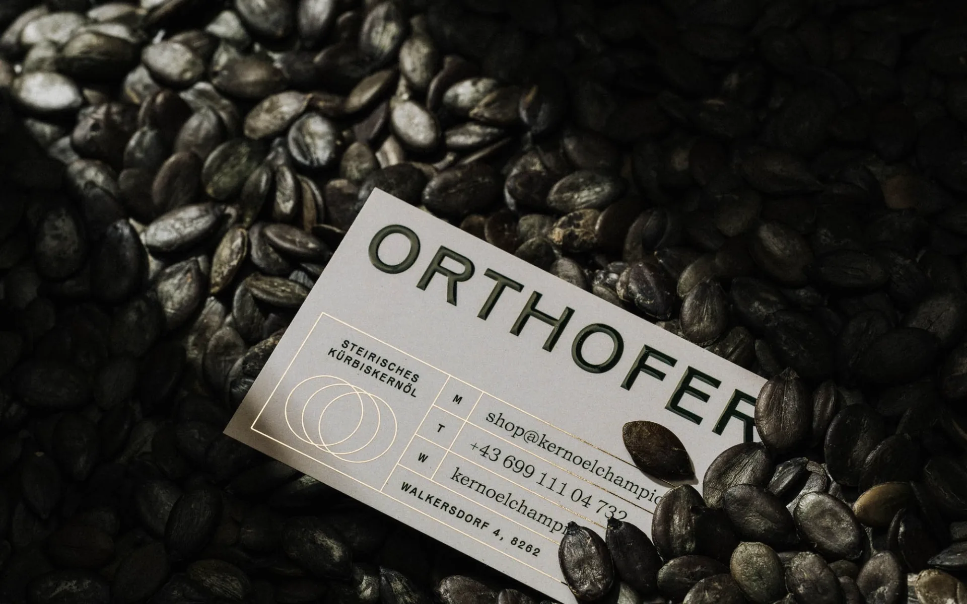
…The identity's defining move is a flexible logo built around the pumpkin itself as the graphic element. Rather than rendering a pumpkin as a decorative icon, Diemling treats the pumpkin…
project
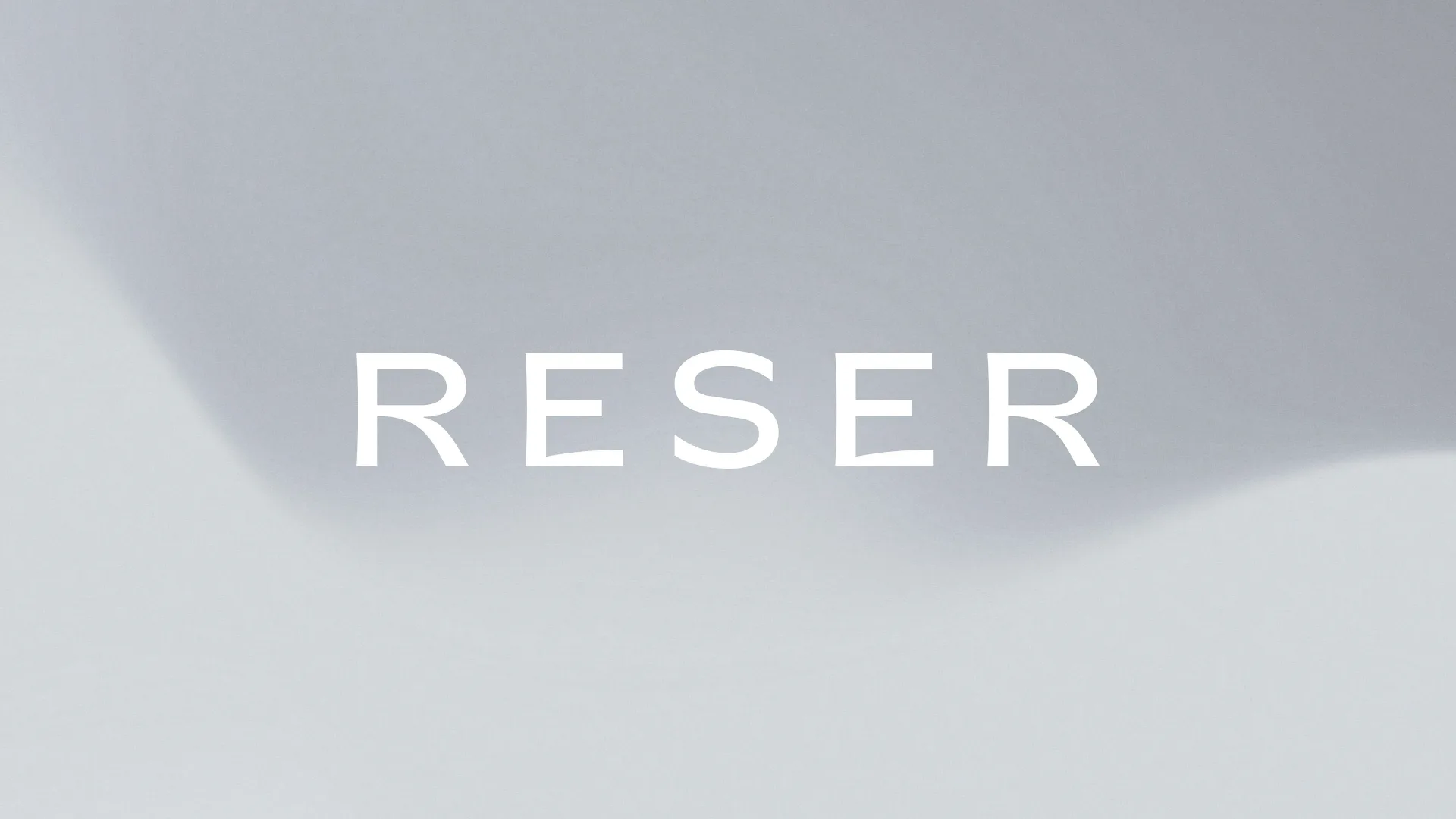
…wordmark visualizes the idea of subtraction—removing unnecessary skincare steps—while the graphic system expresses the concepts of balance and continuous circulation within the skin. Together…
project
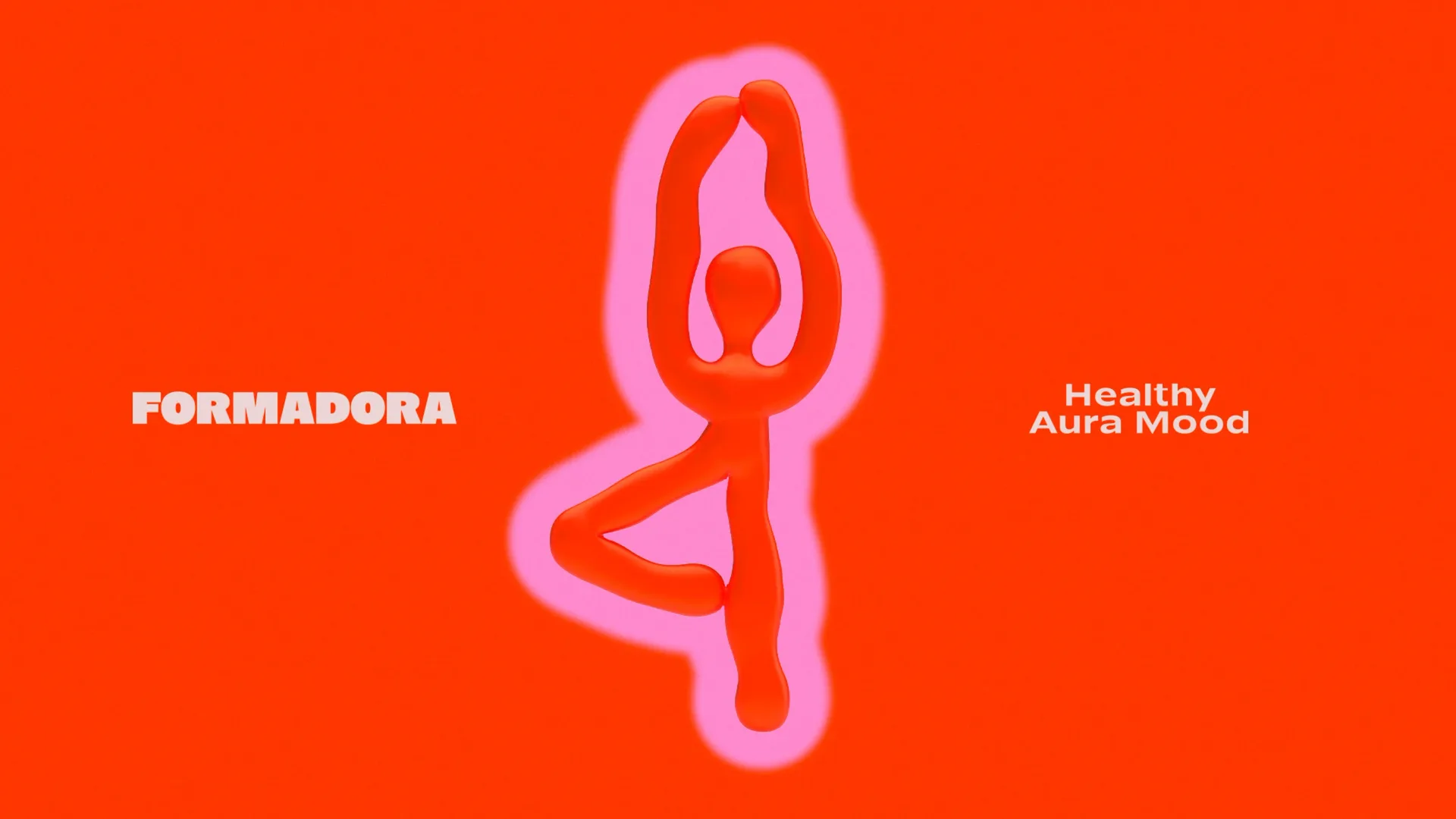
…being. The visual language reflects plasticity, movement, and emotional energy. Fluid graphic forms communicate flexibility, while the vibrant color palette sets the tone of joy, motivation…
project
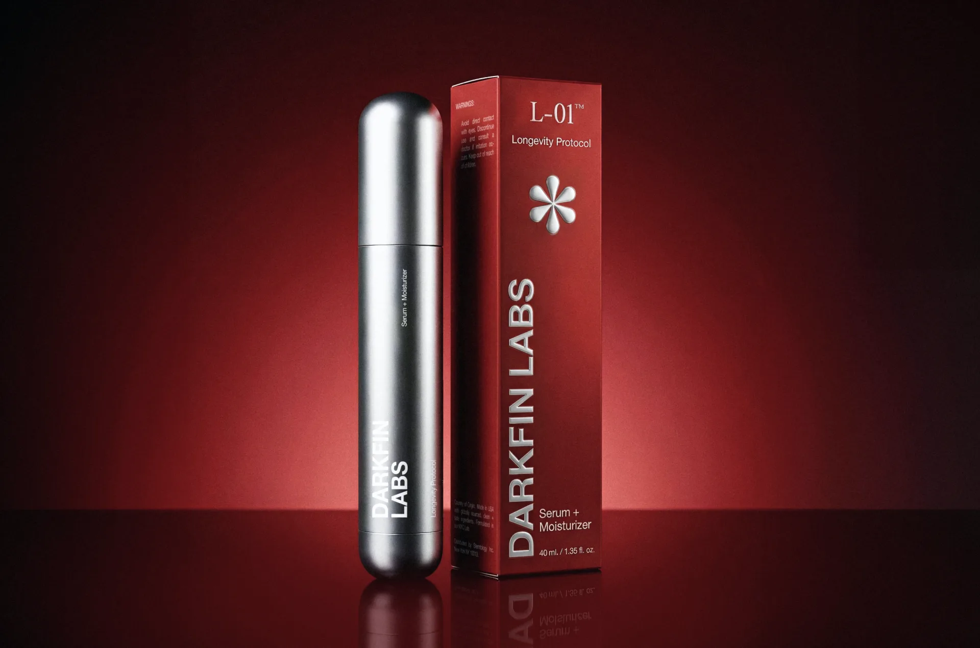
…for the entire identity system. Brand logic: The identity is built around one central graphic element: the asterisk (*). Traditionally used to draw attention to additional meaning,…
project
…Design: Kalleb Garcia Strategy: Kalleb Garcia. Contact: kallebgarcia@gmail.com The graphic pieces were developed to revive the vintage and nostalgic feel of old auto repair shops…
project
…Designed to align with Gopuff's visual language, the photography, color palette, and graphic system were optimized for fast recognition and high-impact merchandising across both digital…
project
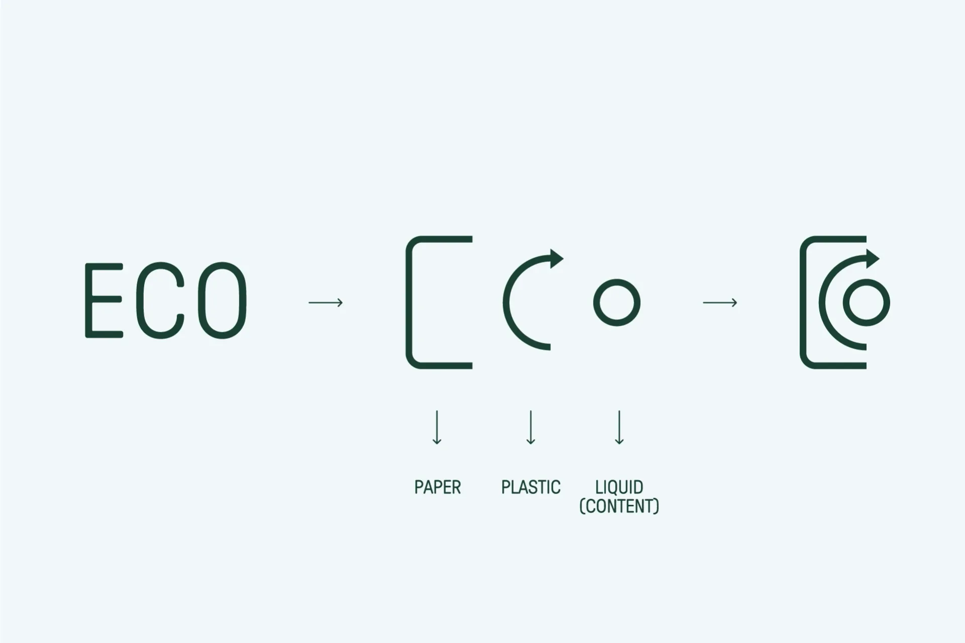
…foundation of a more efficient and responsible system. From this foundational idea, a graphic code was developed with a strong focus on matter and process. Textures evoke natural fibers…
project
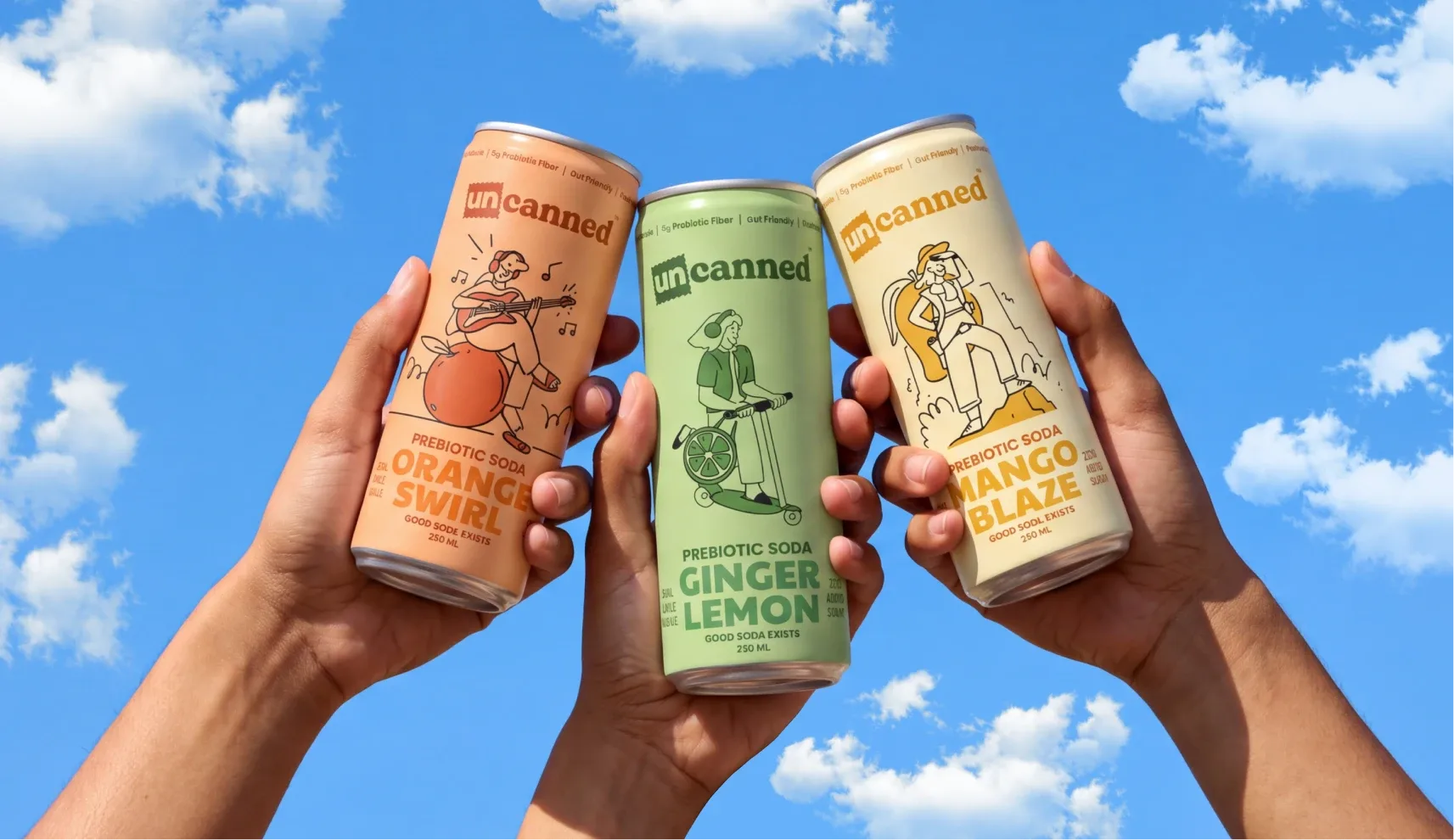
…Design – Himal Hazra Case Study and Presentation – Aniket Singh & Nimisha Modi Motion Graphic Designer – Sumit Kumar Project Manager - Sakshi Gandhi The Challenges Drinks built for…
article
…something closer to cultural emblem than corporate identifier, a distinction that owes less to graphic design than to the community infrastructure the company built around its product. The mark…
project
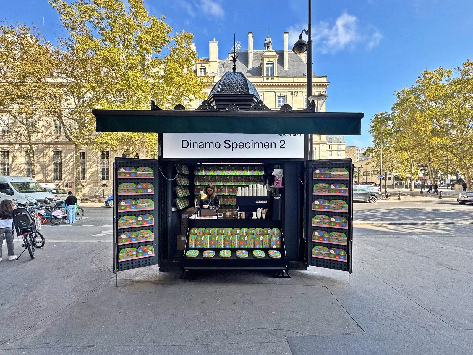
…lineage runs through Armin Hofmann, Wolfgang Weingart, and the entire trajectory of Swiss graphic design. To start a type foundry in Basel is to accept a conversation with history. What…
ranking
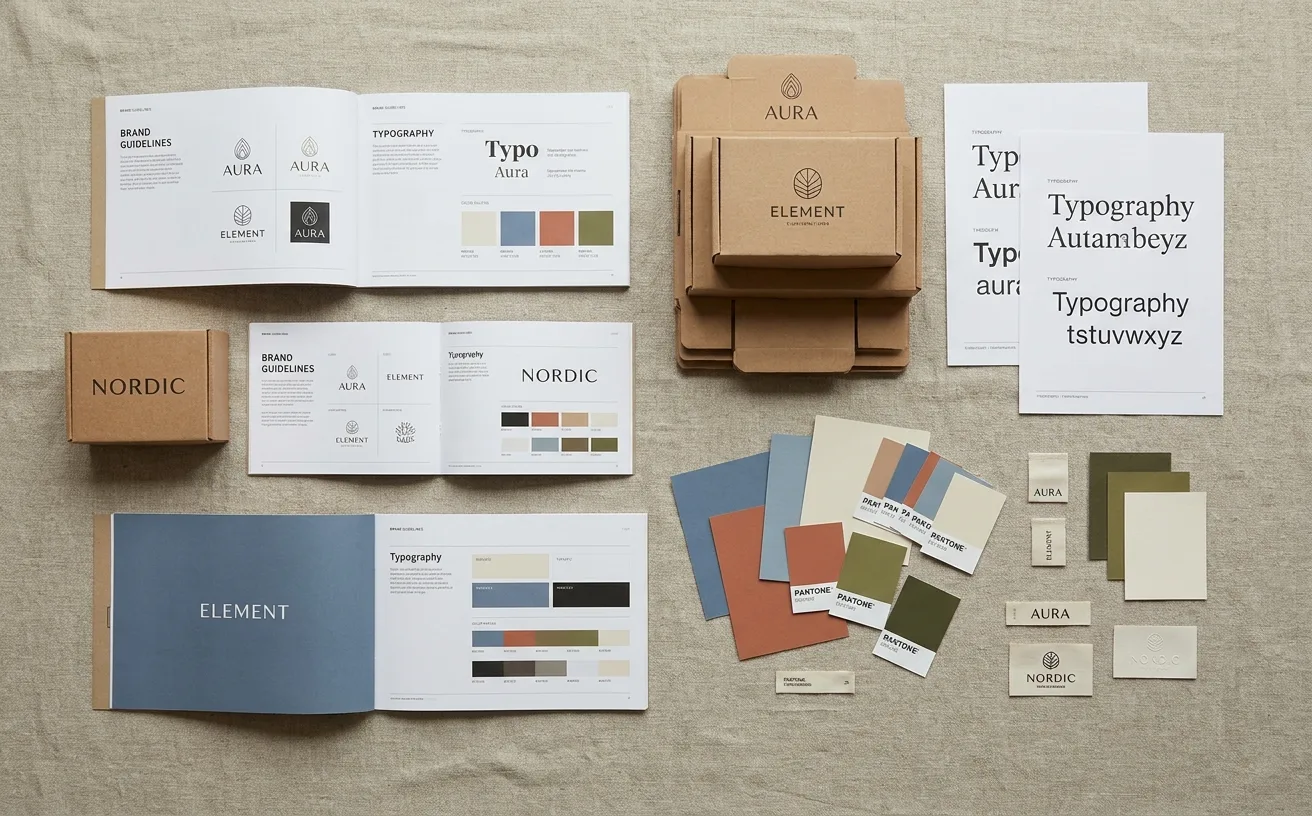
…their own right, not just compliance documents. If you missed it, start with NASA's 1976 Graphics Standards Manual. It will change how you think about systematic design. Read the full…
ranking
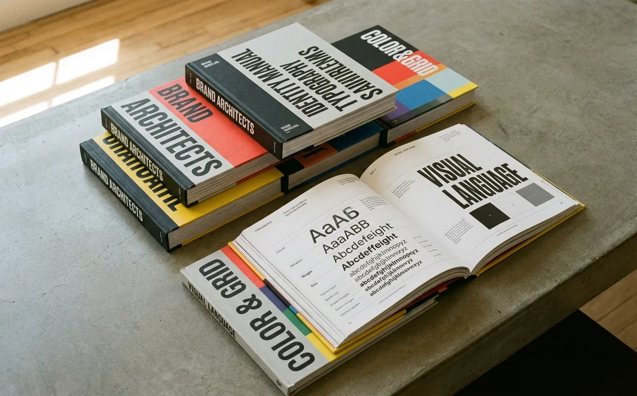
…a potential infringer. 2. NASA: The 1975 Standards Manual That Defined an Era NASA's Graphics Standards Manual, designed by Danne & Blackburn in 1975, is arguably the most famous brand…