project
Evenmouth: web design and 3D renders for science-led oral care
by Saxon Campbellcurated by WeLoveDaily
We use cookies to measure site traffic and improve WeLoveDaily. Nothing loads until you choose. Cookie Policy.
Work, articles, studios, brands and categories across the archive.
23 results
project
by Renua | Renua.onecurated by WeLoveDaily
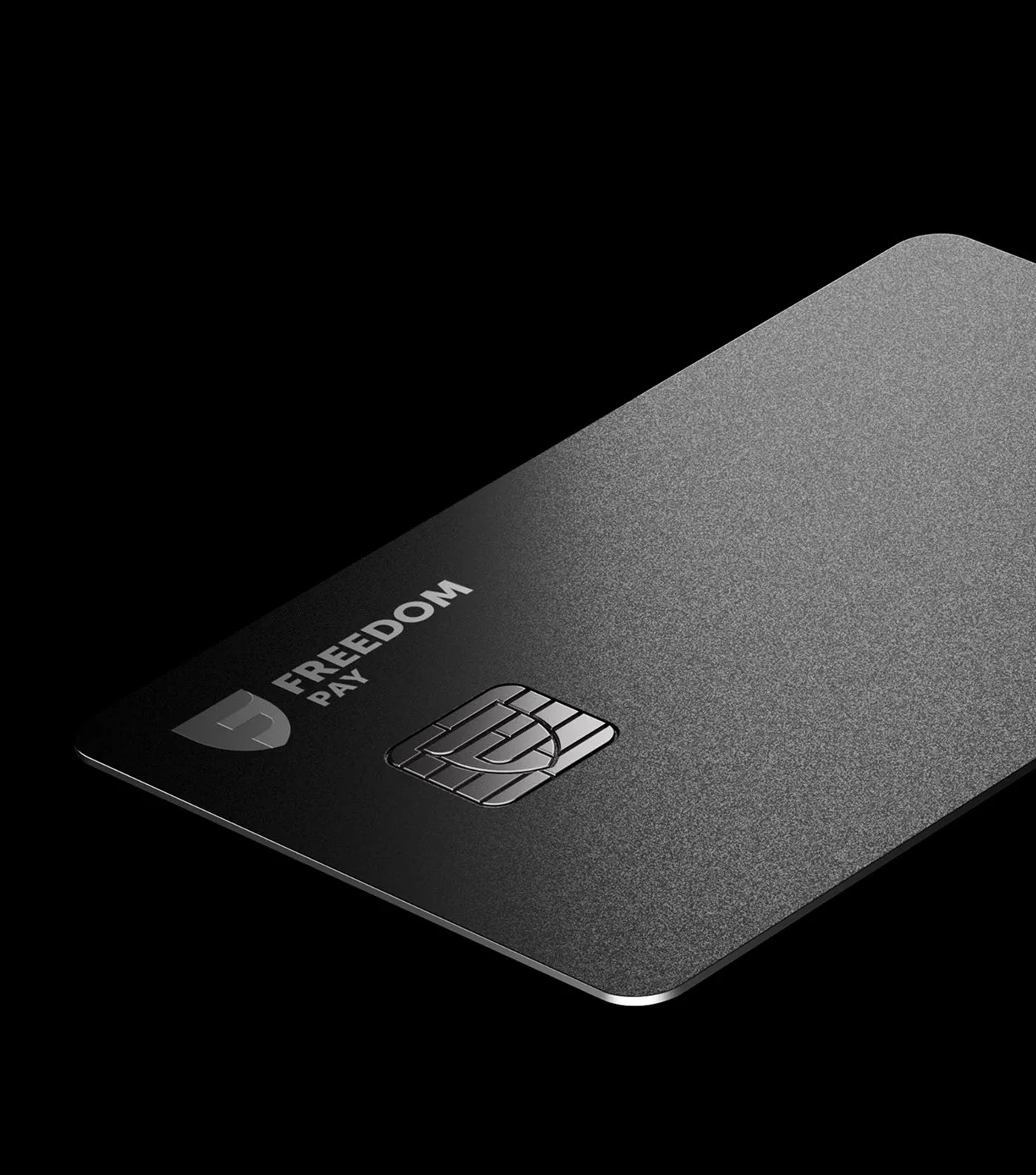
…strength, and scalability within a fintech context. A confident evolution of the bank’s product and visual identity. We reimagined Freedom Finance Bank’s card portfolio as a unified…
project
by Happycentrocurated by WeLoveDaily
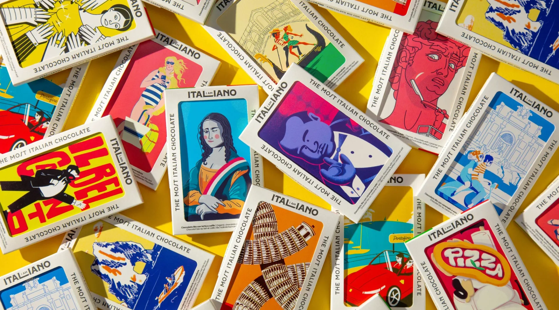
…is deliberately varied: some bars use high-contrast vector work, others use painterly renderings, others use typographic compositions with custom letterforms by Mattia Cristini. This…
article
by Jose Pablo Dominguez
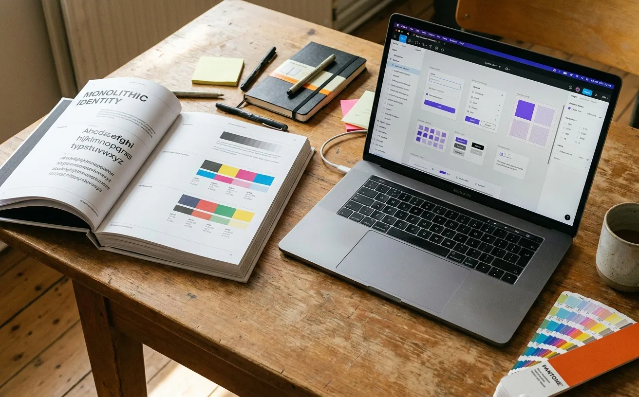
…deliverables of a brand system are different: A component library (usually in Figma) of actual production-ready assets A design-tokens specification (colors, typography, spacing as named variables…
article
by Jose Pablo Dominguez
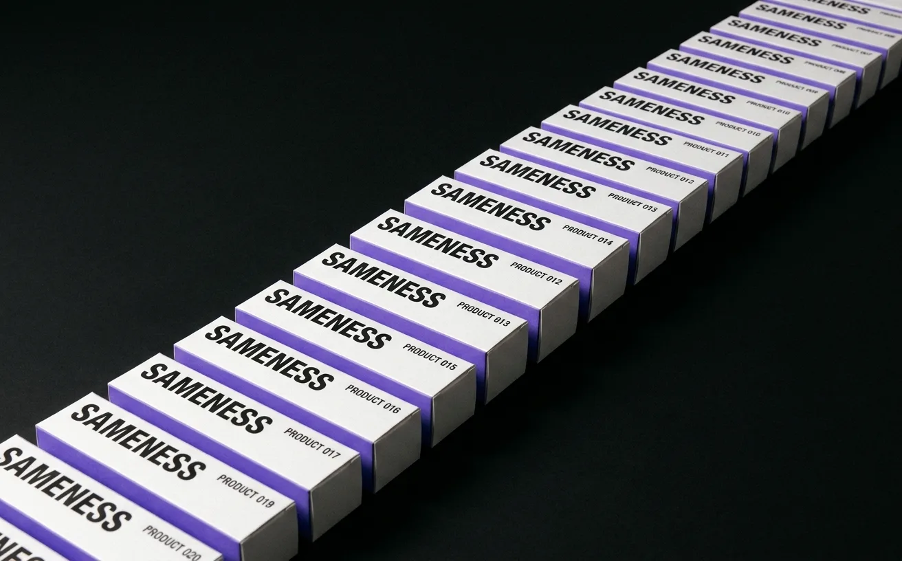
…rational move is to ship the cheapest identity that won't actively hurt, use it to test the product, and invest in real brand work only after product-market fit. This logic produced a generation…
article
by Jose Pablo Dominguez
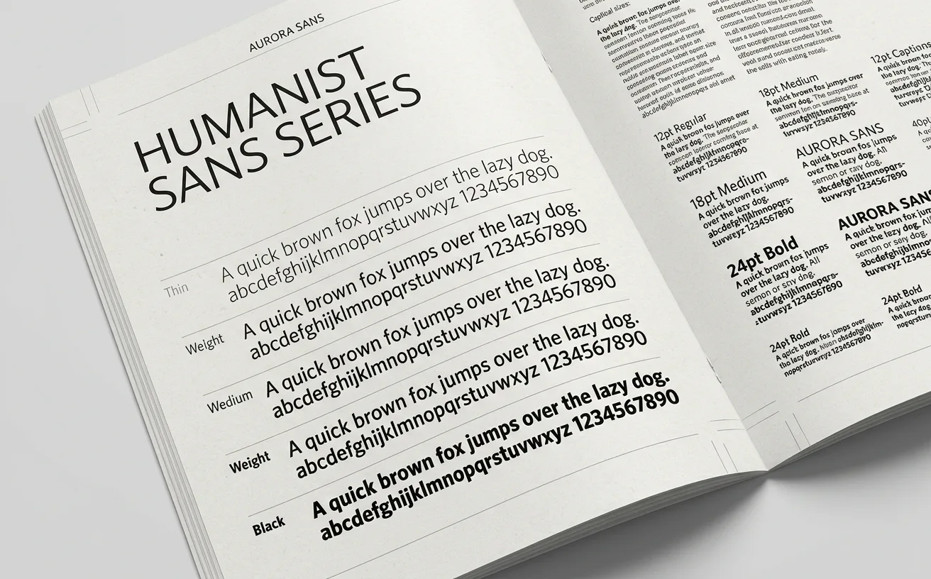
…resolution legibility, rounder curves. The typeface auto-swaps the correct cut depending on the rendered size of the text. A 10-point button and a 48-point headline are set in visually different…

project
curated by WeLoveDaily
…for small sizes loses presence at large ones. The Bélo's geometric simplicity means it renders cleanly at any size. Cultural neutrality. The Bélo references nothing culturally specific…

project
curated by WeLoveDaily
…The butterfly is drawn at a low level of abstraction: simple wings, a center spine, no rendering flourishes. The typography across the app is a clean workhorse sans-serif: notably, not…
project
curated by WeLoveDaily
…s you would expect from an AI company. The neural-network particle animation. The "AI" rendered in a glitch typeface with a holographic gradient. The hero video of a robotic hand touching…

article
by WeLoveDaily Editorial
…And it made those choices work by confining them to brand surfaces while keeping the product canvas deliberately quiet. The Mark as Community Signal Figma's logo (five overlapping…
article
by WeLoveDaily Editorial
…juice. Tropicana Pure Premium (the best-selling premium juice brand in the country, a product they had been buying for years, sometimes decades) had vanished from the shelves. Except…

article
by WeLoveDaily Editorial
…Stripe Paradox Stripe is a B2B infrastructure company. Its customers are developers, product managers, and finance teams. Its core product is invisible to end users, when a consumer…

article
by Jose Pablo Dominguez
…biodegradable packaging" was a marketing claim more than a material specification. The products that carried the label were usually petroleum-derived plastics with enzyme additives:…

article
by WeLoveDaily Editorial
…the 1930s, the brand manager was responsible for the commercial performance of a single product line: its packaging, its advertising, its shelf placement, its pricing strategy. It was…

article
by WeLoveDaily Editorial
…subscription, a toothbrush startup, and a dog food delivery service. Now squint. Remove the product photography and you are looking at the same website six times over. A geometric sans-serif…

article
by WeLoveDaily Editorial
…are designed experiences, engineered with the same rigor that luxury brands apply to the products themselves. And they represent some of the most sophisticated thinking in contemporary…
article
by WeLoveDaily Editorial
…between a brand and its audience. A mark on a letterhead, a sign above a door, a stamp on a product. The logo existed in stillness, and the brand guidelines that governed it were principally…
article
by WeLoveDaily Editorial
…functionally indistinguishable from one another. The reasons were practical and real. Sans-serifs render cleanly at small sizes on digital screens. They scale gracefully from favicon to billboard…
article
by WeLoveDaily Editorial
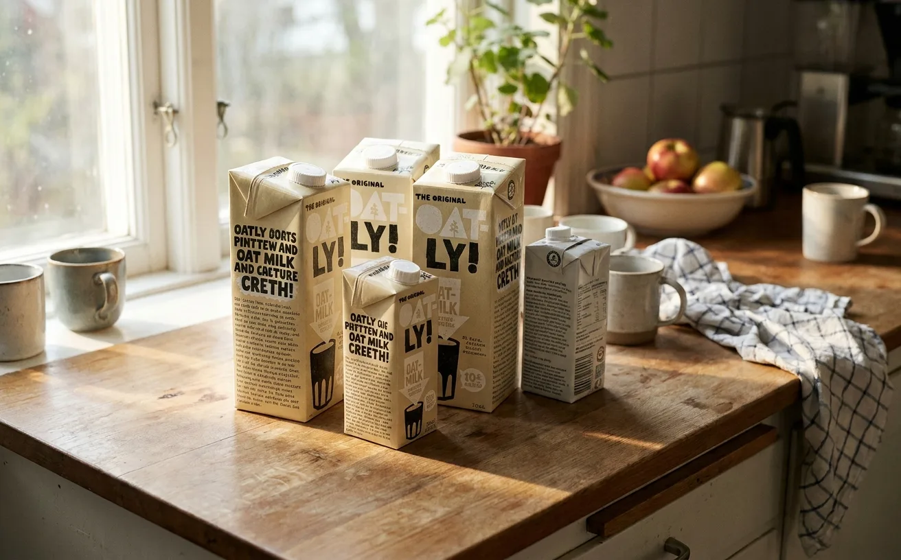
…one edition of the packaging, a long passage about the environmental impact of dairy production, written in a tone that is simultaneously earnest and self-aware. On another, a meditation…
project
by Lippincottcurated by WeLoveDaily
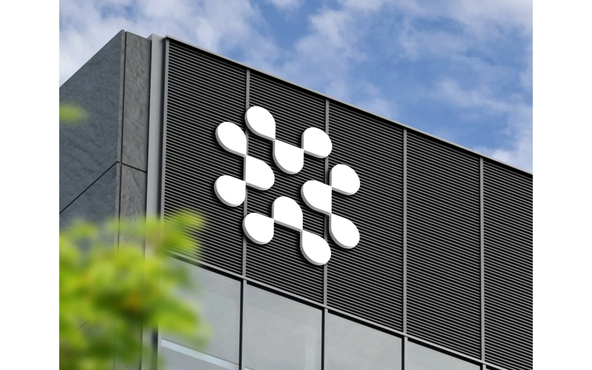
…When Samsung undertakes a global brand refresh, the identity system must function across product lines, regions, retail environments, digital interfaces, and corporate communications.…
project
by Wolff Olinscurated by WeLoveDaily
…immediate and violent. The logo (a jagged, crystalline arrangement of the numerals "2012," rendered in electric pink) was called ugly, incomprehensible, even seizure-inducing when animated…