
article
We use cookies to measure site traffic and improve WeLoveDaily. Nothing loads until you choose. Cookie Policy.
Work, articles, studios and categories across the archive.
project
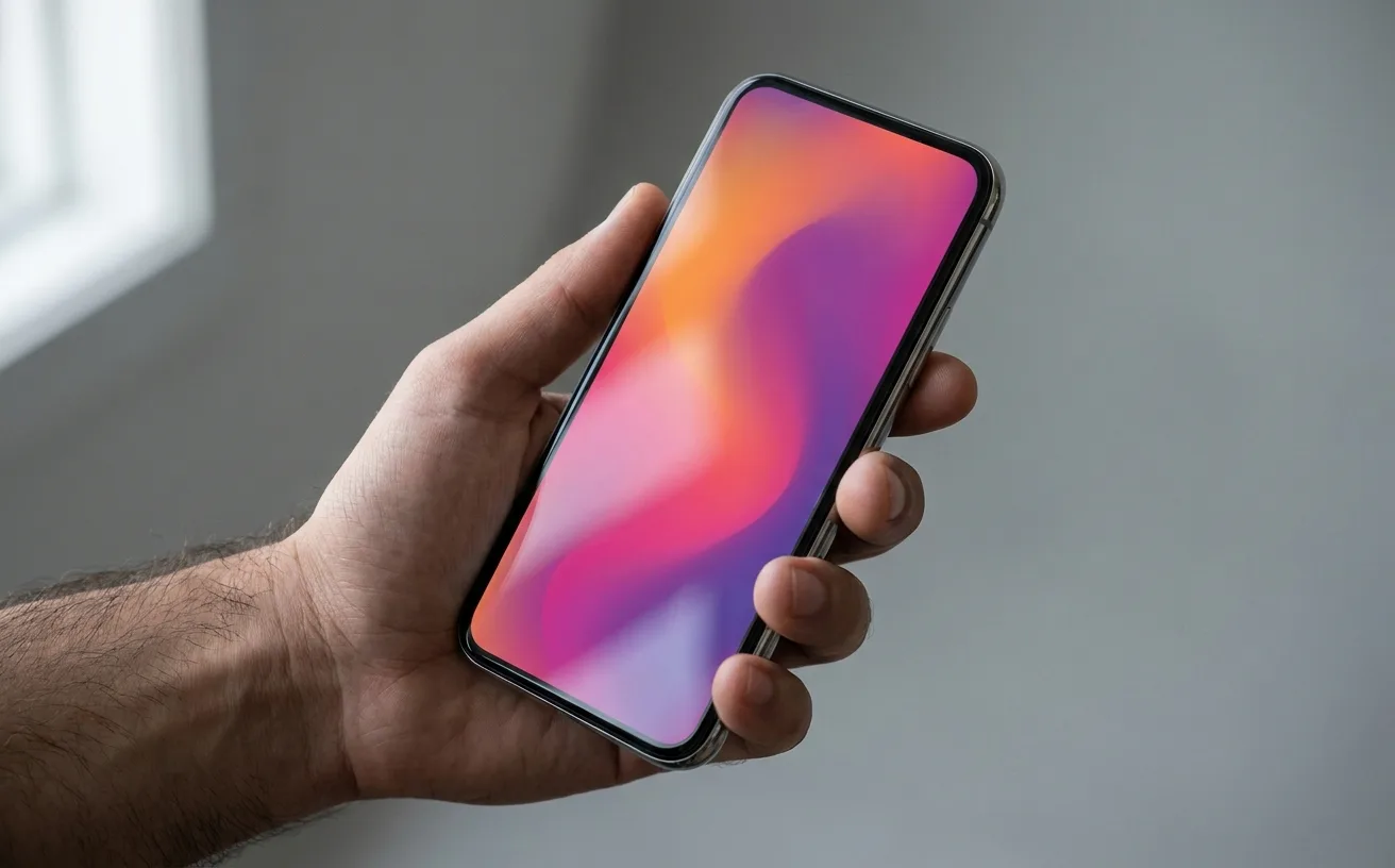
…purple gradient. The rebrand was widely mocked at the time. The new icon was called flat, generic, a step backward from personality. Eight years later, the judgment has quietly reversed…
article
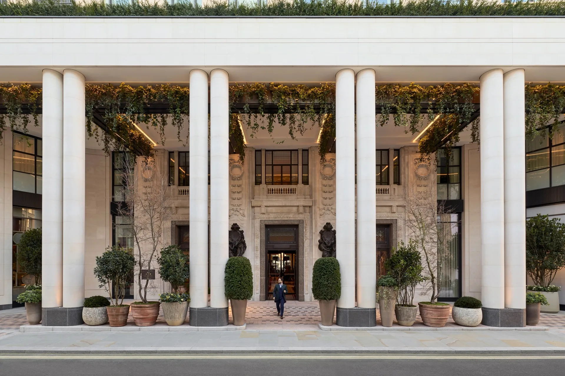
…standalone membership concept (wellness programming, cultural events, co-working) designed to generate recurring revenue and repeat visits independent of room bookings. This is the moat. Hotels…
project
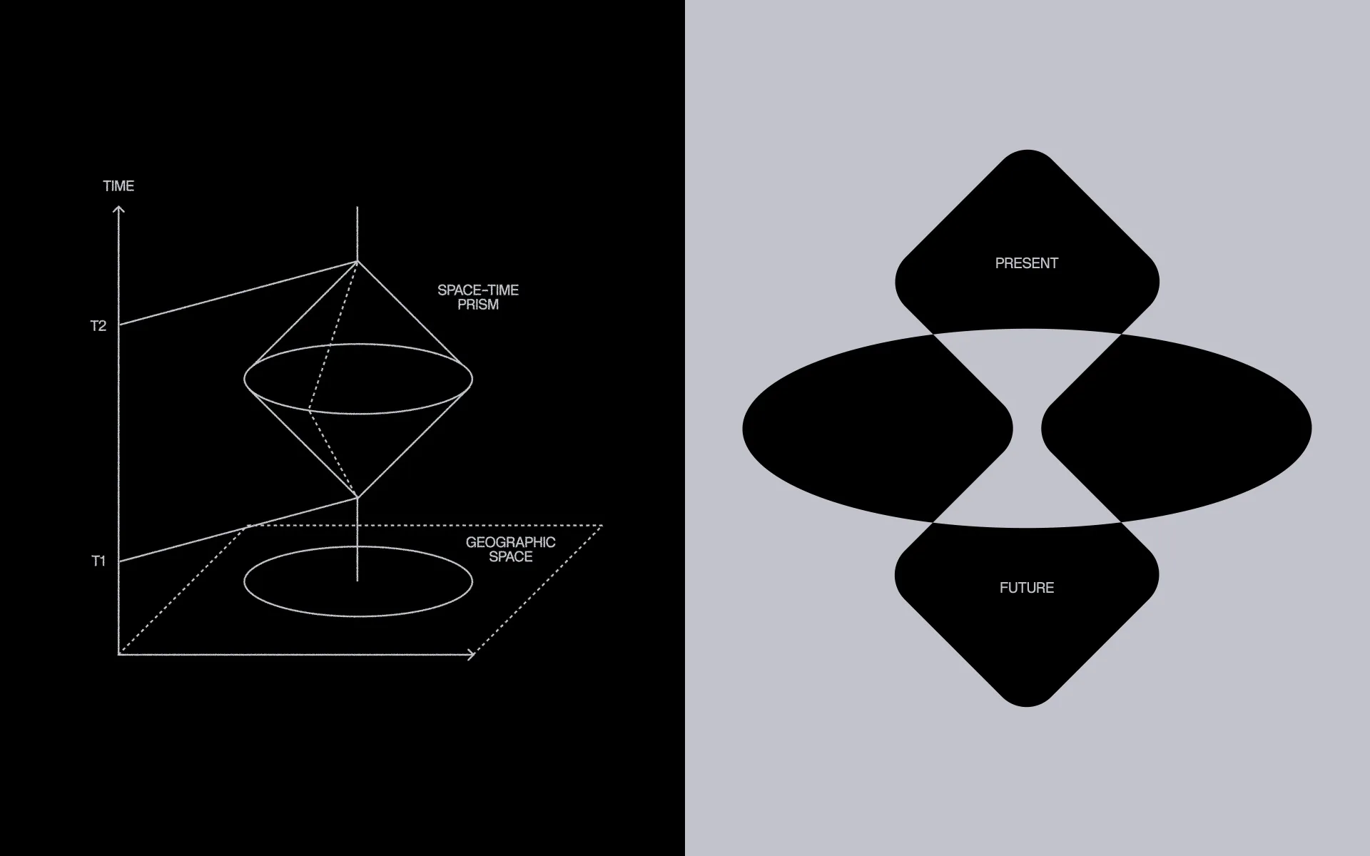
…visual language easier to work with – and to give it a wider range of use – we built a generative tool for creating these characters. It also let us add a game-like layer to the brand…
article
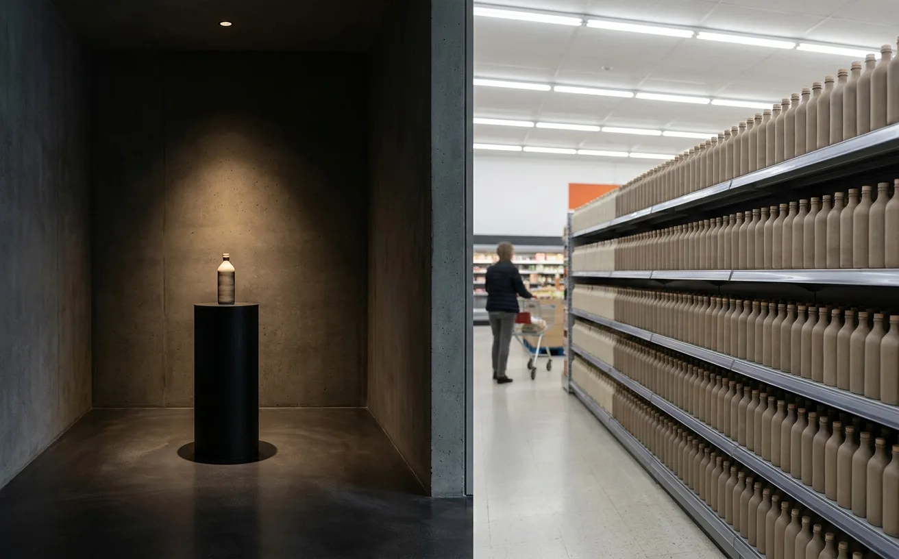
…between premium grocer and mass grocer), Banana Republic (too expensive for mass, too generic for cult). The middle-position failure mode is predictable. Leadership wants the volume…

article
…documentation, its press materials, and its cultural footprint. And it's the color that a generation of SaaS founders referenced when they told their designers: "Make it look like Stripe…
article
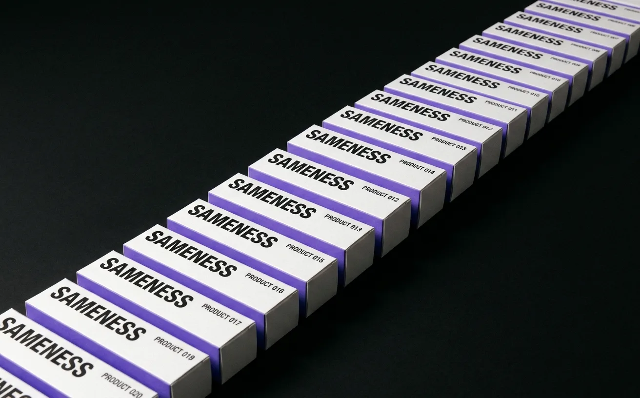
…and invest in real brand work only after product-market fit. This logic produced a generation of SaaS startups that all look the same: a Geist or Inter wordmark, a single saturated…
article
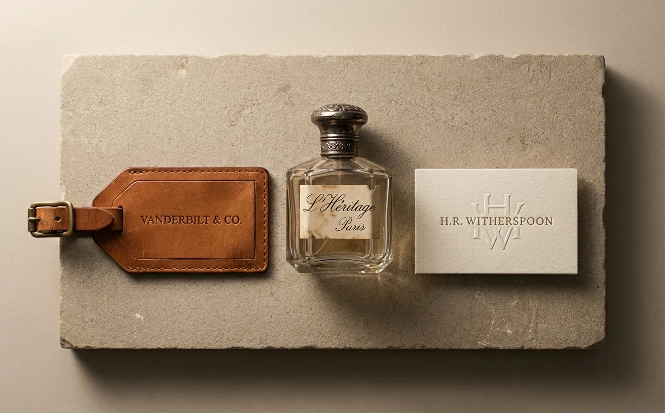
…Legal distinctiveness. Personal names, particularly surnames, are trademarkable in ways generic words are not. "Apple" is a trademark only in the specific category context of computers…
ranking
…The pink-and-red palette is correct; the real asset is the system for integrating user-generated content into official brand surfaces. Steal: the workflow for editing UGC at volume without…
ranking
…deceptively simple: Inter was designed for screens from the first stroke. Its tall x-height, generous spacing, and carefully tuned apertures made it legible at the small sizes where most UI…
article
…processed. The brand had, in effect, removed its own recognition signal and replaced it with generic category cues. It was as if a person had changed their face, their voice, and their clothes…

article
…lowercase. A muted colour palette: blush, sage, cream, perhaps a single accent of terracotta. Generous whitespace. A hero image that could pass for a lifestyle editorial. A tagline that uses…
article
…stroke widths, high contrast signals investment. Spacing. Luxury typography tends to use generous letter-spacing, sometimes extravagantly so. Wide tracking creates visual breathing room…
article
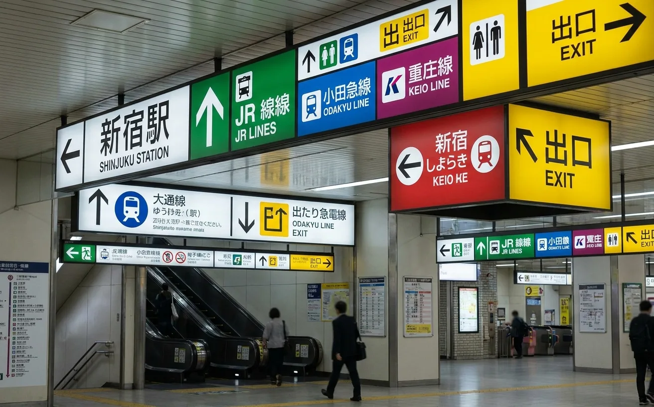
…simultaneously without becoming cluttered, because the hierarchy is strict and the spacing is generous. The Latin-script typography deserves particular attention. Where many international…
article
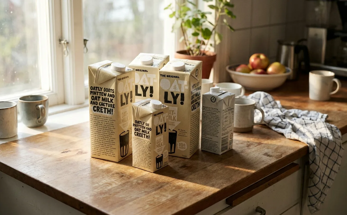
…commentary about being a brand. The environmental messaging delivered with a wink. An entire generation of consumer goods brands (particularly in the plant-based, wellness, and DTC spaces)…
article
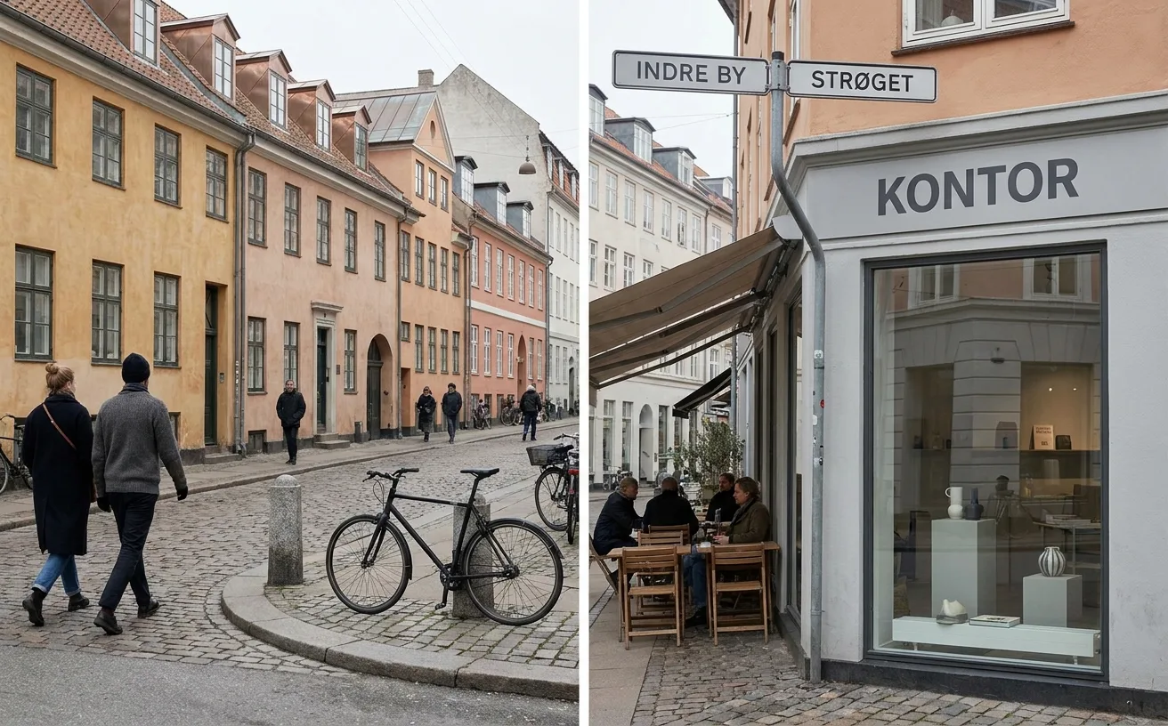
…sits at the center of this ecosystem. Its architecture and design programs have trained generations of practitioners who move fluidly between commercial practice and public service. The…
article
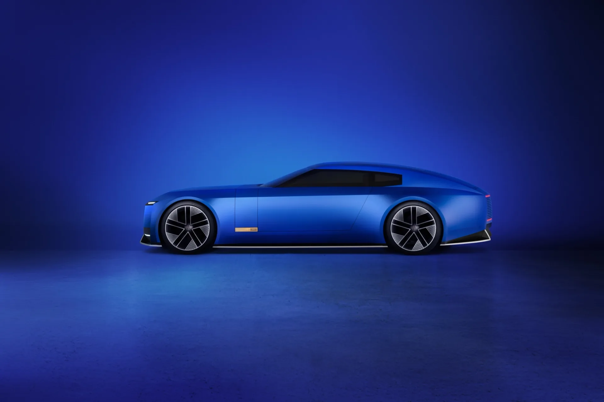
…reveal materials is rigorously structured: tight grids, disciplined leading, unusually generous margins for an automotive brand. The structural work below the controversy is strong.…