
project
We use cookies to measure site traffic and improve WeLoveDaily. Nothing loads until you choose. Cookie Policy.
Work, articles, studios and categories across the archive.
project
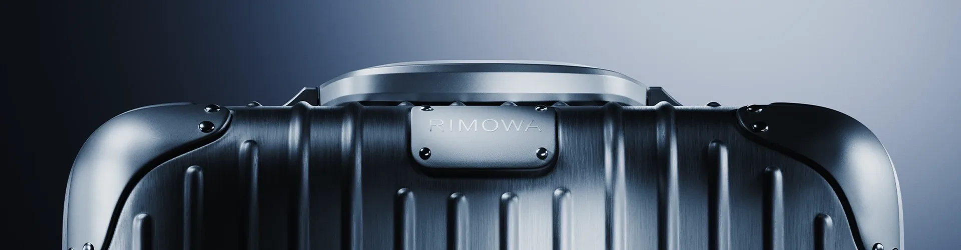
…explores the intersection of industrial engineering, material precision, and cinematic product storytelling. The goal was to translate the strength and elegance of the aluminum structure…
project
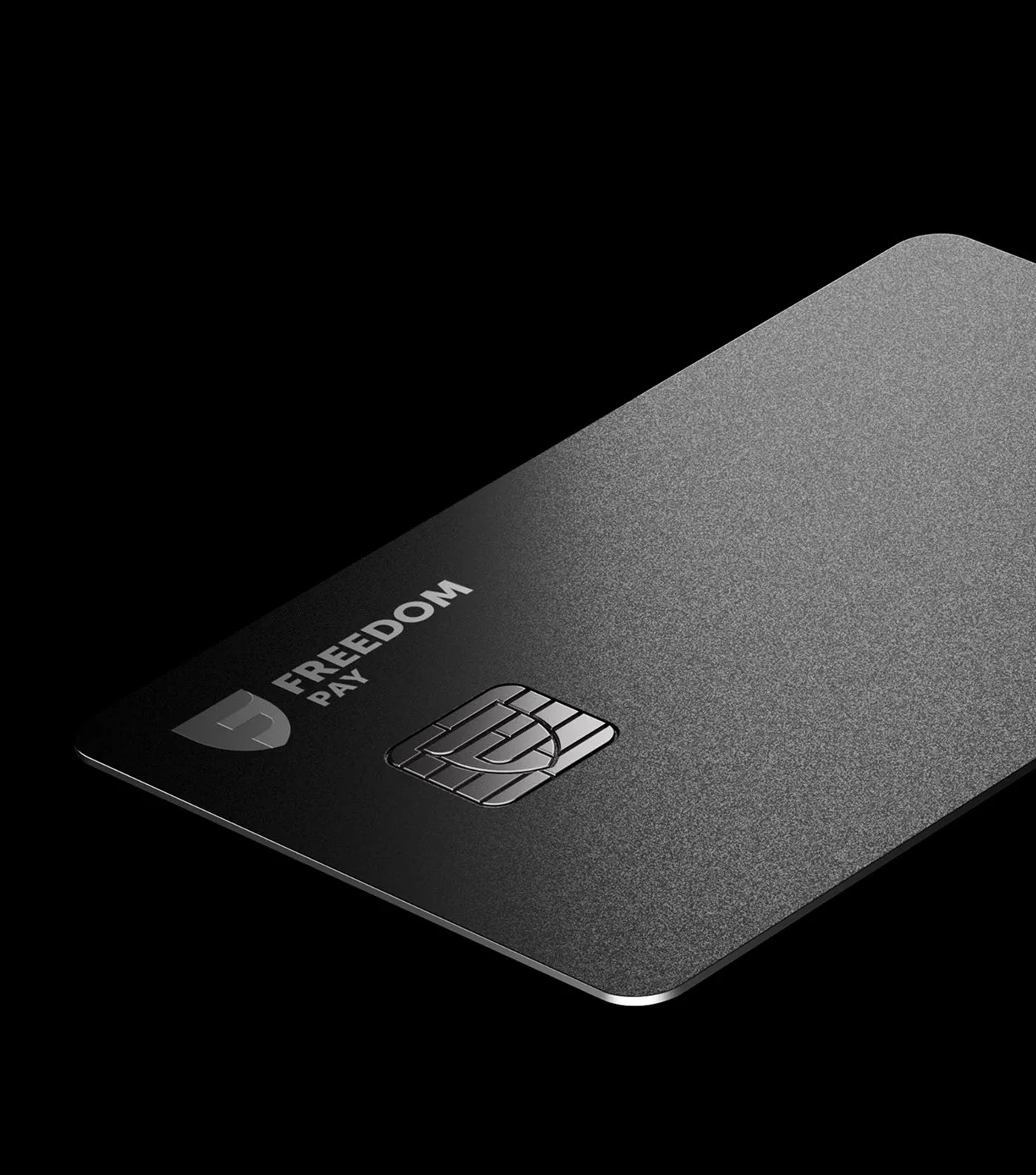
…Finance Bank’s banking card portfolio. Through material exploration, lighting, and precise animation, each banking tier was shaped into a distinct yet cohesive visual system – reinforcing…

article
…between a brand and its audience. A mark on a letterhead, a sign above a door, a stamp on a product. The logo existed in stillness, and the brand guidelines that governed it were principally…
project
…Form Working closely with Bloq.it’s marketing team allowed us to deeply understand the product and push the boundaries on its intricacy, into a straightforward narrative. Following…
article
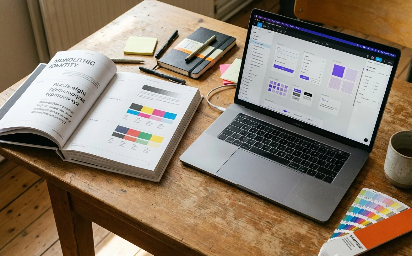
…deliverables of a brand system are different: A component library (usually in Figma) of actual production-ready assets A design-tokens specification (colors, typography, spacing as named variables…
article
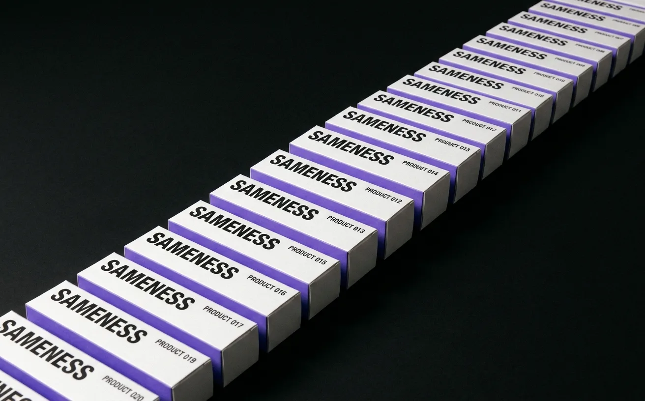
…rational move is to ship the cheapest identity that won't actively hurt, use it to test the product, and invest in real brand work only after product-market fit. This logic produced a generation…
project
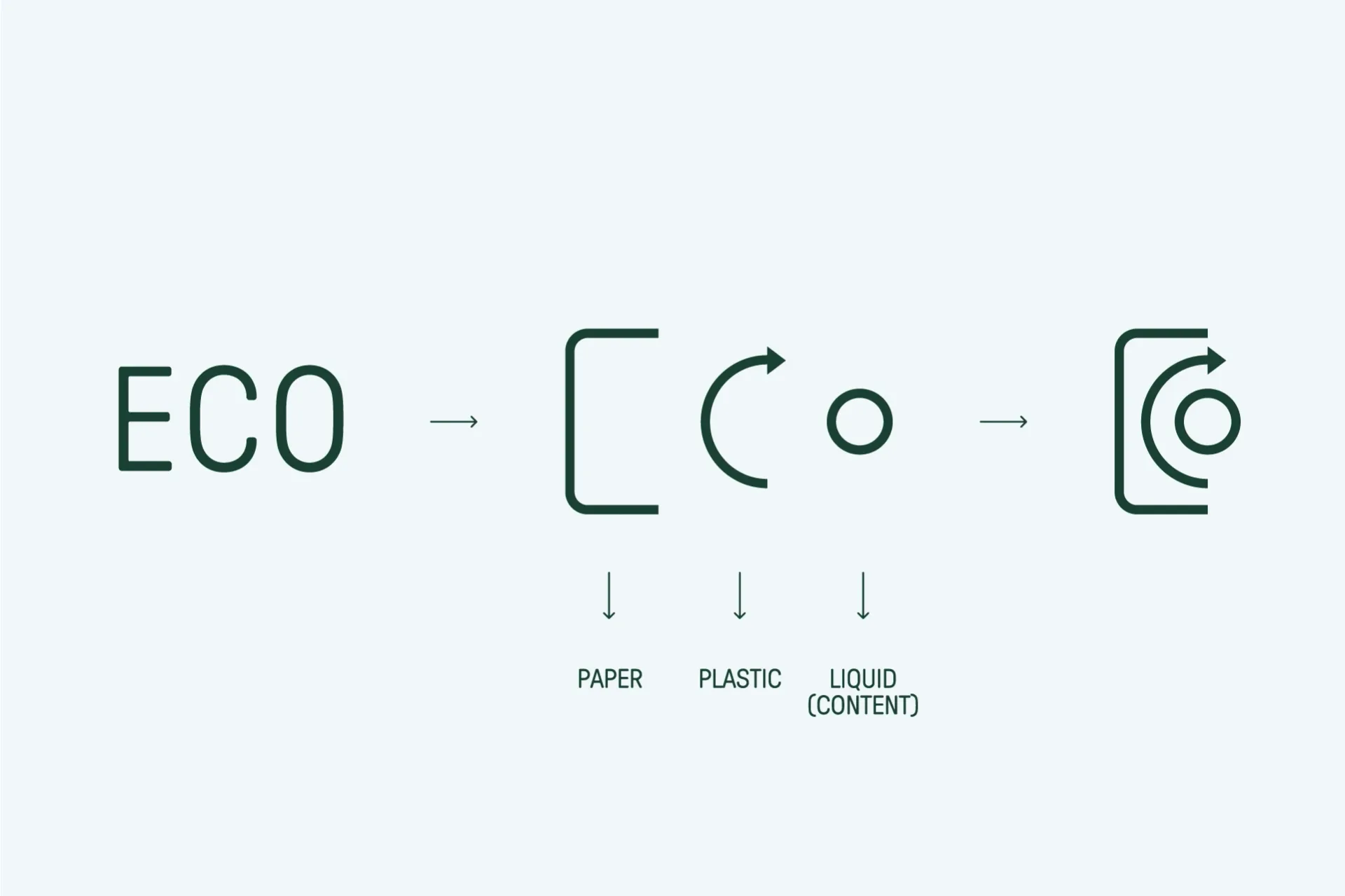
…reinforce the business model while clearly organizing and communicating the breadth of the product portfolio. The visual language is designed to scale, adapting to industrial, corporate…
article
…variables were designed to eliminate. Not as a theoretical capability, as a practical, production-tested workflow that replaces static style libraries with a single source of truth. This…
project
…number of visual clichés you would expect from an AI company. The neural-network particle animation. The "AI" rendered in a glitch typeface with a holographic gradient. The hero video of…
article
…juice. Tropicana Pure Premium (the best-selling premium juice brand in the country, a product they had been buying for years, sometimes decades) had vanished from the shelves. Except…
article
…The name is the mark. Every mention (in a tweet, a Slack message, a conference slide, a product listing) reinforces the visual identity. There is no gap between what the company is called…
project
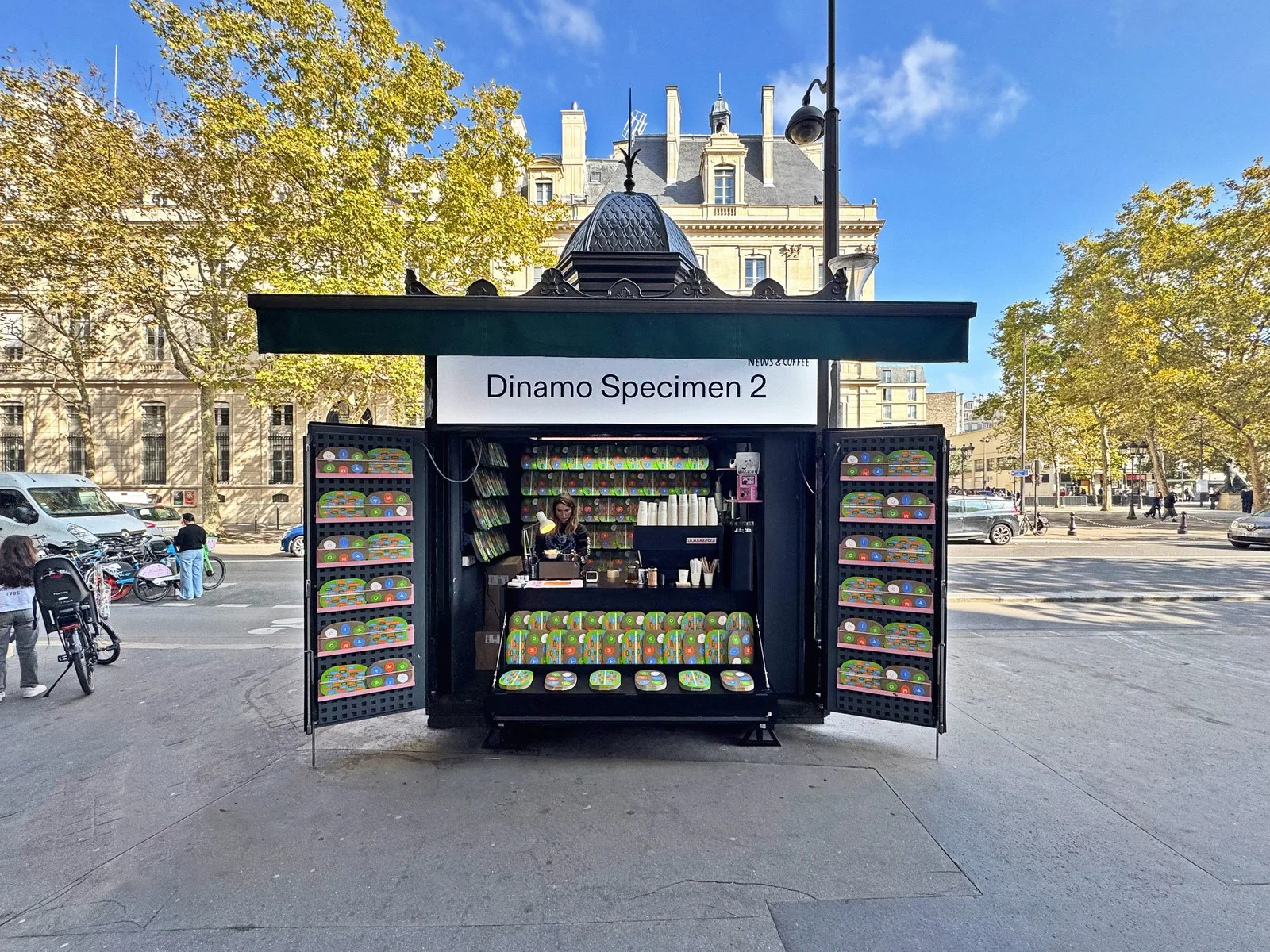
…enough for commercial deployment but strange enough to reward attention. They sit in a productive tension between utility and authorship, the kind of tension that makes a brand's typography…
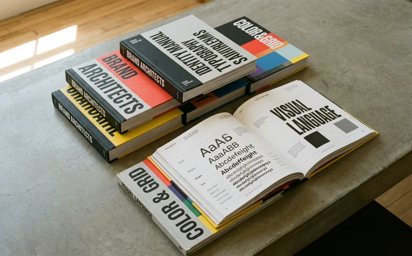
ranking
…guidelines become a collectible, you've transcended the format. 3. Slack: Brand Guidelines as Product Documentation Slack's brand guidelines (brandfolder.com/slack) take an approach that reflects…
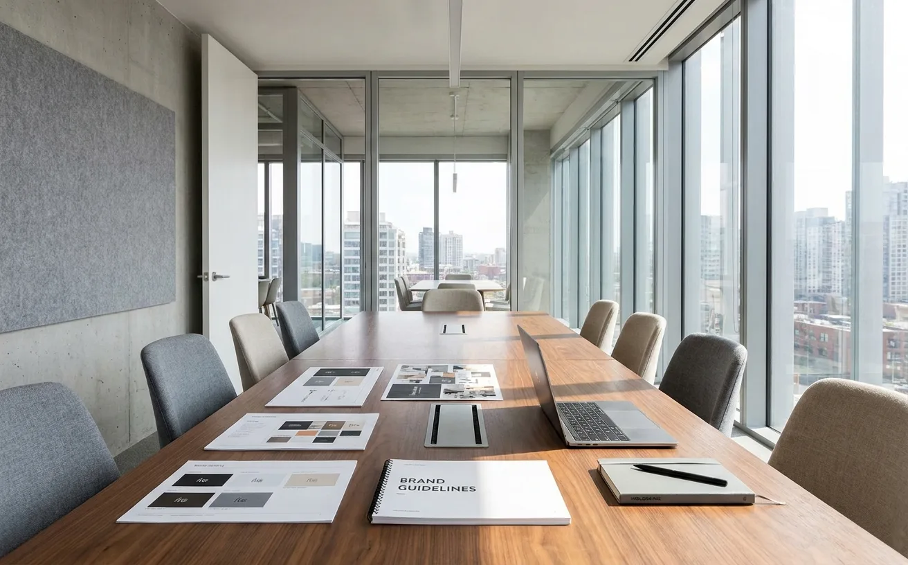
article
…the 1930s, the brand manager was responsible for the commercial performance of a single product line: its packaging, its advertising, its shelf placement, its pricing strategy. It was…
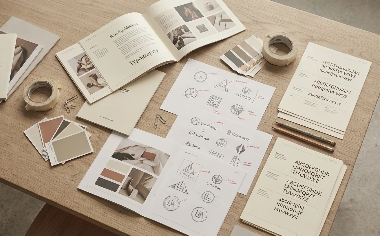
ranking
…transformation as first-class design elements. In a landscape where too many agencies bolt a logo animation onto a static identity as an afterthought, DIA builds from motion outward. The result…
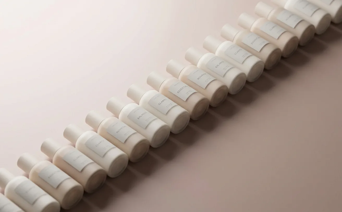
article
…subscription, a toothbrush startup, and a dog food delivery service. Now squint. Remove the product photography and you are looking at the same website six times over. A geometric sans-serif…
article
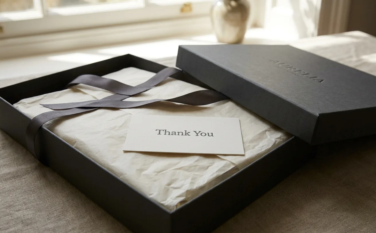
…are designed experiences, engineered with the same rigor that luxury brands apply to the products themselves. And they represent some of the most sophisticated thinking in contemporary…
project
…brand identity itself. What began as a friendly owl perched atop a straightforward ed-tech product has become something rarer and more interesting: a character so vivid that it has effectively…
article
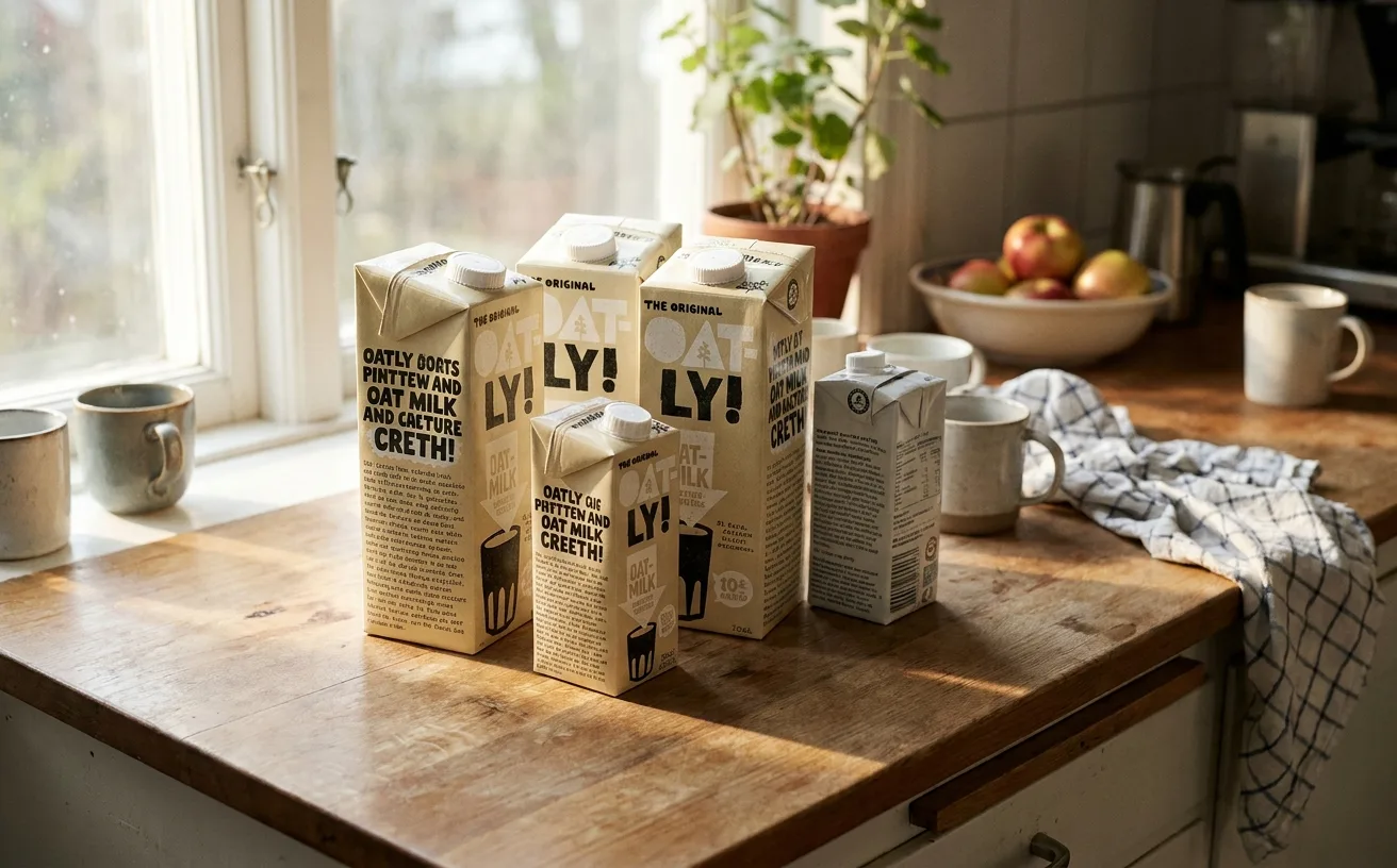
…one edition of the packaging, a long passage about the environmental impact of dairy production, written in a tone that is simultaneously earnest and self-aware. On another, a meditation…
article
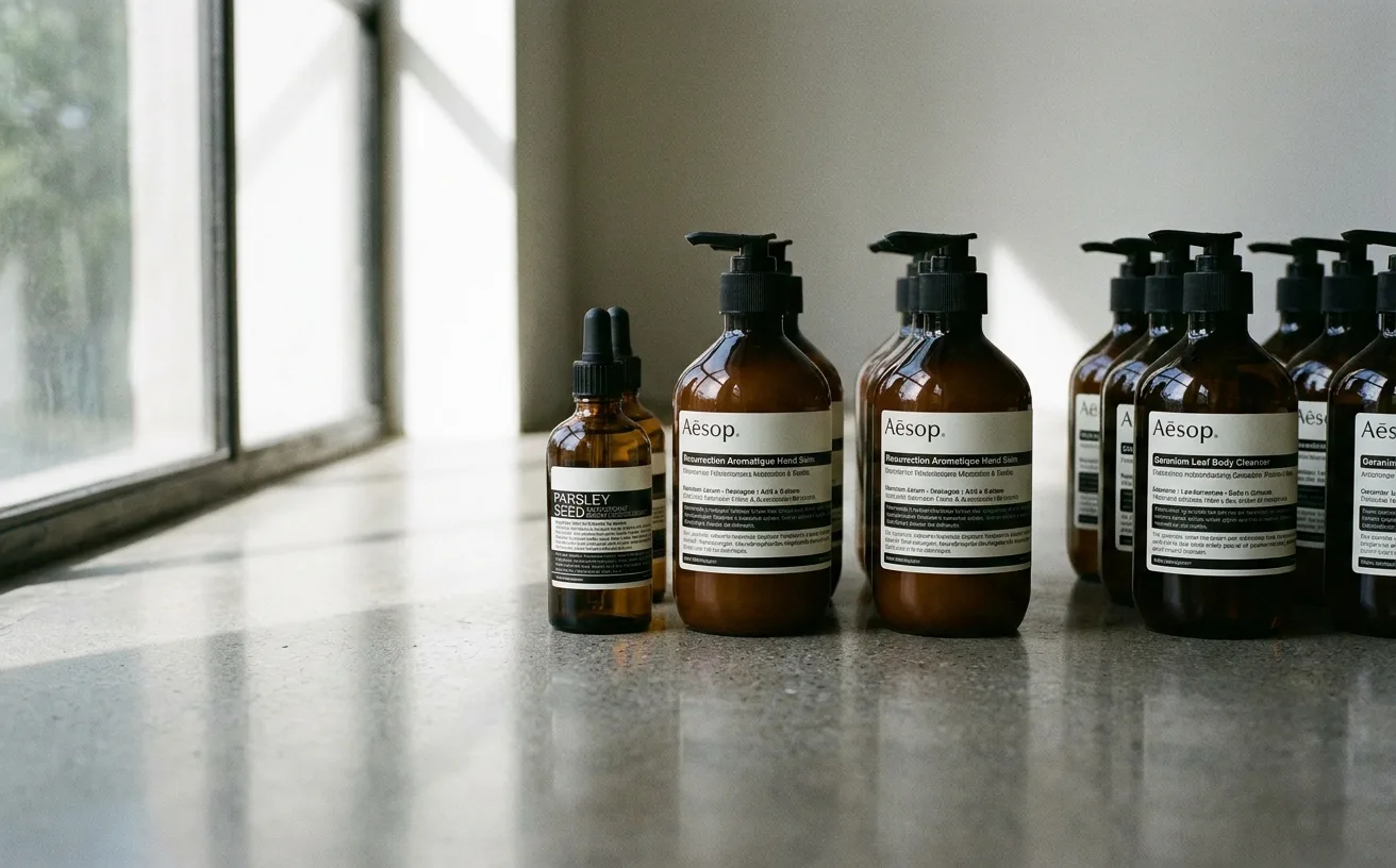
…stocked the salon shelves with literary journals alongside the shampoo. The earliest Aesop products were formulated for his salon clients, packaged in the amber glass bottles that remain…
article
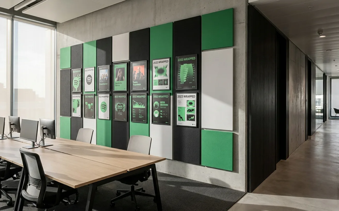
…materials: websites, billboards, event stages. Spotify chose a green that works inside the product, in the exact lighting conditions where users actually encounter it. The marketing adapted…
project
…ugly, confusing, and hostile to the developers who had to implement them. The original product insight was simplicity: seven lines of code to accept a payment. But the design ambition…
project
…rendered in electric pink) was called ugly, incomprehensible, even seizure-inducing when animated. A petition demanding its withdrawal gathered tens of thousands of signatures within days…