article
Work, articles, studios and categories across the archive.
project
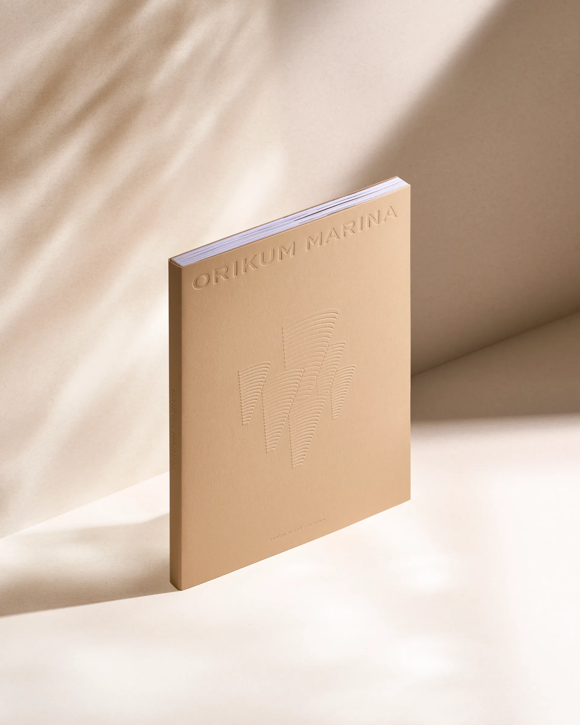
…Orikum Marina project continue the idea of the architectural concept like a coral reef. Minimal cone-shaped graphics of the book cover symbolizes the corals-like structure and linear…
project
…different kind of brand origin story. Why the Aesthetic Worked Millennial pink. Clean, minimal product design. UGC-friendly packaging. Every visual choice was optimised for shareability…
project
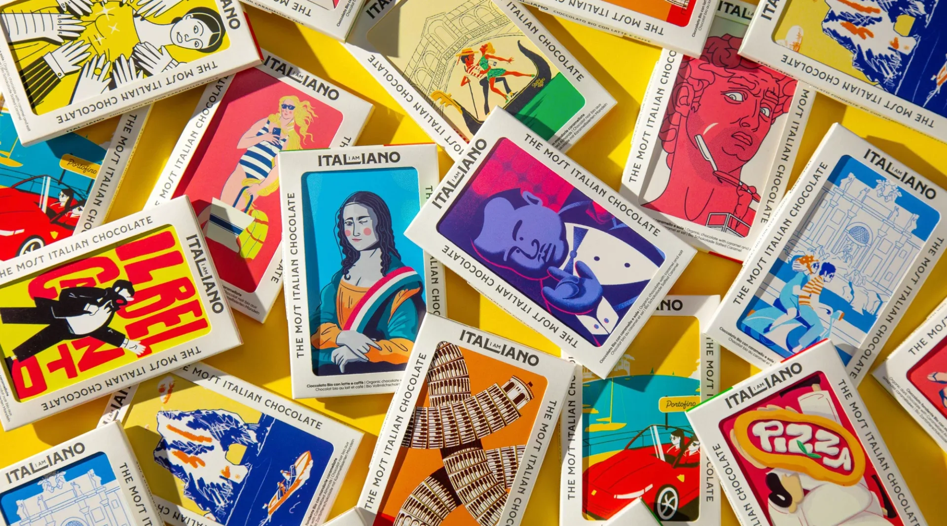
…every brand claims "artisanal" with near-identical packaging vocabularies: kraft paper, minimal gold foil, a typographic wordmark. I AM ITALIANO walked around the consensus by treating…
project
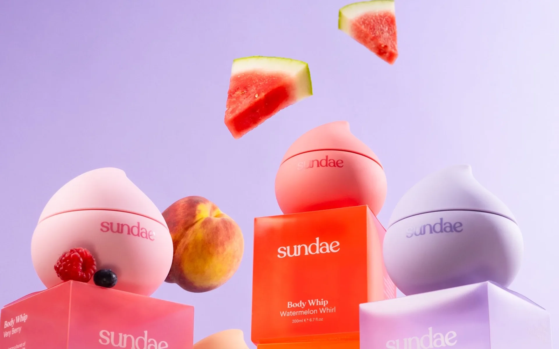
…distance as a color-field rather than a label-first identification. Graphic language is minimal on each bottle: the Sundae wordmark in a tight sans, the scent name in a smaller complementary…

article
…look like still-life compositions. The lighting is warm but not yellow. The signage is minimal, clean, lowercase. Even the parking lot feels curated. This isn't accidental. It's the…
ranking
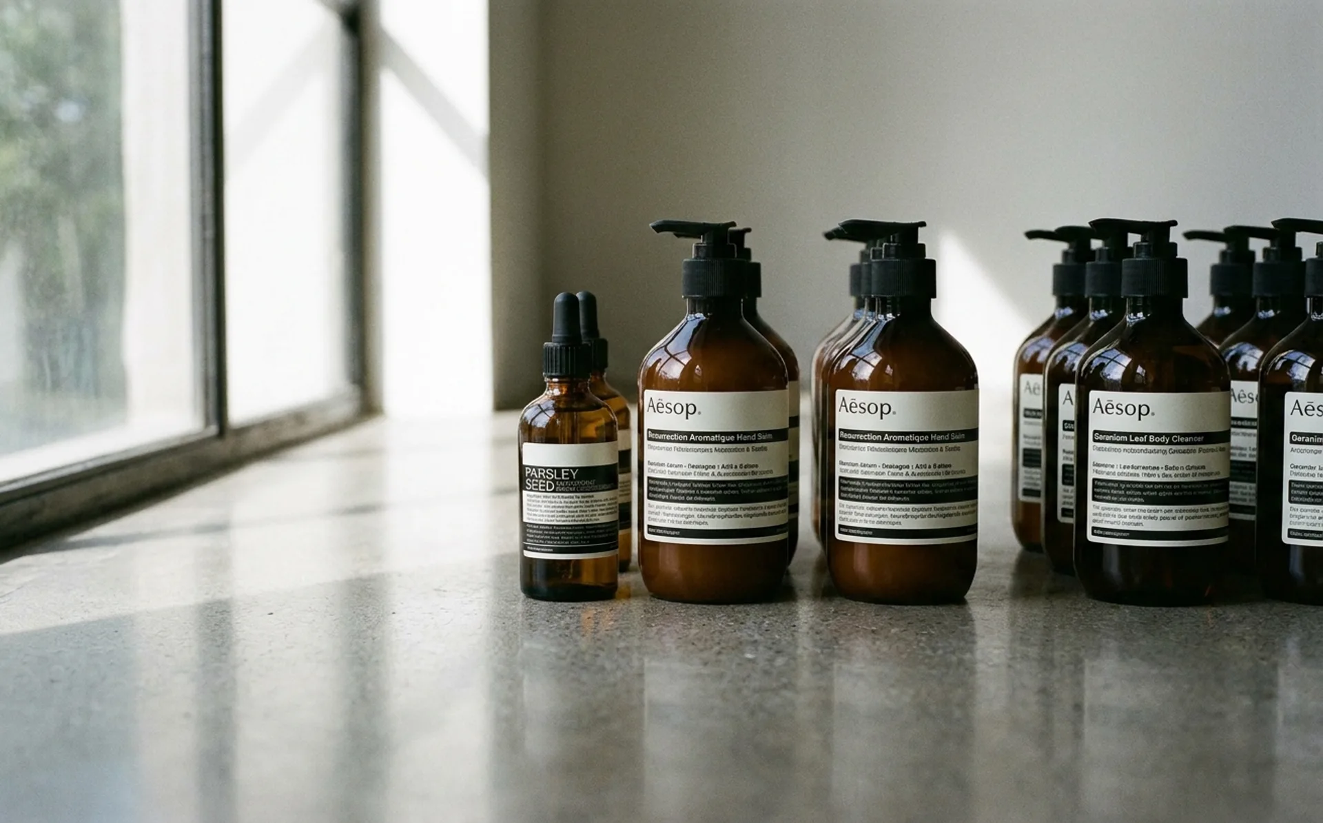
…Distinguishing move: Restraint as the brand's primary asset. The apothecary amber bottles and minimal black-and-white labels have remained essentially unchanged for 35 years. Steal: the thesis…
project
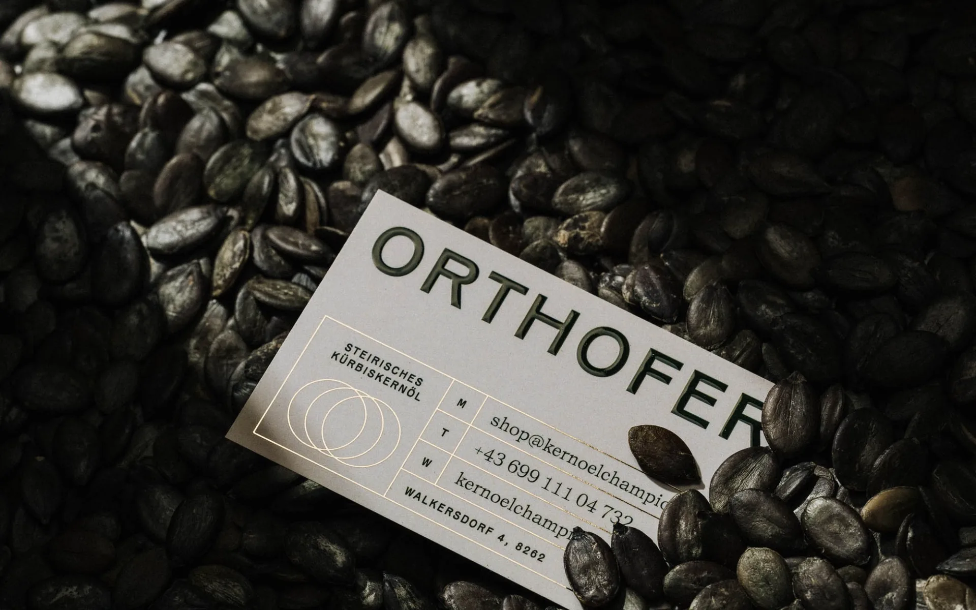
…signals seriousness about the heritage claim. Packaging alternates between cream-on-cream minimalism (for the skincare line) and a warm textile gesture on the bedding packaging: a subtle…
project
…stylized farmhouse typography) and equally easy to get wrong in the other (over-modernized minimalism that loses the heritage signal). Orthofer lands in the rare space where the brand reads…

project
…personality. Headers, body text, buttons all use the same treatment. The color palette is minimal: the ink blue, white, a neutral gray, and a single bright accent for action states. This…
Article
…WeLoveDaily writes for) has seen every logo trick. Negative space cleverness. Geometric minimalism. Heritage revival. These still work, but they don't surprise. They're expected. Systems…
project
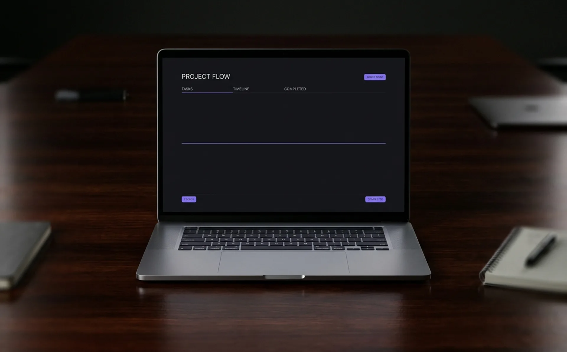
…well-kerned terminal. That's the intended experience. The identity's restraint is not minimalism for its own sake. It's bandwidth efficiency. Every pixel that's not information is a…
article
…considered typeface. Notion spent years as a wordmark-only brand before introducing a minimal mark that most users still cannot recall. This is not a coincidence. It is a pattern,…
article
…and the brand guidelines that governed it were principally concerned with clear space, minimum sizes, and colour fidelity. That world is over, or at least, it is no longer the whole…
ranking
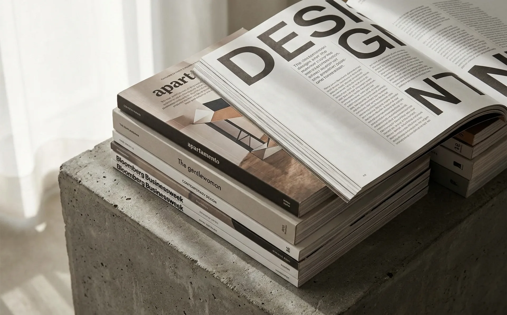
…a food magazine could do typographically. Display type set uncomfortably large against minimal supporting elements. The magazine reads closer to a zine than a consumer publication despite…
project
…identity as a promise of futurity. OpenAI's visual system leans on the black-and-white minimalism of a design-forward consumer brand, with the orb-like mark doing the imaginative work…
ranking
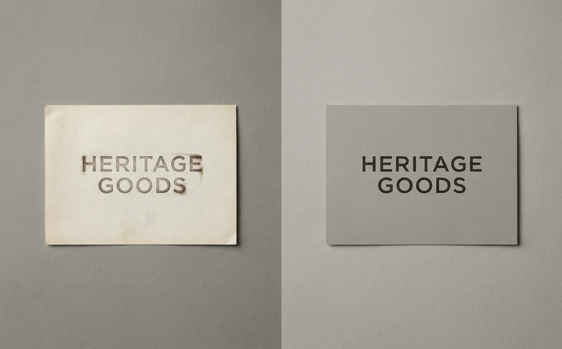
…Verdict: Cautionary tale. Tropicana's 2009 redesign (by Arnell Group) famously shipped a minimalist carton that stripped the orange-and-straw shelf signifier, tanking sales by an estimated…
project
…infrastructure. The logic is straightforward. In an attention economy saturated with minimalist wordmarks and interchangeable sans-serif identities, a character offers something a logo…
article
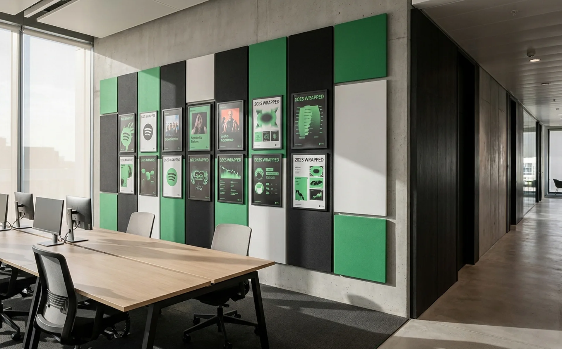
…leans on Spotify's existing strengths: the dark interface, the green accent system, and a minimalist player chrome that keeps the brand present without overwhelming video content. But the…
project
…interface arrived early: simple, almost childlike characters with oversized heads and minimal features, rendered in a style that suggests a designer's sketchbook rather than a corporate…
ranking
…where a new kind of studio thrives: smaller, more opinionated, less interested in safe minimalism, and more willing to treat branding as a cultural act rather than a corporate exercise…