project
Work, articles, studios and categories across the archive.
project
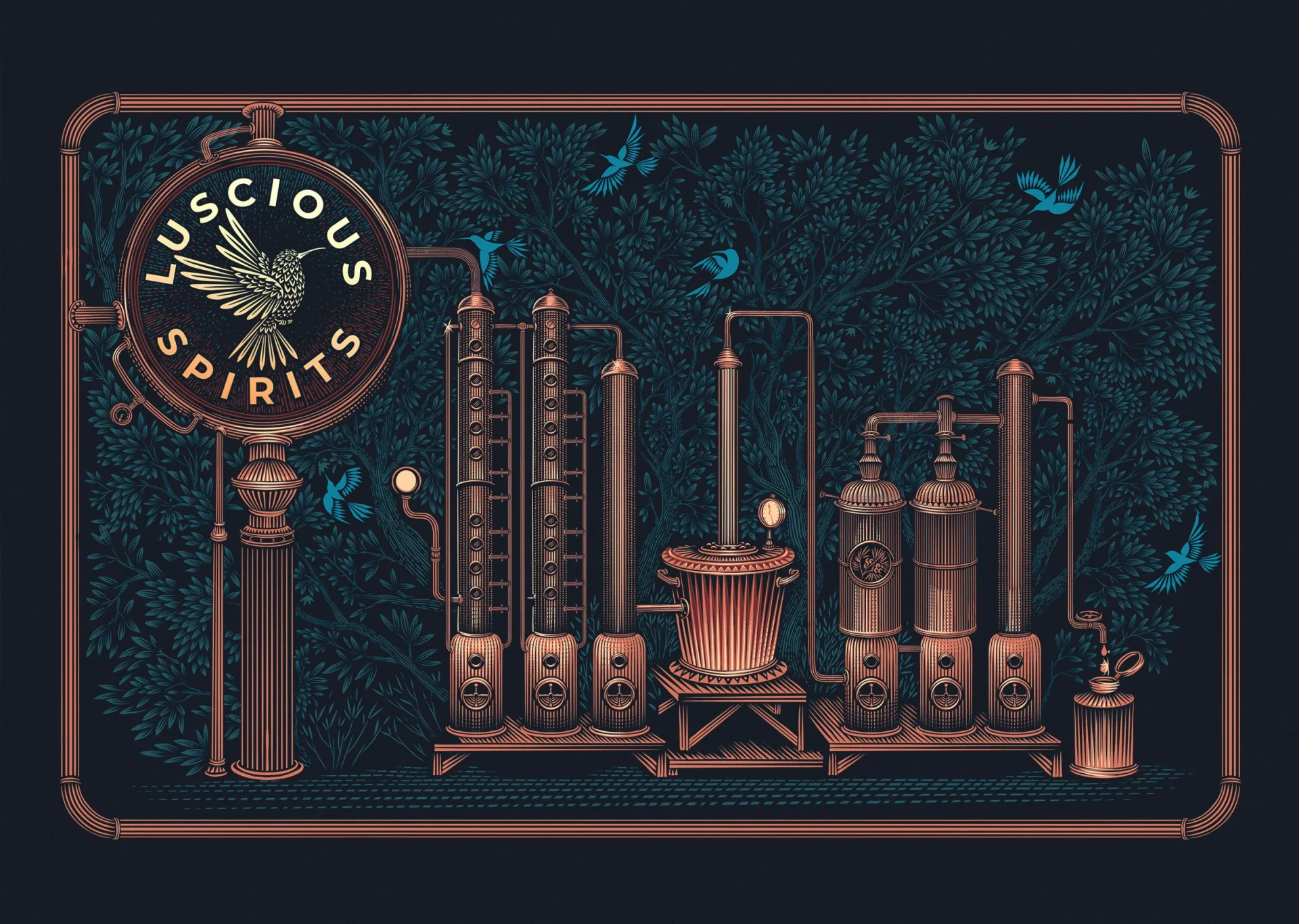
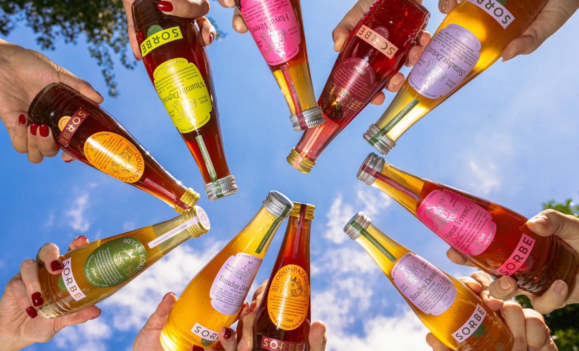
…curious, agile and nature-led spirit. Expressive typography, bold colour and a layered label system, drawing on stamps and seals, give the brand a distinctive and lively presence. The…
project
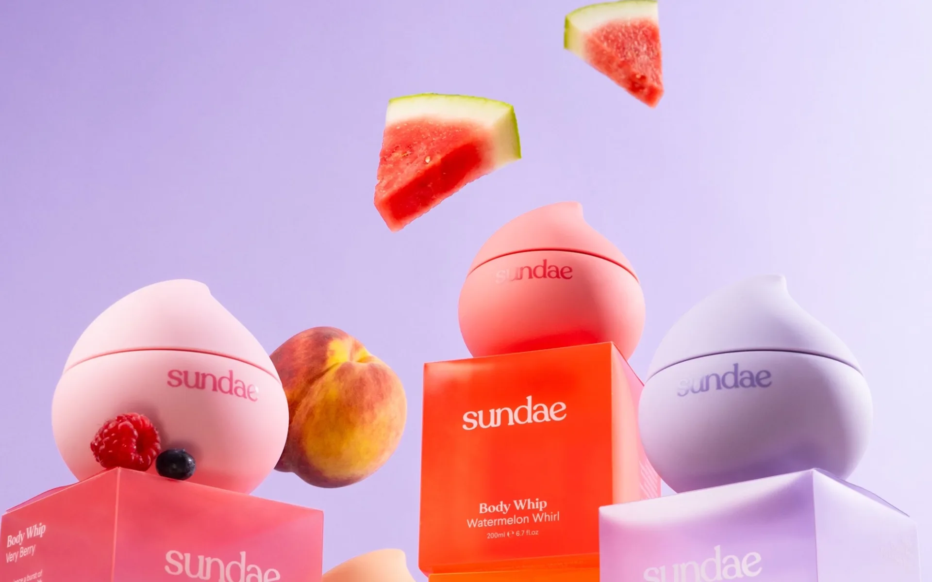
…receive six color treatments, each readable at distance as a color-field rather than a label-first identification. Graphic language is minimal on each bottle: the Sundae wordmark in…
project
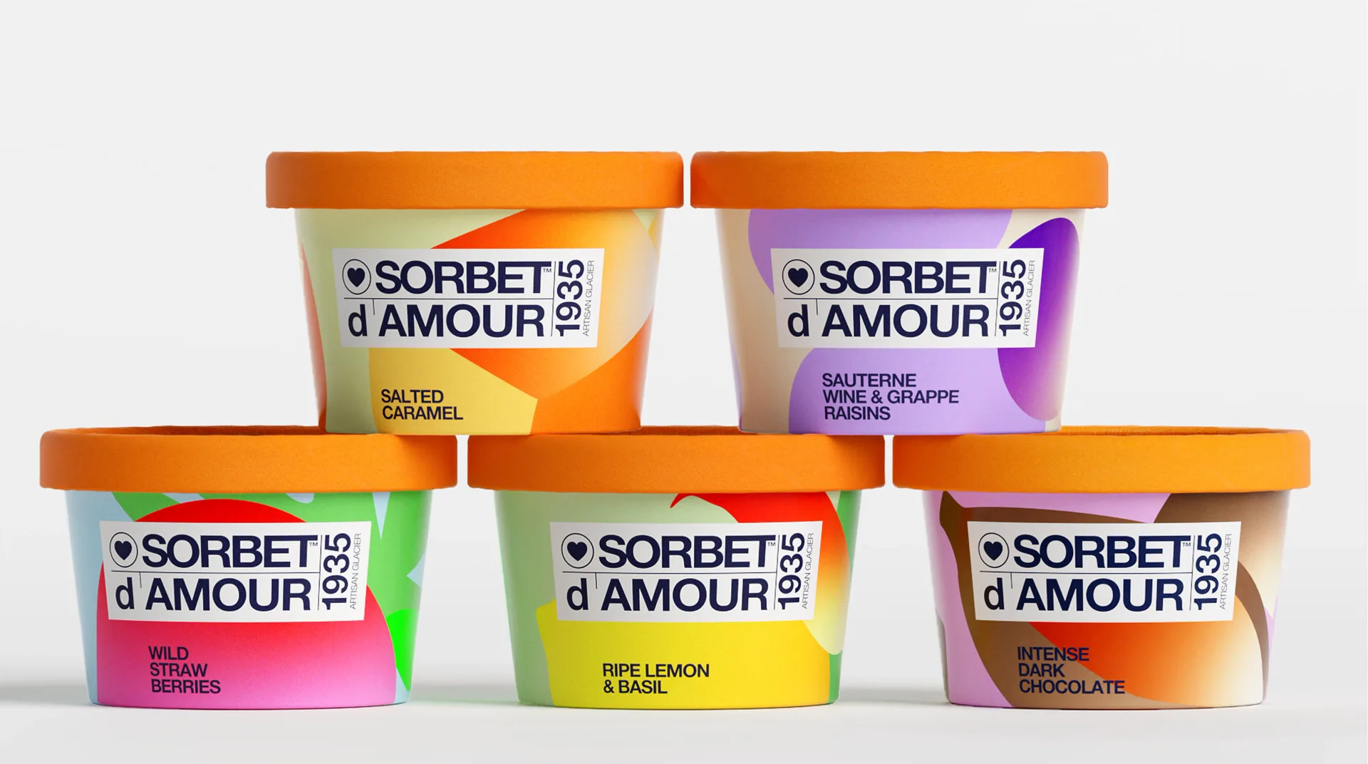
…product line: flavor-specific color worlds built from abstract organic shapes, a unified label system anchoring the brand mark across the range. The result is a system that works at shelf…

article
…a category of associations before a single product is seen. A brand name is not just a label - it is a position. The Constraints a Name Creates When you name a company 'Oatly,' you…
project
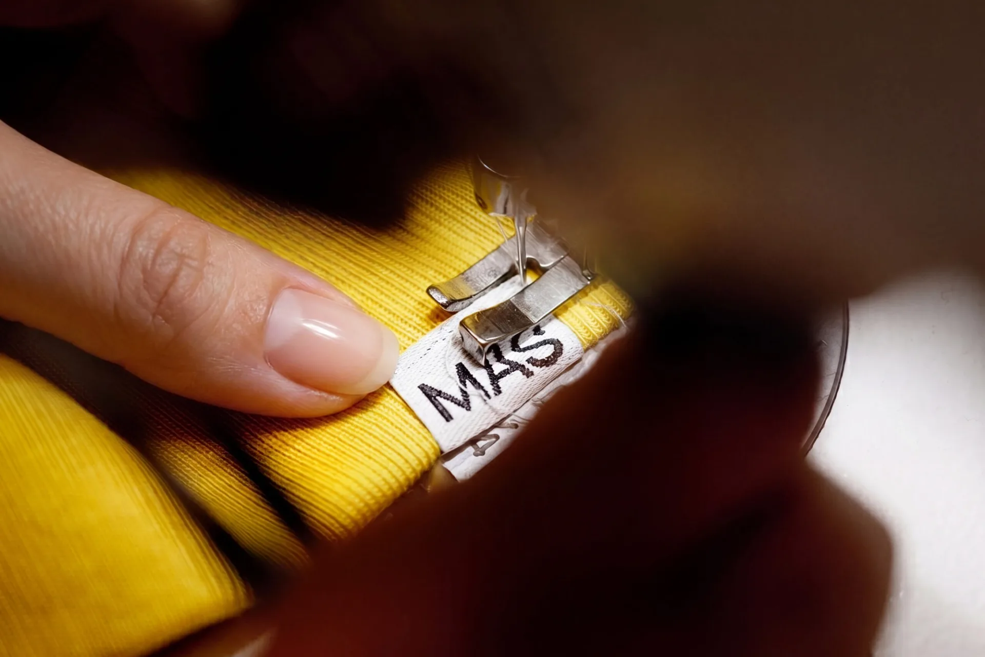
…distinguishing detail without sacrificing legibility at small scales (important for woven labels on garments). An anniversary badge inspired by measuring tape marks the 75 years; a secondary…
project
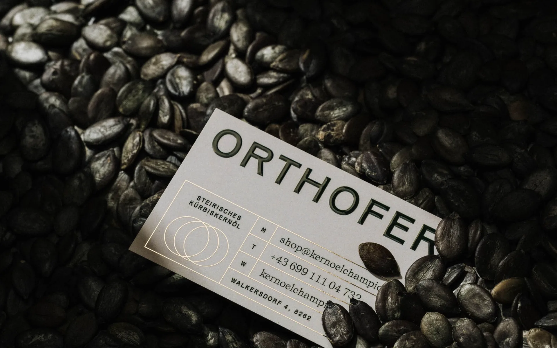
…pumpkin's silhouette as a mark that can be scaled, cropped, and reoriented across packaging, labels, and secondary materials, a modular asset rather than a fixed lockup. The color palette…
article
…includes packaging scale, how products sit on a shelf, the density of information on a label, the weight of a shopping bag. Aesop has spatial identity. Most DTC brands don't. Second…
article
…being a flag. The typography that feels like it belongs on both a boarding pass and a wine label. Every touchpoint, from the cabin crew uniforms to the in-flight menu design to the lounge…
project
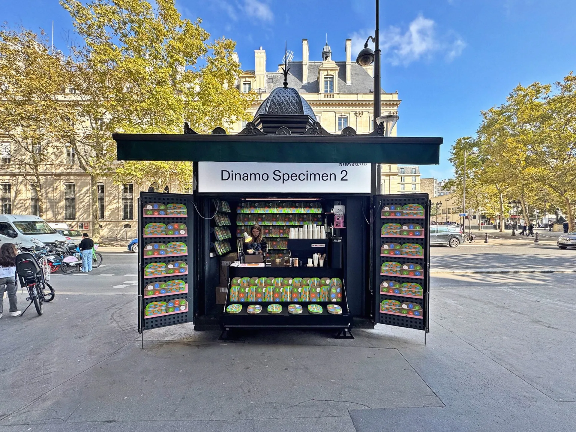
…literate brands of the past decade: technology companies, cultural institutions, fashion labels that care deeply about visual language but would never describe themselves as "typographic…
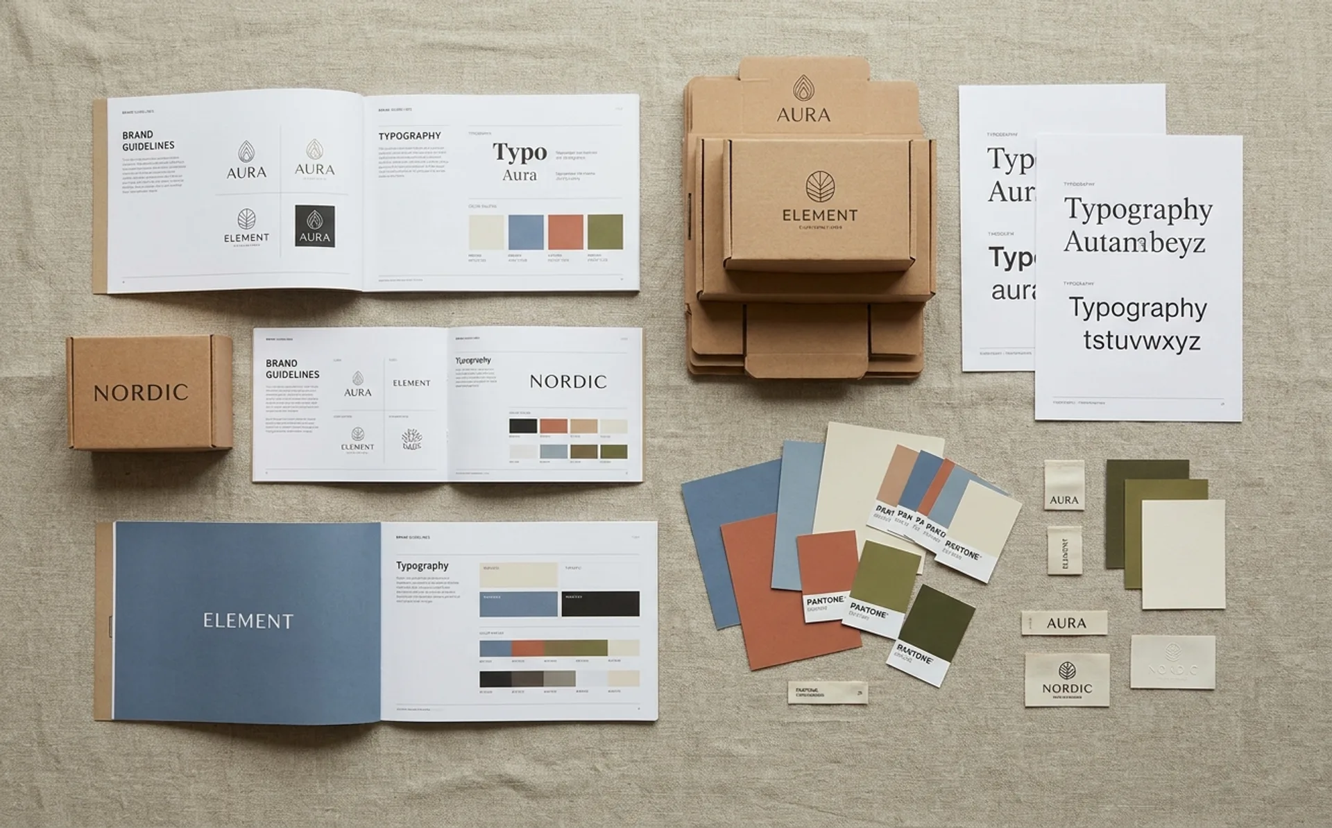
ranking
…experience since the 1980s. The changes are subtle: a slightly warmer kraft tone, cleaner label typography, and a new approach to product information hierarchy that prioritizes visual…
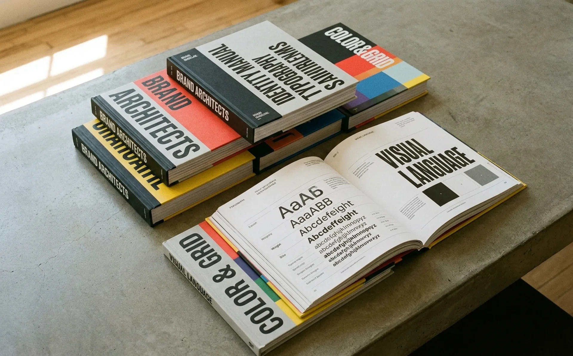
ranking
…The most visible brand touchpoint for many companies is language: error messages, button labels, email subject lines, help documentation. Mailchimp's Content Style Guide treats these…
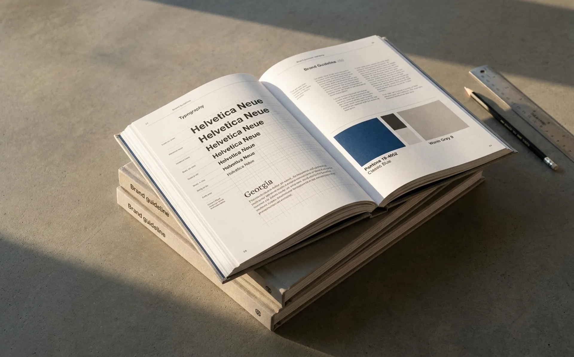
ranking
…as the brand's primary asset. The apothecary amber bottles and minimal black-and-white labels have remained essentially unchanged for 35 years. Steal: the thesis that distinctiveness…
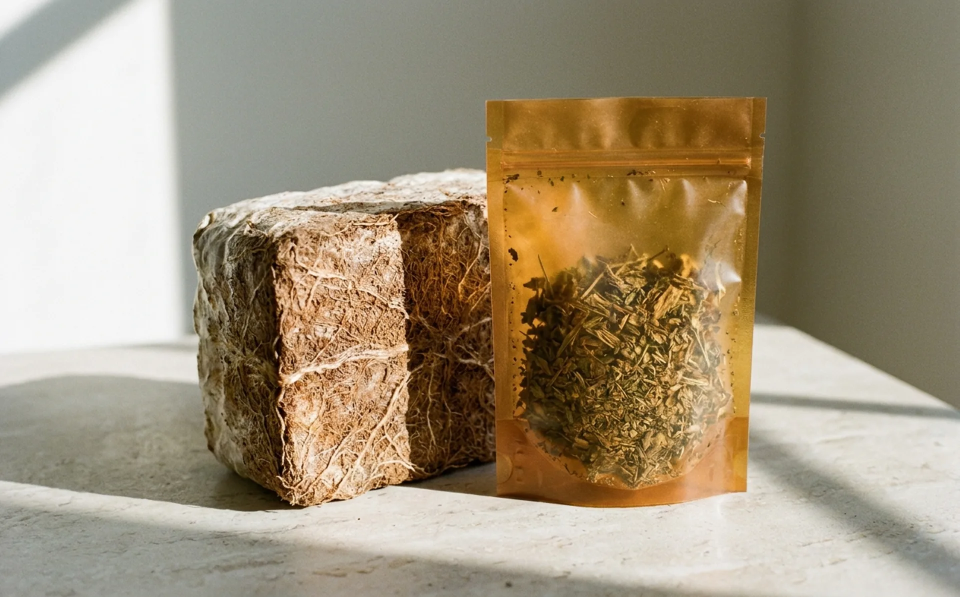
article
…was a marketing claim more than a material specification. The products that carried the label were usually petroleum-derived plastics with enzyme additives: "biodegradable in industrial…
article
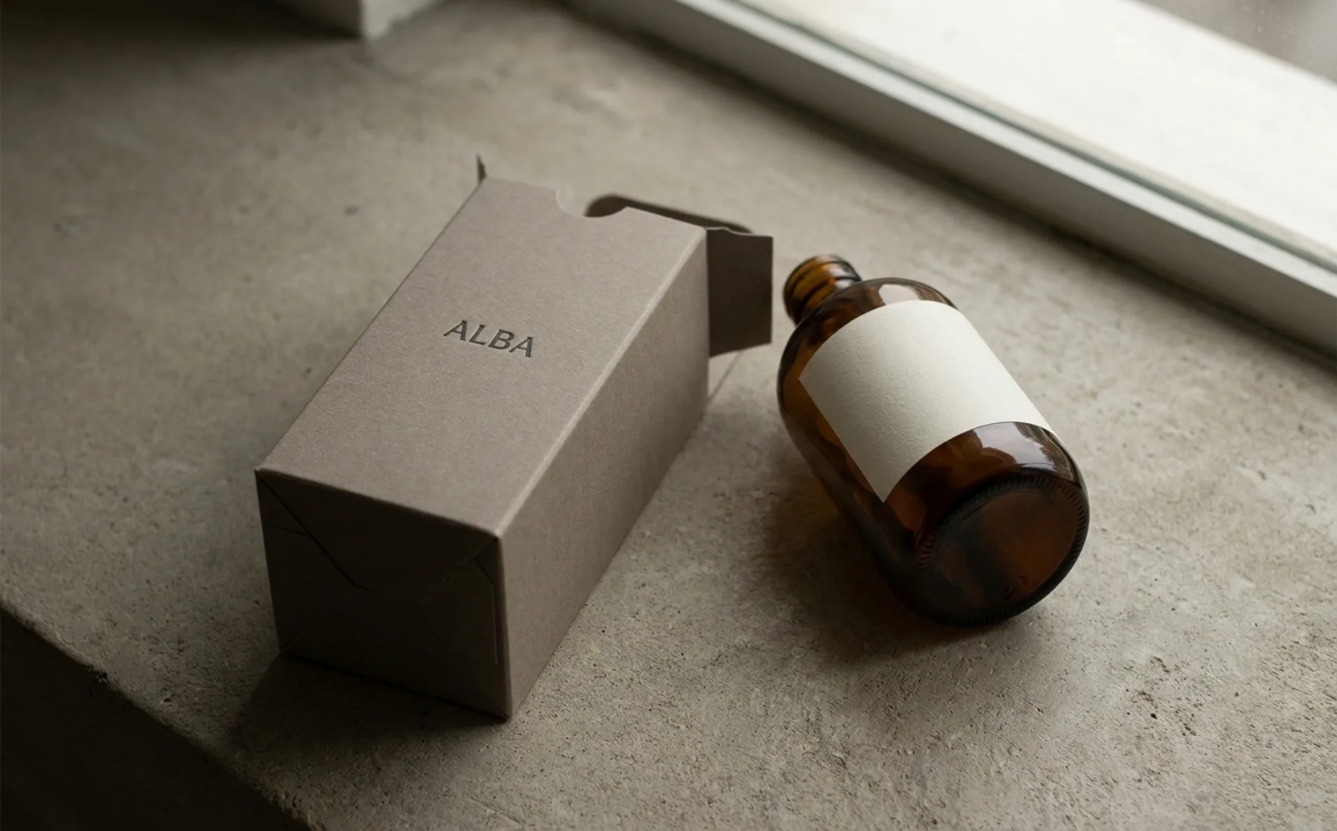
…their existing design discipline (single-substrate amber bottles, minimal black-and-white labeling, restrained secondary packaging) was effectively mono-material before the term existed…

article
…differentiation, and that the resulting identity could belong to anything from a fashion label to a fintech. A year and a half on, the picture is quieter and considerably more complicated…
article
…and black palette, custom Chinese-inspired typography, and unapologetically maximalist label design, reject every convention of the "artisanal condiment" category: the kraft paper,…
article
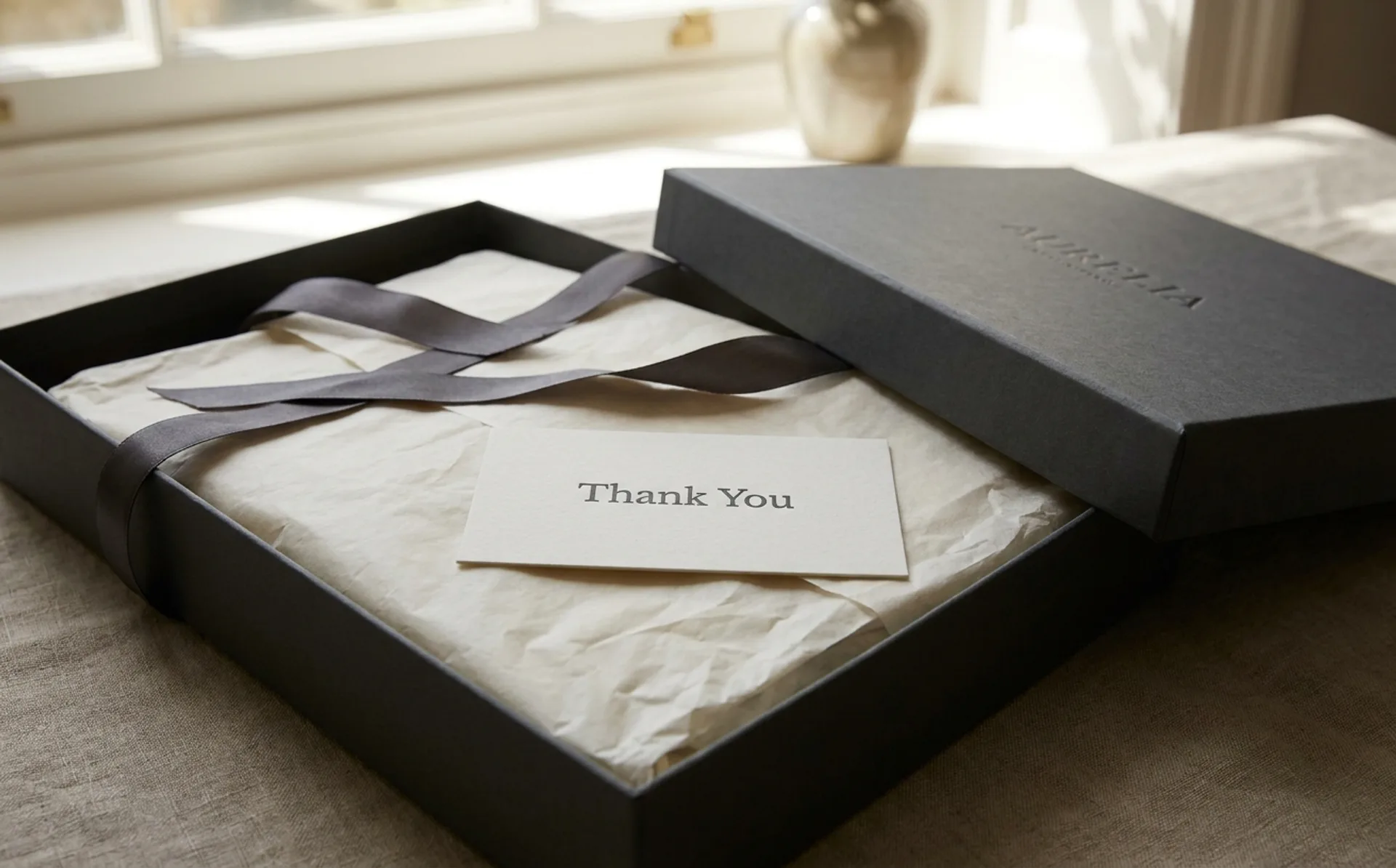
…much a design object as the formulation inside it. The amber glass, the apothecary-style label typography, the pump mechanism's resistance: every element is calibrated to reinforce the…
article
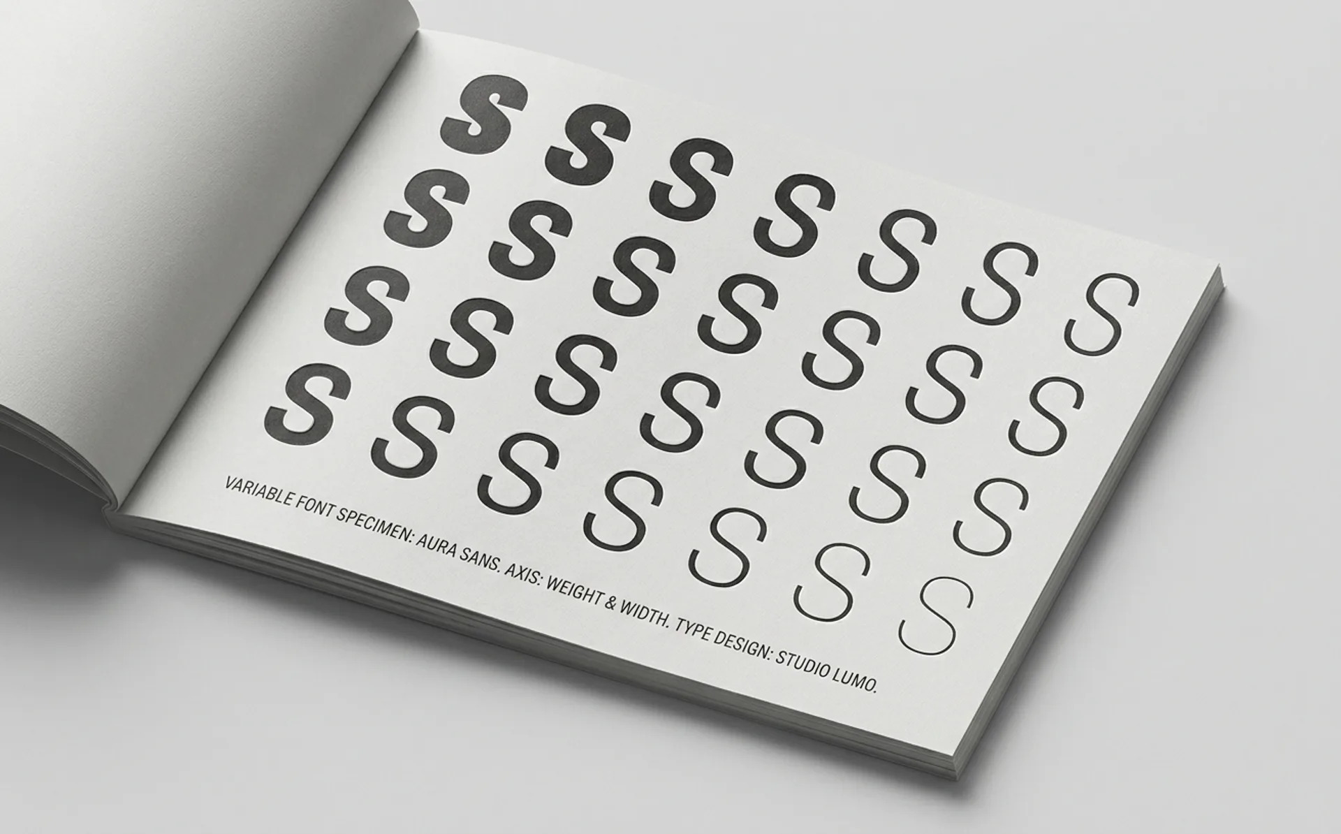
…design system, typography is defined as a set of named styles (Body, Heading 1, Caption, Label, and so on) each mapped to a specific combination of typeface, weight, size, and line height…
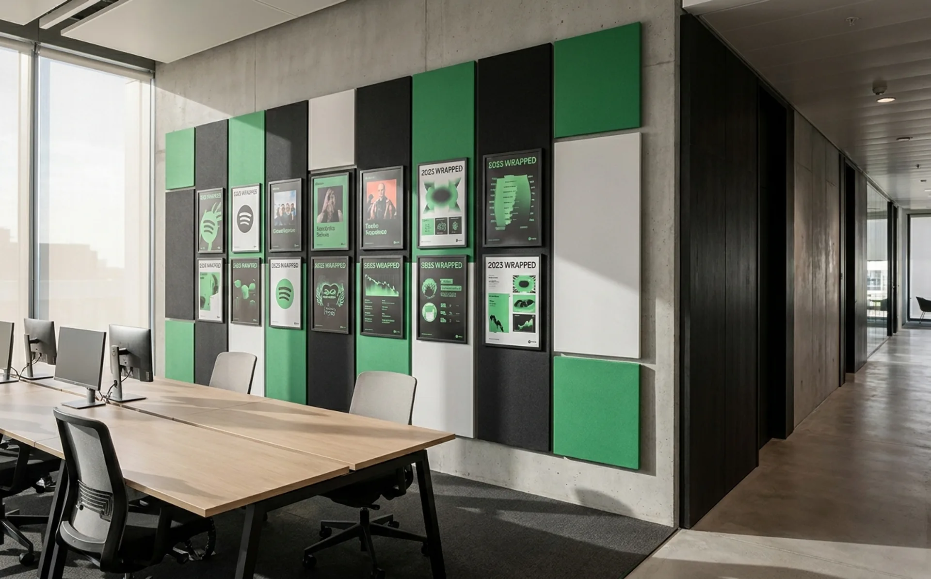
article
…and browsing layout that signal "this is a book" without requiring the user to read a label. The brand system is learning to differentiate content types through interface design rather…
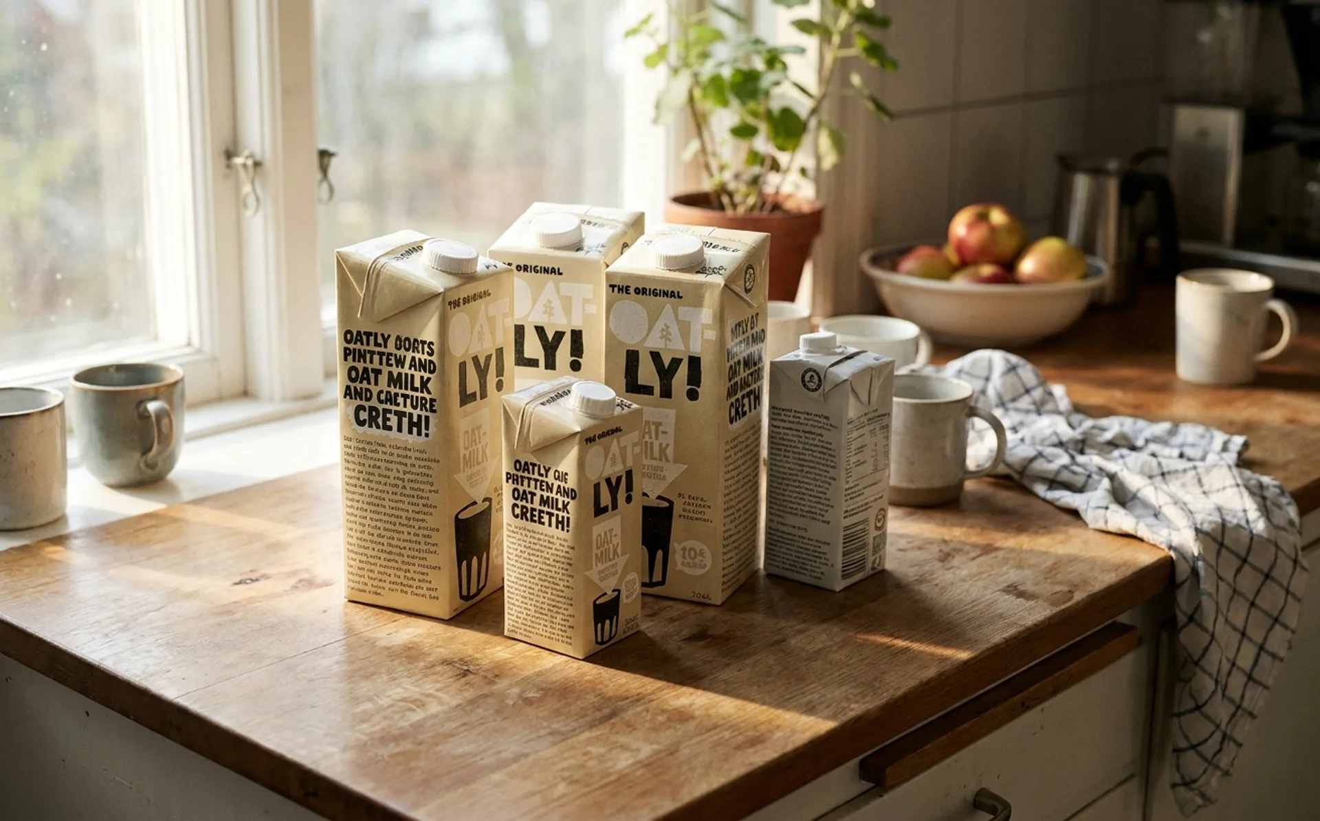
article
…Barista Edition and turn it around. Where every other beverage brand places a nutrition label, a barcode, and as little else as legally permitted, Oatly has put something unexpected…
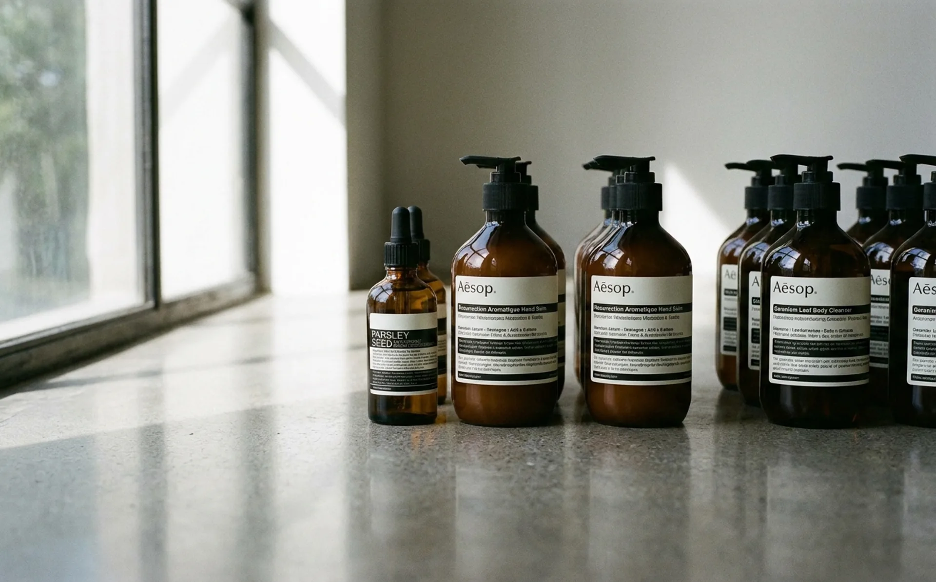
article
…wordmark itself. The packaging system is deliberately monochromatic: amber glass with cream labels, aluminium tubes with brown ink, cardboard boxes in a single shade of kraft. There is no…