project
Work, articles, studios and categories across the archive.

project
…operator adjusting focus mid-shot — giving those frames a sense of being handled rather than rendered. Sound Design What makes this approach unique is the way music and sound design blend…
project
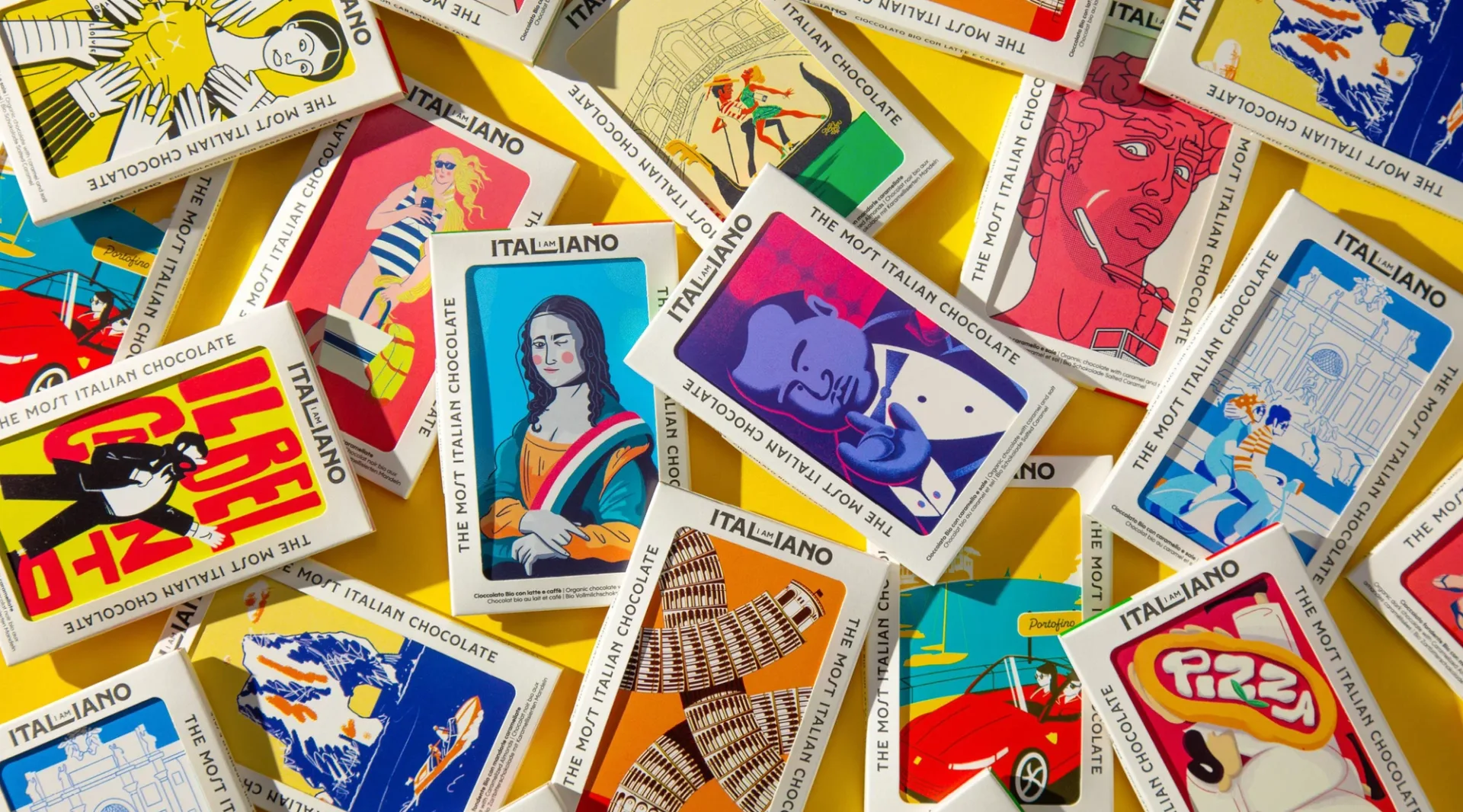
…is deliberately varied: some bars use high-contrast vector work, others use painterly renderings, others use typographic compositions with custom letterforms by Mattia Cristini. This…
project
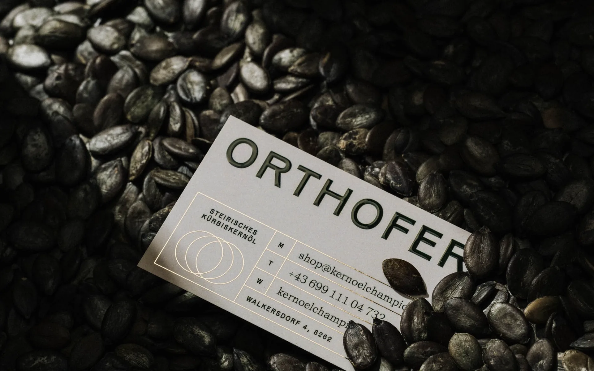
…is a flexible logo built around the pumpkin itself as the graphic element. Rather than rendering a pumpkin as a decorative icon, Diemling treats the pumpkin's silhouette as a mark that…
project
…and "lightning" and "10x." Then you log into the product and it takes four seconds to render a page. Linear is the opposite. The brand barely mentions speed. The product, a project…
article
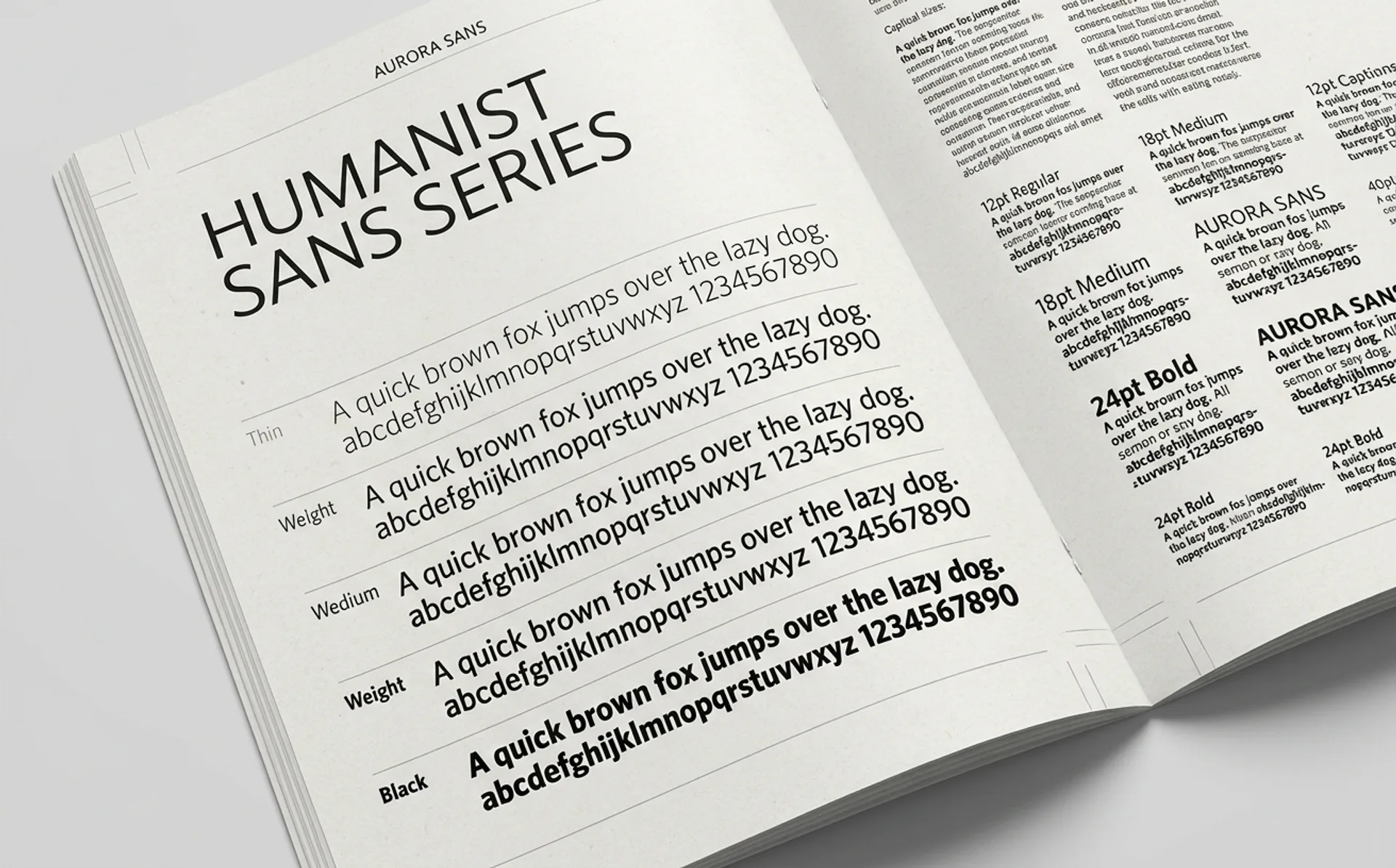
…resolution legibility, rounder curves. The typeface auto-swaps the correct cut depending on the rendered size of the text. A 10-point button and a 48-point headline are set in visually different…

project
…for small sizes loses presence at large ones. The Bélo's geometric simplicity means it renders cleanly at any size. Cultural neutrality. The Bélo references nothing culturally specific…

project
…The butterfly is drawn at a low level of abstraction: simple wings, a center spine, no rendering flourishes. The typography across the app is a clean workhorse sans-serif: notably, not…
project
…s you would expect from an AI company. The neural-network particle animation. The "AI" rendered in a glitch typeface with a holographic gradient. The hero video of a robotic hand touching…
article
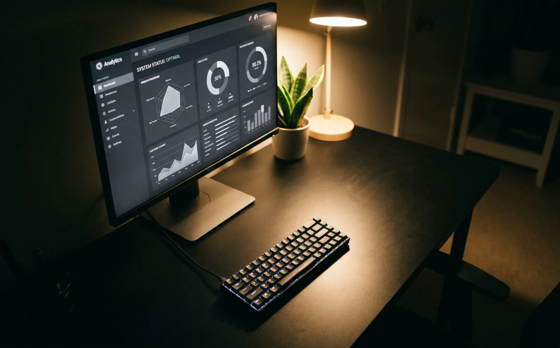
…Mono or tight grotesque typography at a generous line-height. Geometric SVG illustrations rendered in flat line-work rather than full-color illustration. Aggressive whitespace. A hero video…

project
…early: simple, almost childlike characters with oversized heads and minimal features, rendered in a style that suggests a designer's sketchbook rather than a corporate asset library…
article
…clean sans-serif wordmarks with geometric precision, no icon, no symbol, just the name rendered with craft. The approach communicates "we are an engineering company that cares about…
article
…collection's mode selector, choose `Brand A`. 3. Every component inside that frame now renders with Brand A's tokens. 4. Duplicate the frame. Switch the duplicate to `Brand B`. Instant…

article
…palettes. Warm creams, muted greens, soft tans. The bio-material categories do not currently render saturated colors well, so packaging systems using them tend to lean into the earth-tone…
article
…created by Hernan Torrisi, designers could export compositions as lightweight JSON files that render natively on iOS, Android, and the web. For the first time, a brand's motion guidelines…
ranking
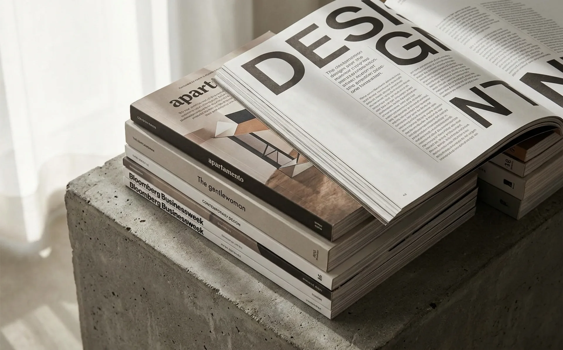
…column, generous margins), but the image treatment is unusually daring. Full-bleed images rendered with deliberate imperfections. 11. Dummy Mag German magazine covering sociology and…
article
…functionally indistinguishable from one another. The reasons were practical and real. Sans-serifs render cleanly at small sizes on digital screens. They scale gracefully from favicon to billboard…
article
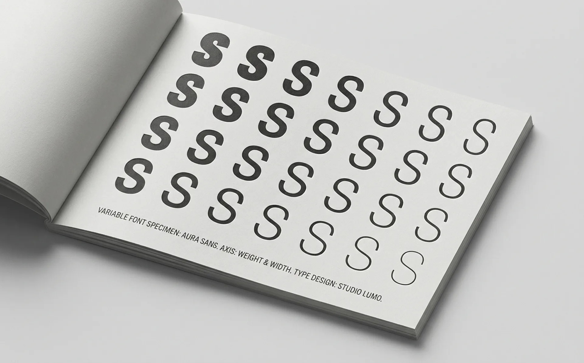
…contain Regular and Bold. It contains every value in between, and often values beyond, rendered by interpolating between the designer's master drawings. This was not entirely new as…
article
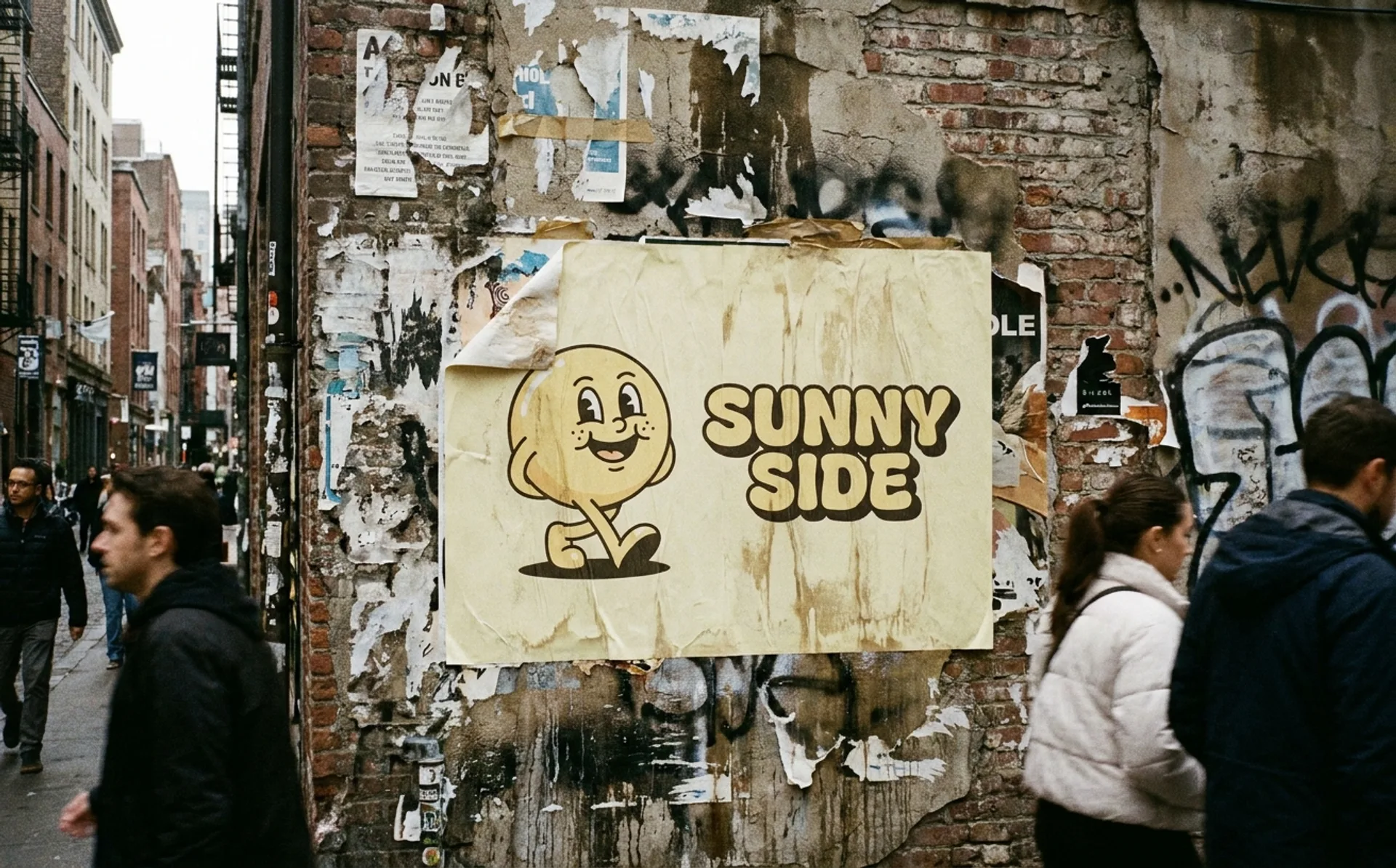
…Mailchimp was already one of the most recognizable brands in tech. Freddie the chimp, rendered in a hand-drawn illustration style, winked from the corner of every email footer powered…
project
…Lippincott's solution centered on a single graphic element: the heart. The heart symbol (rendered in Southwest's tricolor palette of blue, red, and yellow) became the carrier of the brand…
article
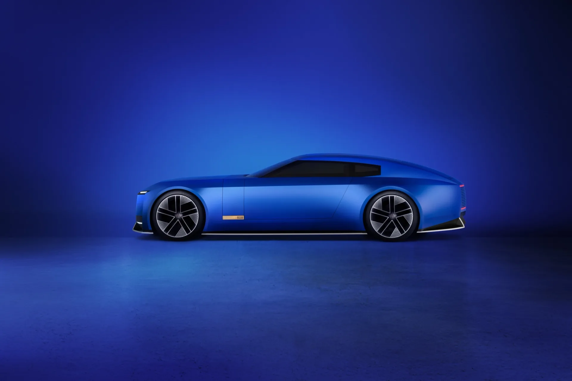
…reception allowed. Once product arrives and the conversation moves to the cars, the system will render cleanly. The sequencing. Brand reveal first, product reveal second, was risky but correct…
project
…immediate and violent. The logo (a jagged, crystalline arrangement of the numerals "2012," rendered in electric pink) was called ugly, incomprehensible, even seizure-inducing when animated…

article
…culture. Each location is an act of architectural translation: the same brand language rendered in a completely different material vocabulary. This approach is staggeringly expensive…