ranking
7 Typefaces That Defined Brand Identity in the 2020s
by WeLoveDaily Editorial
We use cookies to measure site traffic and improve WeLoveDaily. Nothing loads until you choose. Cookie Policy.
Work, articles, studios, brands and categories across the archive.
37 results
article
by WeLoveDaily Editorial
From Lockups to Systems The old model of brand identity: a logo, a colour palette, a typeface, a set of rules for how they combine. A 200-page PDF that lives in a shared drive and…

article
by WeLoveDaily Editorial
…usually means a set of colors, some textures, a photography direction, and maybe a custom typeface. That's not a world. That's a visual system. A real brand world is something you can…
guide
by WeLoveDaily Editorial
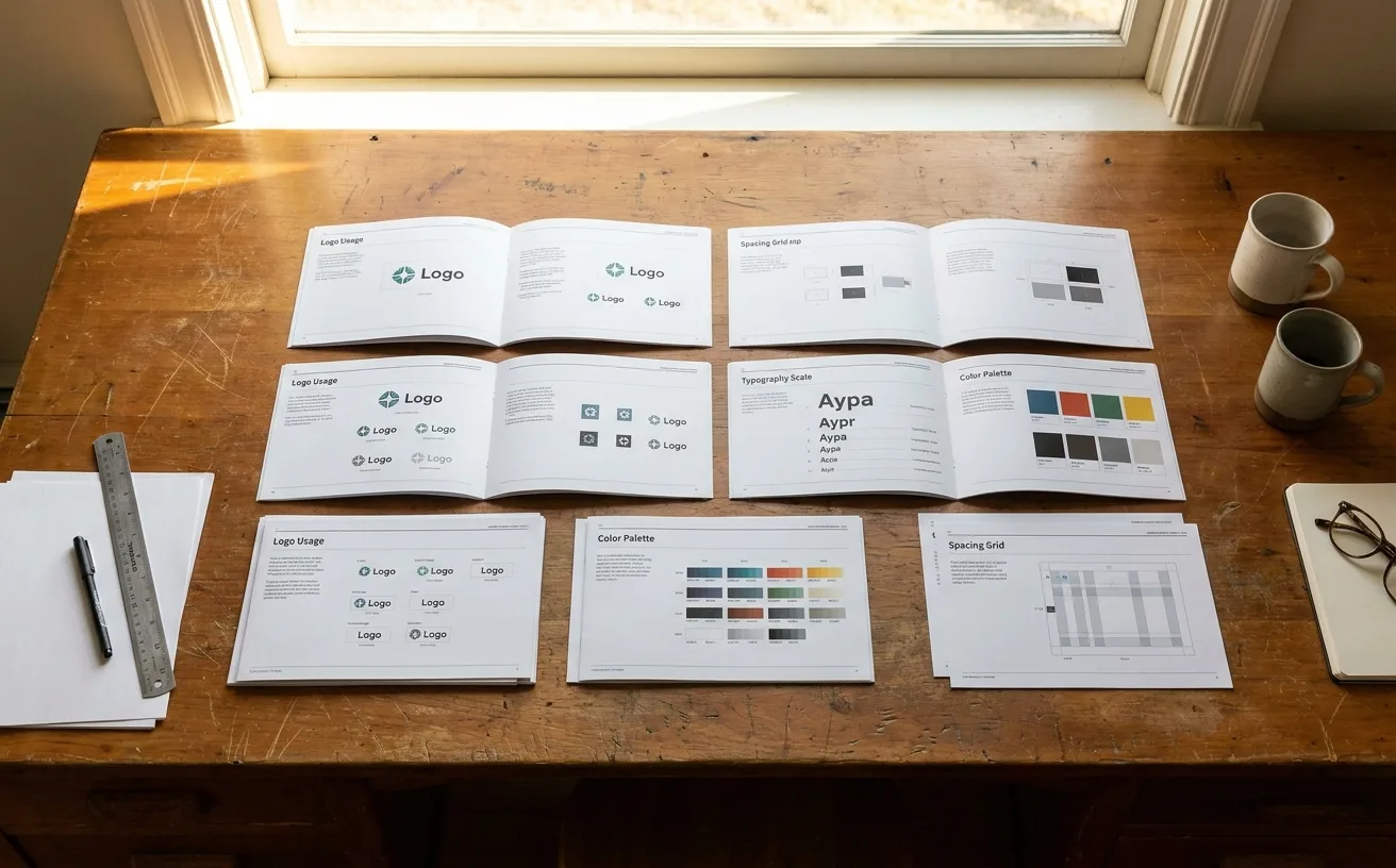
…answers the 10 most common questions: primary logo file, primary color hex codes, primary typeface name and where to download it, approved photography style (one example), do-and-don't…
article
by WeLoveDaily Editorial
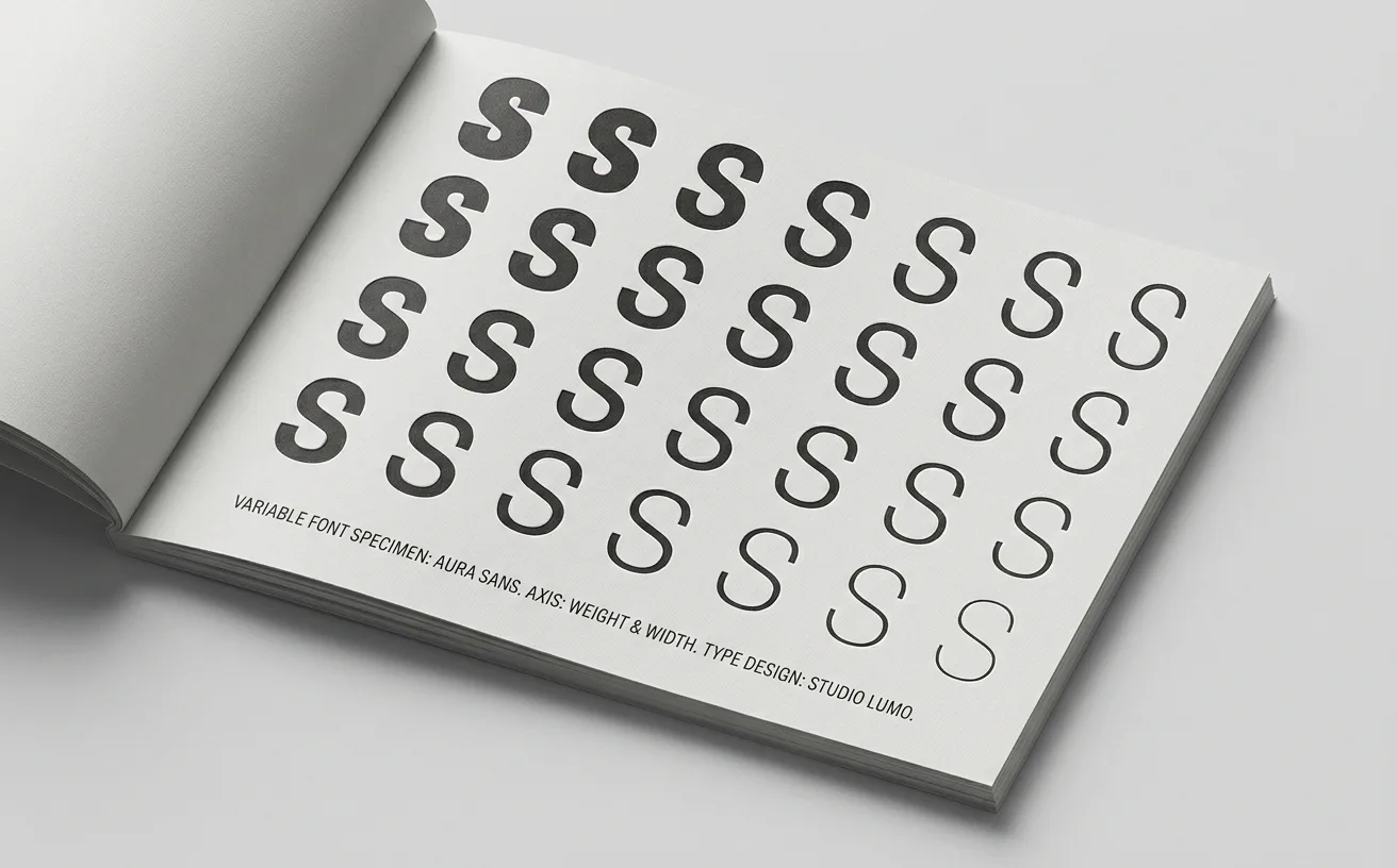
…traditional typographic vocabulary but that may be precisely right for the particular typeface, screen density, and background color in question. The brand's typography becomes tuned…
article
by WeLoveDaily Editorial
…reconsider how they navigate the internet, launched with a name set in a single, considered typeface. Notion spent years as a wordmark-only brand before introducing a minimal mark that most…

article
by Jose Pablo Dominguez
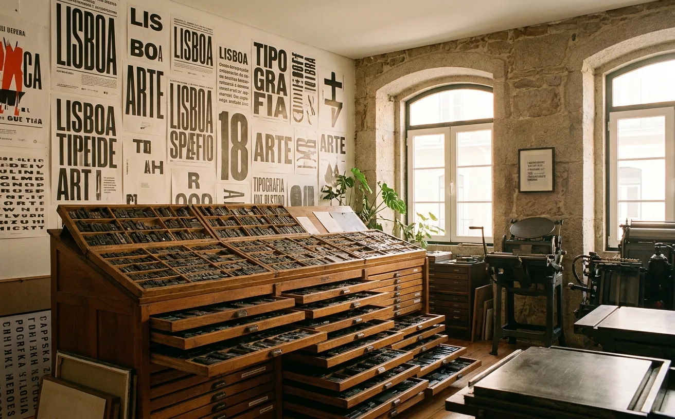
…ninger and Cristóbal Henestrosa have built a substantive Mexican foundry scene. Mexican typefaces (not just typefaces designed in Mexico, but typefaces that feel of Mexico) are now common…
article
by Jose Pablo Dominguez
…smaller but sharply curated foundry, has built a reputation for ultra-contemporary display typefaces that show up in fashion and cultural brand work. The foundry's output is less about system…
project
…from an AI company. The neural-network particle animation. The "AI" rendered in a glitch typeface with a holographic gradient. The hero video of a robotic hand touching a human hand. The…
article
by WeLoveDaily Editorial
…most revealing case studies in contemporary brand identity: a quiet argument about what typefaces actually communicate and why certain visual signals resist the gravitational pull of trends…

project
by Pentagram
…institutions. Where an earlier generation of Pentagram partners might have delivered a logo, a typeface, and a set of usage guidelines bound in a handsome book, the newer partners are delivering…

article
by WeLoveDaily Editorial
…primary brand identifier. It's more visible than the wordmark, more distinctive than the typeface, and more imitated than any other element of the system. The gradient works for several…
article
by WeLoveDaily Editorial
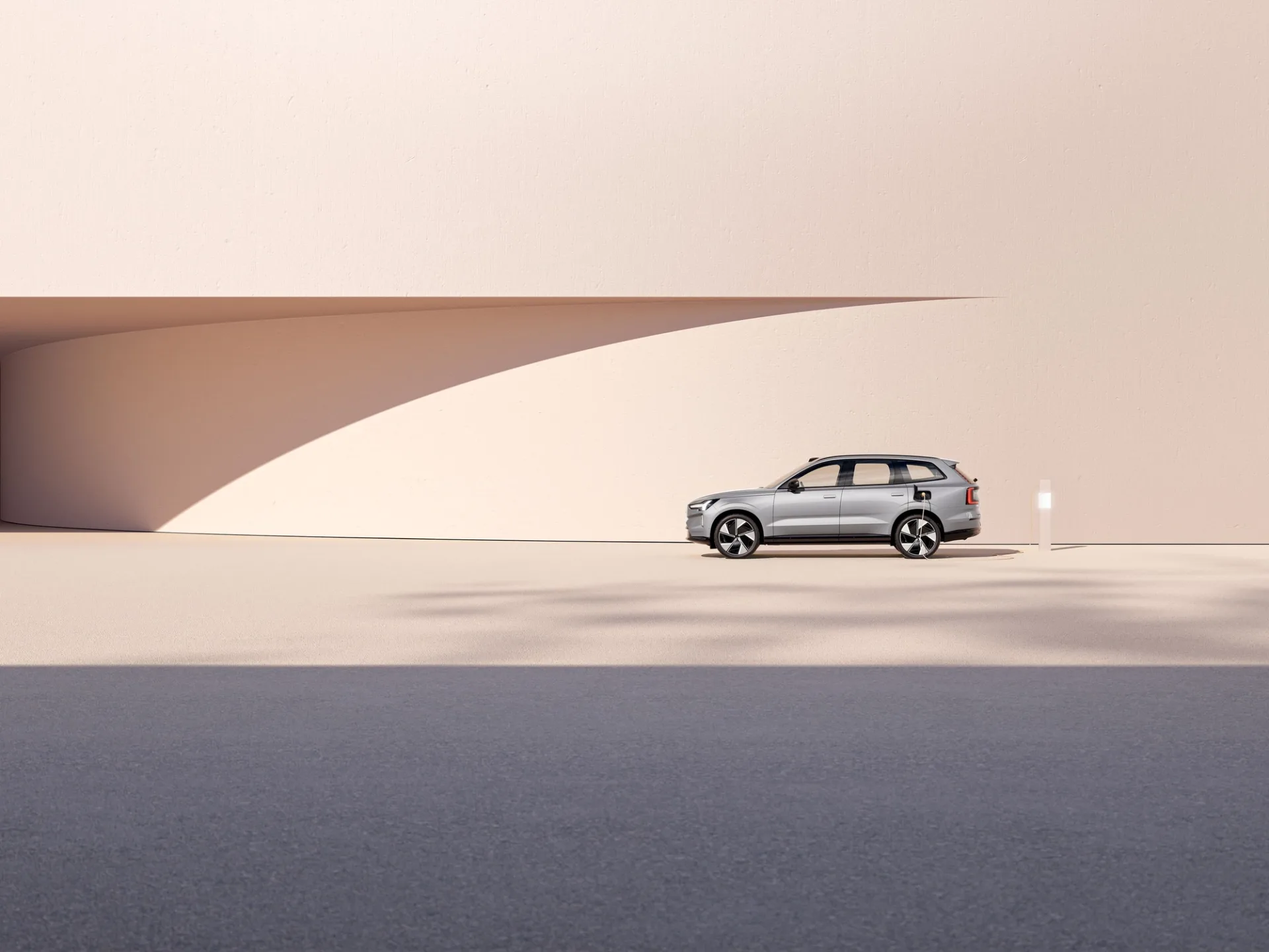
…Typography as Architecture Volvo's type system is where the real ambition lives. The custom typeface, Volvo Novum, operates at three weights across every touchpoint, from dealer signage to…
guide
by WeLoveDaily Editorial
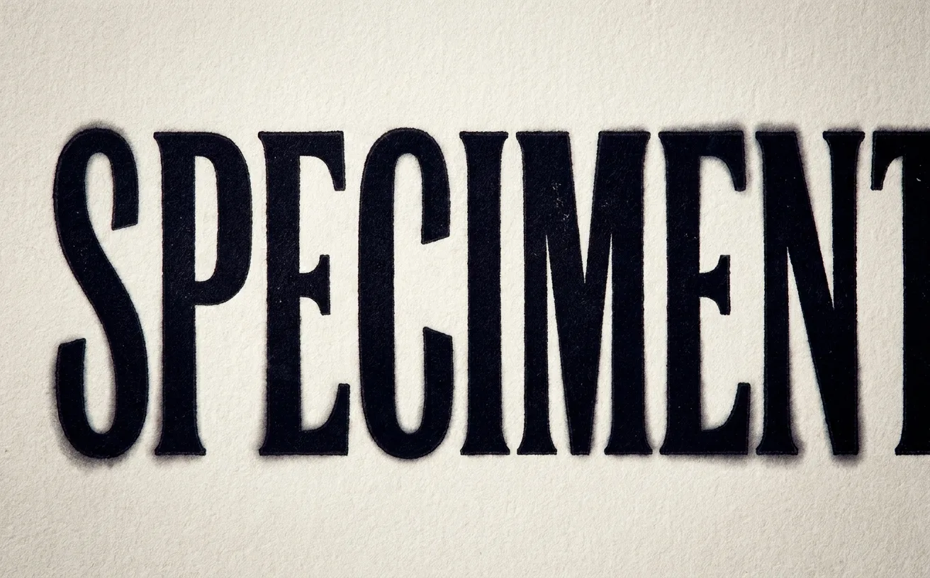
You set a headline at 120 pixels. The typeface is excellent: you chose it for exactly this moment. The weight is right, the case is right…
article
by WeLoveDaily Editorial
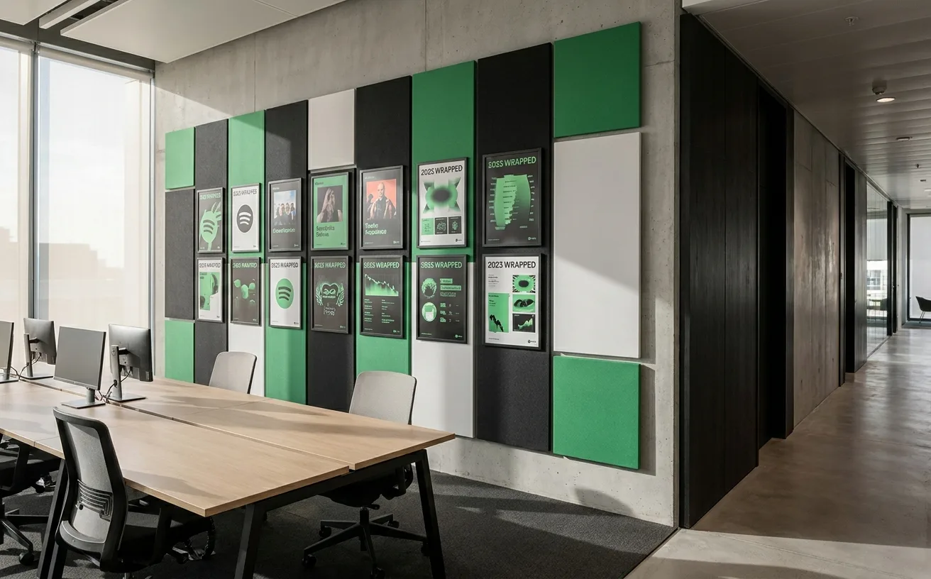
…product experience. Each year's Wrapped introduces a distinct visual language: custom typefaces, experimental color palettes, animated transitions, data-driven graphics. The 2022 Wrapped…
article
by WeLoveDaily Editorial
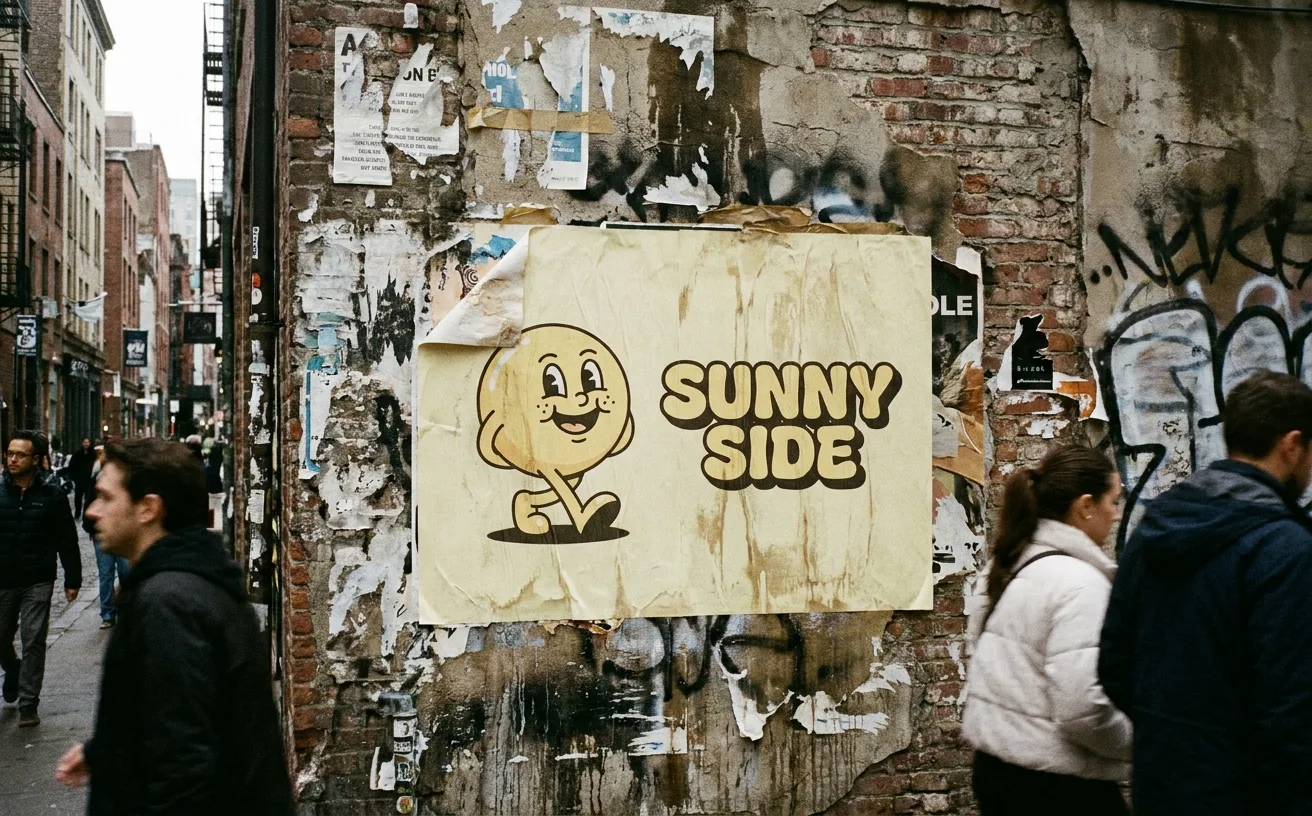
…footer powered by the platform. The camel-cased "MailChimp" wordmark sat in Cooper Light: a typeface so closely associated with the brand that using Cooper anywhere near email marketing felt…
project
…terminals, angled ascenders, a lowercase "g" that mimics the owl's raised eyebrow. A custom typeface, Feather Bold, embedded the mascot's personality into the typography itself. The design…
article
by WeLoveDaily Editorial
…suggesting that the entire viewing experience is contained within the brand. A custom typeface, Max Sans, developed with type foundry F37, uses pure geometric forms that reference the…
article
by WeLoveDaily Editorial
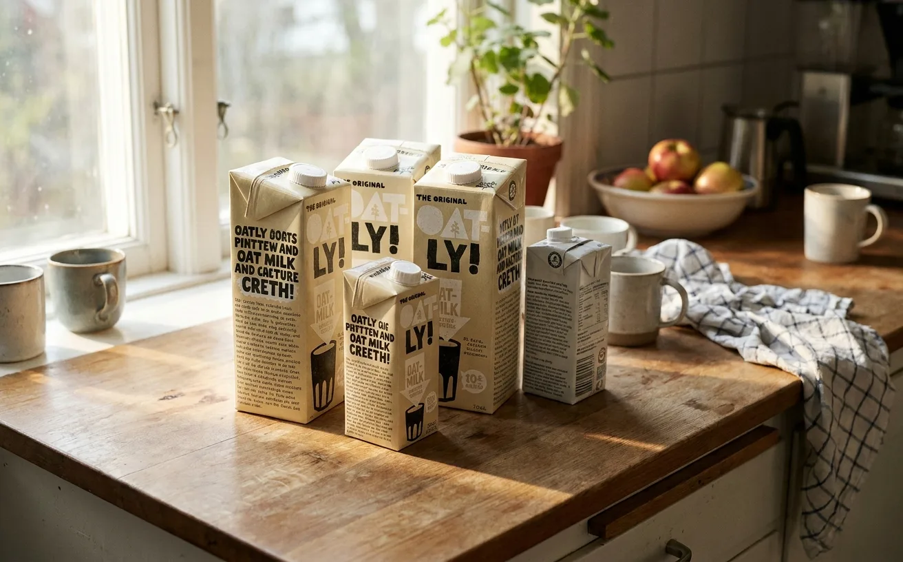
…an extraordinarily well-designed lie. Start with the typography. Oatly uses a custom typeface that blends hand-drawn imperfection with the consistency of a designed system. The letterforms…

article
by Jose Pablo Dominguez
…material substrates tends to be restricted. Designers are responding by committing to fewer typefaces, tighter spacing, more disciplined hierarchy. Copy-led narrative. When the material itself…
article
by WeLoveDaily Editorial
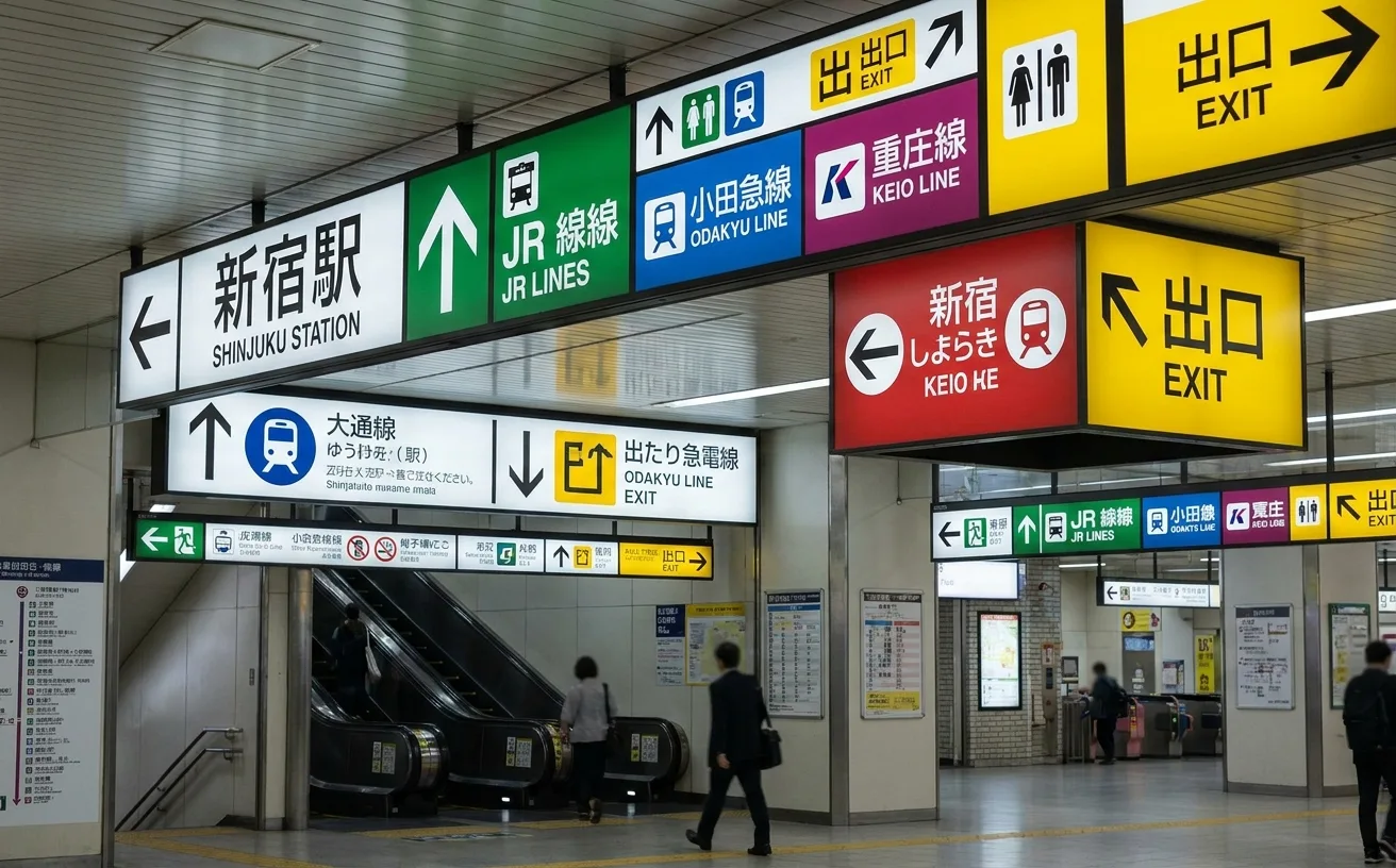
…carefully controlled typographic hierarchy. Japanese text, typically in a clean Gothic typeface such as Shin Go or the system typefaces from the Hiragino family, is set at the largest…
article
by Jose Pablo Dominguez
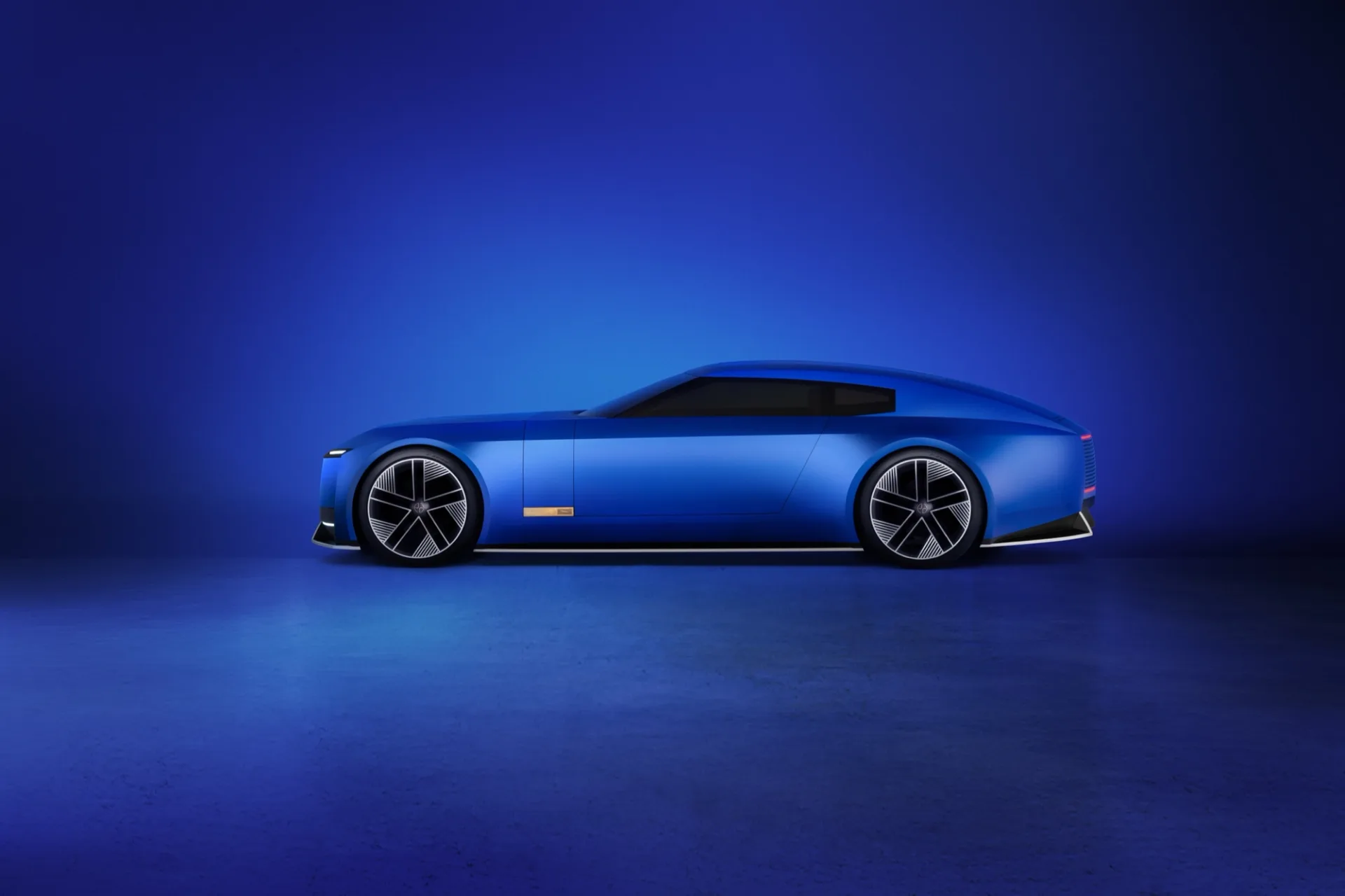
…far, paid that price. The design system itself (the geometric monogram, the Jaguar Sans typeface, the pink-chrome accents, the maximalist imagery direction) is stronger than most of the…
article
by WeLoveDaily Editorial
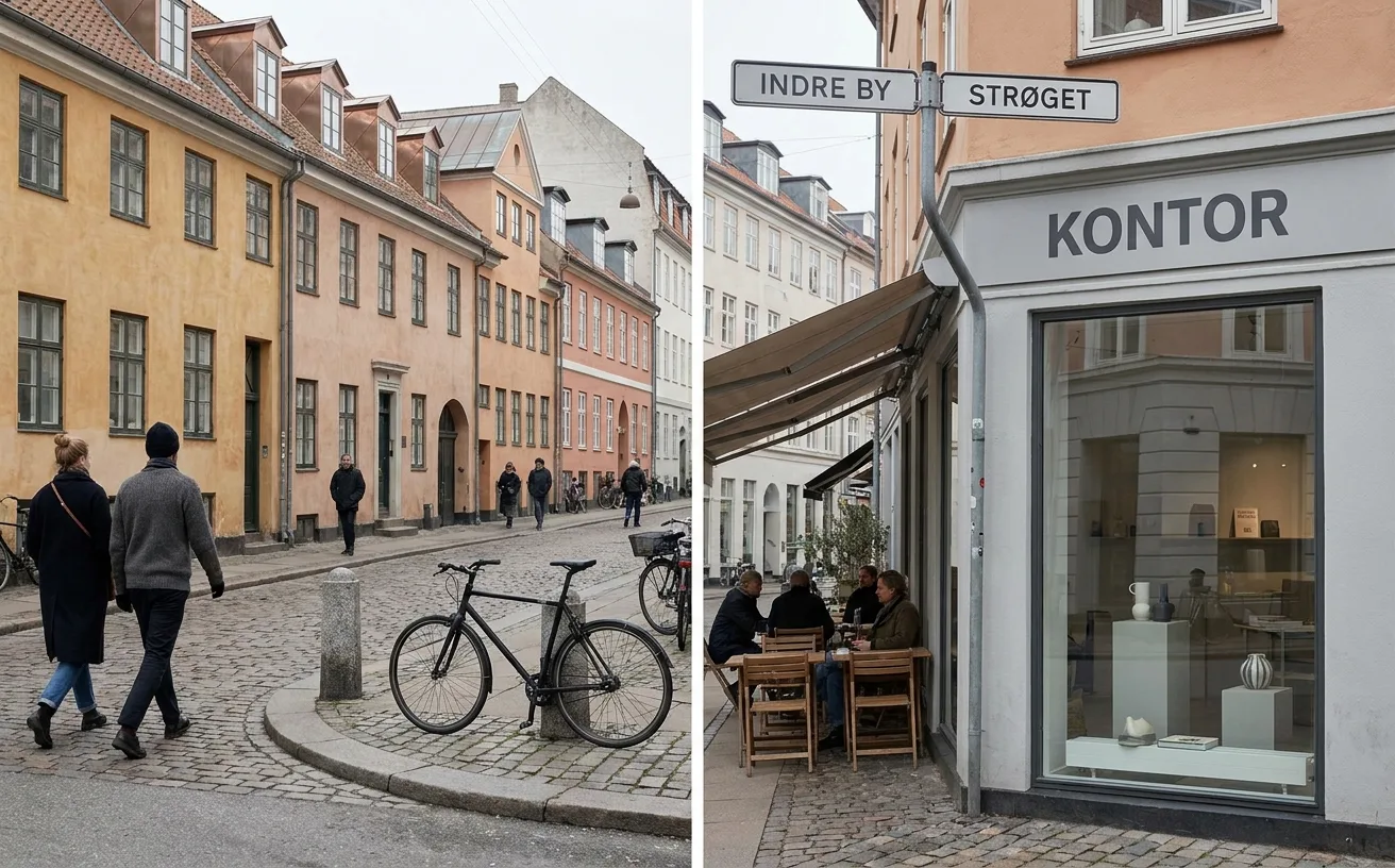
…physically separated surface, slightly elevated, with its own traffic signals designed in a typeface that matches the city's wayfinding system. The bench at the bus stop isn't municipal afterthought…

project
by Alex Dang
…refreshing sense of coolness into the heat of HCMC. The distinctive yet highly legible Abordage typeface complements the system across taglines and brand applications. (KEY FEATURES): •…
project
by Pentagram
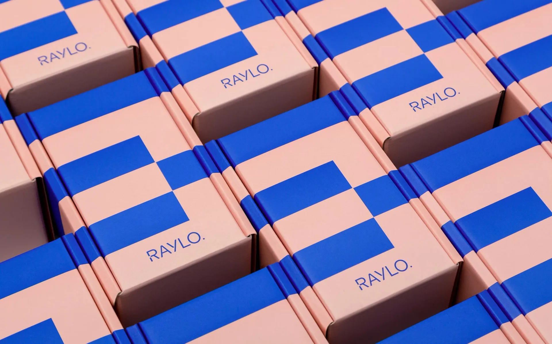
…Consistency at that spread is what stops a two-colour pattern from reading as decoration. The typeface was altered by a single glyph The system is set in FK Grotesk, chosen for typographic…