project
Work, articles, studios and categories across the archive.
project
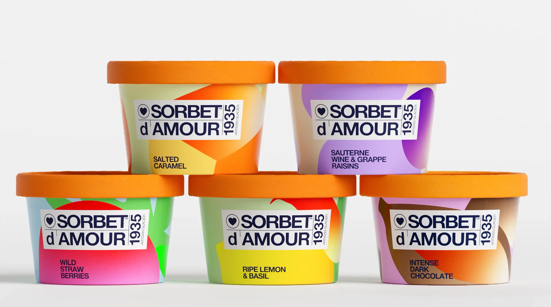
…always been. We designed the graphic language for a new product line: flavor-specific color worlds built from abstract organic shapes, a unified label system anchoring the brand mark…
project
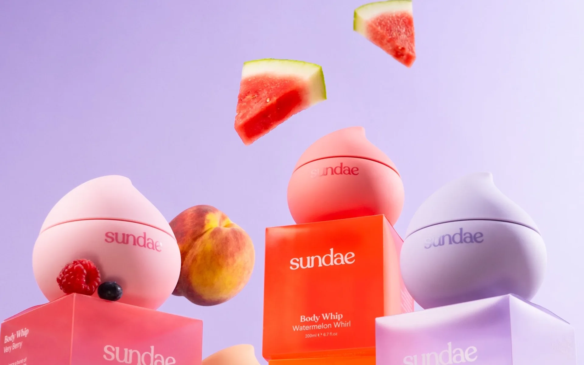
…bottles punctuate the rectangular-bottle category's monotony. Six scent variants receive six color treatments, each readable at distance as a color-field rather than a label-first identification…
ranking
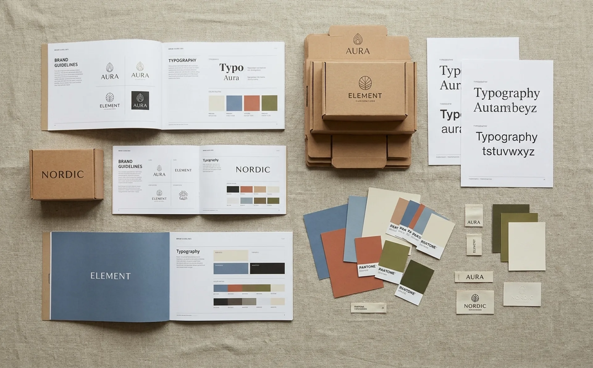
…on a complete packaging redesign that replaced its original hand-drawn look with a bold, color-blocked system anchored by custom display type. The new design sacrifices indie charm for…
project
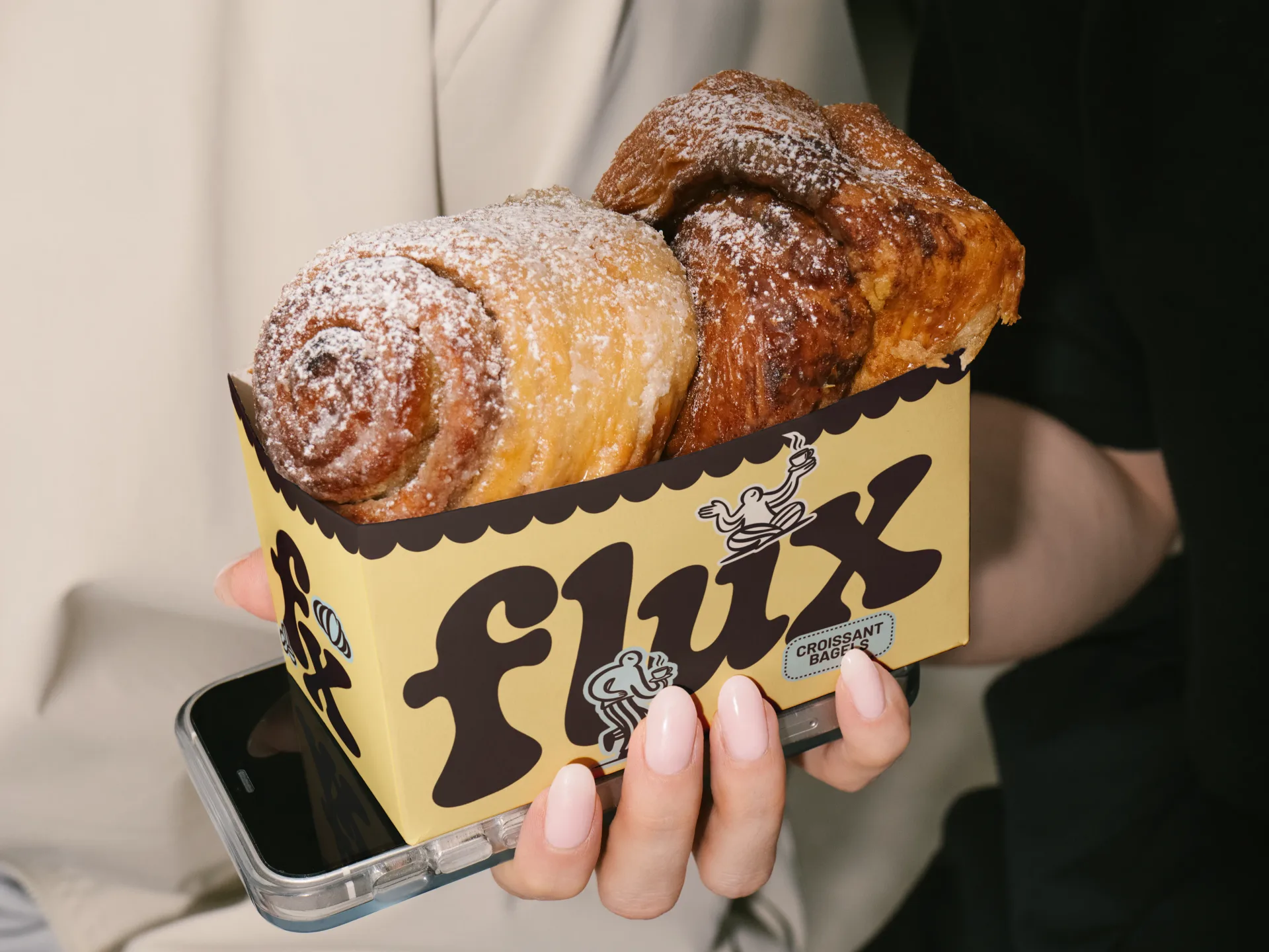
…Visually, Flux Coffee combines a retro touch with a homey, approachable atmosphere. The colors, typography, and illustrations are designed to feel nostalgic yet fresh, bringing the comfort…
article
…multi-material predecessors because the engineering is exposed rather than concealed. Color palettes compress. Printing on a single substrate with recyclable inks usually restricts…
project
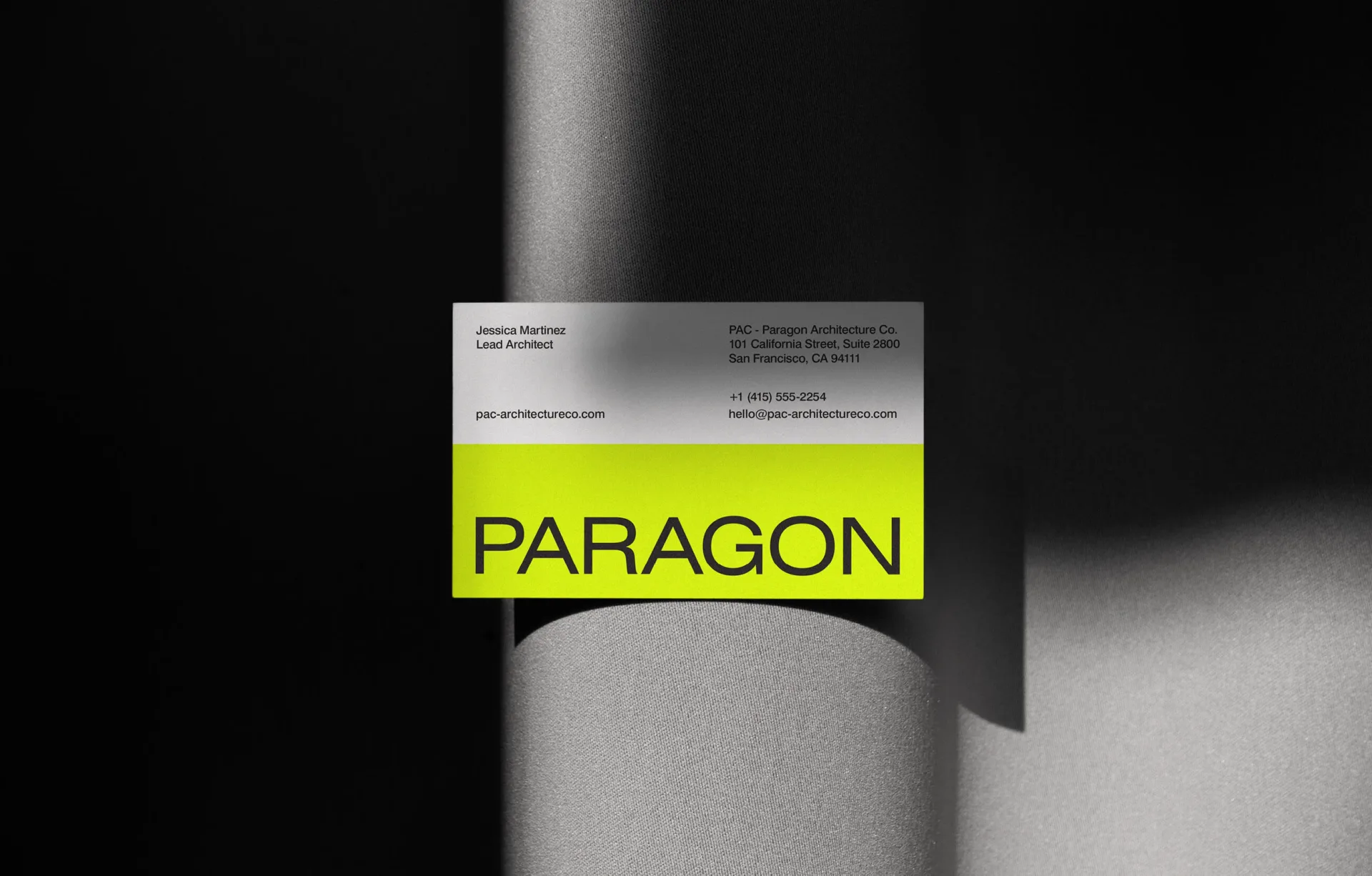
…vision and expertise. The new identity features a sleek, modern logo, a sophisticated color palette, and contemporary typography. The branding elements come together to create a distinctive…
ranking
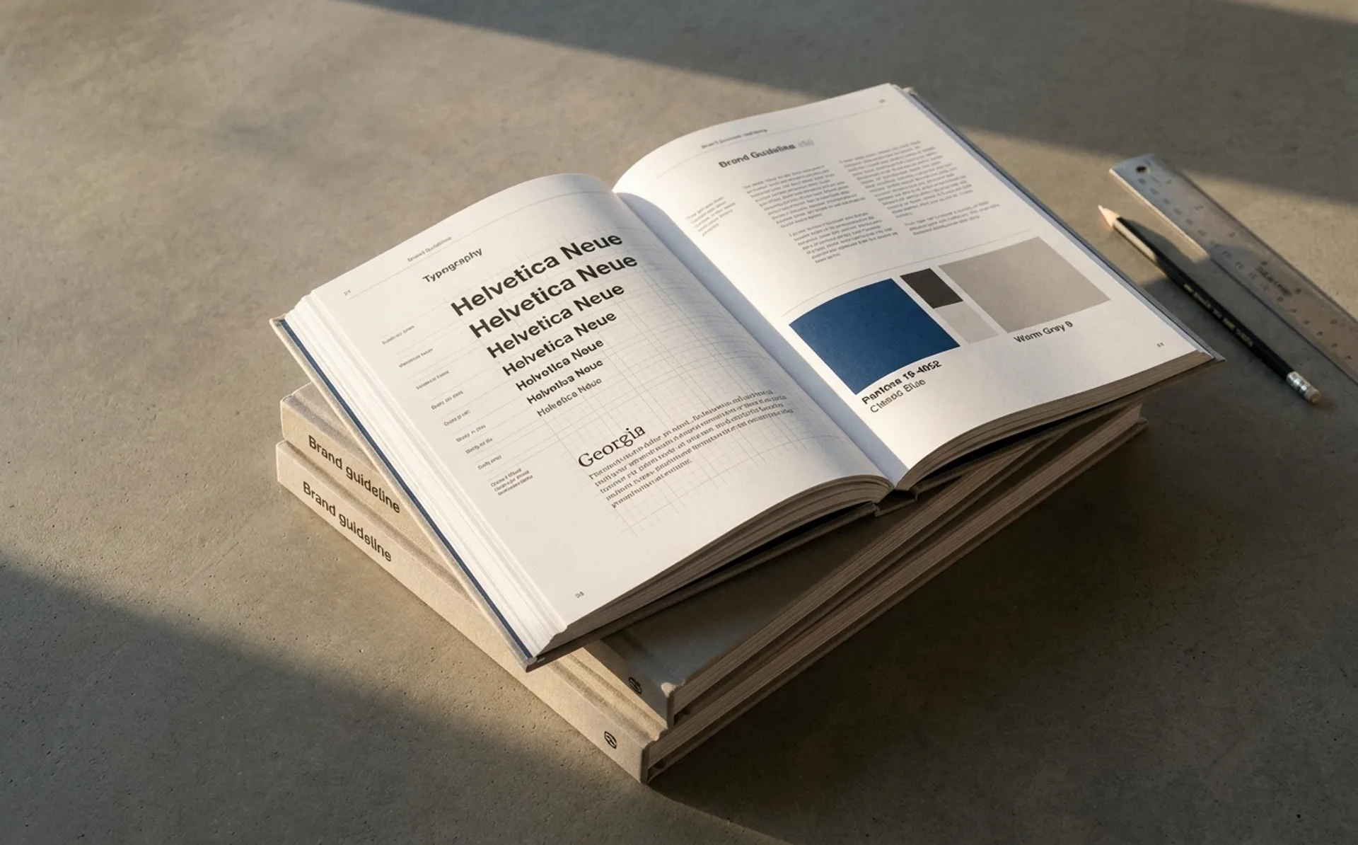
…original team in the room. Steal the structural moves: token-first design systems, parametric color, optical-sized typography, explicit governance, decision documentation for edge cases.…
project
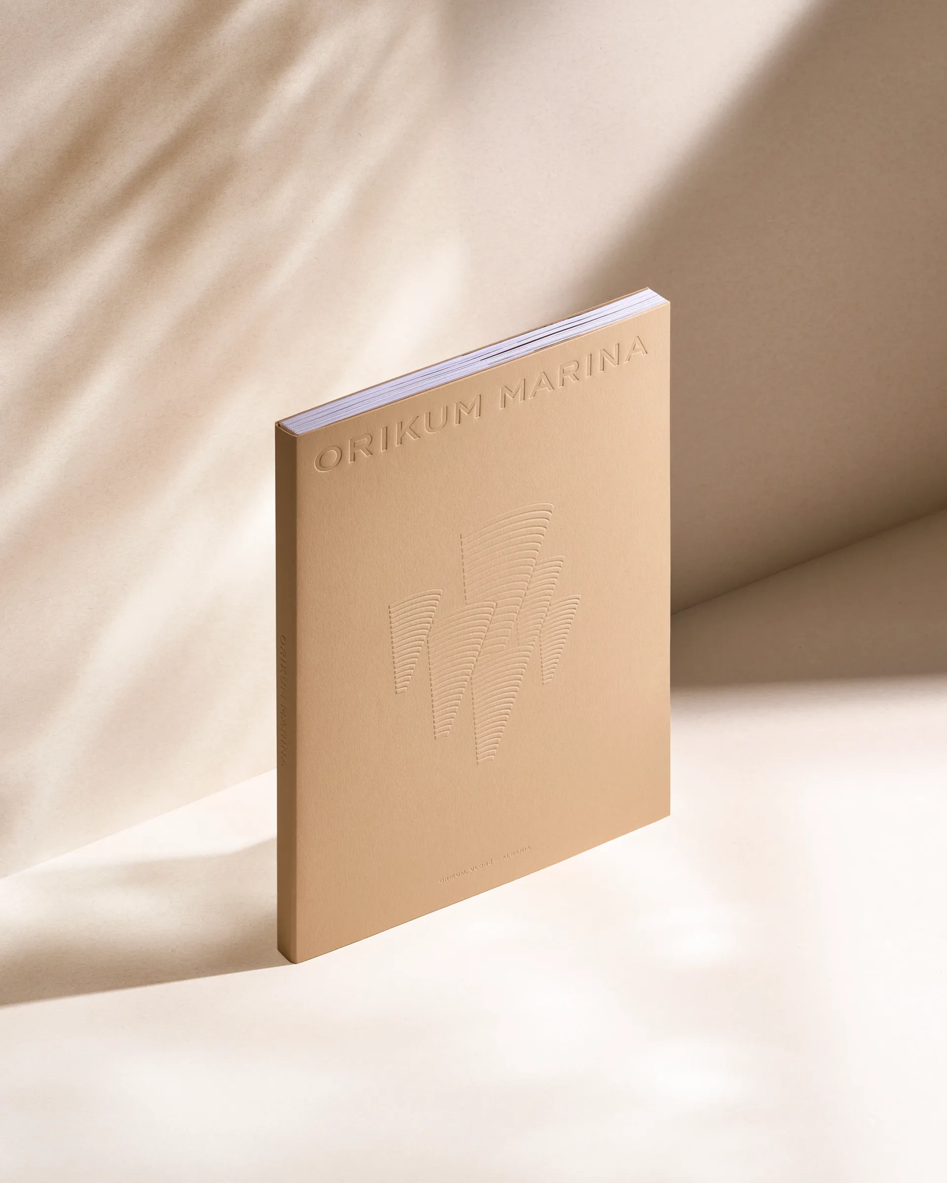
…symbolizes the corals-like structure and linear texture of the buildings. The selection of sand color paper refers to the limestone finishing material of the facades.
ranking
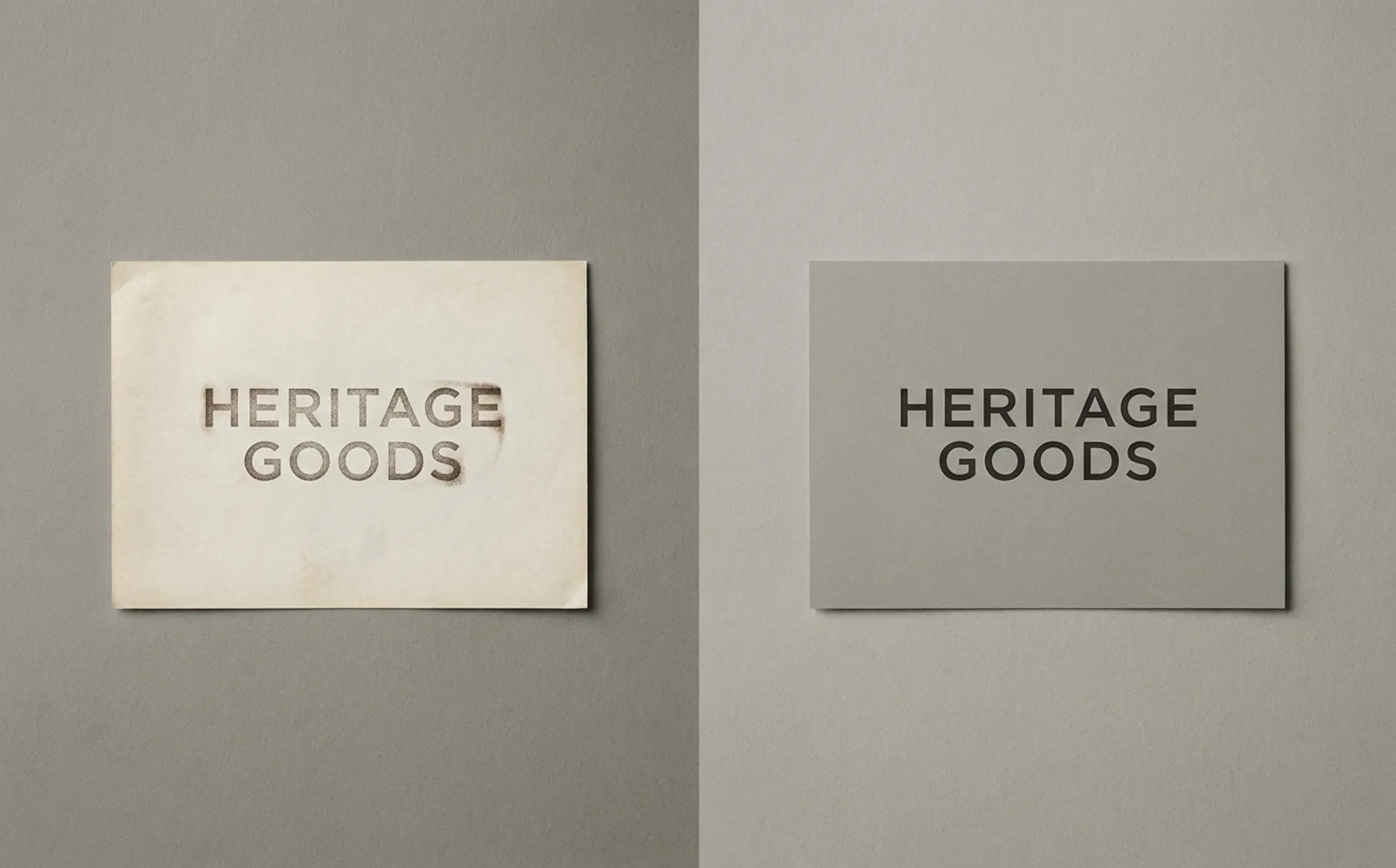
…strip the ornament, keep the recognition anchor, invest the savings in a typographic or color asset that compounds. The failures in this sample share a single trait: a brand trying…
project
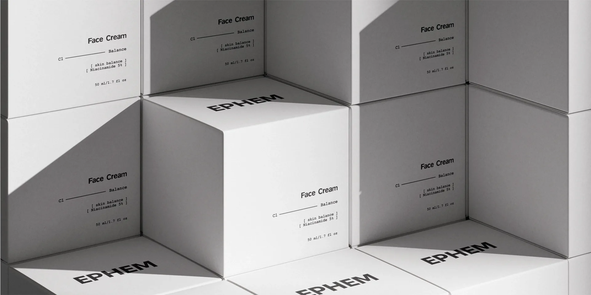
…to essential, effective steps. The visual system is based on strict typography, neutral color logic, and modular structure. Design decisions avoid decoration and focus on clarity, balance…
project

…coordinate—mapping place, memory, and movement. Each scent is assigned a route code and color palette inspired by terrain—misty hills, river valleys, open fields—turning geography into…

project
…structuring, synthesis, and operational output. Each element of the system, logo, typography, color, and interface language,was designed to behave like the product itself: calm, precise, and…
project
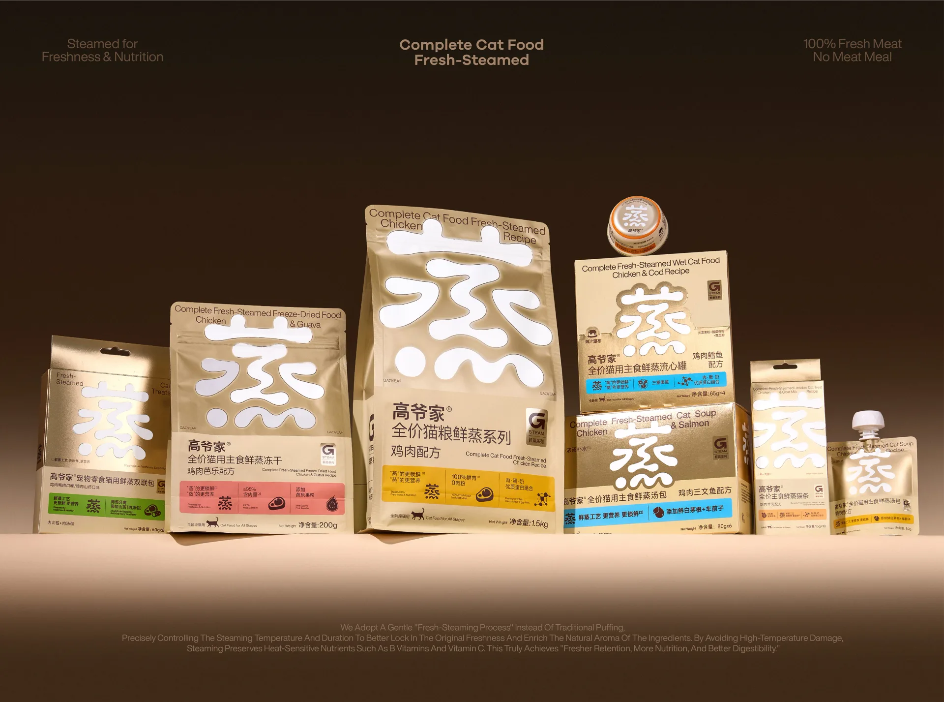
…selling point in the most direct and precise way. Paired with a clean, warm, and natural color palette and material choices, the design aligns the typography with the overall atmosphere…

project
…is built around a clear modular system: containers act as information blocks, while bold color shapes function as visual modules that create rhythm and a sense of order. Everything is…
project
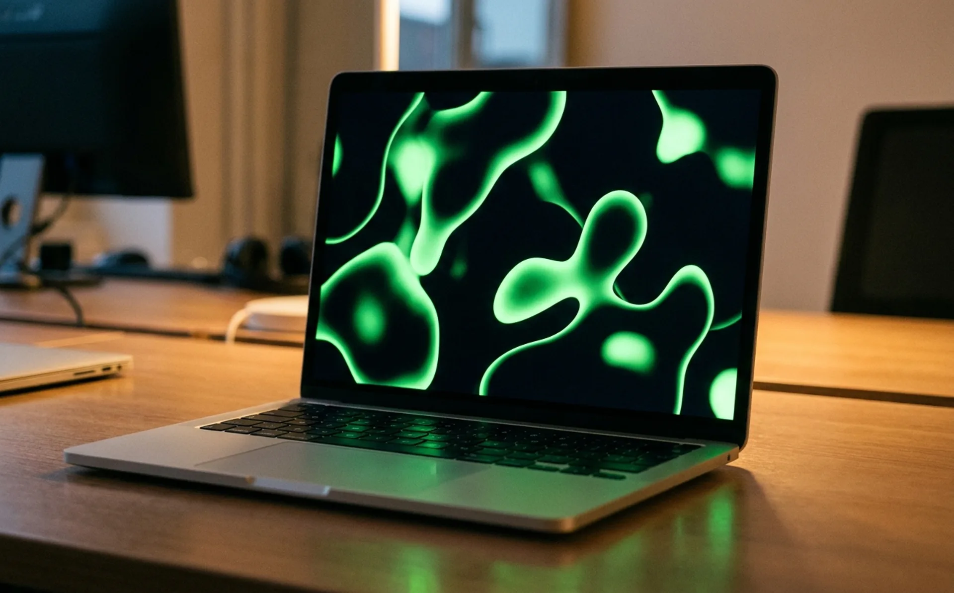
…The system The identity's primary asset is a reinterpreted signature green: the brand color Think was already known for, but evolved into a fluid, motion-first element rather than…
project
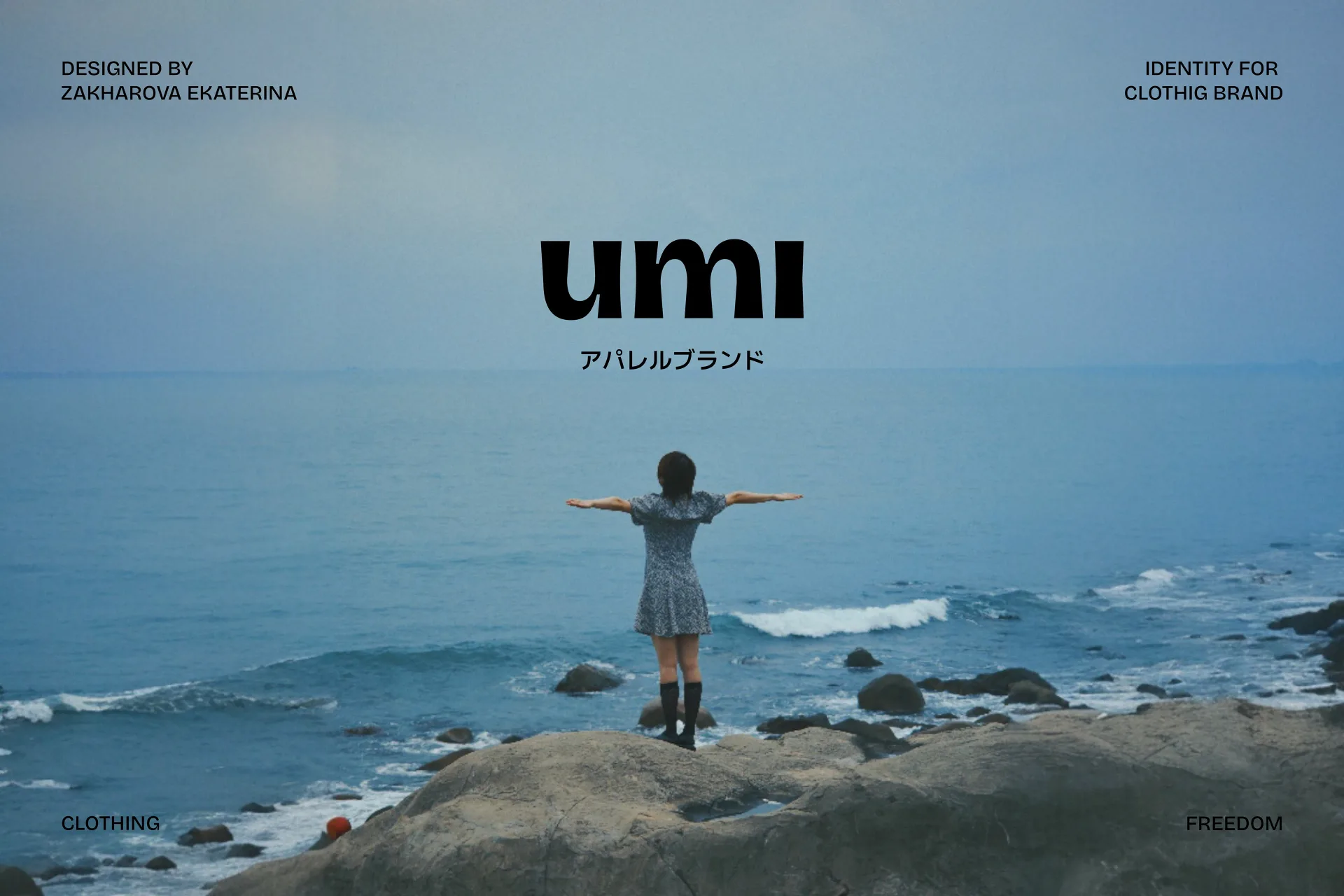
…feature is the creation of essential yet expressive pieces where the focus is placed not on color or trends but on form and quality. The brand designs garments with close attention to texture…
project
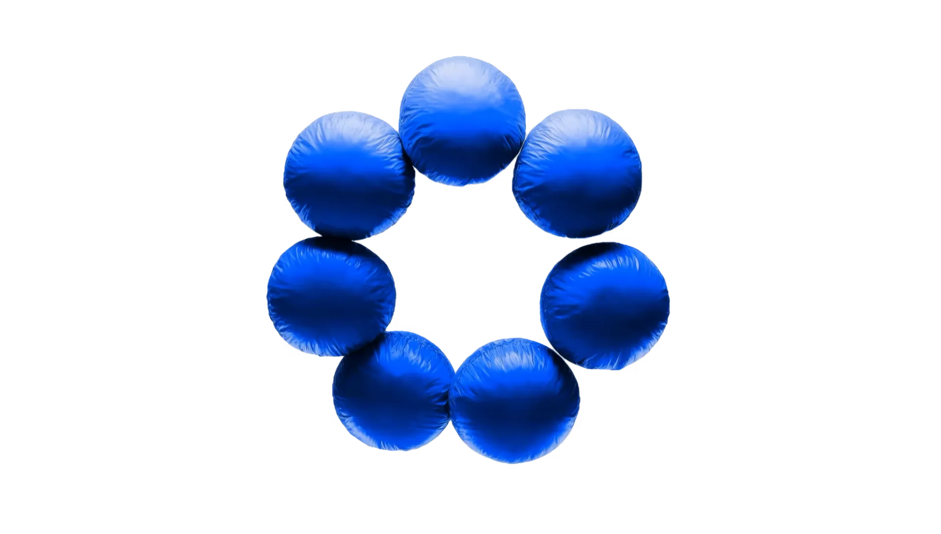
…engineering documentation than a marketing deck. The wordmark is a precise custom logotype; the color palette is restrained to a primary and a pair of editorial-weight accents; typography pairs…
project
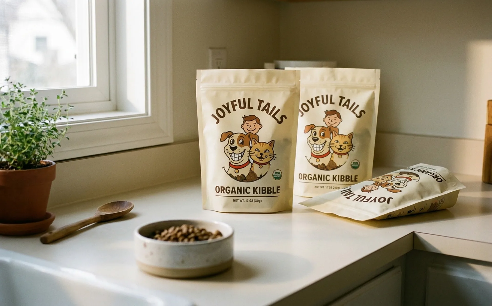
…warm, specific, reads as contemporary without trying to look generationally trendy. The color palette leans on warm creams and a saturated accent that reads as both pet-aisle-friendly…

project
…secondary seal carries the brand's history as a graphic asset rather than a dated stamp. Color palette is utilitarian: workwear white, chef-coat black, and a single warm accent that surfaces…
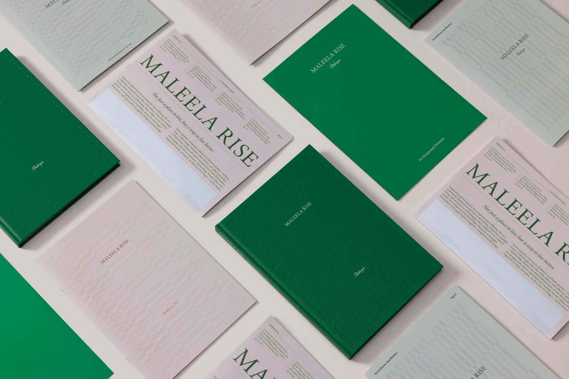
project
…slight asymmetry in the counterforms, details that reward a close look without shouting. The color palette is subdued greens with a warm cream neutral, photographed in natural daylight to…
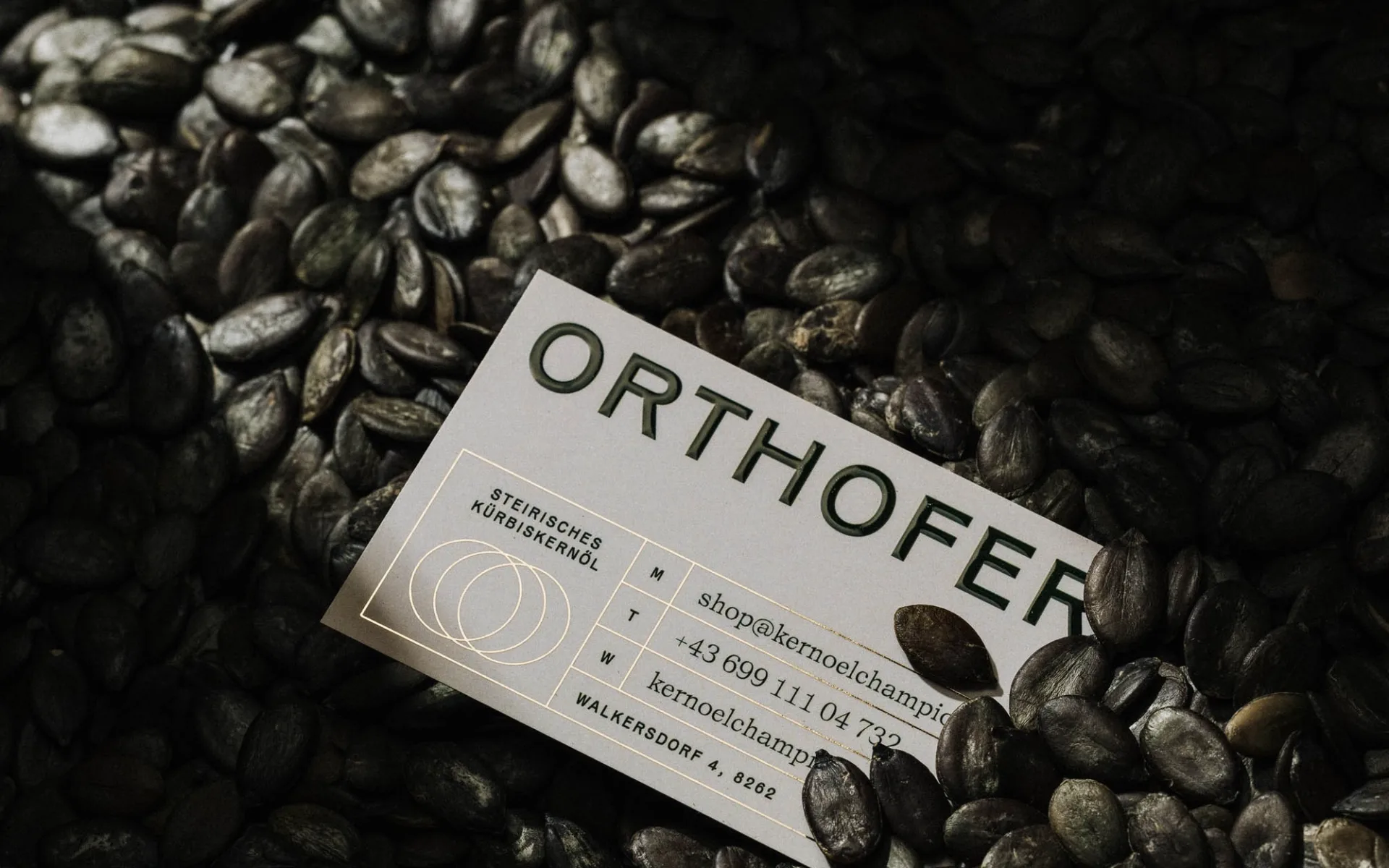
project
…packaging, labels, and secondary materials, a modular asset rather than a fixed lockup. The color palette is restrained to a premium food register: a deep forest green evoking the oil itself…
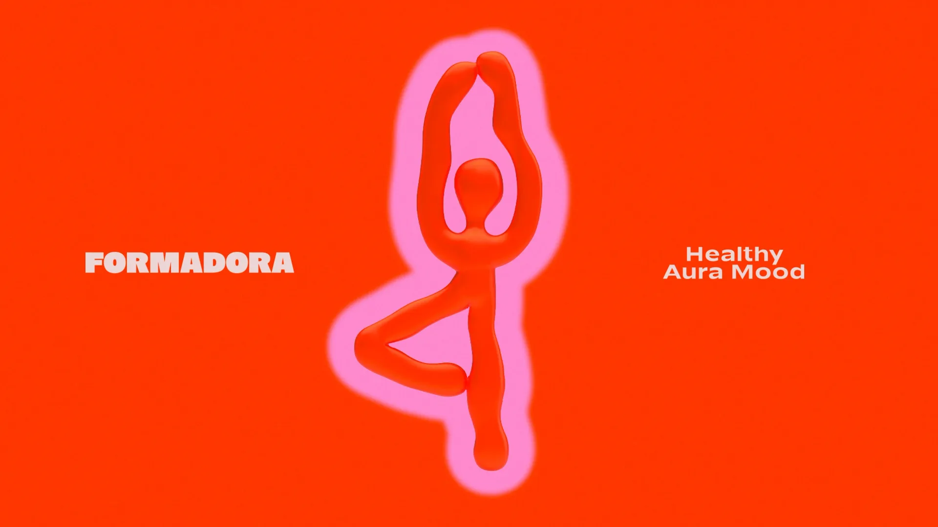
project
…movement, and emotional energy. Fluid graphic forms communicate flexibility, while the vibrant color palette sets the tone of joy, motivation, and vitality. FORMADORA is a system that trains…

article
…sounds expansive and strategic. It implies depth. In practice, it usually means a set of colors, some textures, a photography direction, and maybe a custom typeface. That's not a world…

project
…unified the product family while allowing each SKU to communicate its own purpose through color, typography, and product-specific messaging, whether highlighting electrolyte-enhanced Pebble…
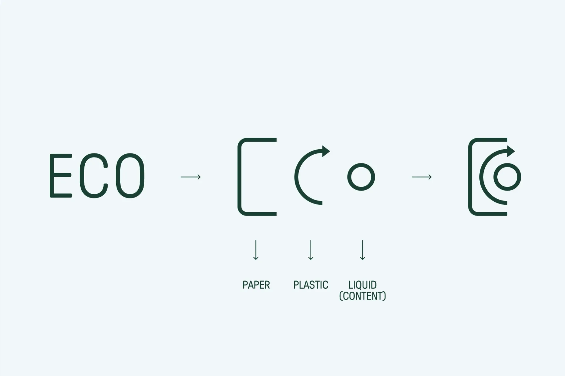
project
…is not only formal, it is structural and systemic. The brand development articulates a color palette, typographic system and visual elements that reinforce the business model while…